• Welcome! The TrekBBS is the number one place to chat about Star Trek with like-minded fans.
    If you are not already a member then please register an account and join in the discussion!

TAS scoutship shuttlecraft...

I've been giving this more thought. When I first saw this ship on television back in the day I was quite intrigued by this new type of shuttlecraft. Back then I was only dimly aware of inconsistency in size in regards to the hangar deck we saw on TOS. But back then all I had was memory to go by since it would be years before I would see stills or screencaps of this ship allowing me to examine it in more detail.

Looking at it now I'm no longer so enamored with the onscreen execution of the design even though I still find it somewhat interesting. What is readily apparent is that this design (and the same applies to other TAS designs) doesn't exibit the same kind of thinking that Matt Jefferies applied to designing for TOS. There is the size consideration, of course, but there's also the fact that the proportions make little sense. The craft has this enormous bow section that's almost a third of the ship's length! One might imagine that perhaps there was additional space for storage or something else in that bow section except the cockpit area we see gives no indication of such access. The craft was conceived to be visually appealing in a quick-and-dirty way and with possibly little to no thought as to how it fit believably within the Star Trek universe as designed by Matt Jefferies. The sole nod to MJ are the warp naceles and perhaps the nav deflector on the bow.

Still, looking at this I can see modeling a ship on the design that diverges very little from the original version. One key would be to largely ignore the size element and dismiss the design as a shuttlecraft that could berth within a starship hangar. Perhaps it could be more of a runabout type concept.

Hmm...
 
Last edited:
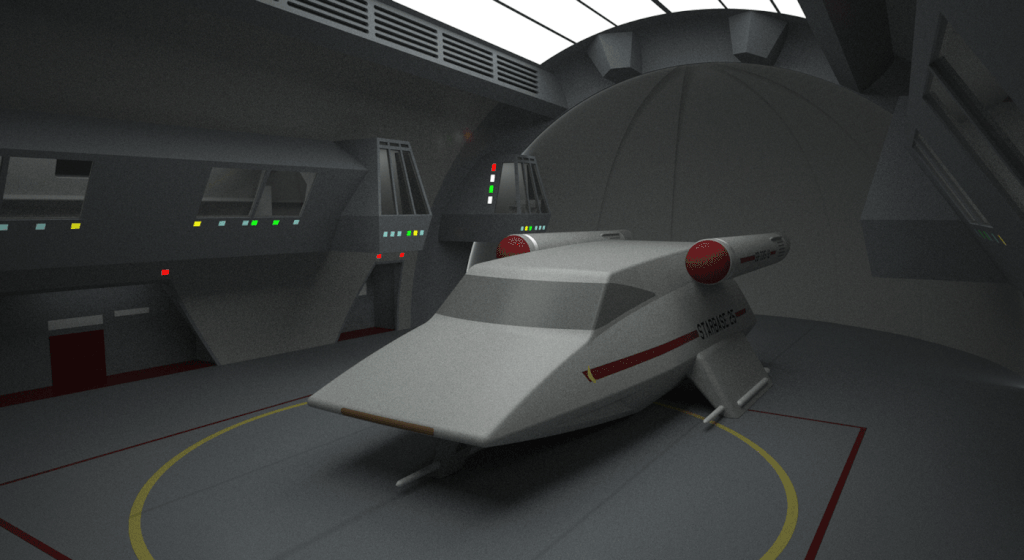
I still rather like this version even if it's not as faithful as my newer effort. In some respects I think it feels more TOS like than my new version.

 
A starbase shuttlecraft temporaily berthed aboard the Enterprise.


To be brutally honest although I did my best to make this design more realistic to fit in the TOS universe I think it misses ultimately. I think the real problem is because the basic concept on which it's based is flawed. It just doesn't look like something that would have been designed for TOS even if MJ had had more free reign in the later seasons. By that I mean that after the Class F was established what else MJ could have done extrapolating from parameters already set by the existent Class F design.

To that end it's why I feel that my first attempt from two years or so ago seemed more TOS like because I wasn't quite so beholden to the TAS look. I diverged more. In that vein other ideas I have for TOS or pre TOS era shuttlecraft strike me as more in ste with what could exist at least in terms of concept.

I think part of the issue is that while the Class F design appears simple it is actually quite complex with all sorts of dsitinctive irregular details that add to the visual texture and the design's distinctiveness. While the TAS designs or interesting they are ultimately rather plain and sterile (in my view).

Oddly I don't think this happened with the freighter Huron design which has sufficient detail and distinctiveness to make it interesting and also credible within context of the TOS universe.

I dunno. I'm just dissatisfied on some level.
 
I can understand the (some level) of dissatisfaction, but I have to say, it doesn't look half bad parked there in the bay. Maybe if the viewports didn't look so grey? Is that a result of the bay interior's reflection or is it really that color now?

I think the biggest weakness here is that it simply looks like a common station wagon or some other road vehicle we regularly see on the streets. This tends to fly in the faces of those of us who long to see the uncommon (probably the main reason we gravitate towards space vehicles and starships in the first place). ;)

On the other hand, the forward end is actually reminiscent of the shuttlecraft and skyfighters from the original "V" (the mini-series and its sequels), though those vehicles shifted starkly in distinction from road craft from the windshield on back. That was a beauty of a vehicle that I always thought looked like it could have come right out of a Starfleet factory. :D
 
Yes, it does look like a station wagon. The grey area was suggested to be a sort of "windshield" but that always struck me as so 1950s. It looks more like something drawn for a sci-fi comic book (well TAS isn't that far removed) rather than something given a lot of thought like the TOS and later designs.

That's partly why I like my first attempt better and why I'm also working on something else purely conjectural.
 
Dynamite-looking re-imagination of the TAS scoutship.

If this class of vehicle is anything like the Class F shuttlecraft, the "windshield" could be shrouded by re-entry/blast doors.

The only real challenge for a long-range vehicle like this is that it is supposed to be designed to operate in deep space, supposedly for days or weeks at a time. It would therefore require more defined facilities, such as (1: an airlock, and (2: food slot and sanitation facility for the crew. This would go a long way to helping the ship make sense. The airlock/food/sanitation facilities could all be accomplished by fold-out panels that pop out of the floor, ceiling and walls. Extend the wall panels and you have an instant aft compartment. Retract the wall panels and you have more living space for work, relaxation, or even sleep.

It looks like the bulk of the ship's equipment is going to be in the nose, wings and nacelles. That's where the computer, scanners/sensors, life support, radio and other services would be housed. The nacelles would likely house the power generation. This would leave the rest of the main hull for crew habitat/shelter (and maybe a food slot facility), plus storage for handheld equipment.
 
The grey area was suggested to be a sort of "windshield" but that always struck me as so 1950s.

Just make it anti-glare paint around the actual viewports. It's not as if the inside view in any way supports the idea that the windshield would have triangular side elements. But if that's just black hull around a smallish porthole behind one of the panels next to Sulu here...

http://tas.trekcore.com/gallery/albums/1x14/theslaverweapon_014.JPG

Timo Saloniemi
 
^^ Yeah, I thought about that and it works.

I guess what it really comes down to is that while I think I did a decent job of making the TAS design more "real world" it's just lacking in overall appeal for me.

Like I said before I like my earlier attempt better even though it's more divergent than this recent model. I just think it works better visually overall.
 
If you are not already a member then please register an account and join in the discussion!

Sign up / Register


Back
Top