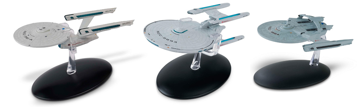
While Picard is supposed to be about Picard and synthetic life, a major point of Star Trek is to present the future as a futurist or World’s Fair would. The ship is the main backdrop and passively describes the future society and comes to represent the future setting. The ship has a couple neat things internally but doesn’t recognize its importance externally.The season wasn't about the ship as much as previous shows were, so it didn't matter to me that it's a more generic one. Let's hope we'll see more interesting designs in S2!
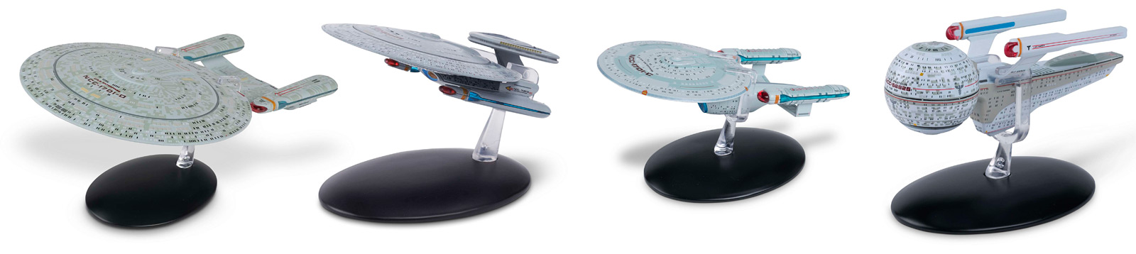
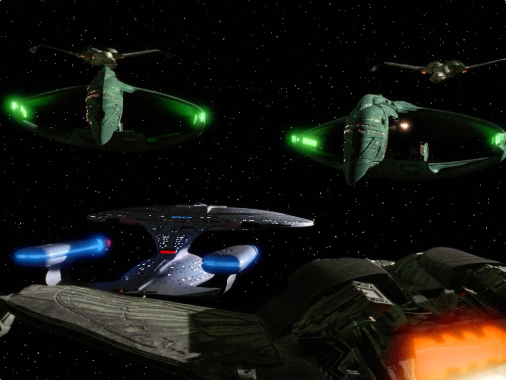
That’s kind of the issue I have with the Martian food replication scene and the brutal ruggedness of Sirena’s mess deck. Both express societal character through their choices but without any thought to the implications of the established technologies. Both ignore precedent from past examples and the ship comes off the same way when it doesn’t take advantage of the more complex design languages of the Enterprise-D, Voyager, and NX-01. Maybe that’s a weak connection but I see them as part of the same overarching technological sphere.
")