• Welcome! The TrekBBS is the number one place to chat about Star Trek with like-minded fans.
    If you are not already a member then please register an account and join in the discussion!

Star Trek: Starships Model/Magazine Subscription

I mean, Hell, the original pilot, "The Cage" was filmed in B&W...that's how old it is.
Uh... no it wasn't. For a while, the colour print was lost, but it turned up over a decade ago and has been broadcast and released in formats including DVD, Blu-ray and online video in colour.

The whole series was shot on a shoestring budget...

Tell that to a fan of 60s Doctor Who!
 
Not necessarily. I didn't have any trouble believing the Klingon ships we saw on "Enterprise" were less advanced than the BoP's and cruisers we saw in the 23rd and 24th Centuries. Even the NX class, if you look closely enough, the metallic plating looks a bit more primitive than the starships of later centuries.

I think it would've been doable to create something that looked like it preceded the BoP.

Oh, OK...I see what you mean. You just had trouble with the 22nd C version of the Romulan BoP. I can understand that. But I think the problem lies more with the TOS BoP more than anything. Because if you look closely at that one, it wasn't much different than a Federation ship with inverted warp nacelles, and a painted bird on the hull. I see what you're saying, but again, TOS was a victim of its own time. I mean, Hell, the original pilot, "The Cage" was filmed in B&W...that's how old it is. The whole series was shot on a shoestring budget , and their model making suffered because of it., not to mention the over-all thought process of what spaceship looked like back then with all the cheesy sci-fi then. TOS came about about a decade too early. Had it been a late '70s production and not a late '60s production, things would have been quite different. And when you look at the Galaxy Class of TNG, I'm surprised they came up with such a radical design in the mid-80s in the middle of the Kirk-era Movies. Coming off of STIII and IV, with the intro of the NX-2000, I would have thought the next logical step would have been something like the Ambassador Class.

Well, the next logical step, ultimately, was the Ambassador Class, but since TNG was set a good ~80 years after the movies, that necessitated going a step or two even further.

Moreover, it should be noted that TNG-era ships and movie-era ships were, for the most part, designed by different people who, in turn, reported to different people.
 
Eaglemoss apparently mentioned back in summer that this collection would be released in Canada too. Has anyone heard when pre-order links would be available for Canadian customers?
 
Well I've just bought issue 2 as the TMP Enterpise is my favourite. I'm a bit disappointed on the 2nd issue.
null_zpsdef3019d.jpg


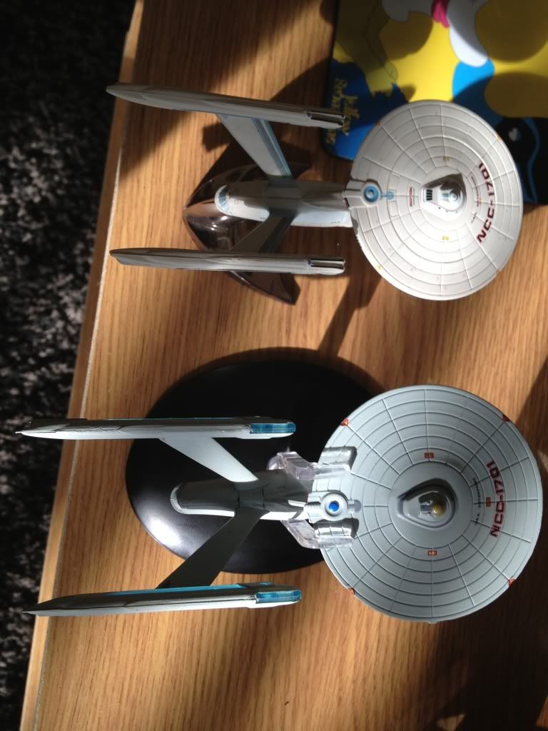
As you can see the top picture is the jonny lighting model the one underneath is the eaglemoss one it's bigger but the fine detail is bad IMO the bussard collectors are clear blue and the warp engine pylon grills are also clear blue as well, IMO not a true representation of the TMP Enterpise the grills should be black.

The jonny lighting model is smaller but has more detail on it.
 
Actually - the TMP refit should have indigo-violet glowing grills - on the inside only and black on the outside. Sometimes I guess it could look blue in some shots. The glow was most prominent in TMP but I don't think they had them going as much in later movies. But yes, as you say, the bussards in the front, however, should not be blue like that, ever. Back then, they weren't even called bussard collectors - I think they were called matter/energy acquisition sinks, IIRC.
 
Well I've just bought issue 2 as the TMP Enterpise is my favourite. I'm a bit disappointed on the 2nd issue.
null_zpsdef3019d.jpg


As you can see the top picture is the jonny lighting model the one underneath is the eaglemoss one it's bigger but the fine detail is bad IMO the bussard collectors are clear blue and the warp engine pylon grills are also clear blue as well, IMO not a true representation of the TMP Enterpise the grills should be black.

The jonny lighting model is smaller but has more detail on it.

I do see what you're saying. Not only do you have the issue with the clear blue nacelles (more on that later) but there are several details that aren't painted in on Eaglemoss model that are on the Jonny Lightning model. But about the nacelles. They were modeled in the clear blue plastic so that natural light shining through them would make them glow. That wouldn't be possible if one side was blacked out as they should be. If that "glow" feature isn't important to you, I guess you could always paint in the black if you wanted to.
 
But about the nacelles. They were modeled in the clear blue plastic so that natural light shining through them would make them glow. That wouldn't be possible if one side was blacked out as they should be. If that "glow" feature isn't important to you, I guess you could always paint in the black if you wanted to.

The Enterprise-D's nacelles are clear blue as well, and while the caps *are* overpainted in red, it isn't enough to keep them from showing blue if you position a light to make the strips "glow".
 
My main issue is the lack of detail on the Eaglemoss model. The JL has more of the fine details painted and more of the decals as well. I would much prefer the JL model over the Eaglemoss.
 
Because I'm a subscriber, I just received issue 3 with the Klingon BoP.

Any chance we could get pic?

It seems now that the subscriptions are active the various issues are arriving fairly rapidly, I'm impressed. I imagine my wallet isn't going to be pleased once they start shipping in the US
 
Because I'm a subscriber, I just received issue 3 with the Klingon BoP.

Any chance we could get pic?

It seems now that the subscriptions are active the various issues are arriving fairly rapidly, I'm impressed. I imagine my wallet isn't going to be pleased once they start shipping in the US

It's identical to the picture on the Eaglemoss site:

http://www.startrek-starships.com/eng/starships.asp

Click on number 3 under Models in Detail for an all-round view. I couldn't achieve any better.

Compared with the model used for the ST II, the red pipe (cloaking field emitter) under the bridge probably shouldn't be as prominent as it is. It's a better effort than the model in issue 2, however.
 
Last edited:
They should make a Romulan bird-of-prey based on TOS, not ENT. I like the 23rd century better than the 22nd.....
 
Speaking of Romulan stuff looking better in TOS, was I the only one who thought Nero and his Romulans didn't look like the Romulans we were all familiar with at all???
 
If you are not already a member then please register an account and join in the discussion!

Sign up / Register


Back
Top