Hm. On Windows computers, I don't use wallpaper, just black screen and icons. And almost all my paying work I do on an LCARS computer. For a Windows computer on the same desk, the almost completely black screen is less distracting.
-
Welcome! The TrekBBS is the number one place to chat about Star Trek with like-minded fans.
If you are not already a member then please register an account and join in the discussion!
You are using an out of date browser. It may not display this or other websites correctly.
You should upgrade or use an alternative browser.
You should upgrade or use an alternative browser.
Star trek panels.... Are they well thought through?
- Thread starter Urge
- Start date
It really depends on whick Trek you're talking about. For TOS, Treks V-X, and TNG, DS9 et al. the controls are just graphically pretty design work with little to no actual functionality. OTOH, there was a brief period in the early Trek movies where the controls -- originally designed for Phase II and modified for TMP -- were actually somewhat thought out.A lot of the action in startrek involves pushing buttons on panels, however, their panels lack all the stuff that we use on our computers and laptops. They dont have number or letter-keyboards, they dont have a mouse, a lot of them dont seem to have screens either. For me, it seems like a lot of them are just random colored squares that they press their fingers against so they make beeps. There doesnt seem to be much info presented on them either.
Below is from a different thread discussing the TMP bridge set from a while back.
The TMP set is covered with what I'd call Colegraphs, as designed by Lee Cole and other members of the Art Dept., who did the instrumentation and a lot of the signage for the film. The TMP set is probably unique in that at least SOME though was given to what the controls were or would actually be. The weapons console is the only one we get any good look at (in TMP and TWOK), but you can see that there's some thought given to how it works.
Diagram of TORP LOAD STATUS display. The red and blue indicators light up as the sliders (next image) are pushed up on the PHOTON TORPEDO panel. (In TWOK they pulled them DOWN, which actually shuts off the console above.)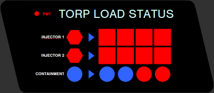
Diagram of PHOTON TORPEDO arming controls. At top are four sliders for setting the torpedo energy levels. Some of the labeling is not clearly visible and thus indicated by ???. The ON and OFF buttons were practical switches on the console face, painted black, that allowed the actor to turn on this part of the console.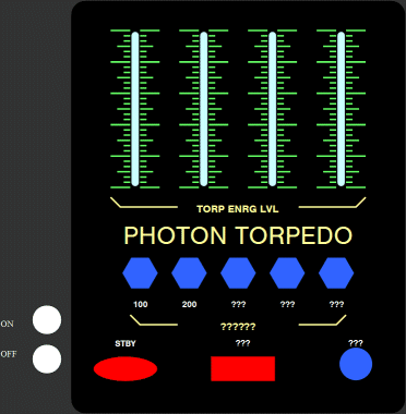
Diagram of PHASER CHARGING controls. At top are four sliders for setting the power levels, and at bottom right are four mechanical push buttons for transferring warp power.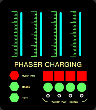
Diagram of FIRE CONTROL controls. At top left are buttons for firing phasers in the indicated direction, and at lower right are hexagonal buttons for firing torpedoes. One of the labels is not clearly visible and thus indicated by ???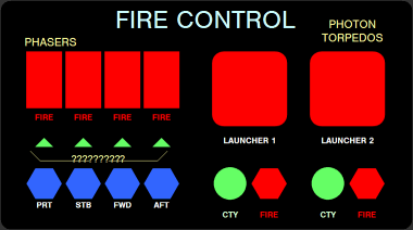
Diagram of DEFLECTOR SCREEN controls. The labels for the square blue lights appear to be in jokes for the art department, with DMAL for Dan Maltese, MINR for Mike Minor, LCLE for Lee Cole and SBAC for Rick Sternbach. The text labels for the hexagonal buttons at lower right are not clearly visible in any references found to date.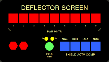
Finally, here's a photo of half-scale console built for insert shots of graphics appearing on the large display (center). You can see how the various panels fit on it. I didn't bother drawing up the COMPTR panel which is just a bank of "accordion" buttons.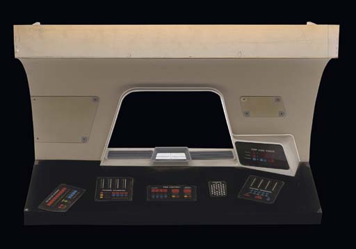
Here's one more for ya to stew on...
From the HELM. Diagram of VELOCITY controls to the right of the manual throttle.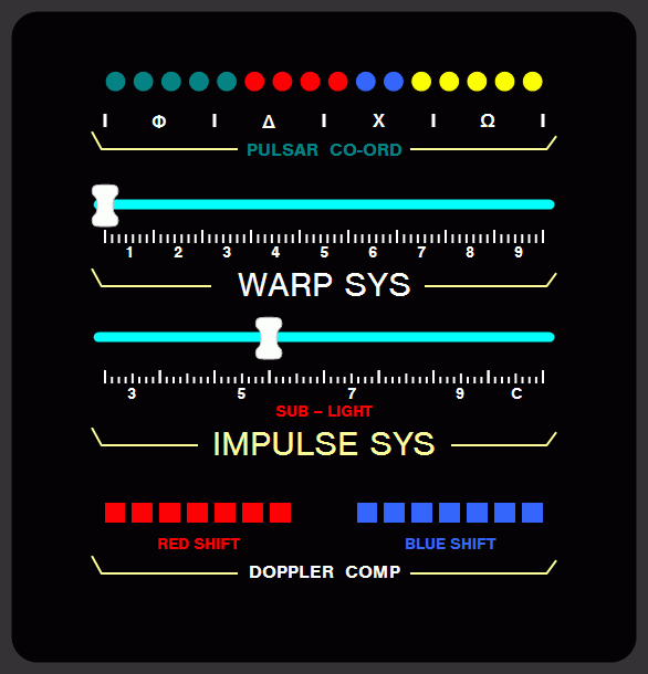
PULSAR CO-ORD appears to be some readout to show that certain pulsars have been triangulated upon in order to know the ship's current position via trig. I smell Jesco Von Puttkamer all over this...
Sliders are used to set the ship's velocity at WARP or IMPULSE. It looks like the number actually indicates the next major tick mark. Odd.
The DOPPLER COMP would seem to show how much doppler compensation is required for a given velocity. These probably light up depending on the ship's velocity.

BINGO!!
I always enjoyed the fact that I couldn't make heads or tails of the control panrls. It made it feel futuristic to me. If I were able to understand it, it would feel much more mundane. That's why TOS actually feels more futuristic to me than later Treks.
That's pretty insightful.
Agreed. Good point there.I always enjoyed the fact that I couldn't make heads or tails of the control panrls. It made it feel futuristic to me. If I were able to understand it, it would feel much more mundane. That's why TOS actually feels more futuristic to me than later Treks.
That's pretty insightful.

I think a cool idea for a future trek-show would be to have large fingersensitive panels, that change display-images a lot when different on-screen buttons are pushed. As the work progresses (forexample if someone wants to analyse incoming radiation, or whatever, down to its last details) the panel can be split into two, four or eight squares with different info displayed on it, and each of these display-squares can be opened completly, so that it fills the whole panel. The ones behind it can be possible to "shuffle" up top by pressing on their icon/text thing at the bottom-line, kind of like when you go through different browser-windows that displays different websites while surfing. Something like that will be windows-innspired, while at the same time being something completly different. I imagine that the backround-picture (if they will have something like that) on public starfleet-panels will be the starfleet logo, but the panels wont show it a lot, since it will always be other things covering it. Perhaps if the computer is re-starts (something that doesnt happen a lot in Startrek, it happened once in a TNG-episode I saw to fix a virus-problem) the logo will be present in the beginning, before programs and displays are opened over it.
With panels such as that, keyboards and screens will merge, so that you only have verticaly standing panels that are both keyboard and screen in one. Offcourse, the different panel-images that is interacted with doesnt always need to be completly thought through, but it would be cool to have panels that "live" a little, perhaps not only by changing images, but also with different sounds. The panel-speakers can say things like "unable to comply" "prosessing" "analysis complete" "warning" and other things.
With panels such as that, keyboards and screens will merge, so that you only have verticaly standing panels that are both keyboard and screen in one. Offcourse, the different panel-images that is interacted with doesnt always need to be completly thought through, but it would be cool to have panels that "live" a little, perhaps not only by changing images, but also with different sounds. The panel-speakers can say things like "unable to comply" "prosessing" "analysis complete" "warning" and other things.
Yea, LCARS as presented were limited by the studio budget. If they had had LCD screens and more money for cgi, I am sure TNG, DS9, and Voyager would have had more interactive displays as you describe. You'll just have to imagine that is what you see when they press a couple buttons and stare at a screen that does not really change for a few seconds. It's an old show.
Hello Urge.
Your questions resemble some of those I asked when I was thinking about how domestic computer systems could be improved in the future.
I thought about what startrek shows us and whether it gives us any ideas for both the user interface, and the software model.
The first thing to remember is that this was designed as a set for a television show. It is meant to give the illusion of being technical without addressing any real technical design issues. In that respect it is purely aesthetic. It is likely that no thought went into it regarding practical computer design.
I think Roddenberry's idea for TNG was no moving parts, and that was the only real guideline for the art department.")
Not necessarily. A display that is constantly changing needs to be constantly read and reread. In a system designed for efficient interaction (helm or weapons), or a system designed to report critical information (engineering) it might be an impediment to keep changing the layout.
But it depends heavily on the console's function and how it has been designed. And as said above -- these were low budget television sets, so static box of lights is what we got for the bulk of the panel.
The idea I came up with last year when we were discussing stuff like this, is that many buttons may not be necessary if for example, the computer is able to track eye movement and know exactly where we're looking at the screen. One button would suffice to correspond to a mouse click at that screen coordinate.
This is the behaviour of an actress not of a computer user. It gives the appearance of doing complicated work. I doubt an actual starship would require that degree of button pushing from so many hundred active personnel, just to keep it up and running.
Your questions resemble some of those I asked when I was thinking about how domestic computer systems could be improved in the future.
I thought about what startrek shows us and whether it gives us any ideas for both the user interface, and the software model.
A lot of the action in startrek involves pushing buttons on panels, however, their panels lack all the stuff that we use on our computers and laptops. They dont have number or letter-keyboards, they dont have a mouse, a lot of them dont seem to have screens either. For me, it seems like a lot of them are just random colored squares that they press their fingers against so they make beeps. There doesnt seem to be much info presented on them either.
The first thing to remember is that this was designed as a set for a television show. It is meant to give the illusion of being technical without addressing any real technical design issues. In that respect it is purely aesthetic. It is likely that no thought went into it regarding practical computer design.
I think Roddenberry's idea for TNG was no moving parts, and that was the only real guideline for the art department.
If they where finger-sensitive screens one should expect them to change layouts and show different info and options when the different areas of the screen is pushed, but that doesnt seem to be the case either. It doesnt look real to me - but I might be wrong.
Not necessarily. A display that is constantly changing needs to be constantly read and reread. In a system designed for efficient interaction (helm or weapons), or a system designed to report critical information (engineering) it might be an impediment to keep changing the layout.
But it depends heavily on the console's function and how it has been designed. And as said above -- these were low budget television sets, so static box of lights is what we got for the bulk of the panel.
The laptops in forexample Voyager has screens, but they dont have letter or number-buttons, so one cant write on them. Do they have a mouse-wheel? To me, it seems like they only have three or four big buttons, its very, very odd. Could it be that one can activate different kinds of alfabeth on these black screen-sections, that they are touch-sensitive and can display different forms of keyboards? Have they ever been used to write on in any of the episodes? It all seems strange to me.
The idea I came up with last year when we were discussing stuff like this, is that many buttons may not be necessary if for example, the computer is able to track eye movement and know exactly where we're looking at the screen. One button would suffice to correspond to a mouse click at that screen coordinate.
Also, it seems to be way to much button-pushing, specialy in Voyager. Why does so many buttons have to be pushed all the time? What are they doing? It doesnt seem to have anny effects on the screens (that stays the same) nobody are writing annything.......
Its realy starting to bug me... It seems like its just a sort of bi-activity that goes with the dialoge. In the episode im watching now, B`Lana (the klingon girl) is having a conversation with the Chinese dude over some issue with the captain... And what does she do? Bibibibibib-- Here fingers are moving rapidly across a panel, doesnt the computer take care of annything?

This is the behaviour of an actress not of a computer user. It gives the appearance of doing complicated work. I doubt an actual starship would require that degree of button pushing from so many hundred active personnel, just to keep it up and running.
in some ways, you've described the interface I designed for "Rules of Engagement 2" back in 1993!I think a cool idea for a future trek-show would be to have large fingersensitive panels, that change display-images a lot when different on-screen buttons are pushed. As the work progresses (forexample if someone wants to analyse incoming radiation, or whatever, down to its last details) the panel can be split into two, four or eight squares with different info displayed on it, and each of these display-squares can be opened completly, so that it fills the whole panel . . .
I think a cool idea for a future trek-show would be to have large fingersensitive panels, that change display-images a lot when different on-screen buttons are pushed. As the work progresses (forexample if someone wants to analyse incoming radiation, or whatever, down to its last details) the panel can be split into two, four or eight squares with different info displayed on it, and each of these display-squares can be opened completly, so that it fills the whole panel. The ones behind it can be possible to "shuffle" up top by pressing on their icon/text thing at the bottom-line, kind of like when you go through different browser-windows that displays different websites while surfing. Something like that will be windows-innspired, while at the same time being something completly different. I imagine that the backround-picture (if they will have something like that) on public starfleet-panels will be the starfleet logo, but the panels wont show it a lot, since it will always be other things covering it. Perhaps if the computer is re-starts (something that doesnt happen a lot in Startrek, it happened once in a TNG-episode I saw to fix a virus-problem) the logo will be present in the beginning, before programs and displays are opened over it.
With panels such as that, keyboards and screens will merge, so that you only have verticaly standing panels that are both keyboard and screen in one. Offcourse, the different panel-images that is interacted with doesnt always need to be completly thought through, but it would be cool to have panels that "live" a little, perhaps not only by changing images, but also with different sounds. The panel-speakers can say things like "unable to comply" "prosessing" "analysis complete" "warning" and other things.
There are changes in the panels, depending on the function you are using. Sometimes you see a button change color or label or get blacked out or a display come up with a button is touched. That wasn't always shown on Trek, and sometimes there isn't much difference to see.
But here's one example of that from my LCARS system. On this screen if you input 8, the 8 button, 7 button, and the two buttons to the far right of the 7 button all change, and new button appears at bottom right. Also, the black square on the divider to the right of the 7 button is replaced when a small black number 8 to remind you that you had input 8. And one of the new buttons gives you the opportunity to change all that back.
LCARS Options Menu
Here's one that lets you rotate a CGI model with the arrow keys or call up schematics. That's pretty interactive. And similar things were shown in action on VOY.
View 360: Danube Class
For a real system, LCARS doesn't work at all -- see my post in the other thread about that.
But as an imaginary interface in a show, it works very well! It has a lot of bright colors, little substance (such as text or icons) and it lookes energetic; animated. Like there's lots of things going on. And because of the lack of substance, people don't get distracted by reading it when the scene doesn't require it. It's a perfect backdrop that suggests something is going on without actually letting you know what it is.
But as an imaginary interface in a show, it works very well! It has a lot of bright colors, little substance (such as text or icons) and it lookes energetic; animated. Like there's lots of things going on. And because of the lack of substance, people don't get distracted by reading it when the scene doesn't require it. It's a perfect backdrop that suggests something is going on without actually letting you know what it is.
For a real system, LCARS doesn't work at all -- see my post in the other thread about that.
But as an imaginary interface in a show, it works very well! It has a lot of bright colors, little substance (such as text or icons) and it lookes energetic; animated. Like there's lots of things going on. And because of the lack of substance, people don't get distracted by reading it when the scene doesn't require it. It's a perfect backdrop that suggests something is going on without actually letting you know what it is.
Wrong. A real LCARS system does work and can do many things. I've made one for ordinary PCs, and there are thousands of users worldwide (over 130,000 downloads so far).
I already posted a link to the screenshot gallery, but here it is again:
LCARS 24 Screenshot Gallery
I don't want to rain on what's obviously your hobby, but since you replied to me: I really have to strongly disagree with you on this one. Your work is fantastic, but LCARS in and of itself doesn't work well as a real-world interface. Sure, Trekkies like it because it's from Star Trek, but that doesn't make it good.Wrong. A real LCARS system does work and can do many things. I've made one for ordinary PCs, and there are thousands of users worldwide (over 130,000 downloads so far).
I already posted a link to the screenshot gallery, but here it is again:
LCARS 24 Screenshot Gallery
Of course LCARS can do a lot of things if you make it to. Any interface can do that. But that doesn't mean it can do it well. And those screens show you exactly why LCARS doesn't work as a real interface. It looks complicated, while there is actually very little going on. It's very bright, not something many people can look at for more then half an hour or so. It's unnecessary wasteful, there is a relatively tiny amount of screen estate actually in use by the content. It's also very unusable; you don't see at first glace, within a few fractions of a second, what you can do with it and how you do it, you need to figure it out first which is a bad thing.
An example:
http://lcars24.com/sh1.html
This example shows the user the date and time. But, the elements are scattered over the upper and lower content area; there is no clear way of moving your eyes. It makes it very hard to easily digest. It looks cluttered, even though it doesn't offer much information at all, only the light and dark orange text is actually useful information. It's also not easy to use, the interactive options are set in words instead of symbols; so you'll have to take the time to read them. But there's a problem: They're extremely hard to read. The font size is very small, the font is all-caps, which slows your reading speed by quite much, the font is not very legible and it's also black on high contrast colors; a very unreadable combination. It's also not something you'd actually want to do anything with; looking at those colors for more then a few minutes gives most people a headache.
Another example:
http://lcars24.com/sh4.html
This one looks incredibly cluttered and complicated. It's not, there's not much information there after all, but it looks cluttered and complicated and that's what counts. I can't instantly see what it is, what I can do with it and how I can do it; I have to read every single thing first, that's not a good thing. The colors are even worse then the other one; not only are they too bright, they also clash with each other; sort of like an lsd trip. Take all the shapes and colors away, put it in a legible dark font on a light background and you're left with a small list you can easily digest.
Another example:
http://lcars24.com/sh13.html
In this example, the main content only takes up less then 2/3rd of the screen real estate. The color and font of the text make for less-then-savory reading, especially for something longer then a few words. The menu is horizontal, with words instead of symbols. So, you have to read it first, again. Not only that, but the menu is aligned vertically, instead of horizontally. Most GUI's have it horizontal for a reason: that way, it takes up much less screen estate.
Really, the work you've done is fantastic for everybody who likes to look at LCARS -- me included. But LCARS definitely don't work in the real world -- only if you're already familiar with the system, and even then it does it less good then any conventional modern user interface. If I'd submit a LCARS based proposal to a good friend that designs user interfaces for a living, he'd laugh out and slap me around the head with it. The whole concept of LCARS is flawed, and if you take away everything that's wrong with it for real-world application, it won't be recognizable as LCARS in any way any longer.
Um, the concept of LCARS is to have panels and displays all over the place, many of which serve special functions, and most don't even have a chair in front of them, let alone a surface for moving a mouse. A microwave oven or washing machine could be operated by a small LCARS panel. A small LCARS panel built into a coffee table or arm of a chair could be the remote control for a TV and even have a button that lets you switch that to control an air conditioner, etc. Starships have them all over the walls, like stained-glass window or an art gallery. You can walk up to a display and tap one button to implement some task, just as you do with a light switch, or see some vital piece of information from across the room.
As to the clock screen you pointed out, the alarm clocks in my house are like that, running on, for example, and 86-MHxz 1995 model Toshiba 460 CT, worth probably no more than $15 on eBay. As a bedroom clock, it could be on a small stand or even a shelf. When the alarm goes off it plays music or talks until you tap the space bar then waits for whatever snooze period the user has set and then starts making noise again. It's a different concept from Windows. It's an appliance. You can use its other features or not.
My LCARS bedroom clocks are certainly better for checking the time at a distance than normal clocks, and double as night-lights. Plus the space bar (when the alarm is not sounding) makes the screen go all white to serve as a temporary light so you can walk over to the room's light switch without tripping on something.
As to the word processor you pointed out, you may not like the style, but I use that for most of my paying work, mainly because of its shorthand typing functions, where a long chemical name or even a phrase can typed with three or four keystrokes, with automatic word completion using a previous example of the word in the file. It's efficient for my purposes. And I think anybody would agree that the cursor is easier to spot at a glance than with any other word processor. Actually, with Word, if you make the background gray to avoid snowblindness, the cursor becomes invisible.
Not to get into the middle of the discussion about LCARS 24's implementation, but I have to agree that LCARS as seen in TNG et al is a poor interface design.
I mentioned the game "Rules of Engagement 2" I did some years ago. The design of that UI was inspired by LCARS, but when I started to actually implement the interface for the first of the games it became obvious that it didn't work well. There were too many colors and it was hard to tell a button from a label, etc. The approach I took was to standardize a color coding system and consistent graphical elements. Buttons that caused an action (verb) were one color. Buttons that were a selection (noun) were a different color. Related controls and displays were tucked under an LCARS like shape I called an "inverse L bracket". { and } type shapes connected functions and readouts. I even color coded the dialog boxes. Alert boxes were yellow and you could not use any other part of the interface until you dealt with it.
By the second game I further differentiated controls from visual elements by giving them a different shading treatment: gradient color for non-interactive elements and flat color for buttons, etc.
My experience trying it on new users was that for about 5 minutes they poked at it tentatively, but once they caught onto the rules, they could operate any one of the dozens of panels that popped up relatively intutively. But that was because I made concrete design decisions and stuck to them.
Last edited:
What DS9Sega is saying is exactly what I'm talking about:
Of course it's possible to mold the LCARS concept into something you want it to do. But that doesn't mean that it does it well. Of course, for a microwave, it can work -- you only have a few options. But then, why keep the LCARS look? It's become unnecessary -- and you'd be better off designing something that makes better use of the space the display has. Yes, if you make good design decisions (like context-sensitive buttons, color-coded buttons, a more legible font etc), it can become a moderately good interface. But it can be so much better if you simply throw away the whole concept instead of trying to fit everything into a mold that's not supposed to fit it.
As to the word processor example: It doesn't really matter if you prefer it or not; attractiveness is a personal taste. But ease of use, the amount of information it can display, how well it displays the information, how well you're guided on your actions -- these are all quantifiable items, and the LCARS scores very poorly on that.
You can perhaps compare it to a command line. If you know what you're doing, you can do everything with it, even more (and faster) then with a GUI. But it's not user friendly at all; if you set your basic secretary in front of it, she's got no idea with to do. It's the same with LCARS; if you don't already know what you're doing, it's hard to figure out -- people can only do it since it displays so little information and has so little interactivity that there really aren't many possible things you can do, or do wrong.
Try to remake popular programs like Word (all it's functionality -- not your basic Notepad) or Photoshop or the like into an LCARS and you either have an application that's so chock full of buttons that it's indecipherable or you lose the most part of the funcionality since you simply have no space to put it. Making all functions available by keyboard commands only is possible, but we already know how good that works -- not at all. People had Word '98 for a long time, yet were always asking if it was possible to develop new features that were already in the software; they just couldn't find them.
Yes, you can simply buy more screens and put every component on a different screen. But if the fact that you need more space to display the same things you can do in one in a modern interface doesn't illustrate the space-wasting nature of the LCARS concept, I don't know what will.
Making it a touch-screen doesn't matter either -- the elements you need to display are still largely the same. Perhaps even more so, since you need access to commands normally only available by keyboard.
If an LCARS type interface would really be as effective and usable as claimed, we would be working on it right now. But we aren't; it simply doesn't have the possibilities other common interfaces give both you and the software designer.
It looks nice, in a recognizable sort of way, and it might be 'cool'. But it's not usable at all in the real world -- and the places where it is usable, you'd be better off designing something from scratch.
Last edited:
Um, the concept of LCARS is to have panels and displays all over the place, many of which serve special functions, and most don't even have a chair in front of them, let alone a surface for moving a mouse. A microwave oven or washing machine could be operated by a small LCARS panel. A small LCARS panel built into a coffee table or arm of a chair could be the remote control for a TV and even have a button that lets you switch that to control an air conditioner, etc. Starships have them all over the walls, like stained-glass window or an art gallery. You can walk up to a display and tap one button to implement some task, just as you do with a light switch, or see some vital piece of information from across the room.
Seems as if there's a need to separate "LCARS - the interface design" from "LCARS - the functionality".
You can have the design (big colored buttons, with text) without having the functionality you describe - and you can have the functionality with a completely different (and potentially better) user interface slapped on.
If you're interested in the functionality, and perhaps next generation user interfaces, you might want to google for "Ubiquitous computing", "Ambient intelligence" and/or "Everyware".
Great stuff, and more along the lines of user interfaces as seen in the "Minority Report" or "The Island" movies.
Well, if you haven't seen LCARS 24 in action, maybe it's somehow easy to guess that menus don't open when they're supposed to or somehow can't, etc., etc. I haven't had time to make a YouTube demo. When a submenu opens on a vertical menu bar, the whole bar blacks out, and the submenu appears. It's that simple, is very clear, looks cool, and is perfectly in line with the LCARS paradigm. A file menu or help file opens full screen, instantly when called and can be closed instantly.
Drawing routines work very differently from those of Windows apps but give precise control. Custom displays can be made and edited using a dedicated LCARS markup language, and the user can see the results interactively. And those user-defined screens can have various functionality, as well. That aspect is expanded a bit in the next version, not released yet.
Drawing routines work very differently from those of Windows apps but give precise control. Custom displays can be made and edited using a dedicated LCARS markup language, and the user can see the results interactively. And those user-defined screens can have various functionality, as well. That aspect is expanded a bit in the next version, not released yet.
The thing to remember about LCARS was that at the time it was developed the "windows" paradigm hadn't really taken hold. (yes, yes, I know the Mac was up and flying by then) Most PC users were still confronted with dos based programs with rudimentary graphical interfaces. Wordperfect and Lotus 123 both used basic black backgrounds with solid color interfaces. the idea of button graphics painted to look 3d was not really out there yet. So, LCARS is an extrapolation of what we were used to then. Black backgrounds with primary colors. To make it look "futuristic" the designers rounded all the corners and tried to apply a workflow methodology to the layouts.
How would LCARS look if it had been developed today? the garish colors would be gone as 30 years of interface development has shown they lead to eyestrain. We might see some kind of futuristic mouse type device along with the touchscreen. Due to the nature of using a tough screen, the interface would have bigger buttons than a mouse based system. (for fat fingers). Beyond that, it would be pretty hard to say, depends on the art director?
I actually preferred the system used in Ironman by Tony. Most controls were on touch surfaces seperate from the display surface with the control surfaces still being interactively changing with the use required of them.
Similar threads
- Replies
- 721
- Views
- 71K
- Replies
- 5
- Views
- 787
If you are not already a member then please register an account and join in the discussion!