Alternately, the ship in the teaser could be a poor replica built by the bad guys and used to attack the Romulans in an attempt to start a war. That gag has already been used a couple of times, at least (ENT and New Voyages), but with more convincing fakes.
-
Welcome! The TrekBBS is the number one place to chat about Star Trek with like-minded fans.
If you are not already a member then please register an account and join in the discussion!
You are using an out of date browser. It may not display this or other websites correctly.
You should upgrade or use an alternative browser.
You should upgrade or use an alternative browser.
A typical 60's spaceship design was the Jupiter II.
The Enterprise is downright utilitarian, both inside and out, and as such, isn't the least bit dated.
In your opinion.
Really, the point is moot. The ship is gonna be redesigned, the question is by how much, and will it be accepted.
A typical 60's spaceship design was the Jupiter II.
The Enterprise is downright utilitarian, both inside and out, and as such, isn't the least bit dated.
In your opinion..
Of course it was his opinion- That's your arguement against April?... Though I'm sure other people have the same opinion.
Really, the point is moot. The ship is gonna be redesigned, the question is by how much, and will it be accepted.
Of course the point is moot- if it wasn't debatable, we wouldn't be having this love fest.
Last edited:
True, but what does that have to do with the topic at hand?Since when (ever) did SF-films constrain themselves to what is probable or possible or ...
Honestly, the best SCIENCE FICTION films (as opposed to "space fantasy" films)... or books, or tv shows, or whatever... have had a core of HARD SCIENCE. Hence the name of the genre.
I'd say that "hard science" is CENTRAL to actual Science Fiction. It's just unrelated to some of the crap we've gotten fed over the years which has CALLED itself Sci-fi.
")
Yes, but a car is designed purely for style. The FUNCTIONAL bits look a bit different today than yesterday, sure... because of technological advancements. But it's damned difficult to project "technological advancements" into a period centuries ahead of where we are now.This actually cannot be specified, but it is indeed the case that the asthetics of what we consider SF have changed considerably since the 1960s. Probably because of the technological advances made in the real world.
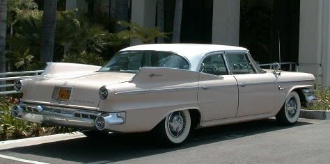
Have a look at a car from the 1960s (and the Enterprise - as beautiful as she is - is a product of that decade) and compare it to one from today: They still have four wheels, two to four passenger doors, a hood and a trunk lid but they look quite different today.
So we're limited to purely stylistic points. That's absolutely relevant to the automobile example you give. Why? Because the cars are designed to "look cool" first and foremost. For FUNCTIONAL equipment (ships, aircraft, machinery of various sorts) this simply doesn't apply.
Since the Enterprise wasn't designed to represent a consumer product, but rather a utilitarian piece of equipment, this isn't really directly relevant. (Now, if you were talking about civilian starships like Harry Mudd's, for instance... sure, it might have big fins just for show... racing stripes... etc, etc.)
Furthermore, the cars of today aren't particular different from the cars of the 60s in appearance. We've gone almost full-circle in many ways. The cars of today more closely resemble the 1960s than they do the 50s, 70s, or 80s... and that's an intentional stylistic choice on the part of the designers.
I just don't see the Enterprise as being done how it was due to "STYLE," as much as functionality... both in-universe and in the mind of the folks who designed and built the ship for the show. Yeah, she looks nice, but she doesn't have anything that looks like it's there "just for kewlness factor."
(Actually, that's the thing that annoys me most about shoes today... and I'm sure that today's shoes will be considered laughable in another 20 years!)
I see your point, but I don't see it as really applying here.
That's it... the point that keeps being raised. It's stated that it would be anachronistic, but there's no fact or evidence to support that claim that I've ever seen.This is not answerable just because it is bullshit.
Of course the original design could be transplanted to the big screen. But it would still look anacronistic (being an icon of the 1960s).
Generally speaking, it comes down to this: people who love the original show want the original ship. People with technical/scientific backgrounds want the original ship. People who are "arteeests" tend to want to play with the design to make it "more happening, more rad, more NOW!"
A really good example of this is on the "intercoolers" on the nacelles, as seen in the original model and in the version we've seen on the trailer.
"Intercoolers" are real mechanical devices. Look 'em up. They're used to provide ... yes... COOLING... to a mechanical device during operation to maintain optimal operation.
The 1701's intercoolers were designe as big coolant loops with radiating elements attached. They later gained a full grill in between the loops and the nacelle body, giving them more radiating surface.
They were FUNCTIONAL-LOOKING.
Now... go to the new version we've been shown. There are FINS in those locations, but they have no evident mechanical or functional purpose. They don't look like machinery... they look like a stylish fashion-accessory for the warp nacelles!
The items we've been shown would serve no useful purpose other than being "cool looking fins." That's a step BACKWARDS as far as I'm concerned.
Oh... "fins" were big on cars in the 1950s and 1960s. So... doesn't this mean that the new version is MORE anachronistic???
Perhaps it is not supposed to "look cool" inside the fictional universe, but "look cool" is EXACTLY what it's supposed to do as a piece of popular 21st century entertainment. "In universe," the 1701 was refir for TMP. In the real world, the 1701 was redesigned to "look cool" on the big screen.So we're limited to purely stylistic points. That's absolutely relevant to the automobile example you give. Why? Because the cars are designed to "look cool" first and foremost. For FUNCTIONAL equipment (ships, aircraft, machinery of various sorts) this simply doesn't apply.
Since the Enterprise wasn't designed to represent a consumer product, but rather a utilitarian piece of equipment, this isn't really directly relevant. (Now, if you were talking about civilian starships like Harry Mudd's, for instance... sure, it might have big fins just for show... racing stripes... etc, etc.)
True, but what does that have to do with the topic at hand?Since when (ever) did SF-films constrain themselves to what is probable or possible or ...
Honestly, the best SCIENCE FICTION films (as opposed to "space fantasy" films)... or books, or tv shows, or whatever... have had a core of HARD SCIENCE. Hence the name of the genre.
I'd say that "hard science" is CENTRAL to actual Science Fiction. It's just unrelated to some of the crap we've gotten fed over the years which has CALLED itself Sci-fi.Yes, but a car is designed purely for style. The FUNCTIONAL bits look a bit different today than yesterday, sure... because of technological advancements. But it's damned difficult to project "technological advancements" into a period centuries ahead of where we are now.This actually cannot be specified, but it is indeed the case that the asthetics of what we consider SF have changed considerably since the 1960s. Probably because of the technological advances made in the real world.
Have a look at a car from the 1960s (and the Enterprise - as beautiful as she is - is a product of that decade) and compare it to one from today: They still have four wheels, two to four passenger doors, a hood and a trunk lid but they look quite different today.
So we're limited to purely stylistic points. That's absolutely relevant to the automobile example you give. Why? Because the cars are designed to "look cool" first and foremost. For FUNCTIONAL equipment (ships, aircraft, machinery of various sorts) this simply doesn't apply.
Since the Enterprise wasn't designed to represent a consumer product, but rather a utilitarian piece of equipment, this isn't really directly relevant. (Now, if you were talking about civilian starships like Harry Mudd's, for instance... sure, it might have big fins just for show... racing stripes... etc, etc.)
Furthermore, the cars of today aren't particular different from the cars of the 60s in appearance. We've gone almost full-circle in many ways. The cars of today more closely resemble the 1960s than they do the 50s, 70s, or 80s... and that's an intentional stylistic choice on the part of the designers.
I just don't see the Enterprise as being done how it was due to "STYLE," as much as functionality... both in-universe and in the mind of the folks who designed and built the ship for the show. Yeah, she looks nice, but she doesn't have anything that looks like it's there "just for kewlness factor."
(Actually, that's the thing that annoys me most about shoes today... and I'm sure that today's shoes will be considered laughable in another 20 years!)
I see your point, but I don't see it as really applying here.That's it... the point that keeps being raised. It's stated that it would be anachronistic, but there's no fact or evidence to support that claim that I've ever seen.This is not answerable just because it is bullshit.
Of course the original design could be transplanted to the big screen. But it would still look anacronistic (being an icon of the 1960s).
Generally speaking, it comes down to this: people who love the original show want the original ship. People with technical/scientific backgrounds want the original ship. People who are "arteeests" tend to want to play with the design to make it "more happening, more rad, more NOW!"
A really good example of this is on the "intercoolers" on the nacelles, as seen in the original model and in the version we've seen on the trailer.
"Intercoolers" are real mechanical devices. Look 'em up. They're used to provide ... yes... COOLING... to a mechanical device during operation to maintain optimal operation.
The 1701's intercoolers were designe as big coolant loops with radiating elements attached. They later gained a full grill in between the loops and the nacelle body, giving them more radiating surface.
They were FUNCTIONAL-LOOKING.
Now... go to the new version we've been shown. There are FINS in those locations, but they have no evident mechanical or functional purpose. They don't look like machinery... they look like a stylish fashion-accessory for the warp nacelles!
The items we've been shown would serve no useful purpose other than being "cool looking fins." That's a step BACKWARDS as far as I'm concerned.
Oh... "fins" were big on cars in the 1950s and 1960s. So... doesn't this mean that the new version is MORE anachronistic???
However, we have not seen the outboard surface of the nacelle intercoolers on the new ship, only the inboard. Therefore, there could very well be a radiating surface on the outboard side.
ST-One
Vice Admiral
Perhaps it is not supposed to "look cool" inside the fictional universe, but "look cool" is EXACTLY what it's supposed to do as a piece of popular 21st century entertainment. "In universe," the 1701 was refir for TMP. In the real world, the 1701 was redesigned to "look cool" on the big screen.So we're limited to purely stylistic points. That's absolutely relevant to the automobile example you give. Why? Because the cars are designed to "look cool" first and foremost. For FUNCTIONAL equipment (ships, aircraft, machinery of various sorts) this simply doesn't apply.
Since the Enterprise wasn't designed to represent a consumer product, but rather a utilitarian piece of equipment, this isn't really directly relevant. (Now, if you were talking about civilian starships like Harry Mudd's, for instance... sure, it might have big fins just for show... racing stripes... etc, etc.)

ST-One
Vice Admiral
Well, movie-making is (usually) NOT about what is possible of 'functional looking'.
And since this movie is made today (even though set in a time period we have already been shown) it will look like a movie made today. And this means that all the designs all the grafics, all the costumes are updated to todays tastes.
And the original Enterprise WOULD look anacronistic in a 2009 movie. Not because the design is dated (for the most part it isn't) but because it is around for over 40 years. People know it and they would (rightly) expect something new(er), something modern(ized) for this new film.
Ground-based vehicle, Earth, 1960.
Exactly... I mean who in their right mind would fly on an airplane designed around the same time as TOS (like the 747) or would send a carrier into battle from around the same time as TOS (like the USS Enterprise)?
Audiences today are so much more sophisticated than at any other point in history. For example, no one today would watch a movie about the Battle of Midway if they used ships and planes from the 1940s... you would have to have the new nuclear aircraft carriers battling each other using modern aircraft like the F-22 or F-117. Why? Because that's what people in 2009 are going to expect from a movie. And don't trouble anyone with details like the fact that those aren't carrier based aircraft because all that matters is that they look cool!
Forget about form follows function or consistency, those ideas are so 20th century!
Sure, a utilitarian design would be timeless, and would work 40 years from now just as well as it did 40 years ago, but who cares! Make something that appeals to the fads of todays hip youths (like the Enterprise E... there was a ship with so much style that you couldn't help but forget it the moment you walked out of the theater), because it isn't like they have seen anything in real life long enough to know the difference (if it looks like it would work in Second Life, it will look real enough).
And the biggest problem with a utilitarian design is that if you try to modernize it... you end up with the same design! But if you throw pointless style at it like art deco or art nouveau elements (like the NX-01 or TMP Enterprise), then you've got something that is sure to need updating in the future as those elements fall out of favor.
 :rolleyes:")
All kidding aside, guys just look at what you have so far and ask yourselves the simple question... why?
That slug-like hood thing on the warp engines... why? The opening on top of the hood... why? Any and all additional pointless bumps... why? Flowing complex curves... why?
If something is added because you saw an open bit of area and felt the need to fill it in, this is one of the biggest mistakes in graphic design today... the fear of nothing. It takes a ton of will power to see some open area and not fill it in with stuff. Some where along the line people lost the ability to know when they have gone too far.
I honestly think that most graphic designers should spend a year or so cooking. Because cooking is a great place to learn taste. And a great place to learn what happens when you take something too far.
Go through and work something to the point where it is just about perfect... and then go over the top and ruin the meal. There is a learning experience a lot of people in Trek (and Sci Fi in general) have been in desperate need of learning (or relearning) in the last 30 years.
Audiences today are so much more sophisticated than at any other point in history. For example, no one today would watch a movie about the Battle of Midway if they used ships and planes from the 1940s... you would have to have the new nuclear aircraft carriers battling each other using modern aircraft like the F-22 or F-117. Why? Because that's what people in 2009 are going to expect from a movie. And don't trouble anyone with details like the fact that those aren't carrier based aircraft because all that matters is that they look cool!
Forget about form follows function or consistency, those ideas are so 20th century!
Sure, a utilitarian design would be timeless, and would work 40 years from now just as well as it did 40 years ago, but who cares! Make something that appeals to the fads of todays hip youths (like the Enterprise E... there was a ship with so much style that you couldn't help but forget it the moment you walked out of the theater), because it isn't like they have seen anything in real life long enough to know the difference (if it looks like it would work in Second Life, it will look real enough).
And the biggest problem with a utilitarian design is that if you try to modernize it... you end up with the same design! But if you throw pointless style at it like art deco or art nouveau elements (like the NX-01 or TMP Enterprise), then you've got something that is sure to need updating in the future as those elements fall out of favor.
All kidding aside, guys just look at what you have so far and ask yourselves the simple question... why?
That slug-like hood thing on the warp engines... why? The opening on top of the hood... why? Any and all additional pointless bumps... why? Flowing complex curves... why?
If something is added because you saw an open bit of area and felt the need to fill it in, this is one of the biggest mistakes in graphic design today... the fear of nothing. It takes a ton of will power to see some open area and not fill it in with stuff. Some where along the line people lost the ability to know when they have gone too far.
I honestly think that most graphic designers should spend a year or so cooking. Because cooking is a great place to learn taste. And a great place to learn what happens when you take something too far.
Go through and work something to the point where it is just about perfect... and then go over the top and ruin the meal. There is a learning experience a lot of people in Trek (and Sci Fi in general) have been in desperate need of learning (or relearning) in the last 30 years.
darkwing_duck1
Vice Admiral
OK, guys, we get it...we REALLY do...some of you won't accept ANYTHING less than 1000% faithful recreations of what they did in the 60s...hell, I half agree...those old sets and costumes hold up just fine...
IT AIN'T HAPPENING!!!!
We aren't getting a recreation, we're getting a reimagination...
GET OVER IT!!!!
Mods, can we please get a lock on this thread since it's devolved into nothing but "it isn't what they did in the 60s" whining?
IT AIN'T HAPPENING!!!!
We aren't getting a recreation, we're getting a reimagination...
GET OVER IT!!!!
Mods, can we please get a lock on this thread since it's devolved into nothing but "it isn't what they did in the 60s" whining?
Mods, can we please get a lock on this thread since it's devolved into nothing but "it isn't what they did in the 60s" whining?
Which is a shame as it started so well, as this thread has been growing Ive been hoping the original poster would post some new artwork to try and bring it back on topic, as talk about a design based on what little we saw in the trailer with what we didnt see filled in.
I dont see what people dont like about the design, there werent that many big changes just additions to details along with what we saw in the teaser and importantly it still looks like the Enterprise (even with the overgrown nacelles)
Not really anything new, just a study of what the turbine-bussard structures might look like, powered up.
http://i248.photobucket.com/albums/gg178/judexavier/STXINCC-1701Side-Front02Posterfun.jpg
One thing I wondering, might they leave the turbines uncovered? i.e. the trailer shots actually show their new take on the classic "spinning lights" effect? They went to alot of trouble (I suppose) to create these rather intricate features.
Although, when I looked at those cowls closely, there seems to be an indication of a folded up lid, almost like a retractable headlight cover. My eyes are getting old, so perhaps I was seeing things")
Has anyone further looked into the "how many decks are in the saucer" study? There seemed to be conjecture early on that the ship was grossly enlarged.
Last question (I promise): There was a thread somewhere that featured a great 3D study of the bridge module. (I assume that the rest of the conjectural ship was in the works). Anyone know what that was or where it is? Had an incredible main deflector dish.
http://i248.photobucket.com/albums/gg178/judexavier/STXINCC-1701Side-Front02Posterfun.jpg
One thing I wondering, might they leave the turbines uncovered? i.e. the trailer shots actually show their new take on the classic "spinning lights" effect? They went to alot of trouble (I suppose) to create these rather intricate features.
Although, when I looked at those cowls closely, there seems to be an indication of a folded up lid, almost like a retractable headlight cover. My eyes are getting old, so perhaps I was seeing things
Has anyone further looked into the "how many decks are in the saucer" study? There seemed to be conjecture early on that the ship was grossly enlarged.
Last question (I promise): There was a thread somewhere that featured a great 3D study of the bridge module. (I assume that the rest of the conjectural ship was in the works). Anyone know what that was or where it is? Had an incredible main deflector dish.
True, but what does that have to do with the topic at hand?Since when (ever) did SF-films constrain themselves to what is probable or possible or ...
Honestly, the best SCIENCE FICTION films (as opposed to "space fantasy" films)... or books, or tv shows, or whatever... have had a core of HARD SCIENCE. Hence the name of the genre.
I'd say that "hard science" is CENTRAL to actual Science Fiction. It's just unrelated to some of the crap we've gotten fed over the years which has CALLED itself Sci-fi.Yes, but a car is designed purely for style. The FUNCTIONAL bits look a bit different today than yesterday, sure... because of technological advancements. But it's damned difficult to project "technological advancements" into a period centuries ahead of where we are now.This actually cannot be specified, but it is indeed the case that the asthetics of what we consider SF have changed considerably since the 1960s. Probably because of the technological advances made in the real world.
Have a look at a car from the 1960s (and the Enterprise - as beautiful as she is - is a product of that decade) and compare it to one from today: They still have four wheels, two to four passenger doors, a hood and a trunk lid but they look quite different today.
So we're limited to purely stylistic points. That's absolutely relevant to the automobile example you give. Why? Because the cars are designed to "look cool" first and foremost. For FUNCTIONAL equipment (ships, aircraft, machinery of various sorts) this simply doesn't apply.
Since the Enterprise wasn't designed to represent a consumer product, but rather a utilitarian piece of equipment, this isn't really directly relevant. (Now, if you were talking about civilian starships like Harry Mudd's, for instance... sure, it might have big fins just for show... racing stripes... etc, etc.)
Furthermore, the cars of today aren't particular different from the cars of the 60s in appearance. We've gone almost full-circle in many ways. The cars of today more closely resemble the 1960s than they do the 50s, 70s, or 80s... and that's an intentional stylistic choice on the part of the designers.
I just don't see the Enterprise as being done how it was due to "STYLE," as much as functionality... both in-universe and in the mind of the folks who designed and built the ship for the show. Yeah, she looks nice, but she doesn't have anything that looks like it's there "just for kewlness factor."
(Actually, that's the thing that annoys me most about shoes today... and I'm sure that today's shoes will be considered laughable in another 20 years!)
I see your point, but I don't see it as really applying here.That's it... the point that keeps being raised. It's stated that it would be anachronistic, but there's no fact or evidence to support that claim that I've ever seen.This is not answerable just because it is bullshit.
Of course the original design could be transplanted to the big screen. But it would still look anacronistic (being an icon of the 1960s).
Generally speaking, it comes down to this: people who love the original show want the original ship. People with technical/scientific backgrounds want the original ship. People who are "arteeests" tend to want to play with the design to make it "more happening, more rad, more NOW!"
A really good example of this is on the "intercoolers" on the nacelles, as seen in the original model and in the version we've seen on the trailer.
"Intercoolers" are real mechanical devices. Look 'em up. They're used to provide ... yes... COOLING... to a mechanical device during operation to maintain optimal operation.
The 1701's intercoolers were designe as big coolant loops with radiating elements attached. They later gained a full grill in between the loops and the nacelle body, giving them more radiating surface.
They were FUNCTIONAL-LOOKING.
Now... go to the new version we've been shown. There are FINS in those locations, but they have no evident mechanical or functional purpose. They don't look like machinery... they look like a stylish fashion-accessory for the warp nacelles!
The items we've been shown would serve no useful purpose other than being "cool looking fins." That's a step BACKWARDS as far as I'm concerned.
Oh... "fins" were big on cars in the 1950s and 1960s. So... doesn't this mean that the new version is MORE anachronistic???
Hey, don't rag on artists, dumbass. LOL
Look, I've stayed out of this because it seems a lot of sound and fury signifying nothing, but it seems now that you're letting your anger take in directions you're going to regret. Don't generalize, because generalizations are invariably false. Don't make it as though engineers will ALWAYS want the original E-nil in ANY TOS-era film, and artists are flaky and will take whatever is new and "kewl". Talk about groundless accusations. Hold yourself to the same standards you're imposing on others with whom you disagree, man.
If we all step back and look at it, we'll all raise our eyebrow at your suggestion that "anachronistic" has an objective definition. It doesn't. It's all in the eye of the beholder. So, that's why some can look at the E-nil and see 60's design asthetics, and some look at it and see a timeless art piece.
Cary, I thought (I could be wrong) I remember you arguing that form does not follow function in the TOS world. If I'm wrong forgive me, but if that is how you see it (as do I, just to keep the record straight), then how can it be a bad choice to have a design element on the new Enterprise whose function isn't readily understandable on first blush in a web trailer?
The features many of us understand as intercoolers on the E-nil were not originally understood as such. That label came quite a bit later. So, it's a harmonization and understanding that's had decades to become comfortable.
Plus, the understanding that the form, flow, and detailing for the Enterprise was changed for the big screen is from the commentary soundtrack on the Director's Edition, with comments from Robert Wise discussing his recollection of why they took the artistic direction they did.
That slug-like hood thing on the warp engines... why? The opening on top of the hood... why? Any and all additional pointless bumps... why? Flowing complex curves... why?
Um...because it's a reboot? I'm sure the new Enterprise will looks just as much as the Original Enterprise as Chris Pine looks like Shatner.
Its. A. Re. Boot.
Back on Track
That posterfun looks great!
Also to help this get back on track I thought I'd whip this up.
Here's Jude's version original and my tweak Vektor's conjecture-prise compared to Masao's Museum version. All ships have been scaled to the same length and I think the results are interesting.

Even though all four of these connies are different overall lengths their proportions are very close. In this one I've overlaid Masao's over all, lining them up with the front and top of the saucer.

Re: Back on Track
I love the look of those nacelle caps lit up. It really makes the ship look less monochromatic, and more energized.
The comparisons are very interesting too. At thumb-nail size they're pretty hard to tell apart.
As for my $0.02 regarding the style changes, I really am not opposed to alterations to the design as long as they are logical and unobtrusive. I think more purists wouldn't mind a more detailed model up to a point, such as Vektor's model. It's meaningless changes I/we will object to. Changing the shape of the bridge, for example.
Still, from the business end, I know they don't want the casual audience to feel like they're watching a re-run. The last thing they want is for the audience to think they can see the exact same thing on the TV Classics channel. In a way, the fact that it's so well known may actually increase their desire to use a different design. MJ set a pretty high standard, but they don't want to show the audience something same old. They want to show the audience something new, based on a classic.
For example, If they did another TOS-Era show, it'd probably have some radical overhauls. There's nothing wrong with the old designs but at the end of the day showing new episodes that are very similar looking to something that's been on re-runs for 40+ years isn't a sound business model. It would make me happy. It just wouldn't be a cool new show everyone'd want to watch.
Possibly correct, possibly not... so far, I've HEARD things that tell me that you're right, and I've seen a trailer sequence and one (potentially misidentified) photo of Abrams' Mac on a set which may... or may NOT... be "the bridge" (or may be some OTHER bridge). We've seen uniforms that aren't TOS uniforms... but this tells us nothing, really.OK, guys, we get it...we REALLY do...some of you won't accept ANYTHING less than 1000% faithful recreations of what they did in the 60s...hell, I half agree...those old sets and costumes hold up just fine...
IT AIN'T HAPPENING!!!!
In about a years we'll know the things that are getting GUESSED AT right now. How it'll all turn out, nobody can say (though lots of people will do so anyway!).
Again, we'll see how much is kept, how much is abandoned, and how they address the differences. Then, and only then, will any such comment be able to be made.We aren't getting a recreation, we're getting a reimagination...
Oh, please, tell me that this comment was intended to be "funny" in some fashion!GET OVER IT!!!!
Mods, can we please get a lock on this thread since it's devolved into nothing but "it isn't what they did in the 60s" whining?
You can't HONESTLY believe that, simply because you disagree with a perspective, people who put that perspective forward should be SILENCED.
Do you?
I've always HATED fascism, personally, so I'd never suggest such a thing.
darkwing_duck1
Vice Admiral
Possibly correct, possibly not... so far, I've HEARD things that tell me that you're right, and I've seen a trailer sequence and one (potentially misidentified) photo of Abrams' Mac on a set which may... or may NOT... be "the bridge" (or may be some OTHER bridge). We've seen uniforms that aren't TOS uniforms... but this tells us nothing, really.OK, guys, we get it...we REALLY do...some of you won't accept ANYTHING less than 1000% faithful recreations of what they did in the 60s...hell, I half agree...those old sets and costumes hold up just fine...
IT AIN'T HAPPENING!!!!
In about a years we'll know the things that are getting GUESSED AT right now. How it'll all turn out, nobody can say (though lots of people will do so anyway!).Again, we'll see how much is kept, how much is abandoned, and how they address the differences. Then, and only then, will any such comment be able to be made.We aren't getting a recreation, we're getting a reimagination...Oh, please, tell me that this comment was intended to be "funny" in some fashion!GET OVER IT!!!!
Mods, can we please get a lock on this thread since it's devolved into nothing but "it isn't what they did in the 60s" whining?
You can't HONESTLY believe that, simply because you disagree with a perspective, people who put that perspective forward should be SILENCED.
Do you?
I've always HATED fascism, personally, so I'd never suggest such a thing.
Get over yourself...your side has stated it's case quite clearly, and repeated itself so often it's sickening..to wit:
"This isn't PERZACTLY what they did in the 60s! It looks stupid, ugly, and retarded! Adams and his team have raped my childhood, then dug up Matt Jefferies' grave and desecrated his corpse just for the added insult! Yadda Yadda Yadda..."
Apparently you missed the part where I said I half wish they DID stay closer to the original...but because I didn't join you in your "Judgemental Chorus" of "it sucks it sucks it sucks" you accuse me of being intellectually fascist...
Noting is going to change in this thread any time soon...your side will attack, the pro-Abrams side will defend, and us neutrals will sit back and wonder why we're wasting our time since NOTHING productive is coming from all the strum und drang...
Hey, there's a difference between an artist and an "arteeeeest." Ya know what it is?Hey, don't rag on artists, dumbass. LOL
The "arteeeeest" isn't nearly as talented, but has a greater sense of his/her own personal "self worth."
You know the type I mean. I dunno if you ARE the type, but if you're not, you've probably seen them. The oh-so-haughty type who are convinced that if they'd been around when the Mona Lisa was being painted, they could've given the artist a few tips on how to make it REALLY good. Yet, somehow, nobody buys THEIR art... "obviously due to the fact that the current market is made up of clods with no taste!"
That's an "arteeeest!" If you see that as being you, well... that's your call.
What bit in there (other than my statement about finding the current trends in shoe design to be obnoxious!) could REMOTELY be considered to represent "anger?" For the record, there's not even the tiniest hint of anger anywhere in that post....but it seems now that you're letting your anger take in directions you're going to regret.
I know, in today's "don't offend anyone... oh except for the accepted targets of course" culture, we've all been trained to walk on eggshells. I just don't do that. And yes, it seems to frighten some folks who see any overt disagreement as an indication of "being really irate" when in fact it's the most central element of ANY actual DISCUSSION.
The reason that discussion has become such a rare thing today, and has been replaced with the mindless inanity of "Myspace blogs" and so forth, is that too many people are afraid to actually discuss things that they care about with people who might not agree with them.
The world would be a better place were that not the case.
Do you realize that you just made a generalization?Don't generalize, because generalizations are invariably false.

MANY generalizations are true. For instance... if an apple falls off of a tree, it falls to the ground... every time! I doubt you can find a single example of one deciding not to and suddenly flying into orbit instead.
However, you do make a valid (if overstated) point, so I'll rephrase my point by saying adding "the overwhelming majority" instead of the implicit "all" in the original comments. And I'll stand by that one.
Well, the term "anachronism" does have a clear definition:If we all step back and look at it, we'll all raise our eyebrow at your suggestion that "anachronistic" has an objective definition. It doesn't. It's all in the eye of the beholder. So, that's why some can look at the E-nil and see 60's design asthetics, and some look at it and see a timeless art piece.
That's pretty clear-cut. It's either an intentional presentation of something out of it's proper place in time, or it's something inadvertently out of it's proper place in time.a·nach·ro·nism (-n k
k r
r -nz
-nz
 m)n.1. The representation of someone as existing or something as happening in other than chronological, proper, or historical order.
2. One that is out of its proper or chronological order, especially a person or practice that belongs to an earlier time.
Humans living in caves, wearing bear skins, using flint knives... that would be anachronistic today. By converse, cavemen using cell phones and walking through airports, looking at Geiko insurance signs... that, also, is an anachronism.
For styles... anachronistic is easy to define, because styles are not defined by functionality. Funky fins on cars served no purposes, so having those today would be undeniably anachronistic. Goofy "beehive" hairdos were a matter of style (and were not often worn even when "in fashion" because they were so utterly impractical!) and they would be unlikely to be seen today.
For aircraft... excepting the most advanced fighter craft... an aircraft which was flying in the 1960s is by no means out-of-place today. For the FUNCTIONAL elements of automotive design, the only "anachronism" is that today's cars are designed so that the owner can't work on them, while in the past they were designed so the owner COULD.
For the TOS Enterprise... there are a few "anachronistic" elements inside. The colored "mood lighting" for instance, and the "swirly" stuff in the overhead panels in the corridors. But by and large, it's designed to look FUNCTIONAL as as such is not a "style" issue at all. Same with the details of the ship design. Sure, there's some art involved... but it was designed to look like a machine, not a sculpture. VERY little of the 1701 design is in any way tied to "styles" which are related to a particular time.
And as I said before, the "revised" intercoolers have more in common with 1960s finned cars than with any reasonable mechanical elements. The image another poster put, above, shows that remarkably clearly, I think!
A good rule is "think through WHY its' how it is." If you can provide a believable reason for that "why" then you're doing OK. That's why I loved Andy Probert's work on Trek... even where I disagreed with a point or two, it was clear he'd thought everything through. He's an artist... not at "arteeeeeest." And there was both artistic AND logical grounds for his decisions in virtually every case.
Well, to start off... yes, you are wrong. I don't believe I've ever said anything like that... and if I ever did, it would have been as a CRITICISM (for instance, I might have criticized the 1701-E design for having "artsy" elements that serve no meaningful, plausible purpose... even though the ship looks good on first blush!)Cary, I thought (I could be wrong) I remember you arguing that form does not follow function in the TOS world. If I'm wrong forgive me, but if that is how you see it (as do I, just to keep the record straight), then how can it be a bad choice to have a design element on the new Enterprise whose function isn't readily understandable on first blush in a web trailer?
I have no idea how you could EVER imagine me saying such a thing, if you've read much of anything I've ever said. I presume you never read the threads wherein I developed my concepts for the Ringship Enterprise or for the Vega class (which is my avatar). EVERY SINGLE SHAPE AND FEATURE in my work is wrapped around a functional element. For instance, I've been working on the embarked cutter for the Vega recently, doing a "high-res" version... and every bump, every curve, every wall element... I could tell you what plumbing or wiring is going through there!
Realize that this is just ONE TINY ELEMENT of the "big ship" I've been playing with for the past couple of years... but it illustrates how I view these things pretty clearly.


In that case, untrue. Jeffries, prior to his work in the film biz, had worked in the aeronautical engineering field. He designed the Enterprise's engines to resemble aircraft engines (which, not coincidentally, are mounted on pylons, in nacelles). MANY engine designs have intercooler systems installed. Real engines, I mean, not "trekkian" ones. Hey just put elements that are often fuel-cooled, today, onto the outside of the nacelles.The features many of us understand as intercoolers on the E-nil were not originally understood as such. That label came quite a bit later.
It's true that some elements were named, later on, and even redefined (I think we'd all have to acknowledge that the lighted dome on the bottom of the primary hull was supposed to be the main weapons emplacement, not a sensor array!) But the aeronautical stuff came from him... and the three "coolant loops" on each nacelle were ripped straight from contemporary aviation engine design, where they are referred to as "intercoolers."
I don't seem to recall that Bob Wise was heavily involved in the redesign of the ship. In fact, as I recall, the ship redesign was pretty much fixed (externally at least) before Bob Wise was signed, wasn't it?Plus, the understanding that the form, flow, and detailing for the Enterprise was changed for the big screen is from the commentary soundtrack on the Director's Edition, with comments from Robert Wise discussing his recollection of why they took the artistic direction they did.
Roddenberry was key to that (but then again, he did have his moments of "arteeest-ness," even when dealing with his own work!). Mike Minor was involved, and of course Andy Probert was key. But overall, the changes were (1) reasonable (considering that it was essentially a new-built ship) and (2) logical (most everything made senses except for the engine nacelle design, which IMHO never really fit in properly with the rest of the ship... and which I've since discovered was done by someone else who wanted them to look "art deco"... a very anachronistic style, honestly, and probably why they're my least favorite element of the ship... too many details on there that seem to be there to "look good" without any logic behind them!)
If you are not already a member then please register an account and join in the discussion!