• Welcome! The TrekBBS is the number one place to chat about Star Trek with like-minded fans.
    If you are not already a member then please register an account and join in the discussion!

Sloppy AI Image....

For reference, here are some actual AI generated TOS posters. There’s definitely models out there capable of producing more convincing results, but usually this is what I would have in mind when I hear the phrase “AI slop”. :)

7pFvLFw.jpeg
SPOCK TREK
:lol::lol::lol:
- Seven Spocks, one Scotty, weirdly young Bones, white Uhura
- Two Spocks, another weirdly young Bones, ambiguous Chekov, and... some dude on the far left
- Two Spocks, Kirk, two Boneses, and some dude on the far right
- Four Spocks in weirdly coloured uniforms
- Seven Spocks of varying ages
- Three Spocks, one blue Spock, some dude on the far left, and another white Uhura

LOL
LOL at all the crews made up of AI Spock variants.
Now I want an AI group poster of Captain Rios and his entire Crew of EH variants, of himself.
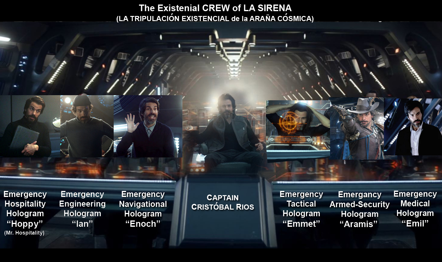
Gld1gV4WMAAeOdr
 
Last edited:
The Spock picture is from a promo shot for the second season.

spock.jpg
Yep. And the shuttlecraft behind him isn't the mockup, it's a slide of the mockup on a projector screen. The second season publicity stills included a bunch that were taken that way.

As a kid, I was confused as to how Uhura, in her Late Year 2 wig, could be standing on the Talos IV beam-down set with young Spock back there in his gray jacket. That was how.
 
That one actually seems more like an old school "put the actress' head on a different body" photoshop.
I would point to her "one set of fingers fatter than the other" or the background details that can't decide if they are straight, curved, or ...wiggly. Also lines that disappear mid-existence (the background is almost impressionistic rather than realistic), and shadows that seem to compete with each other in terms of where the light sources are.
 
For reference, here are some actual AI generated TOS posters. There’s definitely models out there capable of producing more convincing results, but usually this is what I would have in mind when I hear the phrase “AI slop”. :)

7pFvLFw.jpeg
Wow! Not only does this look bad, but it's sooo generic looking. It has a very 1950's vibe to it and all the faces look the same.

Looks like Star Trek as if it came out of Eastern Europe during the height of the Cold War.
 
Not sure why it's disrespectful. It's just Saavik in a midshipmen uniform over the cadet officer uniform.

Hey, would you want Elon Musk's head photoshopped onto your body? Extreme example, I know. :D

The Spock photo was used for the paperback edition of Nimoy's book....with phaser removed:

815bA2gdvLACUF100010.jpg
 
There was an article discussing tv shows that were before their time and this was the image that was used for Star Trek. The movie ships mixed in. And poor Chekov looks like the Ceti eel is now under the skin of his forehead! :p

Screenshot2025030302.jpg

There are more Klingon ships than zits on a teenager as well.

The cast visages look like they were taken directly from cast photos if not episode screencaps.

The movie ship and planet below feel like homage to the end of TMP as well. It all does feel all "thrown together"
 
For reference, here are some actual AI generated TOS posters. There’s definitely models out there capable of producing more convincing results, but usually this is what I would have in mind when I hear the phrase “AI slop”. :)

7pFvLFw.jpeg

On the plus side, composite amalgamations versus direct resource copying renders some comparative originality.

Apart from the stunt double for USS Voyager in the top-middle. Or that exotic can-opener/1701-D amalgamation on the top-right.

But Martin Landau (lower-rightmost) and multiple Spocks suffering from sinus infections takes the cake. The human factor is still missing.
 
If you are not already a member then please register an account and join in the discussion!

Sign up / Register


Back
Top