-
Welcome! The TrekBBS is the number one place to chat about Star Trek with like-minded fans.
If you are not already a member then please register an account and join in the discussion!
You are using an out of date browser. It may not display this or other websites correctly.
You should upgrade or use an alternative browser.
You should upgrade or use an alternative browser.
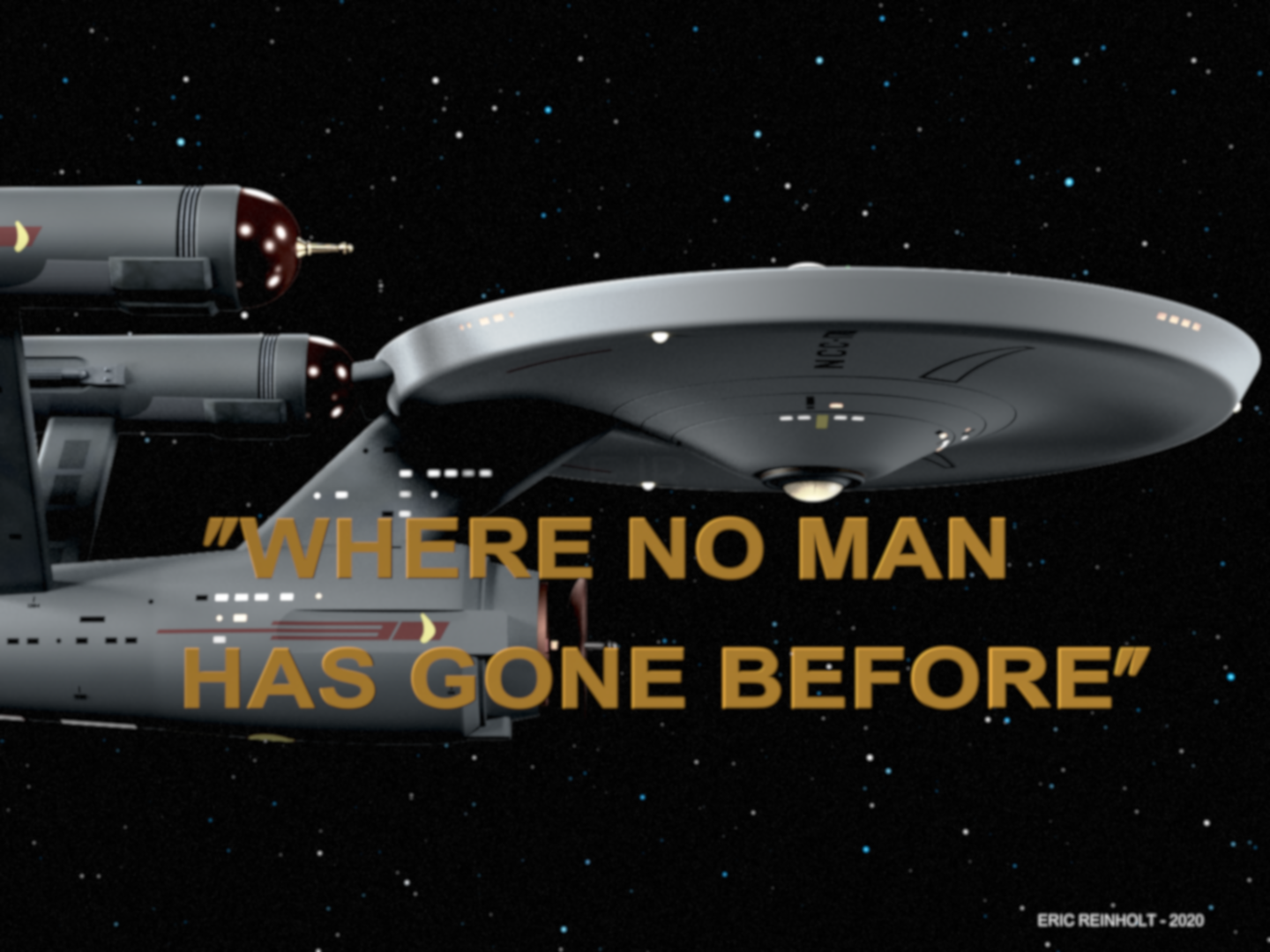
SciFiEric's 2nd Pilot USS Enterprise
- Thread starter scifieric
- Start date

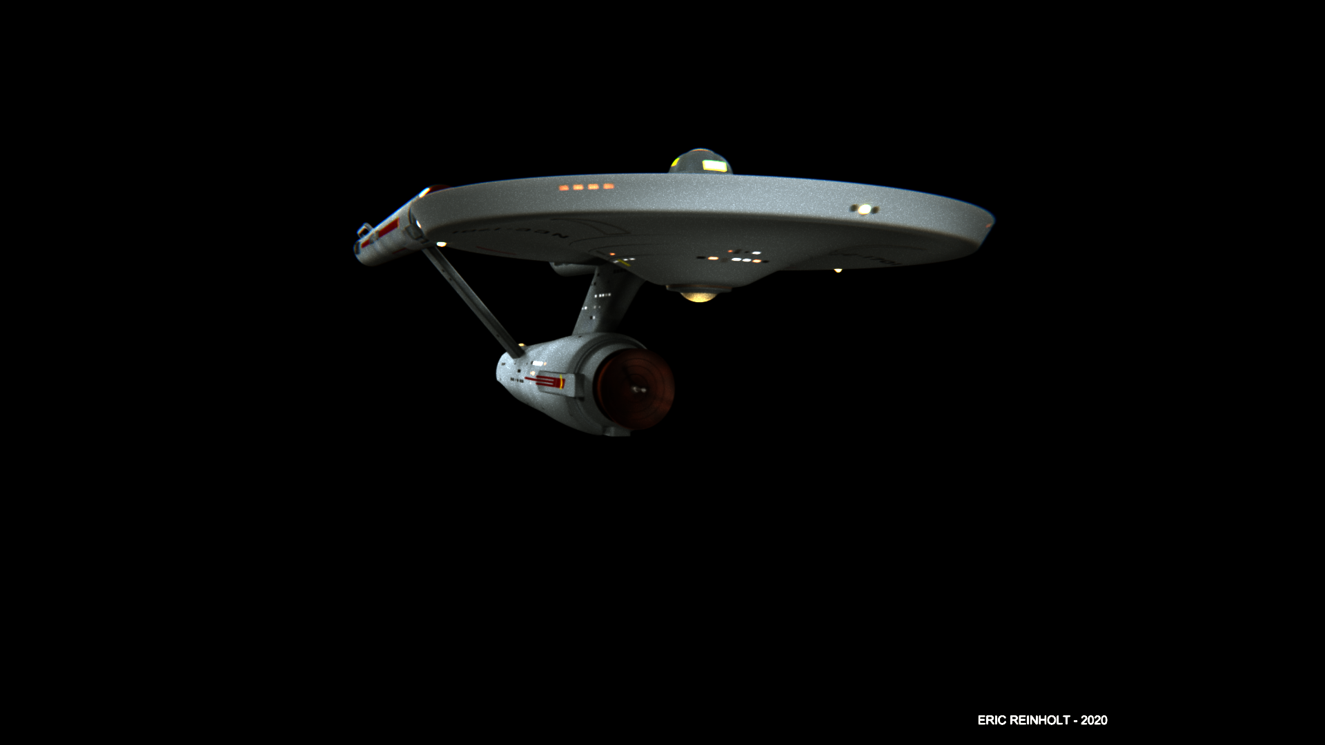
Bingo! At first I thought you had posted a screen cap to show us how yours wasn't working. But then the saucer - so smooth and perfect, esp the lighting around the rim. I have no experience, just offering what I thought as I'm eating my breakfast here. Overall, it is stellar!
Yeah it's definitely the lighting, but I'm also terrible at lighting, so, can't help but good luck!
I think @plynch identified the root issue. The rest of the model looks spot on; it’s the saucer where the lighting is a bit less optimal. Anyone who has built a CGI model of the Enterprise will recognize this problem though... her varied shapes are the secret sauce for her beauty, but they also are a challenge to light properly!
I’m confident you will figure this out though, @scifieric. 8-)
I’m confident you will figure this out though, @scifieric. 8-)
I appreciate the input and observations you all have given me! Thank you very much!
Yeah, I'll have to finish texturing the model, then go and create real lighting instead of my quick model lighting and redo this. I'm just anxious to see the final result ... so anxious, that I didn't wait until I was finished! LOL!
Yeah, I'll have to finish texturing the model, then go and create real lighting instead of my quick model lighting and redo this. I'm just anxious to see the final result ... so anxious, that I didn't wait until I was finished! LOL!
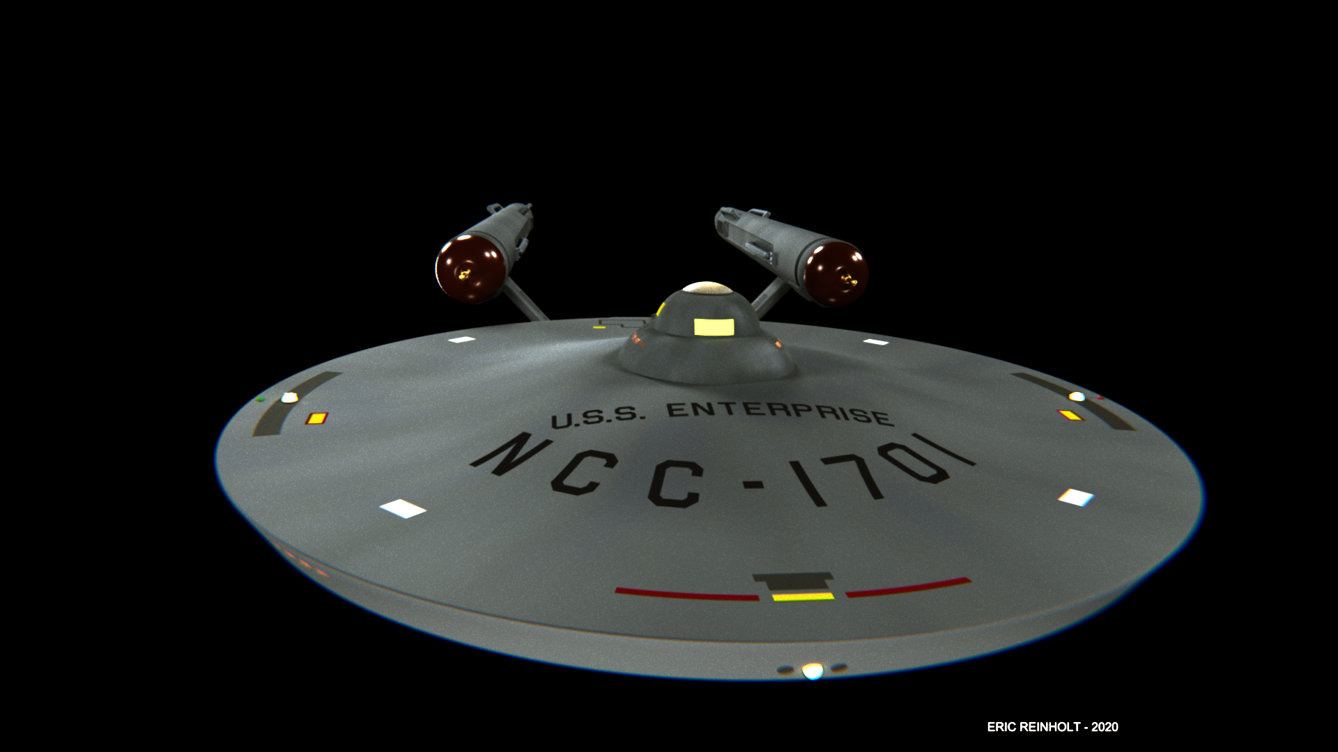
^ That's what I was thinking - maybe lighting but, may also be textures are ... not quite right?
Yeah, no textures at all on the lower saucer. I've still got to do the textures for the whole model, but the rest at least has the first pilot textures.I was going to ask if your textures were turned on.
I think both. Thanks!^ That's what I was thinking - maybe lighting but, may also be textures are ... not quite right?
I’ve been there. It still happens sometimes. It’s not always easy to be patient, but when you are and do it right the feeling of looking at your finished work is...very satisfying.I'm just anxious to see the final result ... so anxious, that I didn't wait until I was finished! LOL!
OTOH seeing that leap when you add that ONE. MORE. THING. Is just... neat! (<-- Buffy quote!)I’ve been there. It still happens sometimes. It’s not always easy to be patient, but when you are and do it right the feeling of looking at your finished work is...very satisfying.
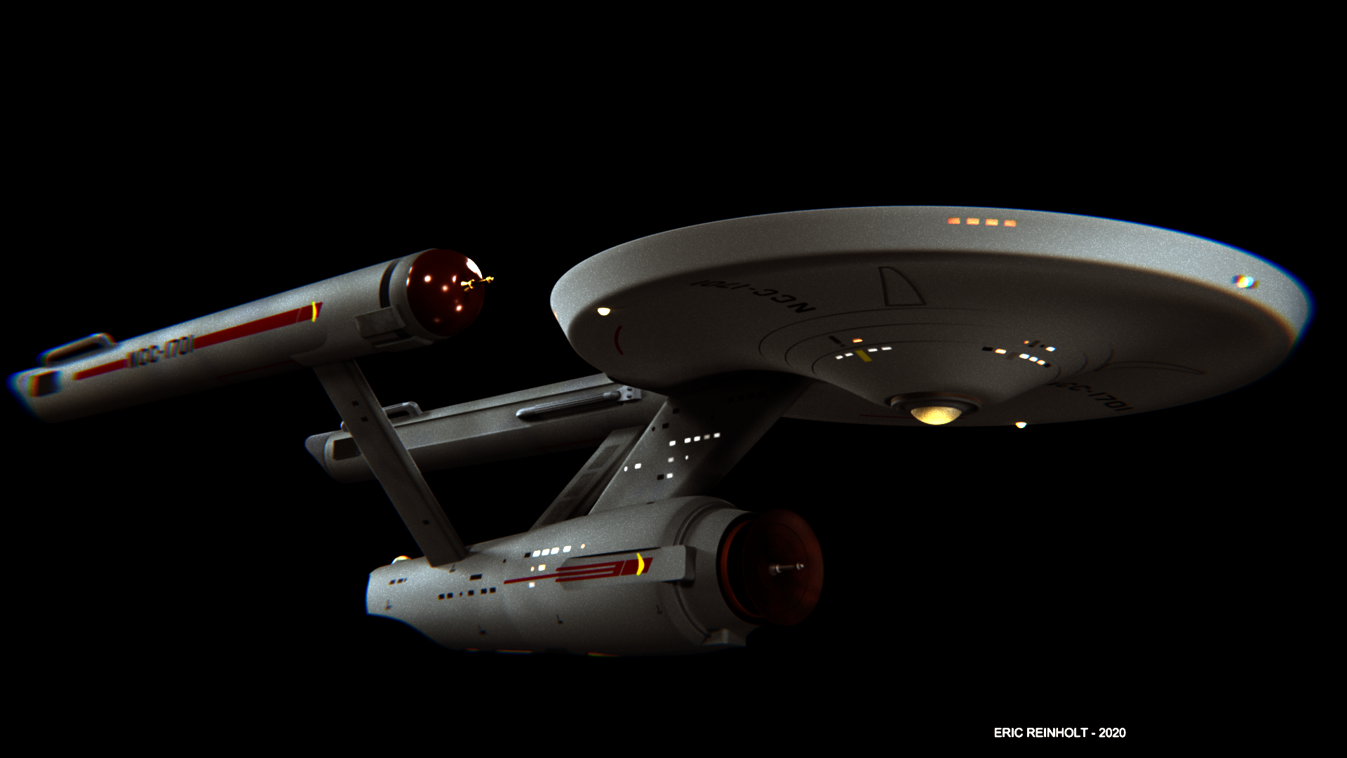
Now THATS what we’re talkin’ about!I should have posted this earlier. I quite enjoy this image.
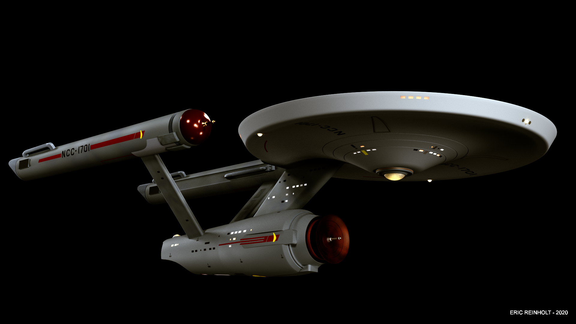

I can hear the music and Kirk’s Captain’s Log narration. All it needs is a TOS starfield.
If I were to nitpick I might say the yellow and red of the Starfleet pennants on the secondary hull and warp nacelles could be a touch too vivid—maybe desaturate them a little. The blue on the dorsal is still there but it looks almost too subtle. Some of the windows and the sensor arrays maybe look too yellow and not intense enough. But these are nitpicks and feel free to ignore them.
But no question this blows TOS-R out of the water.
Last edited:
Classic.I should have posted this earlier. I quite enjoy this image.
Thank you for the compliments and the observations, my friend! Thank you very much!Now THATS what we’re talkin’ about!
I can hear the music and Kirk’s Captain’s Log narration. All it needs is a TOS starfield.
If I were to nitpick I might say the yellow and red of the Starfleet pennants on the secondary hull and warp nacelles could be a touch too vivid—maybe desaturate them a little. The blue on the dorsal is still there but it looks almost too subtle. Some of the windows and the sensor arrays maybe look too yellow and not intense enough. But these are nitpicks and feel free to ignore them.
But no question this blows TOS-R out of the water.
Aw! Thank you, fireproof78!Classic.
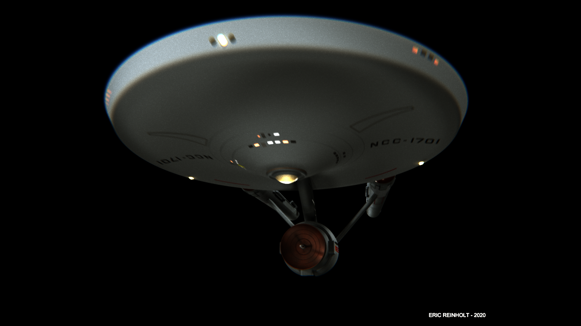
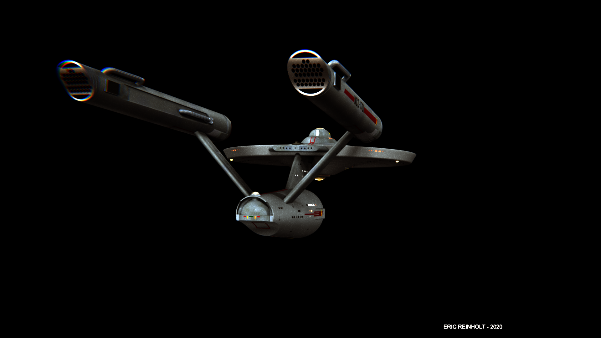
I was tired and listless today, but I still wanted to have some fun. So, here are some more of the new model from various angles, but with some chromic aberration and distortion, along with some simulated film grain and blur. Like I said, just for fun. All done in Blender 3D.
Similar threads
- Replies
- 25
- Views
- 10K
- Replies
- 2
- Views
- 4K
If you are not already a member then please register an account and join in the discussion!