• Welcome! The TrekBBS is the number one place to chat about Star Trek with like-minded fans.
    If you are not already a member then please register an account and join in the discussion!

Rate TUC

Rate TUC

  • 5 star

    Votes: 33 33.3%
  • 4 star

    Votes: 44 44.4%
  • 3 star

    Votes: 16 16.2%
  • 2 star

    Votes: 4 4.0%
  • 1 star

    Votes: 2 2.0%

  • Total voters
    99
I still hate this movie. Ham-fisted Shakespeare shoe-horned in, horrible, choppy editing, ill-disguised cinematic and literary references, obvious and dated political allegory and, worst of all, shitting all over the characters.
It was rape, people.
To Meyer's credit, he's the only movie director to ever properly show a crew aboard these ships.
 
I hated that design from the refit through to V.

You did? Why, if you don't mind me asking? Did you like the original TV design more?

The movie Enterprise (not the B, D, or E) is actually my favorite of the bunch. They took the golden proportions of the original and just made it better imo.

Yeah, I really liked that bridge. I think that Meyer finally got the bridge he wanted to have, but didn't have the budget for, in TWOK. It looked great, imo.

I don't know if it was reward or not. They were ordered back and would probably have had shore leave until they formally stood down in 3 months.

With the peter pan quote, did that mean they just crusied around for a while ignoring SF command before going bacl?
I think that's exactly what they meant. Kirk and Spock still had enough clout to get away with that.

I always had a soft spot for the Sulu Excelsior but there was soemthing magical about the Ent-A, it ws the BRIDGE in the first few movies I hated, it just didn't look like a spacecrafts bridge, I know it's set in the future so your not supposed to understnad the controls, but look at the controls on the D, you would't know what to do with them, but they LOOK functional, look at the ones on the post refit 1701...nearly every button is identical..it looks stupid, not to mention the chairs.

Got it, you were talking about the bridge, not the outside of the ship.
As for the bridge from TMP-TVH, it was designed, if I recall correctly, by Mike Minor originally for the ST Phase II show. When they decided to make Phase II into a movie, Harold Michaelson redid it, taking a lot of the color and flash out of Minor's original concept (see The Art of ST for his concept painting). When TWOK came around, Nicholas Meyer thought the set was really boring, so he had Minor hired and gave him thousands of dollars to spruce it up with added buttons, lights, signage, texture, video monitors, etc. If you compare TMP to TWOK, you can really see that the bridge is better. Finally in TVH, it was repainted and Okudagrams, like the ones on TNG replaced the buttons and monitors.

As for the controls, I disagree with you. In actuality, they had a NASA engineer, if I recall correctly, work out the functions and layout of the controls for the stations. If you look at TWOK, for example, where Khan is looking for the override, you can see the labeling of the controls. It was all pretty well thought out, though there were still just some blinking lights, like all those gold lights at Spock's science station.

Oh, yeah, I built a cardboard model of that TMP bridge when I was a kid too. The level of detail on the consoles and the functions that went into them were really amazing.
 
I take your points.

You want a bridge that looks like it belongs on a spacecraft though, look at the Ent-A in TUC, the Defiant and espechally the Ent-E
 
Compared to other Trek movies, it's a 5-star movie (so isTWOK). In the grand scheme of things, it's maybe a 4-star movie.
 
I'm feeling generous today, so I gave it two stars.

It's filled with plot holes, unnecessary shortcuts, ridiculously anachronistic references, internal and external inconsistencies, and ham-fisted direction.

Considering what they had to work with, Meyer still managed to get some interesting performances out of the actors though...hence the two stars. Besides, it benefits by having Nemesis, Insurrection, and The Final Frontier having lowered the bar already and since.
 
I take your points.

You want a bridge that looks like it belongs on a spacecraft though, look at the Ent-A in TUC, the Defiant and espechally the Ent-E

I guess I'm just not seeing what you're seeing.

I don't see any real differences in terms of what looks real and what doesn't between any of those bridges. If anything, I would think the physical buttons and switches on the TMP/TWOK bridge are more logical from an ergonomics/human factors standpoint.

That cardboard model I mentioned was from a workbook where you punched out the illustrated pieces and assembled the model. Every single station of that original bridge had a function and a lot of detail, something they really didn't care about in the original ST. The actors were given pamphlets on how to operate their stations. That was a big leap in realism for ST, which is what GR wanted for TMP.

Interestingly, as you know, Herman Zimmerman did the TFF bridge, making it look somewhat like the TNG bridge in color and with the Okudagrams. I don't think Meyer liked that bridge (either that, or it was all messed up being used on TNG and had to be redone). In any case, when it was redone into the bridge for VI (and it looks extremely different to me, but you can still see pieces of the TFF bridge), Meyer specifically asked that they add physical switches back onto the bridge, in addition to the okudagrams. He just liked them more. I think he always wanted to make his ST as gritty as possible (like putting a kitchen on the Ent-A, having bunks for crewmembers, cramped corridors). I know that his artistic decisions were controversial, but I really liked what he brought to ST with his work on TWOK, TVH, and TUC.

The TOS one and the others looked functional, the ST I, II and III was the one that did not, maybe someone has a screenshot of the birdge but I remember all the buttons looking identical! Espechally at the back stations.
Something like this
.........
.........
.........
.........

a big mass of lighted dots, how were they to tell one button from another?
It was also way too spartan.

Well, I've seen parts of the original ST bridge on ST: the Tour and I can assure you that there is very little labeling of all those blinking lights. They figured they wouldn't need it because the audience wouldn't be able to see that level of detail in any case. If you watch the show, lettering is typically only used when they absolutely needed it for the story.

The ST I, II, and III bridge, though, as I said, had a lot of detail. Again, check out TWOK or maybe even TMP. If you slow down Khan looking at the helm console, you can see how the switches are all labeled wrt their functions. All the console instrumentation, while having the same type of swithches (i.e. glowing keyboards), have totally different configurations. They are not carbon copies of one another. The layout of the consoles are all different.

Another example: when Spock and Kirk are assessing the Enterprise's damage, they go to that station with the schematics of the ship, with red blinking where the damage is. That is the damage control station, and it was labeled as such in both the model I made and the blueprints for the ship for TMP. That carried over to TWOK because Mike Minor had it worked out before. That station, almost exactly, is what was on his original concept painting for the ST Phase II bridge. It is different from all the other standing stations. I'd built my model before TWOK (it was a TMP cut-out book) and I knew what that station was for and, in the movie, Kirk and Spock went right to it to assess the damage.

You can also see the labeling on the weapons control station if you pause TWOK during the two battles. Again, they put a lot of thought and effort into making the TMP bridge a lot more real than the original bridge. That's not to say that there weren't still some blinking lights for color, like that bank of golden "memory bank lights" (I believe that's what Okuda said they were supposed to be) at Spock's science station.

As for that bridge being Spartan compared to the original bridge, well, I guess that's a matter of taste. Speaking for myself, I tend to agree with you wrt how it looked for TMP, but I thought it looked great in TWOK and TSFS after Mike Minor made his improvements. He wasn't happy at all with what they did to his Phase II bridge in TMP. He said it looked really dull and washed out. He was much happier with it after Meyer gave him thousands of dollars to improve it. It looked closer to his concept painting, which is a lot brighter, probably due to more white paint used instead of dark grey.

Actually, now that I think about it, the final bridge of the Ent-A in TVH probably looked closer to what Minor envisioned. The concept bridge looked that bright.
 
Gave it a four. I'd give it a five, but the Rura Penthe scenes hurt the flick just a tad (other than that, I was thrilled that McCoy would get center stage, as I felt he was underused quite a bit compared to how much screen time he got in TOS).

And while we're on the topic of bridges, I've always been a fan of the E-D bridge from Generations. But I digress :)
 
It's untrue that the consoles all looked the same in TMP. Each one had very distinctive control layouts which look much more functional than the TNG Okudagrams.

I posted a few messages on this subject in another thread...

The TMP set is covered with what I'd call Colegraphs, as designed by Lee Cole, who did the instrumentation and a lot of the signage for the film. The TMP set is probably unique in that at least SOME though was given to what the controls were or would actually be. The weapons console is the only one we get any good look at (in TMP and TWOK), but you can see that there's some thought given to how it works.

<SNIP>

Here they are:

2215340614_3951e0c1c2_o.gif

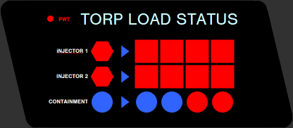
Diagram of TORP LOAD STATUS display. The red and blue indicators light up as the sliders are pushed up on the PHOTON TORPEDO panel. (In TWOK they pulled them DOWN, which actually shuts off the console above.)

2215340406_63ac52b853_o.gif

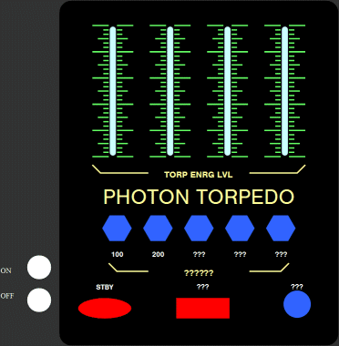
Diagram of PHOTON TORPEDO arming controls. At top are four sliders for setting the torpedo energy levels. Some of the labeling is not clearly visible and thus indicated by ???. The ON and OFF buttons were practical switches on the console face, painted black, that allowed the actor to turn on this part of the console.

2215340630_b1468555a8_o.gif

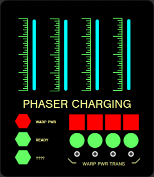
Diagram of PHASER CHARGING controls. At top are four sliders for setting the power levels, and at bottom right are four mechanical push buttons for transferring warp power.

2215340666_7a174e7985_o.gif

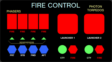
Diagram of FIRE CONTROL controls. At top left are buttons for firing phasers in the indicated direction, and at lower right are hexagonal buttons for firing torpedoes. One of the labels is not clearly visible and thus indicated by ???

2215356036_26a248b91c_o.gif

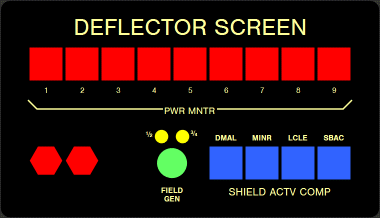
Diagram of DEFLECTOR SCREEN controls. The labels for the square blue lights appear to be in jokes for the art department, with DMAL for Dan Maltese, MINR for Mike Minor, LCLE for Lee Cole and SBAC for Rick Sternbach. The text labels for the hexagonal buttons at lower right are not clearly visible in and references found to date.

2215385000_5d0a947512_o.jpg

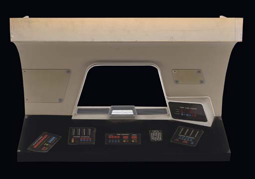
Finally, here's a photo of half-scale console built for insert shots of graphics appearing on the large display (center). You can see how the various panels fit on it. I didn't bother drawing up the COMPTR panel

<SNIP>
Here's a new one for ya to stew on...
2217463413_6894143df3_o.gif


From the HELM. Diagram of VELOCITY controls to the right of the manual throttle.

PULSAR CO-ORD appears to be some readout to show that certain pulsars have been triangulated upon in order to know the ship's current position via trig. I smell Jesco Von Puttkamer all over this... :D

Sliders are used to set the ship's velocity at WARP or IMPULSE. It looks like the number actually indicates the next major tick mark. Odd.

The DOPPLER COMP would seem to show how much doppler compensation is required for a given velocity. These probably light up depending on the ship's velocity.
 
It's untrue that the consoles all looked the same in TMP. Each one had very distinctive control layouts which look much more functional than the TNG Okudagrams.

I posted a few messages on this subject in another thread...

Um, I think he's talking more about aesthetics, not layout (and not nitpicky, either). Even the fonts and patterns are structured alike. And if that's the case, there are definitely similarities between each console.

The same could be said about Okudagrams for sure, but the topic here is TMP :)
 
Um, I think he's talking more about aesthetics, not layout (and not nitpicky, either). Even the fonts and patterns are structured alike. And if that's the case, there are definitely similarities between each console.

The same could be said about Okudagrams for sure, but the topic here is TMP :)
Well, if that's the complaint, it's, pardon me, fairly ridiculous. The TMP stations actually look more differentiated from one another than some of the other shows.

"Actual" to who, as if it were straight fact? Beauty is in the eye of the beholder when it comes to computer layouts of fictional shows. And besides, I said Okudagrams were open to criticism anyway.

To say that there aren't similarities amongst TMP's own consoles as far as aesthetics and design goes is pretty out there. Heck, if they didn't have similarities amongst each other, they'd be badly designed. Familiarity for its users goes a long way.
 
I still hate this movie. Ham-fisted Shakespeare shoe-horned in, horrible, choppy editing, ill-disguised cinematic and literary references, obvious and dated political allegory>>>snip<<

I agree with your opinion entirely, far too knowing.

Horrible. I watched TUC in summer07, was almost like watching a parody. Spock saying in the conference room early in the movie, (paraphrased) "We vulcans have a saying..only nixon could go to china" wtffff

I find Kim Catrall attractive, however i found her quite ugly in this movie. Plummer was very good, very magnetic

I liked the movie and Plummer as well, but I would think that if anyone would hate the movie for the ham-factor, it'd be Plummer's acting :)

And I giggled at the Nixon line. Those Vulcans get to the point!
 
The TMP set is covered with what I'd call Colegraphs, as designed by Lee Cole, who did the instrumentation and a lot of the signage for the film.

While Lee Cole did indeed do the bulk of the console graphics and a lot of the signage for TMP (and set the overall style), I contributed about 1/4 to 1/3 of the final backlits and applied signage by the time my involvement with the film was over. Since the graphics requirements skyrocketed when the Phase II series suddenly became a feature, I was asked to pitch in. All of the weapon station graphics were mine, along with gravity control, wall com panels, proto-PADDs, wormhole asteroid animation elements, travel pod controls, and a bunch more.

If you study the torpedo controls, you'll see that this is where we first introduce the idea of programming the yield with injected matter and antimatter (in magnetic containment), and we carried this over into TNG.

Rick
www.spacemodelsystems.com

Well, all I can say, Mr. Sternbach, is that you done good! :)

I thought that bridge looked great.

I'm a big fan of your work. I loved the Star Trek Spaceflight Chronology.

Thanks for posting!
 
While Lee Cole did indeed do the bulk of the console graphics and a lot of the signage for TMP (and set the overall style), I contributed about 1/4 to 1/3 of the final backlits and applied signage by the time my involvement with the film was over...

That's good to know, Rick. Andy Probert told me who had done some of the insert animations, etc., but it's fun to identify who did what piece.

As to the weapons station, I have never been able top make out everything that's labeled on it, as you can see form the recreations I did. In the depths of your memory, and chance you recall what thoise where I put ???? might've been?

Hmmm...I might be able to figure it out based on watching the DVD, but it's in storage at the moment, and I don't have xeroxes of the original graphics. Believe it or not, we had to take stuff we wanted copied way over to the print shop and log the job with the proper production charge number. What a pain, but thank goodness we didn't have to go through that for TNG onward. :)

Rick
www.spacemodelsystems.com
 
If you are not already a member then please register an account and join in the discussion!

Sign up / Register


Back
Top