Kind of a side thought but I am wondering at the implications of the big red lines going up to the nacelles: power conduits, jefferies's tubes. turbolift shafts?
Water slides.
Kind of a side thought but I am wondering at the implications of the big red lines going up to the nacelles: power conduits, jefferies's tubes. turbolift shafts?
Kind of a side thought but I am wondering at the implications of the big red lines going up to the nacelles: power conduits, jefferies's tubes. turbolift shafts?
Water slides.
Certainly not standard turbolifts...
Certainly not standard turbolifts, but there'd have to be some sort of conveyance so technicians could get up there.
Gotta be something better than the staircase from Hell that FJ put in his plans.
Incidentally, with all these references to the Writer's Guide regarding Engineering, it should be noted that the Writer's Guide actually says nothing about where Engineering is, nor is it very specific about the way the engines work. All those references in TMoST are found ONLY in TMoST.
Certainly not standard turbolifts...
Ya - non-standard - considering they'd be on a slant, and we'd all be huddled into one corner for the ride LOL

LOL well that would explain the swept-strut design for the refit: Tying the waterslides and the swimming pool together.Kind of a side thought but I am wondering at the implications of the big red lines going up to the nacelles: power conduits, jefferies's tubes. turbolift shafts?
Water slides.

I'm up for hosting other people's work. I just don't have time to make a lot of updates on the fly. I guess the eternity since I last updated the site speaks to that fact!
[...]
First of all, thanks for asking. Some folks have not done so, and it cheeses me off. Those folks know who they are.
Anyway, feel free to host a few images from my site if you wish, provided the annotations remain intact. In other words, please keep the "trekplace.com" captions on them.
Have fun! I haven't had time to contribute much to this or any Trek-related discussion in quite some time, with my work schedule, ongoing MBA studies, and an upcoming wedding. I have a full plate -- I mean saucer section.


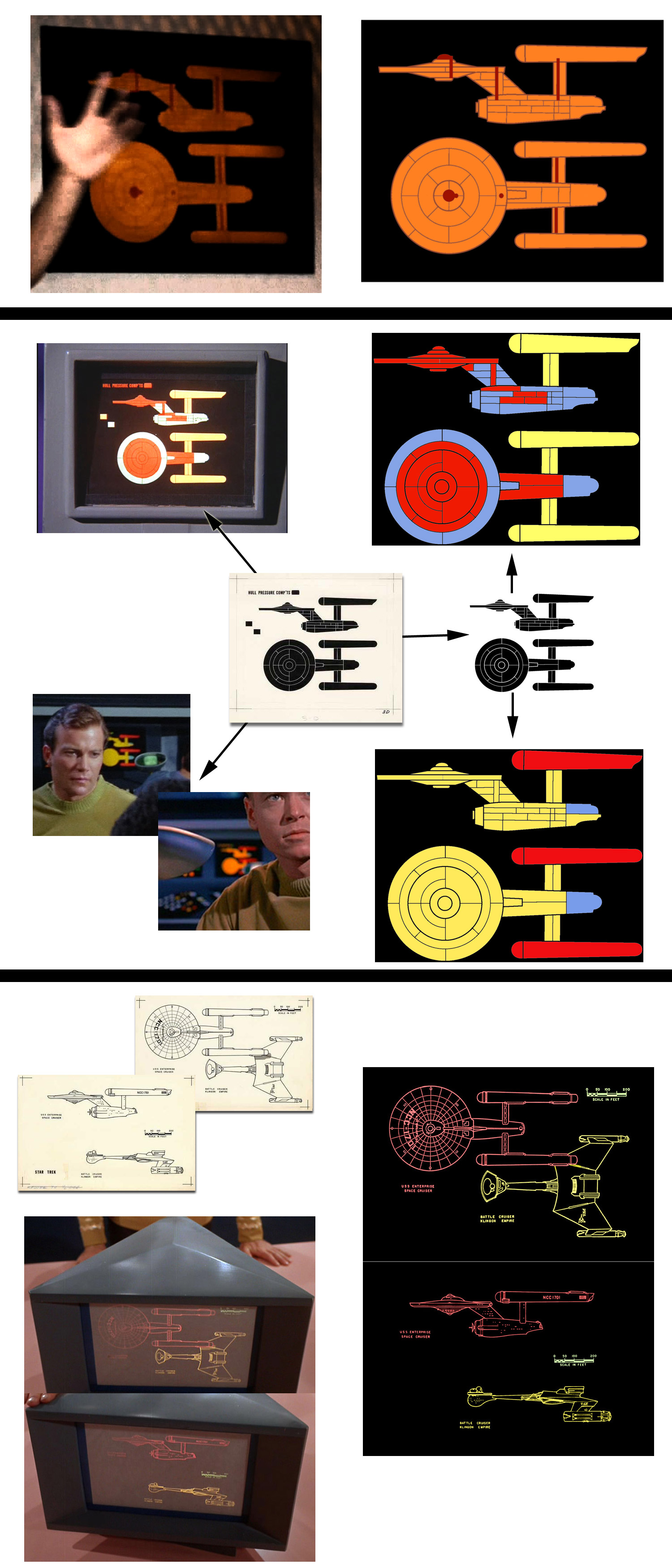
I was wondering if anyone had any observations about the nature of these two screen-caps from "The Day of the Dove", and the standard bridge (engineering?) display, before I plow in.
I have a long-winded Matt Jefferies post over in my thread:
http://www.trekbbs.com/showpost.php?p=2719881&postcount=11
I'd tend to agree with Cary. I'd put little faith in the accuracy of the compartment drawing though I still think there's info to be gleaned from it as Shaw has shown.
Well, I think that one had to keep in mind the tools of the trade back then. Today I can create and then modify graphics I make quite easily. But in the 1960s everything was hand drawn, copies for staff were made with Ditto hand cranked copiers (which was still in use in many schools until the early 80s), and drawings for large graphics were done as negatives with colors added using colored jells.As I understand it, the larger image here (from DotD) and the smallest one from the bridge display is actually the very same set-piece. It was pulled from the bridge set and re-colored for the close-up in DotD and, according to the Star Trek Sketchbook was lost on MJ's desk. It was evidently not re-installed on the bridge, and happened to become preserved. Somewhere i think I recall hearing it is the last surviving piece of the original bridge set.
I'd like to know if I'm wrong or not.
Well, I think that one had to keep in mind the tools of the trade back then. Today I can create and then modify graphics I make quite easily. But in the 1960s everything was hand drawn, copies for staff were made with Ditto hand cranked copiers (which was still in use in many schools until the early 80s), and drawings for large graphics were done as negatives with colors added using colored jells.
Because of this, often the base graphic would only be made once... as is the case with the hull pressure compartment diagram, but the working piece in the display could be made a few times using other colors (and made at different sizes).
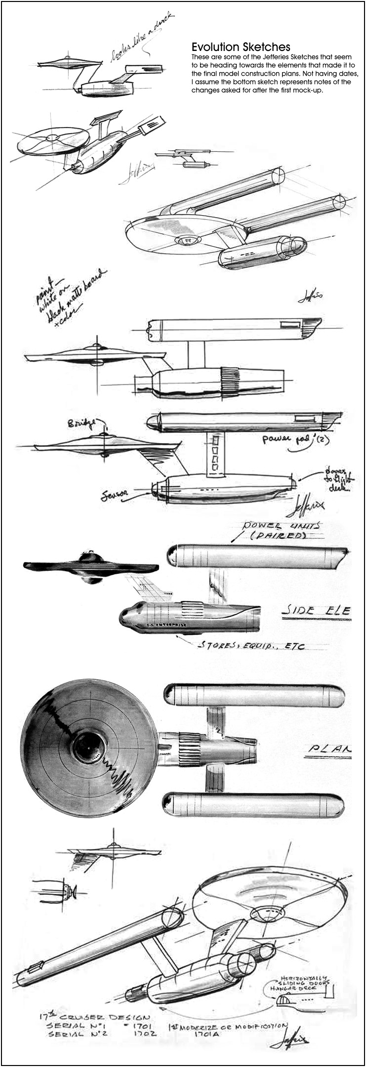
Well, both graphics (turbolift and hull pressure compartments) were done very early as schematics diagrams rather than true depictions... mainly because when they were made for The Cage the models weren't built and the large scale plans for the models weren't finished yet. So where did the general outline for those diagrams come from? One need only look at the evolutionary sketches Jefferies made.Crudeness is understandable, but not in comparison to some other work on the show of this type.
Abstractness is understandable, but not inaccuracy. The top of the primary hull is highly inaccurate, the shrinking rather than expanding (moving forward) secondary hull is inaccurate, the pylons are massively thick. Not just abstract, inaccurate. Like 'never seen' the Pilot/Production design inaccurate.

We use essential cookies to make this site work, and optional cookies to enhance your experience.