-
Welcome! The TrekBBS is the number one place to chat about Star Trek with like-minded fans.
If you are not already a member then please register an account and join in the discussion!
You are using an out of date browser. It may not display this or other websites correctly.
You should upgrade or use an alternative browser.
You should upgrade or use an alternative browser.
Pre TOS star cruiser....
- Thread starter Warped9
- Start date
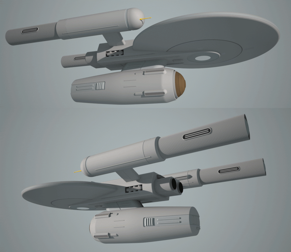
I concur that the design evokes the Art Moderne movement, and I love it. The simple, streamlined shapes contrast nicely with the blockier detailing of the "greasy bits" to give a good sense of verisimilitude, and along with the squat nature of the design, feel more primitive than TOS without being clunky.
I've taken physical detailing about as far as I'm comfortable with except for just a little bit of something I want to add to the well around the upper saucer dome. Then it's on to running lights, windows and signage as well as a bit of creating the look of some panels with slightly different tones (something I've actually already started as I went). Like the clipper I want to exercise restraint in terms of the number of windows used.
On this point I particularly like how my clipper design came out. The saucer alone ties it to the Trek universe, but the rest creates a sense of a construct from about a century pre TOS yet without looking overly derivative or ungainly.
I'm already beginning to consider my next project. I'm thinking of shifting gears and coming back to the pre TOS era later. Next I'm thinking of tackling what I call the TOS era Masao-class destroyer. Masao made some detail changes to FJ's destroyer/scout design and I'm thinking of fleshing it out further. The major departures from FJ are incorporating the nav deflector into the dorsal, adding a connecting structure between the dorsal and the warp nacelle and (my idea) incorporating some form of small hangar facility aft of the B/C deck superstructure. While the saucer is essentially a Connie hull I would alter the arrangement of some of the windows.

The use of horizontal lines does break up the overall chunky or weighty look of the design as well as suggesting speed and motion. The detailing on the secondary hull, particularly at the front, suggests something 1920-'30s rocketship or locomotive to me. The whole idea was to use shapes and lines to suggest bulkier systems and technology without having a design that looks awkward and ungainly. Note that in my pre TOS designs I also eschew the use of elaborate lighting effects (like lighted nacelle inserts) and excessive surface detailing seen in other versions of Trek. This is to try for something that could conceivably fit within the TOS universe, something the designs of ENT fail with in my view.I concur that the design evokes the Art Moderne movement, and I love it. The simple, streamlined shapes contrast nicely with the blockier detailing of the "greasy bits" to give a good sense of verisimilitude, and along with the squat nature of the design, feel more primitive than TOS without being clunky.
On this point I particularly like how my clipper design came out. The saucer alone ties it to the Trek universe, but the rest creates a sense of a construct from about a century pre TOS yet without looking overly derivative or ungainly.
I'm already beginning to consider my next project. I'm thinking of shifting gears and coming back to the pre TOS era later. Next I'm thinking of tackling what I call the TOS era Masao-class destroyer. Masao made some detail changes to FJ's destroyer/scout design and I'm thinking of fleshing it out further. The major departures from FJ are incorporating the nav deflector into the dorsal, adding a connecting structure between the dorsal and the warp nacelle and (my idea) incorporating some form of small hangar facility aft of the B/C deck superstructure. While the saucer is essentially a Connie hull I would alter the arrangement of some of the windows.
Last edited:

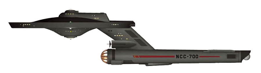
When I move on to my TOS era Masao-class starship this is the general outline I'm thinking of. I will enlargen the nav-deflector pod a bit as well as move the nacelle downward a little (but not further aft). The hangar area I'm envisioning will not be a cut-and-paste of the existing Connie style hangar area but rather a wholly new design to integrate better with the shape of the B/C deck superstructure. I will also think about redesigning the reactor loop and inboard (now underside) nacelle trench since I think it looks odd oriented downward as is.


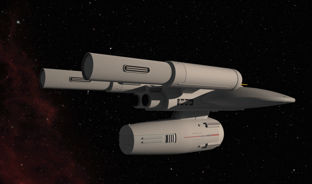
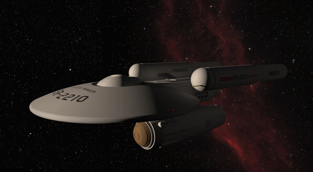
A different kind of update here. What's notable isn't the model, but the background.
Up to this point I would render my models and then Photoshop them onto a starfield or spacescape of some sort. It works, but it's basically a messy cut-and-paste method that doesn't always get the best results.
But over the past few days I've been learning how to do it more effectively. Essentially I create my starscapes in Photoshop and save them as HDR images as a .exr file. I can then load those right into my rendering program (Maxwell Render) and have my 3D model right in the scene. The end result is being able to render the model already set in the scene it's meant to be in eventually. This saves a lot of time and avoids the messiness of cut-and-pasting the rendered model's image onto another image.
I'm reasonably sure I'll get more proficient at it as I go forward, but posted here is my first effort at generating a space environment with the (unfinished) model already in it.

This one is a model update: signage on the nacelles.
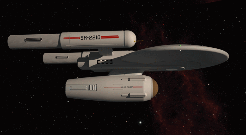
A note on the scene, though, because it's nice to be able to render the ship already in the scene. I could also add objects like other ships or planets and moons (assuming I have the models) and the light and shadow effects would all be consistent. Using an HDR image also makes for a background scene that seems to have more depth. And so along with making new models I'll also have to start making new scenes to put them in.

A note on the scene, though, because it's nice to be able to render the ship already in the scene. I could also add objects like other ships or planets and moons (assuming I have the models) and the light and shadow effects would all be consistent. Using an HDR image also makes for a background scene that seems to have more depth. And so along with making new models I'll also have to start making new scenes to put them in.
Close. Spaceship Registry...and I like the sound of it.SR = Starship Registry?
")
The background HDR image is 300 dpi yet it's only 3000 x 1500 pixels. I rendered it as four main separate separate layers: black background, small distant stars, nebula and larger nearer stars. I also made a layer of some star clusters and dark clouds. All the stars I generated from scratch in Photoshop but the nebula is from a Hubble image I tweaked for my own use. What Maxwell does is allow you to project this image as a circular screen background that surrounds your model. As such you can rotate your background as well as your model to get different views. You can also project your background image as a dome, but I think you have to create the original image differently. I'm not sure yet.
Eventually I'll learn how to do planets where you model a sphere or half sphere and map a surface texture onto it. I understand you can do that in layers as well in terms of land masses, oceans and clouds. That's got to be a challenge.
Presently I'm planning to do these scenes with my own model designs, but one day I want to build my own 3D TOS Enterprise and other ship for never seen TOS era scenes.
The main hull signage. I like the shadowing in this---makes it look rather moody.
I'm currently working on something within my modelling program that---if I can get it to work--- will conveniently give me the volume of the model. And if I scale the model to exact measurements (easy enough) then it will give me my volume in cubic metres (or whatever units I wish) and from that I can get approximate tonnage.

I'm currently working on something within my modelling program that---if I can get it to work--- will conveniently give me the volume of the model. And if I scale the model to exact measurements (easy enough) then it will give me my volume in cubic metres (or whatever units I wish) and from that I can get approximate tonnage.
Last edited:
These are gorgeous...
I've always loved the TOS design ethic.
I have one personal nit though...
One of the basic tenets of MJ's ships, was that the nacelles were purposely placed a good distance away from the actual living areas of the ship, due to the energy radiation if you will, given off by the WARP effect.
As such, your designs would be truer to form if the front ends of the nacelles were either a bit farther back, and/or out, from the primary hull.
Getting just the right balance with the tighter (smaller) size of the ship would probably take a bit of nuancing, as in either moving the connection point of the pylon to the nacelle or perhaps lengthening the pylon to push the nacelles out (or both).
But finding that balance, is one of the most important facets in Trek type ships.
As I said, it's just a nit of mine and I don't mean to downplay your wonderful effort in any manner.
But it was an important design element that was incorporated pretty much throughout all of the Trek incarnations.
The one major exception is of course the DS-9 Defiant, but I believe that even in the DS-9 Tech Manual, it is mentioned that there is new and very heavy shielding between the nacelles and the interior of the ship.
Since earlier era ships didn't have that particular tech, the 'distance' design, was their way of protecting the crew.
Last edited:
^^ I have read the same thing regarding the nacelles. However, if you really look at the MJ design you can't help but notice that the nacelle domes aren't far from the saucer and it's the long slender pylons that create the illusion of the nacelles being set far from habitable parts of the ship. Note in both of my pre TOS cruiser designs the nacelle domes are similarly close to the saucer while the rest of the nacelles are set further away. Yes, there is a central section that supports the nacelles, but it's mostly the impulse engines and very little access for personnel in addition to being heavily shielded. And as starship design and construction methods evolve they will eventually be able to build seemingly fragile looking structures that are far stronger than they appear such as the engine pylons and support dorsal of MJ's design.
Last edited:


What this image shows you are the kind of 2D line images SketchUp can export. What this means is that it will allow me to recreate exact line drawings when it comes time to make the schematics. And because I'm working from an existing model I don't have to "best guess" what something is supposed to look like from different angles--SketchUp will have done that with precision already for me. Note, too, that there are some things that don't appear as lines (notably on the side of the dorsal) because those edges actually have rounded edges. A curve appears only if it appears as an edge from the p.o.v. of the viewer, in this case as seen directly in side elevation. In my models I try to incorporate a certain level of detail including edges that could actually be rounded.
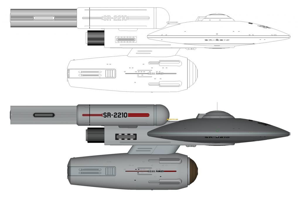
Regarding window arrangement I must confess to a degree of fudging in terms of deck levels. I didn't do any sort of actual cross section to lay things out with precision. Rather I spaced out decks in a general way and then slapped in some windows along those guidelines with the general assumption the windows would be a bit more than halfway up the bulkheads. I did assume the possibility of not all decks being having the same ceiling height and between decks structures (floors/ceiling) would have a measure of mechanicals between them. I think that allows me the flexibility to rationalize why windows levels might not all be evenly spaced. One thing in particular I quite like with this kind of graphic is that it can show what something like signage and lettering correctly looks like in a 2D image. Lettering on a cylinder would actually look just a bit squashed. Seen from above the ship's name on the saucer wouldn't look straight but actually slightly curved because it's laying on a compound curve surface angling away from your p.o.v.

Regarding window arrangement I must confess to a degree of fudging in terms of deck levels. I didn't do any sort of actual cross section to lay things out with precision. Rather I spaced out decks in a general way and then slapped in some windows along those guidelines with the general assumption the windows would be a bit more than halfway up the bulkheads. I did assume the possibility of not all decks being having the same ceiling height and between decks structures (floors/ceiling) would have a measure of mechanicals between them. I think that allows me the flexibility to rationalize why windows levels might not all be evenly spaced. One thing in particular I quite like with this kind of graphic is that it can show what something like signage and lettering correctly looks like in a 2D image. Lettering on a cylinder would actually look just a bit squashed. Seen from above the ship's name on the saucer wouldn't look straight but actually slightly curved because it's laying on a compound curve surface angling away from your p.o.v.
Last edited:
Similar threads
- Replies
- 14
- Views
- 2K
- Replies
- 25
- Views
- 10K
- Replies
- 10
- Views
- 3K
If you are not already a member then please register an account and join in the discussion!