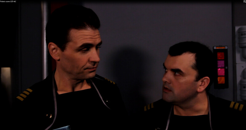
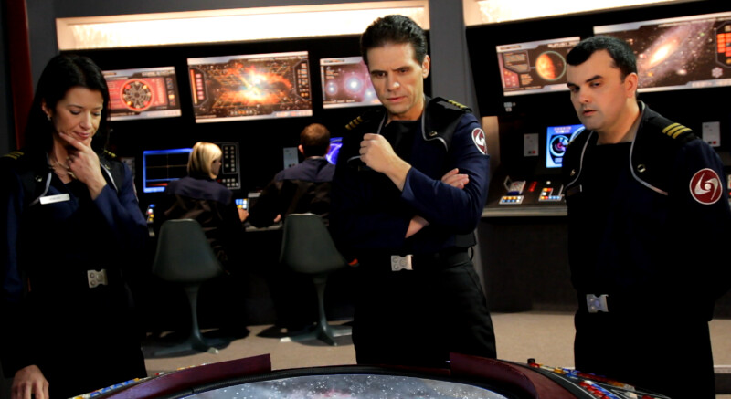
No, I just like red. The ship interiors in Forbidden Planet use dark red accents, for example, and I sort of went back and forth between that and using international orange - also popular in films like When Worlds Collide (the red-orange used on the original Star Trek series kind of straddles the line, a little closer to international orange than to maroon). The red works better, but what probably decided it was that headliner padding material was available in red but not orange. An awful lot of our set detailing is based on the "what's on sale at Home Depot" principle.
This effects test, BTW, is just something I put together as an experiment - note the image-mapping problems on the center displays - and doesn't represent the professional work of Michael and Neo-FX, who will certainly do more interesting things.
This effects test, BTW, is just something I put together as an experiment - note the image-mapping problems on the center displays - and doesn't represent the professional work of Michael and Neo-FX, who will certainly do more interesting things.


