-
Welcome! The TrekBBS is the number one place to chat about Star Trek with like-minded fans.
If you are not already a member then please register an account and join in the discussion!
You are using an out of date browser. It may not display this or other websites correctly.
You should upgrade or use an alternative browser.
You should upgrade or use an alternative browser.
NCC-1701 USS Enterprise Deck by Deck - WIP
- Thread starter havoc92
- Start date
- Status
- Not open for further replies.
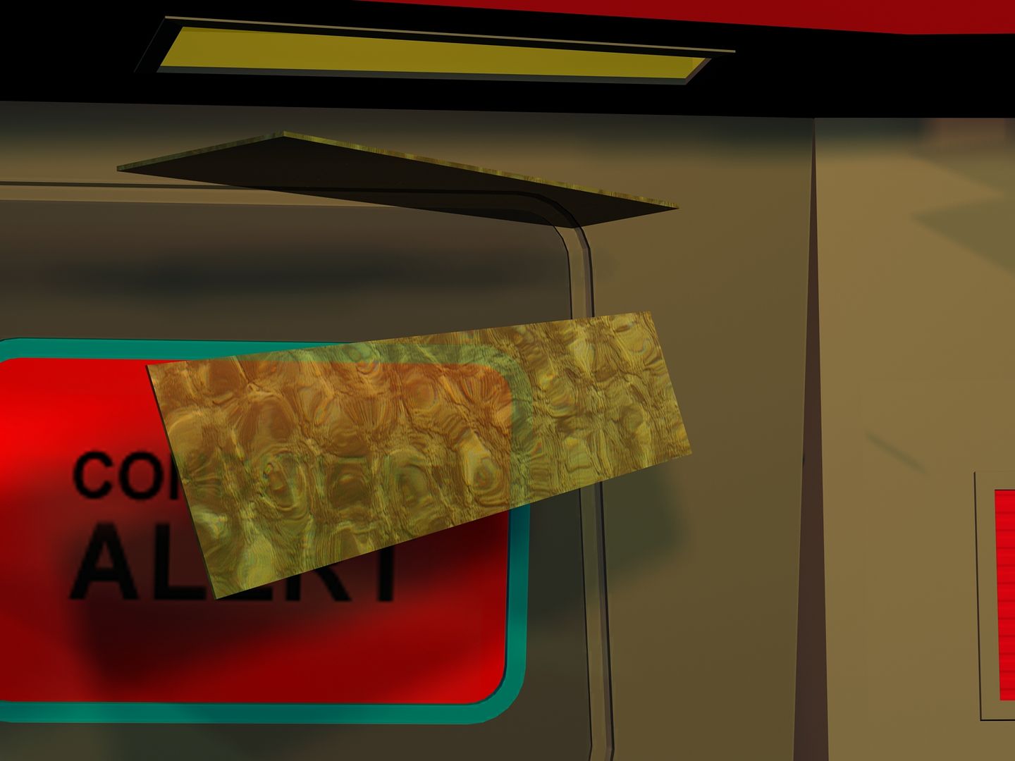
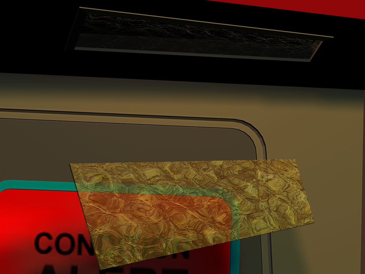
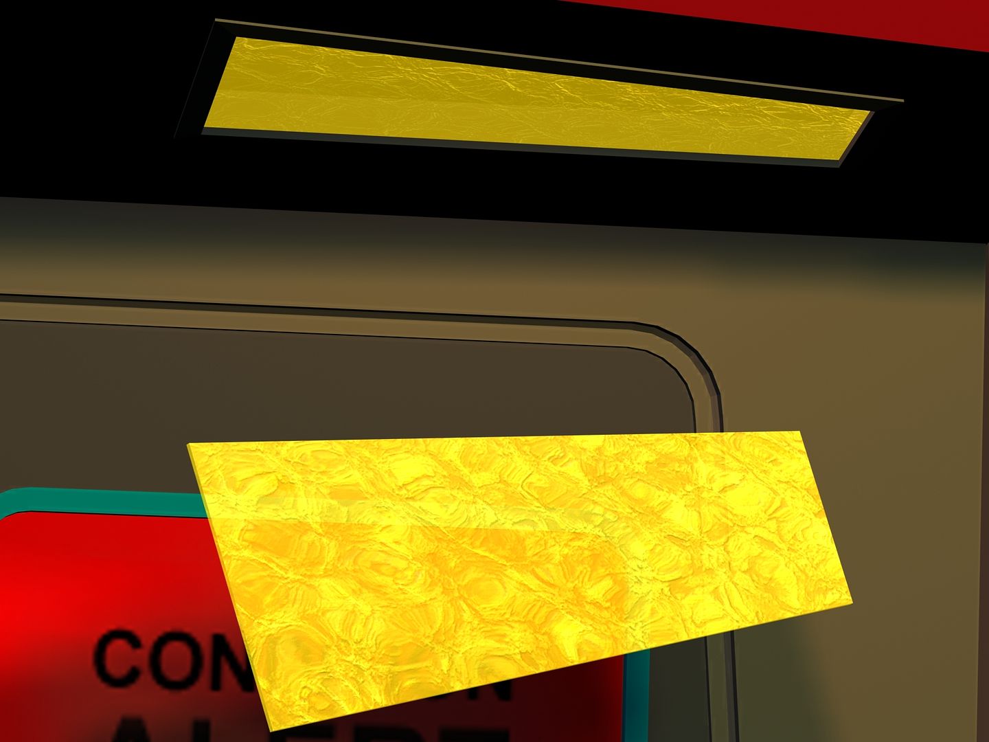
Neat. Is that yellow part the one that self-illuminates or is it just the glass and the panel above it is what lights up?
Both, lol. I simply cloned the panel above, dropped it 20 inches and rotated it on x so that the effect could be seen head on as well as insitu. Figured for demonstration purposes it's easier to tell if I'm pulling off what I intend if one can see both angles.
It isn't exactly what I wanted; but, having spent nearly a week pouring over images on the web for reference, this is the closest I could come to what was originally used. Some of the panels wound up later being more of a diamond cut; but, this is the version I preferred - less machined - more organic. The Glass surface here is actually derived from an
image of a volume of water - which I might add was the intention of the design of the glass plates originally used.
That is just beautiful. You are really putting some great effort into the "Old Girl." The detail is amazing. As a fan of TOS, I thank you.
That is just beautiful. You are really putting some great effort into the "Old Girl." The detail is amazing. As a fan of TOS, I thank you.
Thank you.
")
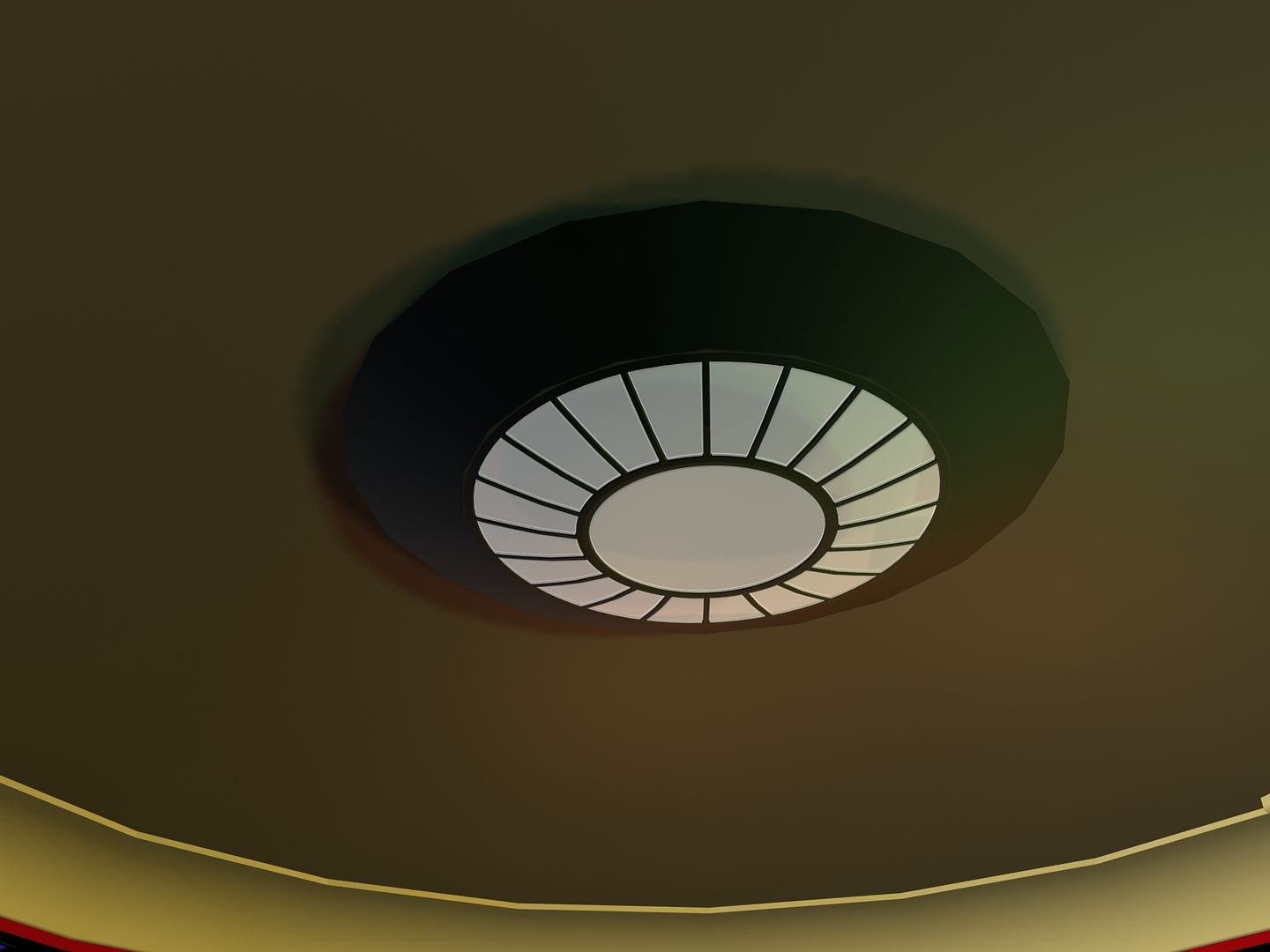
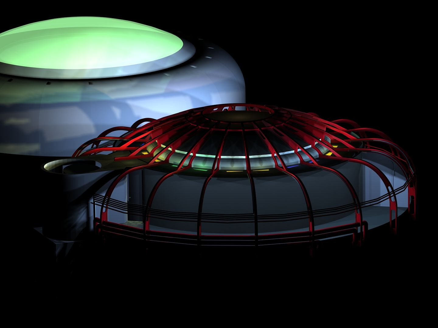
Ok, here's the basic design for the overhead central lighting sconce.
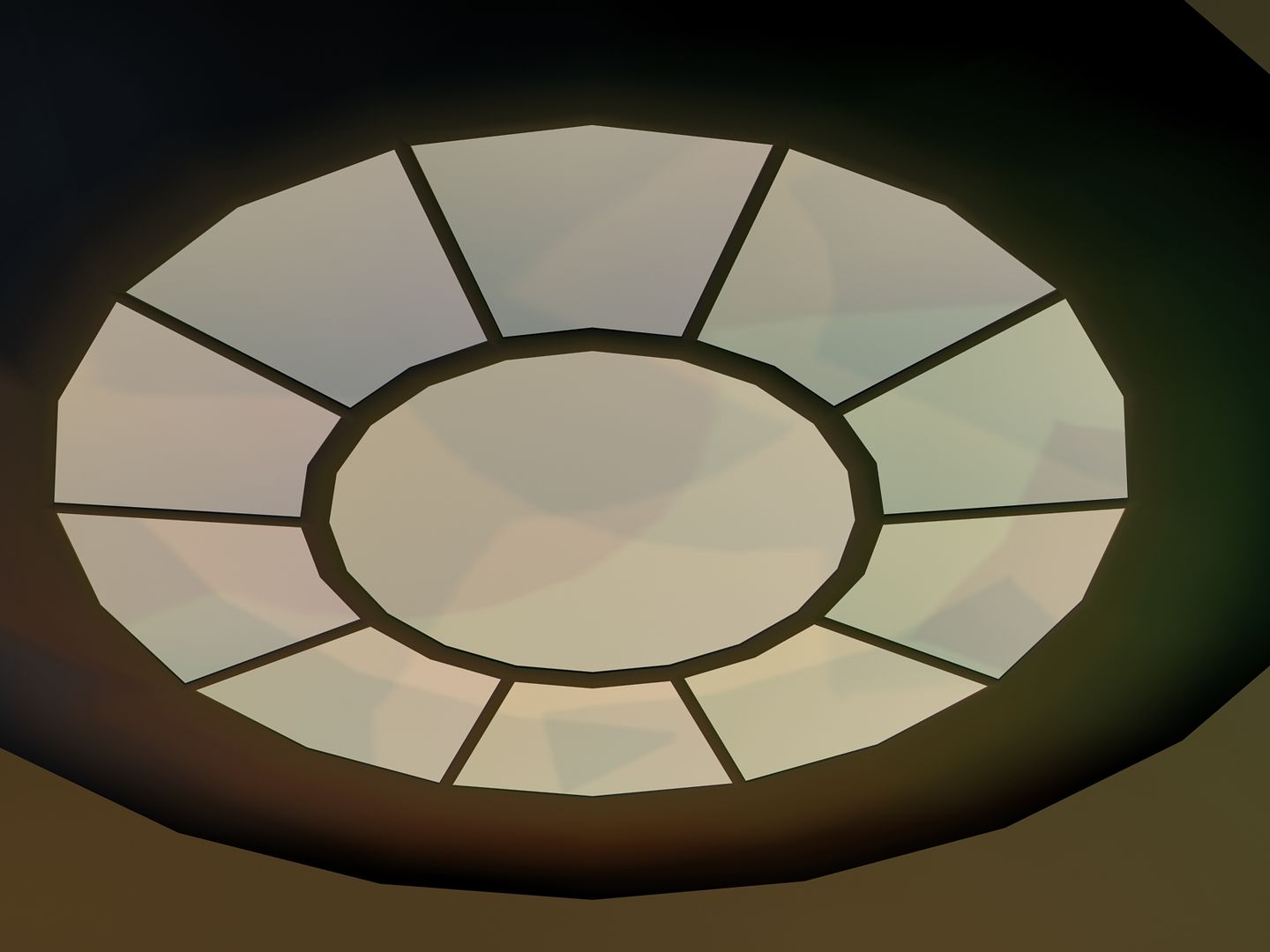
Debating as to whether to go higher poly with it. But the main idea is that the walls of the dome are 20 sided and the sconce echoes that. Just think that rather than simply looking like repeating a theme, it looks too low poly. We'll see.
Debating as to whether to go higher poly with it. But the main idea is that the walls of the dome are 20 sided and the sconce echoes that. Just think that rather than simply looking like repeating a theme, it looks too low poly. We'll see.
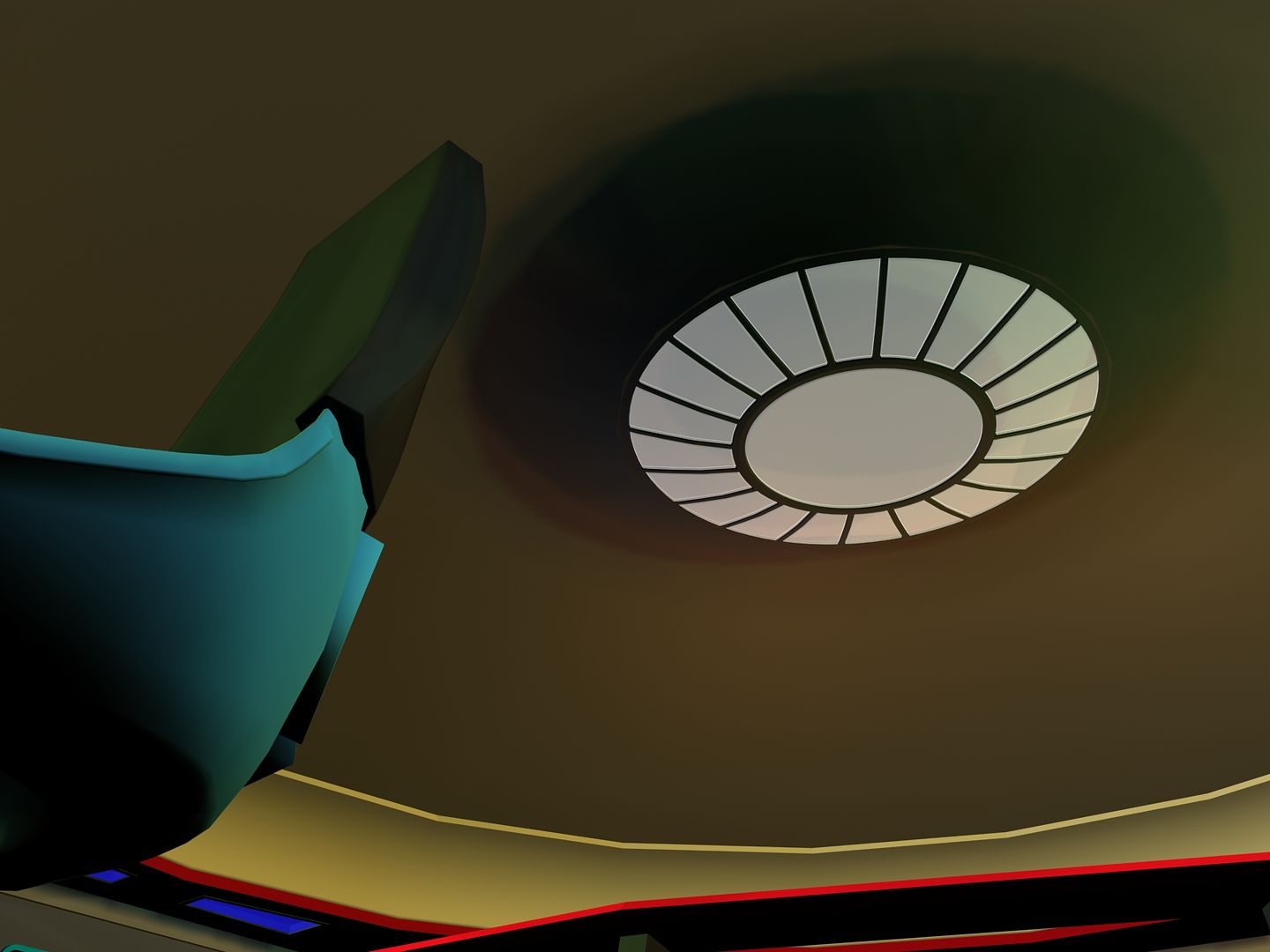
I like the general theory. Maybe it just needs some more structural lines or beams to avoid the "low poly" look?
Yeah, that was another concern - not enough real definition.
I doubled the number of light panels to give it more lines to
that end.
^^ Yeah, I tend to agree. Maybe something to give it more depth and three-dimensionality, like something along the lines we see on the transporter platform wall?
Thought about dressing it up more; but, figured it was better to leave it a little understated. Kinda one of those things that should do it's job without being a distraction was my thought.
Maybe alter the lighting so it isn't completely uniform to make it less flat and curve it instead of making it segmented off since it is anyone's guess as what is up there.
Exactly
Part of the problem, I think, among others was that it was pretty squat against the upper dome; so, I increased it's height - dropping it down more; but, still kept it far enough up that it's essentially out of the way and likelywon't much be seen.
Last edited:
Everyone at work has been passing around the same bug; so, been down for a few days; but, back on my feet. Spent the down time
doing research (between napsJ and building a 3d alphabet for all the wall plaques, nameplates and the like. Spent the day today building the characters. After that, I'll build them into a reference board, do a good render and dump it to photoshop So I'll have some accurate head on characters to work with when I build the textures. There are going to be hundreds of these things; so, getting it right is going to be important.
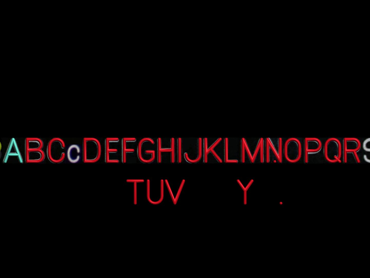
Finished the majority of the Alphas today. Still have 6 characters to build there and the numerals, arrows and punctuation bits to
go.. so not much left. Here's an image of the characters so far.
Beyond this, the basic scene file is setup to begin work on Deck 2. These name plates will be in use immediately starting with this
next deck; so, once this is out of the way, it's on to creating the labs.
doing research (between napsJ and building a 3d alphabet for all the wall plaques, nameplates and the like. Spent the day today building the characters. After that, I'll build them into a reference board, do a good render and dump it to photoshop So I'll have some accurate head on characters to work with when I build the textures. There are going to be hundreds of these things; so, getting it right is going to be important.
Finished the majority of the Alphas today. Still have 6 characters to build there and the numerals, arrows and punctuation bits to
go.. so not much left. Here's an image of the characters so far.
Beyond this, the basic scene file is setup to begin work on Deck 2. These name plates will be in use immediately starting with this
next deck; so, once this is out of the way, it's on to creating the labs.
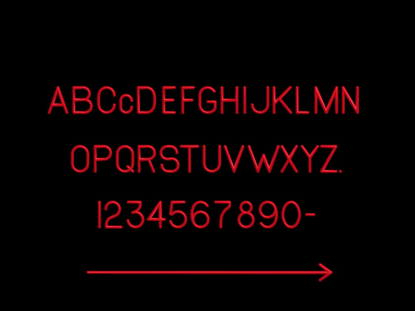
Very happy with the outcome and even more happy to be done creating them. What a pain. lol.
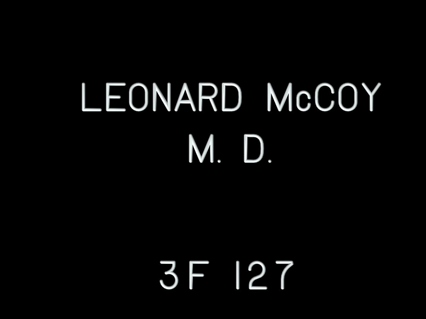
Wait, you're done with them? Don't you need to make 430 of them and then assign them to individual crewmembers' doors?!

Dakota Smith
That could be a whole lotta polys!")
Oh, no. lol. This is just a means to the end of creating a texture that's accurate and realistic. All my signs should end up as a simple box with a texture. It just seemed wiser to do it this way. And it gave me options I didn't have in photoshop.


Here we go. This is a preview of the first finished tile I'll be using to build the signs with
in order to create my textures. The font was derived from a cylinder of .063 radius
(appr. 1/16th inch) then scaled on y to give a .032 depth (appr. 1/32). The outer black
layer is .032 thick for a total intrusion of .064 into the sign base. The base thickness
will be 1/8". And the tiles are designed to give 1/8" seperation between characters with a
margin of .25" above and beneath. Average outer margins from the top and bottom edges
of the characters is 3/4" with 1/2" inch average spacing between lines. So, it's pretty simple
to reconstruct these. Character height is 1" on small standard signs.
..And this was requested at the main thread on 3dBuzz; so, throwin it in for the heck of it.
- Status
- Not open for further replies.
Similar threads
- Replies
- 0
- Views
- 7K
If you are not already a member then please register an account and join in the discussion!