Making the V specifically functional in an interesting way could definitely lead me to reevaluate. Thank you for being so gracious, by the way.
-
Welcome! The TrekBBS is the number one place to chat about Star Trek with like-minded fans.
If you are not already a member then please register an account and join in the discussion!
You are using an out of date browser. It may not display this or other websites correctly.
You should upgrade or use an alternative browser.
You should upgrade or use an alternative browser.
If the saucer separates as two independent craft, how would that effect maneuvering with such weirdly asymmetrical craft?
If this is the direction you want to go with this, I suggest reconsidering the saucer mounted impulse engines. They really ought to be positioned in such a way as to thrust against the ship's center of mass, which might result in an interesting arrangement if you figure out where the CoM would be for each of those partial saucers.
Looking forward to seeing more...
--Alex
Hummmm... put the phaser in the "V" will be interesting. I´m anxiouslly waiting to see it! But think about to place small phaser stripes in a few places over the saucer herself too. ")
The saucer front will have a two torp launcher (moved from the neck), or I´m mistaken? If that is ideed torp launchers, I believe it needs to be resized (up) a bit.
About the naceles front, the "two eyes" (bussard) looks a bit strange for now. I think you can still improve that shape.
The saucer front will have a two torp launcher (moved from the neck), or I´m mistaken? If that is ideed torp launchers, I believe it needs to be resized (up) a bit.
About the naceles front, the "two eyes" (bussard) looks a bit strange for now. I think you can still improve that shape.
I like the idea of some moving parts on the nacelles. That was one of the features I liked on the JJprise. Are you thinking internal spinny-thing movement, a'la Gabe Koerner's version of the Big E or the external "brakes" of the STXI Enterprise?
Y'know, this is starting to remind me of the description used for the MU E-D in the "Dark Mirror" book from many years ago - almost to a fault:
It was Enterprise. But not his [Picard's] Enterprise. It was a dark gray, even enlarged, a gunmetal color, cool and unfriendly. The design was overtly the same--the great sloped disk of the primary hull, the nacelles, the secondary hull, all where they should be. But the secondary hull seemed larger; the nacelles were raked farther forward, and lower. The primary hull's curve was deeper and now had a frowning look about it. If ships had expressions, this one had its eyes narrowed. It was a cruel look, and intimidating. Just visible, because of the rake of the primary hull, were the characters ICC 1701-D ISS ENT-- The rest was curved away out of sight.
Spinning turbine like things in the front, similar to the ones on the STXI Enterprise. ") Elongated, though, to fit inside of course.
Elongated, though, to fit inside of course.
Elongated, though, to fit inside of course. Yep, That was a great book.Y'know, this is starting to remind me of the description used for the MU E-D in the "Dark Mirror" book from many years ago - almost to a fault:
It was Enterprise. But not his [Picard's] Enterprise. It was a dark gray, even enlarged, a gunmetal color, cool and unfriendly. The design was overtly the same--the great sloped disk of the primary hull, the nacelles, the secondary hull, all where they should be. But the secondary hull seemed larger; the nacelles were raked farther forward, and lower. The primary hull's curve was deeper and now had a frowning look about it. If ships had expressions, this one had its eyes narrowed. It was a cruel look, and intimidating. Just visible, because of the rake of the primary hull, were the characters ICC 1701-D ISS ENT-- The rest was curved away out of sight.
I should re-read it soon. I wondered if anyone else had thought that. Well, some of the ideas came from these images I've had on my Hard Drive since about 2004... mainly just the split saucer, and the way the neck ties to the extended battle section.

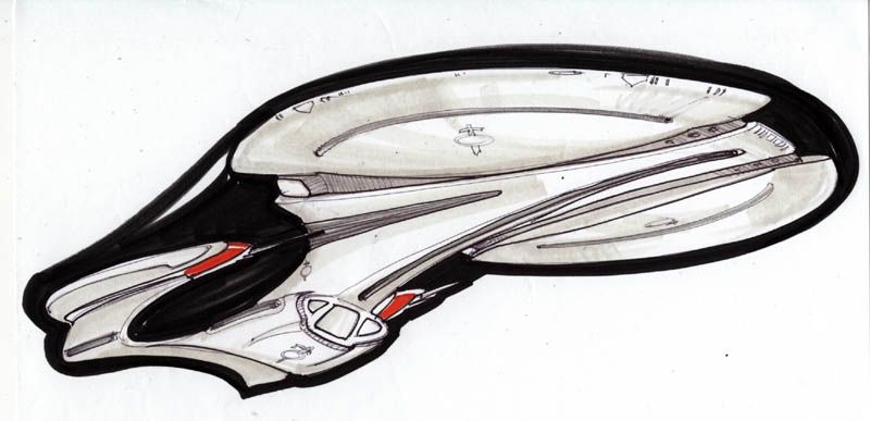
Of course, mine's pretty different, and will look even more so when it's all detailed out.
Anyone have idea where these came from? They may even have come from this board.
-Ricky
Love your work madman !!! Its amazing 
Here's some WIPs...
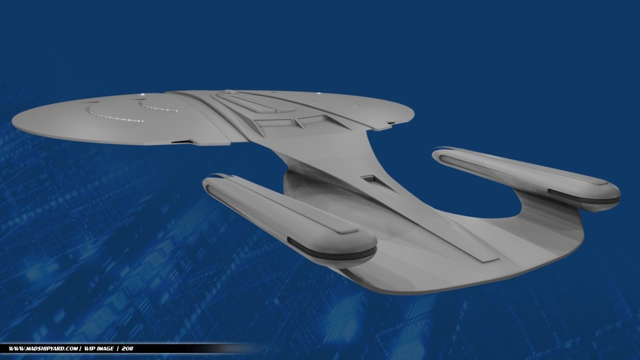
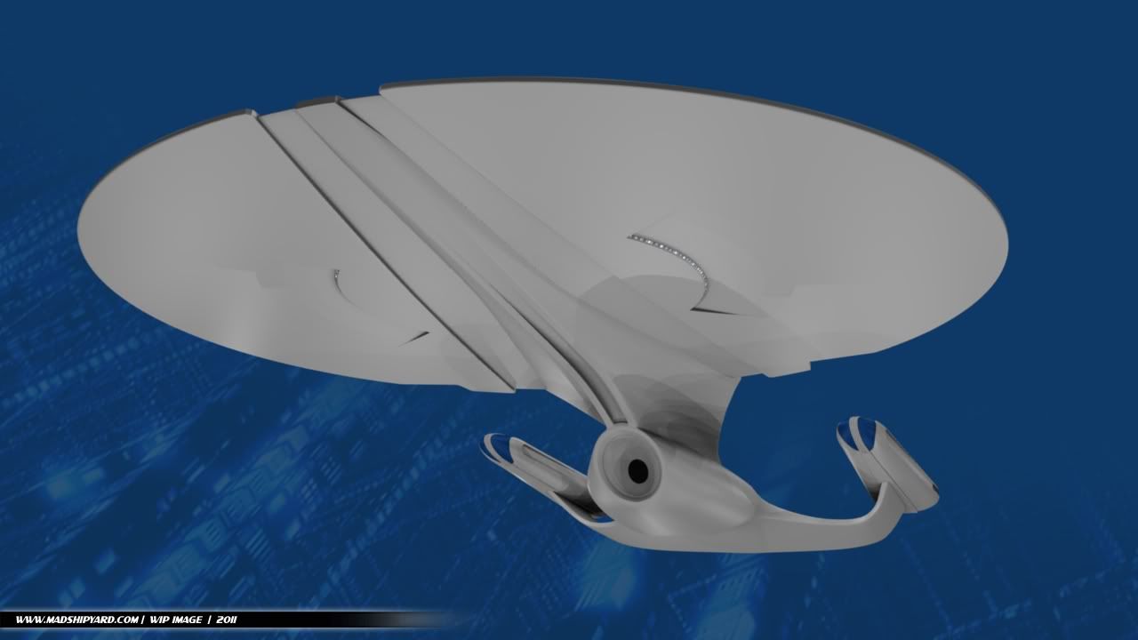


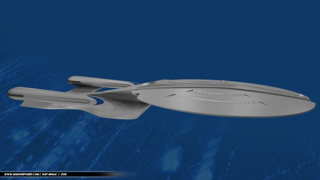
The proportions seem a lot like the TNG version, but the whole shape is flatter, and stretched out towards the front.
I just started cutting in windows, and I'll be adding more details and stuff. I've got an idea to "re-imagine" phaser strips, too.
So, what do ya'll think?
-Ricky[/QUOTE]
Here's some WIPs...
The proportions seem a lot like the TNG version, but the whole shape is flatter, and stretched out towards the front.
I just started cutting in windows, and I'll be adding more details and stuff. I've got an idea to "re-imagine" phaser strips, too.
So, what do ya'll think?
-Ricky[/QUOTE]
A suggestion madman what about a 360 degree phaser strip may have two inner phaser and a outer phaser strip ??
This is really top notch, I think you've made some serious improvements to the look of the D. Most Next Generation designs leave me kind of cold but this is sweet. I think I like the version of the primary hull from your drawing better, but I wouldn't kick your modeled version out of bed for eating crackers either. Awesome work as usual...
This is really top notch, I think you've made some serious improvements to the look of the D. Most Next Generation designs leave me kind of cold but this is sweet. I think I like the version of the primary hull from your drawing better, but I wouldn't kick your modeled version out of bed for eating crackers either. Awesome work as usual...
It's not his drawings, though I do agree that the deflector/secondary hull shape in them is very intriguing.
Yep, That was a great book.Y'know, this is starting to remind me of the description used for the MU E-D in the "Dark Mirror" book from many years ago - almost to a fault:
It was Enterprise. But not his [Picard's] Enterprise. It was a dark gray, even enlarged, a gunmetal color, cool and unfriendly. The design was overtly the same--the great sloped disk of the primary hull, the nacelles, the secondary hull, all where they should be. But the secondary hull seemed larger; the nacelles were raked farther forward, and lower. The primary hull's curve was deeper and now had a frowning look about it. If ships had expressions, this one had its eyes narrowed. It was a cruel look, and intimidating. Just visible, because of the rake of the primary hull, were the characters ICC 1701-D ISS ENT-- The rest was curved away out of sight.
Well, some of the ideas came from these images I've had on my Hard Drive since about 2004... mainly just the split saucer, and the way the neck ties to the extended battle section.
Of course, mine's pretty different, and will look even more so when it's all detailed out.
Anyone have idea where these came from? They may even have come from this board.
-Ricky
hmmm i have 4 guess's for the artist of these :
Atolm, Andrew Probert, John Eaves, and maybe Doug drexeler
A suggestion madman what about a 360 degree phaser strip may have two inner phaser and a outer phaser strip ??
Well, my idea will provide them with a way to fire multiple beams, aimed in different directions at the same time... so I think it'll work for 360 degree coverage up top.
This is really top notch, I think you've made some serious improvements to the look of the D. Most Next Generation designs leave me kind of cold but this is sweet. I think I like the version of the primary hull from your drawing better, but I wouldn't kick your modeled version out of bed for eating crackers either. Awesome work as usual...
Yeah, thanks.
The drawings weren't mine, just something I had looked at a few years ago, and saved on my hard drive. The ellongated bussards, showed in the drawings posted in the previous page, looks interesting. I believe it looks more integrated and better aligned to the ship´s body. Can you consider this small change?
Possibly... I may try a variant, and see how that works. That would provide a way to add more stuff inside... Good idea.
More later...
-Ricky
^I would discount 3 of those.
Ok and i also forgot could be Titan Designers art
An interesting effort.. My only comment would be to replace the straight lines with curved which will provide unifying effect. In other words, in the top view, bow the lines coming off the dorsal, curving them toward a narrow gap at the bow. Look at the shape you have curved around your bridge, for example.
Hmm, imagine overlaying the Voyager profile (plan view) onto your design and see how the curved lines complement, rather than conflict with, your plan view profile... mirroring it on the saucer underside of course. You should then, for the sake of continuity, follow that example in your bussard cutouts as well.
If you want a rOund deflector then I'd suggest pulling more of a teardrop-shape feature from the saucer's underside center down around the deflector opening to provide a bolder cross-axis statement rather than dropping a circle in the middle of elongated oval shapes, as viewed from the front.
The pie-shaped saucer window cutouts are nice. I would probably widen the sides more. Speaking of sides, have you considered what effects the blast from your engineering hull impulse engine might have on that narrow exhaust channel?
Finally, would you mind showing us what your saucer section looks like when separated?
Thanx, Andrew-
I think it looks good. Better than the original (Sorry Mr. Probert.) The only thing I would do is make the back of the nacelles longer.
Similar threads
- Replies
- 2
- Views
- 477
- Replies
- 5
- Views
- 1K
- Replies
- 3
- Views
- 504
- Replies
- 3
- Views
- 976
If you are not already a member then please register an account and join in the discussion!