Wow, alot of comments for this one.
")
I had thought it would get everyone going.
That is looking seriously cool so far. So much sleeker than the "prime" Galaxay.
In the prime universe, the more advanced a ship was, the sleeker it looked. In the nu universe, things are more advanced earlier on, so this could really work.
Can we assume this is, like, 4 miles long then?
")
Thanks.
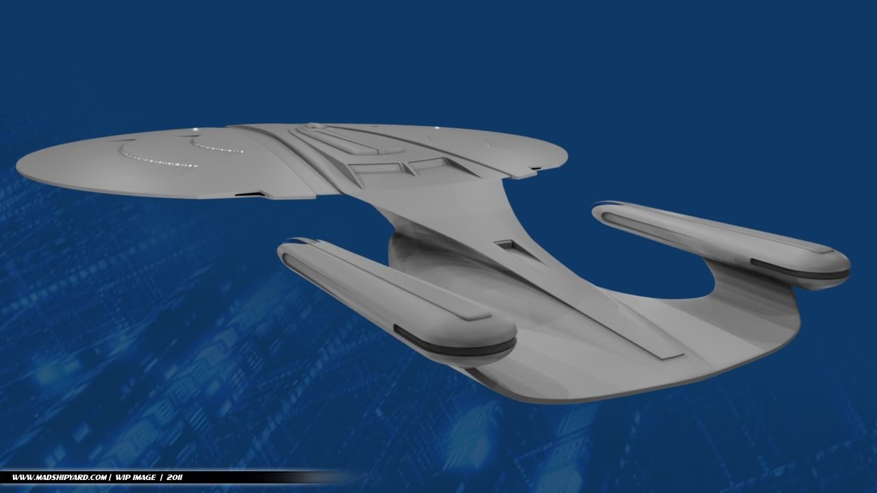
Hehe, not quite... the model is about twice as long as my STXI Big E, but it's about 3 times wider across the saucer section.
Looking good, Mad. I am wondering about the blue Bussard collectors on the nacelles? Otherwise a very nice, streamlined look - better balanced the original Galaxy, methinks.
Playing with an idea... I think I'm actually going to put moving parts in there, JJ Style.
Very nice! Do I see some influence from LordSarvain's Planet of the Titans Enterprise in the secondary hull?
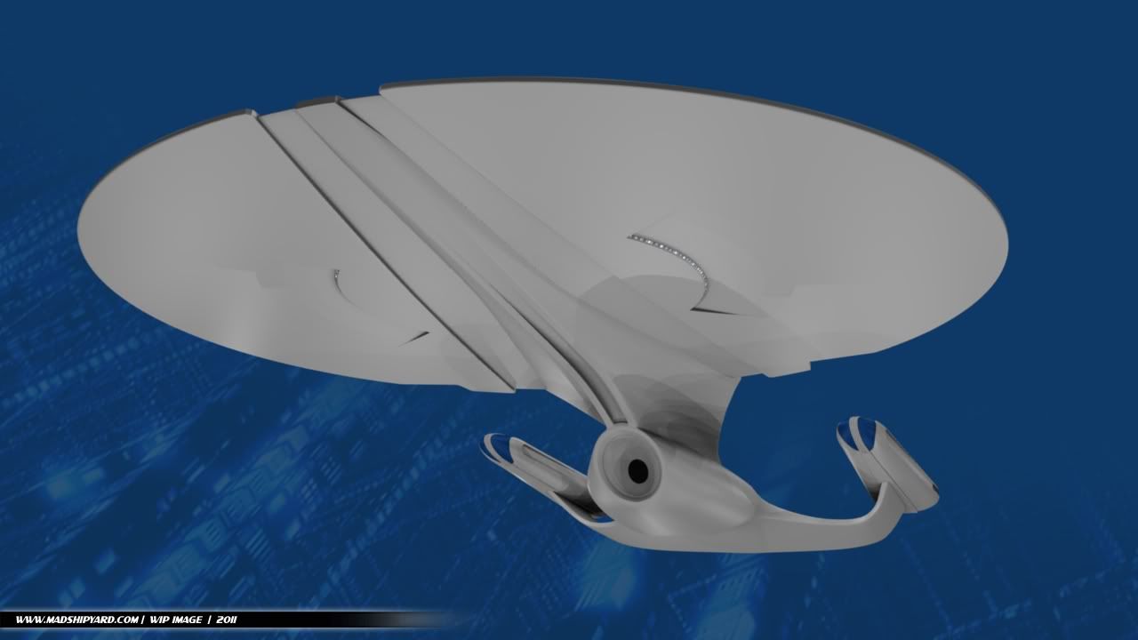
Yep, mainly with the round deflector dish area. I never liked the eye shaped one on the "D".
Very good, and even better, very
right - it fits with being almost but not quite the Galaxy-class we know. Great work so far!
Thanks.
That's exactly what I'm going for.
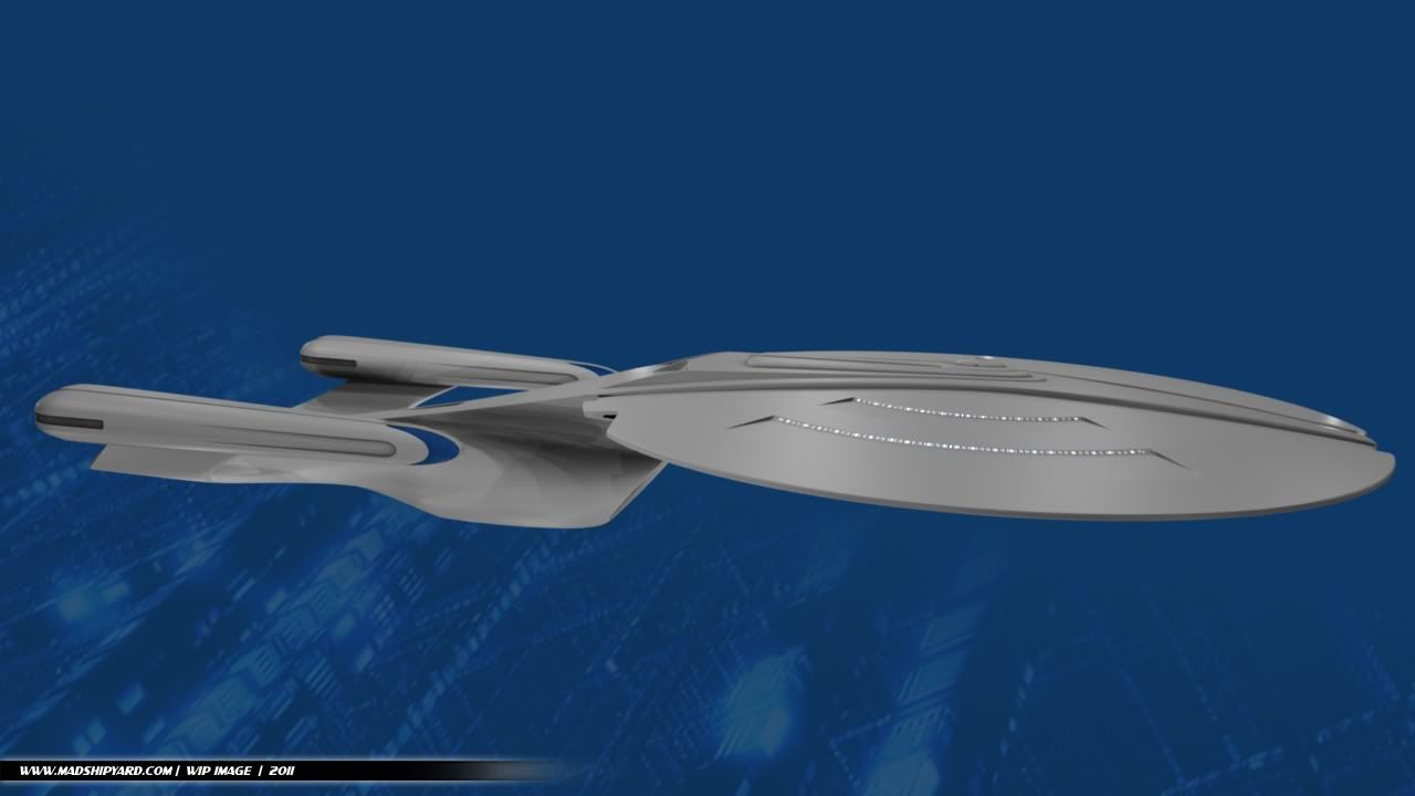
side view, the frontside of the neck looks a bit too stretched forwards, if that makes any sense.
but very cool otherwise!!
Well, that was the STXI influence... I wanted it stretched out, almost unbalanced even.
I like it from the side and rear but I must admit I'm not to keen on the V cutout on the saucer.
Agreed about the V on the saucer. It doesn't really go with the round, curvy nature of the rest of the ship.
Hmm, one of the things I like best is that "V". If it helps any, the new "phaser strips" will be going in there. I think ya'll get a kick out of those.
I think the circular main deflector really has something going for it that unifies the Galaxy with the TOS and TMP Enterprise. This I like, provisionally.
I agree that the V cut-out, as it's being called, isn't working for me, either on top or bottom of the saucer. It looks like a giant Kzin God raked its claws across the ship.
Ricky, I believe that I´m love with her!
Go ahead, it looks totally C O O L !!!!!

Hehe, indeed I will.
I like her. Overall, she looks leaner and sleeker. Not sure about the v-cut out. I'm guessing that it is supposed to have something to do with the hull separation's appearance. I wonder what Andrew Probert will have to say about her?
I was thinking about that... that whole middle section is part of the neck and secondary hull, so I kind of envisioned just the sides coming off... maybe into 3 separate parts. Almost like the Saucer separation would result in the battle section, and 2 really big life boats. Not sure I'll actually build it into the model, though.
Woww.. For some reason I expected an Abramsverse reimaging...this is very cool.
Well, it kind of is.
Glad you like it.
Leave the V-cut on the top of the saucer but massage the lines so they match the fluidity of the rest of the ship. Ditch the V-cut on the bottom of the saucer. For ship separation have most of the saucer drop away from the V-cut leaving just the v-cut as part of the battle section. The main bridge now stays with the ship and you get a much more aggressive looking battle section than the old "cobra head".
If that makes any sense.
Yep, that's my intention exactly.
I'm pretty set on the design so far, so I probably won't be changing anything major at this point.
Ditch the V-cut, but use the v-contour of the neck to define the separation line of the hull.
Also, the side view looks a bit wonky, as if all the lines that should be flat horizontals aren't (namely the dividing line between the top and bottom of the saucer).
That's weird... It's definitely perfectly horizontal. Maybe it's just the way the neck is going in there is making it look that way to you. Anyway, weird is what I'm going for.
More updates later... Thanks for the comments everybody!
-Ricky