Wow that is amazing! That would make a great movie poster!
-
Welcome! The TrekBBS is the number one place to chat about Star Trek with like-minded fans.
If you are not already a member then please register an account and join in the discussion!
You are using an out of date browser. It may not display this or other websites correctly.
You should upgrade or use an alternative browser.
You should upgrade or use an alternative browser.
MadMan's Wallpaper Thread (Wide Image Warning)
- Thread starter MadMan1701A
- Start date
Great website artwork...love the whole look/design. The newest ship posters also remind me of collector card sets. You should consider doing a mock-up set, with gold foil emboss edges, etc. (Perhaps deckplans and a brief spec list on the B side). Just a thought ")
Anyway, wonderful work as always.
Anyway, wonderful work as always.
That would be neat. I never did get into the trading cards back in the day... even though I was in the target range for the TNG ones.Great website artwork...love the whole look/design. The newest ship posters also remind me of collector card sets. You should consider doing a mock-up set, with gold foil emboss edges, etc. (Perhaps deckplans and a brief spec list on the B side). Just a thought
Anyway, wonderful work as always.
Judexavier, any plans to complete your ortho views of the New Enterprise? 
OK, I have something new!
This is my new Narada model, scaring away some Klingon D6 Cruisers.

A square version: http://i5.photobucket.com/albums/y200/MadMan1701A/Wallpapers/NaradaandD6s1280.jpg
The Narada isn't super detailed, but at this range, I think it gets the point across.
This is my new Narada model, scaring away some Klingon D6 Cruisers.
A square version: http://i5.photobucket.com/albums/y200/MadMan1701A/Wallpapers/NaradaandD6s1280.jpg
The Narada isn't super detailed, but at this range, I think it gets the point across.


^Thanks.
Does anyone have ideas about what else I can have the Narada doing? maybe I should dust off my debris field i was building and make an image of the attack over vulcan.
Does anyone have ideas about what else I can have the Narada doing? maybe I should dust off my debris field i was building and make an image of the attack over vulcan.
Does anyone have ideas about what else I can have the Narada doing?
oh, you know, just kickin' back on a risan beach with a tall romulan ale and m'ress...
Ha.Does anyone have ideas about what else I can have the Narada doing?
oh, you know, just kickin' back on a risan beach with a tall romulan ale and m'ress...
What's the deal with M'Ress, anyway? I don't understand all this furry stuff...
OK, I've been messing around with these this morning...
A new poster:
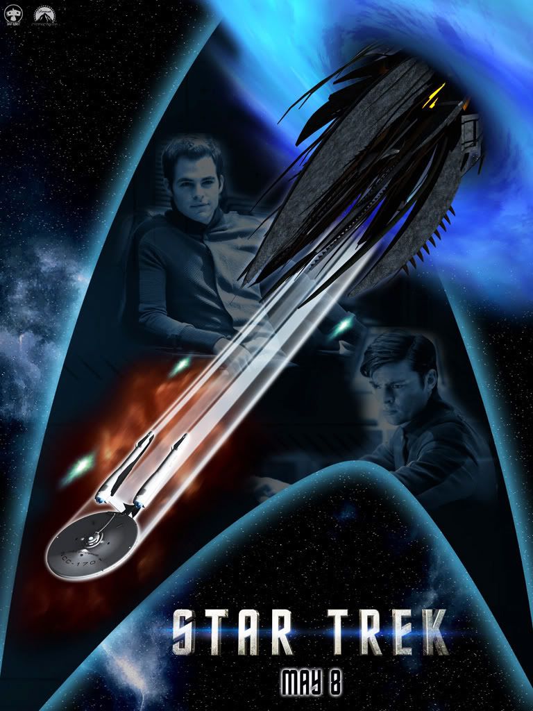
And Wallpaper based on it...
It turned out reminding me of the Generations poster. This is going to replace the one I have on the front of my website.
A new poster:
And Wallpaper based on it...
It turned out reminding me of the Generations poster.
This is going to replace the one I have on the front of my website.
Last edited:
Very cool man, I like it.
Thanks, guys.
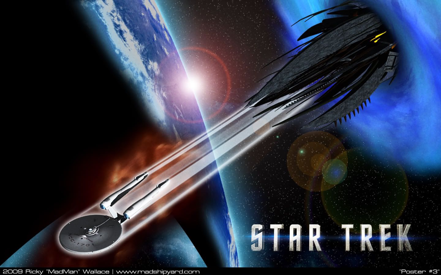
So, on the wallpaper one, I am going to refine some things. I want to get rid of the "Earth" part on the Delta, since I think it doesn't work well. I like the lens flare, but I may tweak the colors on it.
I was also thinking that something doesn't look right on the poster... where Kirk and McCoy are. Any ideas of what could make it look better?
OK, I decided that I am happy with the poster, but I tweaked the wallpaper... I think I might be on to something.

and a square one...
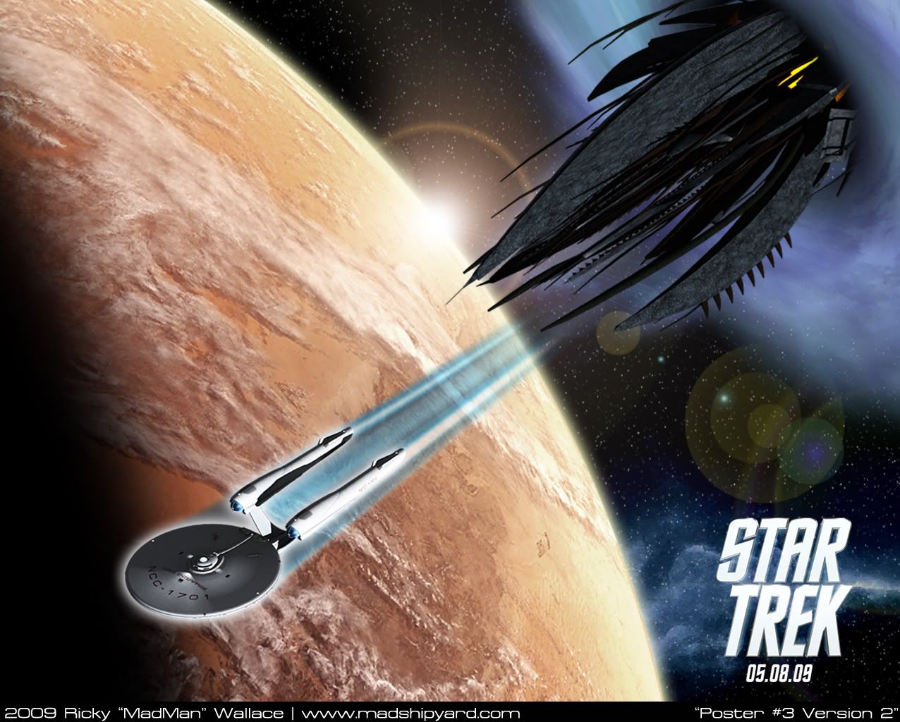
I like Vulcan being there, A LOT better. What do you guys think?
and a square one...
I like Vulcan being there, A LOT better. What do you guys think?
Yeah, I didn't think of that.Cool Posters though you make it look like the Enterprise also came out thru that Wormhole
I like it with the earth better. Something about it makes it look more "movie poster" in my mind. With Vulcan as the background the first impression I keep getting is that the planet was photoshopped in. Maybe if you extended the nightside of Vulcan so the Enterprise is completely into it like the Earth version has. Also, small thing here, The "speed lines" in the Earth version give the impression that the Enterprise is moving at an angle to the direction of motion. It may just be an optical illusion created by the image angle. it's not as noticable with the Vulcan version due to the less prominent coloring for the lines.
Hmm, I'm surprised you like the earth version better.I like it with the earth better. Something about it makes it look more "movie poster" in my mind. With Vulcan as the background the first impression I keep getting is that the planet was photoshopped in. Maybe if you extended the nightside of Vulcan so the Enterprise is completely into it like the Earth version has. Also, small thing here, The "speed lines" in the Earth version give the impression that the Enterprise is moving at an angle to the direction of motion. It may just be an optical illusion created by the image angle. it's not as noticable with the Vulcan version due to the less prominent coloring for the lines.
I think I'm going to keep Vulcan, but I might do as you suggested, moving the night side up further, so that Enterprise is totally in the Black.The "Speed Lines" were screwed up in the first image. I didn't realize it, but i messed up the angle right before I hit apply, in the plugin.
I totally changed them on the new image, so that they should line up properly, now.Similar threads
- Replies
- 14
- Views
- 3K
- Replies
- 10
- Views
- 956
- Replies
- 2
- Views
- 356
If you are not already a member then please register an account and join in the discussion!