Makes sense that the command color would be green, anyway. Best way to sell new color TVs, by having your uniforms be primary colors: blue, red, green.
-
Welcome! The TrekBBS is the number one place to chat about Star Trek with like-minded fans.
If you are not already a member then please register an account and join in the discussion!
You are using an out of date browser. It may not display this or other websites correctly.
You should upgrade or use an alternative browser.
You should upgrade or use an alternative browser.
Kirk's Tunic Color?
- Thread starter Nardpuncher
- Start date
- Status
- Not open for further replies.
Saw one of the third season tunics on display at a museum in Seattle -- definitely looked like the color in this photo and in Klingongoat's avatar.The standard command duty tunic was more of an olive drab but velour having a bit of an odd sheen under stage lights (which was a big part of the reason why Theiss picked it in the first place), it tended to look more goldish when things were brightly lit.
If you've ever brushed a piece of velour with your hand, the nap of the fabric can change colour whether it's leaning one way or the other. Similarly, coloured gels were used over the studio lights.
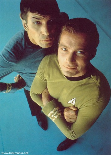
I've been told that this shot (below) best captures the natural appearance of the shirts off-camera, but still some people's brains interpret the shirt colour as green and others as gold:
One was a green wraparound "leisure tunic." The other was a mustard color. Not really gold or yellow. But not green either.
Man, if I ever open a jar of mustard and its green like this, I'm throwin' it away.
Same can be said of the velour uniforms in my "Omega Glory" viewmaster reels and in some of my photonovels from the first season, especially the uniforms in "Where No Man Has Gone Before." And the uniforms in the earliest episodes, such as "The Corbomite Maneuver," definitely look more green, as do the early jumpsuits that various crewpersons wore.
I wish that they had opted for something closer to olive than lime green because not only would the actors have looked a little better in them, but the color issue would no longer be an issue. A tunic essentially the same shade as the first season wraparound would have been great.
Perhaps that was a little too military for everyone's tastes, but I think the contrast with the other colors would have worked better than gold.
James Cawley worked closely with Theiss on TNG and was given all the costumer's notes on the TOS uniforms including the plates to make the rank braid and insignias. He's gone on record on his forum that the first-season velour uniforms were gold, while the green-gold (avacado-like) uniforms were only in the third season. That color was used, apparently, so that under lighting the uniforms would recreate the gold color of the previous season on film.
Weird.
Isn't there a reference to green material looking gold on film in "The Making of Star Trek", which came out before Season Three was being made and therefore has only episode guides for the first two seasons?
Yes, I do recall they had trouble recreating the colour when they switched from velour, but Kirk's wraparound is green (wool blend) because the other command shirts were green (velour). There was also a switch of material at an earlier point, iirc; I thought because the original velour shrank with every cleaning.
I wish that they had opted for something closer to olive than lime green because not only would the actors have looked a little better in them, but the color issue would no longer be an issue. A tunic essentially the same shade as the first season wraparound would have been great.
It was the intention to match the colour, but the wool blend wraparound reflected the light very differently.
The DVD boxed sets, particularly the first half of Season One, are intriguing to watch because what appeared always quite gold on VHS jumps to very green in many scenes as they pass under the gels.
I mean, aren't there Kirk uniforms left over from the show to take a look at for reference? I could've sworn....
About a year ago, "It's a Wrap!" had a weird mauve uniform top from TOS up for eBay auction. The unique scorch marks on it pinned its use to one particular Spock episode. Over 40 years, the science blue colour had faded/skewed to a very unusual mauve.
So there's the reason for Shatner's gut -- he swallowed the pit!!!
")
I mean, aren't there Kirk uniforms left over from the show to take a look at for reference? I could've sworn....
About a year ago, "It's a Wrap!" had a weird mauve uniform top from TOS up for eBay auction. The unique scorch marks on it pinned its use to one particular Spock episode. Over 40 years, the science blue colour had faded/skewed to a very unusual mauve.
Profiles In History, p. 208 of their catalog: http://www.profilesinhistory.com/auctions/A27_Lots_559-713.pdf
Faded, just like the film clips. Darn these unstable chemicals...
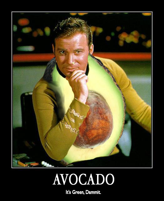
Theiss himself described the color of the velour command tunics as "avocado."
The green color of the first and second season tunics is sometimes apparent in the color-corrected HD footage of "Star Trek Remastered."
http://tos.trekcore.com/hd/albums/1x14hd/balanceofterrorhd033.jpg
The green color of the first and second season tunics is sometimes apparent in the color-corrected HD footage of "Star Trek Remastered."
http://tos.trekcore.com/hd/albums/1x14hd/balanceofterrorhd033.jpg
The green color of the first and second season tunics is sometimes apparent in the color-corrected HD footage of "Star Trek Remastered."
Indeed, but a friend of mine, who abhors the Remastered versions with a passion, plays the regular TOS DVDs on his huge plasma screen home cinema and the green of the command uniform shirts often shows up.
Who cares what color it was as long as it got ripped...
And a big welcome to Iowagirl!
Unlike trekmovie.com, here you actually have to do something to get blocked, rather than just not liking what JJ and his merry band have in store for us.
Enjoy!
Who cares what color it was as long as it got ripped...
And a big welcome to Iowagirl!
Unlike trekmovie.com, here you actually have to do something to get blocked, rather than just not liking what JJ and his merry band have in store for us.
Enjoy!
Thanks, Captain and a big hi to you!
You mean, I'm actually allowed to speak my mind...?? Incredible!
Look forward to reading you, here or on trekmovie.com. 
Unlike trekmovie.com, here you actually have to do something to get blocked...
One has to do quite a bit to get blocked at trekmovie.com, though it's natural that the folks who do get blocked never really get what the problem is - even when it's explained to them.
 :rolleyes:")
The series uniforms were always red, blue and green. The pilot uniforms were green, blue and a peach color that was changed to red for that division in the series. If you look at the enlisted 'tech' crew jumpsuits, you will also notice that they are indeed red, blue and green, as well as the dress uniforms.
Other colors on the show have also been stated incorrectly. For instance, the set colors were often quite different to the naked eye than to the TV audience. The walls of the corridors and various areas of the ship, like the bridge, transporter, sickbay and engineering that looked 'white' on screen were actually a medium-light gray - like a primer gray. The insets on the upper bridge stations that contained the data screens that appeared blue or blue-gray on the tube were actually a neutral gray. The bridge carpet that often looked 'brown' on home screens was actually a gray automotive carpet.
The ship models themselves that appeared 'white' or almost any other color on the tube, were actually a cool-gray color known as "aero blue", which is a light gray with blue and green added (it actually looks more greenish-gray to the naked eye than bluish, like the name would suggest).
Jerry Finnerman, the DP, would use a lot of colored gels to give the show a very rich, saturated look that appeared more theatrical in nature. He not only used this scheme to light the sets and cast, but also oversaw the lighting of the miniatures at both Anderson's and Dunn's facilities where the Enterprise and other spacecraft were shot, therefore maintaining a consistent look throughout the show. This is part of the reason why many of the colors used in the wardrobe, sets and models is often questioned.
The other contributing factor was the film stocks used on the show, of which there were two: Eastman 5251, which was used in the first and second seasons, and Eastman 5254, which was used in the third year. Both stocks were somewhat 'warm' in their rendition of colors, as the was print stock at the time, 5385, which, if any of you are lucky enough to own film frames of the show's dailies, you'll notice that the color has shifted through the years to a very magenta color.
One nice thing about the remastered series is that they were able to go back to the original camera negatives and fully extract the best and closest example of the show's actual appearance that has ever been done. The command uniforms now often appear in many scenes as they actually did on the set, the green color now being quite evident, and other wardrobe and set colors looking closer to their actual appearance. Sadly, the new cgi effects have eliminated the original model shots, and have not captured the color palette so beautifully rendered in the original show - the ship now shown rendered in mostly plain "white" light and an uninspired 'plain' appearance that no longer matches the consistent, colorful look of the original.
[
Weird.
Isn't there a reference to green material looking gold on film in "The Making of Star Trek", which came out before Season Three was being made and therefore has only episode guides for the first two seasons?
I just checked my copy, 27th reprinting September 1991, and in Part VI, Chapter 6 "Aliens -- Dressed and Undressed," the only references to the uniforms is the "rotten velour" and its shrinkage problems. There's also a mention of switching fabrics for the new season (no specific fabric is mentioned for the switch), the issues they had with the invisible zippers, and how they had to custom make the uniform boots. Nothing is mentioned about the uniform colors.
Despite Cawley's expertise in matters of Trek costuming and having known Thesis, I suspect that he may be misremembering. As Thesis in interviews has gone on record as saying that it's been "avacado" or "lime-green" from the start.
Even in the first season, the alternate command uniforms (wrap and dress) were off a "green" base. Then again, the prototype wrap seen on Charlie Evans in "Charlie X" was a sort-of gold/yellow suade. Apparantly, according to the Asherman compandium, the prototype was meant for Kirk but they went with the one made of wool.
Who knows what the original idea was behind that brown wraparound Charlie was wearing. Could've been an idea for a field jacket, could've actually been something made for the episode and was just based on Kirk's wraparound tunic.
- Status
- Not open for further replies.
Similar threads
- Replies
- 18
- Views
- 3K
- Replies
- 9
- Views
- 3K
- Replies
- 47
- Views
- 17K
If you are not already a member then please register an account and join in the discussion!