• Welcome! The TrekBBS is the number one place to chat about Star Trek with like-minded fans.
    If you are not already a member then please register an account and join in the discussion!

July challenge entry

WinstonSmith

Lieutenant Commander
Red Shirt
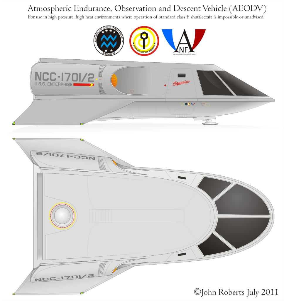
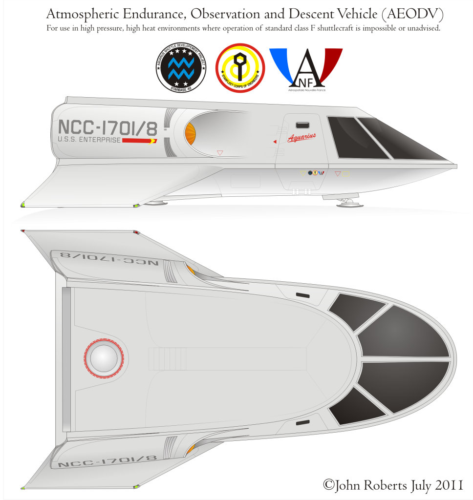
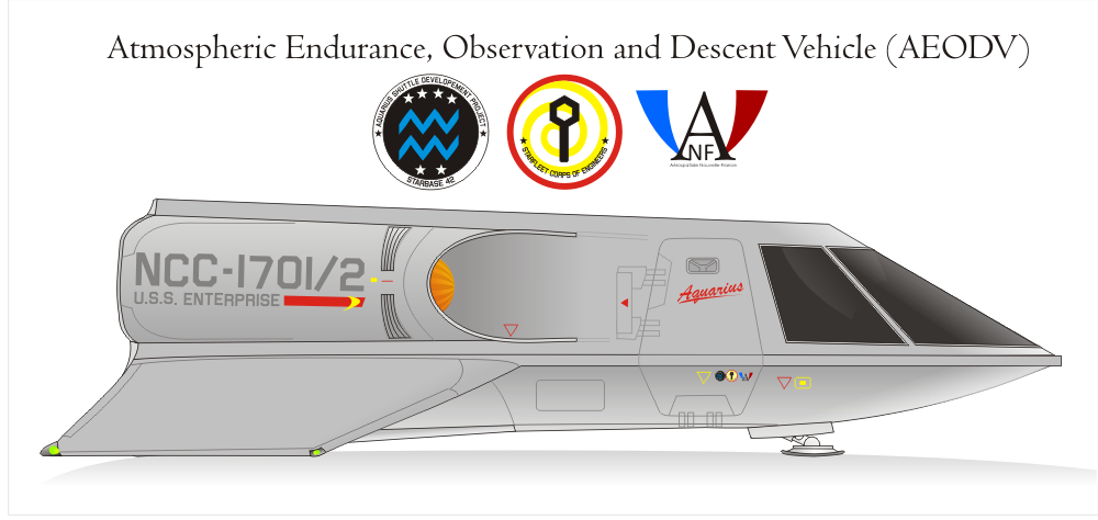
I present for your consideration the shuttle aquarius, on special assignment to the enterprise for scientific observation of gas giants, where atmospheric pressure would present a danger to a normal class F; ;)
Aquarius.png


comments and constructive criticism welcome! :)
 
Very cool... Do you have any other views?

And don't forget to email it in before the end of the month as well... :D
 
Nice! I like the shrouded nacelles. From the panel lines, it looks like the upper part of the door hinges aft, and the lower part hinges down - is that correct?

What program did you create this in?
 
thanks guys! :)
Klaus, I'm afraid I don't have any other views at the moment. I'll try and remember :D
BJ, that was indeed the idea regarding the doors. the image was made in corel draw :)
 
for some reason, despite getting off a plane from vancouver this morning, I felt motivated to knock up the top view this afternoon. this will probably be either the, or close to, final image;
aquarius1.png

enjoy! :)
 
Like everyone else said, very nice work! Love the shrouded, "scoop" nacelle design. (which I think makes more sense as a
bussard- matter-sucking thingy :))
One question I've been meaning to ask for a while, what is the font you (and others) use for the "classic" shuttle name script?
 
Ooh, I'm liking this one! :techman: She looks especially nice from the dorsal view.

Though I would be careful about what number she is given, since Columbus is not only supposed to be NCC-1701/2, but also canon. I looked around a little, and it seems that 8 isn't used by canon, or fanon for that matter, so I would suggest using that number.
 
I'm glad people like the "scoop" nacelles. Judexavier, the font that I use is Brushscript, but it's quite possible there are other good fonts out there that mimic the original better. still, it does a good enough job ;)
Publiusr, man, some of those R&D planes are pretty strange looking, aren't they? :)
JES, I must confess to basically pulling the number out of a hat :D thanks for letting me know! I already have to change the port running lights to red (D'oh!) so it shouldn't be a problem fixing it up at the same time :)
 
Pleased I could help.:D

I had to cut my comment short yesterday, since I was going to see Captain America with my dad at 4:00.

I like how the nacelles are integrated into the shuttle. It makes it nearly impossible to shoot or shear them off now. Come to think of it, they can't fall off on a rough landing either.
 
okay, so barring any stuffups on my part that have gone as yet unnoticed, this should be the final design :D ;
aquarius2.png
 
If you are not already a member then please register an account and join in the discussion!

Sign up / Register


Back
Top