Hmm. I don't see a big enough difference in the original ones from the Enterprise... that was the main reason for the re-design. Let me get them all done, and textured... that should help with the phillips head look.
This might put me on many people's shitlist, but I prefer this to the original universe Excelsior. :ducks:
WOW madman this is looking amazing !!! Can't wait until I see the final result.? Keep it up !!!! LLAP
Thanks guys. I probably won't be able to do any more until the weekend, but here's a new size comparison... it was requested over at SFM.
I prefer the ST6 version, but the idea behind this exercise is to create a version that fits into this new style without looking as bad as the Fuglyprise.
I prefer the Generations version - I really do As for your comment about the new Enterprise: Don't let me ever catch you in Munich
I disagree. While an interesting inspiration this stands in ILM's shadow of the original excelsior. It's hard for lighting to strike twice. People have been trying real hard to variate the Excelsior into JJ-style.
You mean the version with the love handles and the ENORMOUS impulse engines aimed straight at the bussard collectors? Eww thats the first design Eaves screwed up, the second one is the Ent E which also would blow the nacelles clean off if it ever activated the impulse engines, on both accounts I call that pathetic... As for the new Enterprise you'd have to dump it into a black hole, only then it will look better..
Yeah, that's the on. I know, those extra impulse engines are stupid but they look good (if only they wouldn't burn away the nacelles...). And the 'love-handles' add character to an otherwise pretty uninspired-looking secondary-hull. He seems to have issues with his impulse engines
While this is not rendered as photo realistic as ILM (at least not just yet) I do still think this is a very elegant design and worthy of being a JJ universe Excelsior.
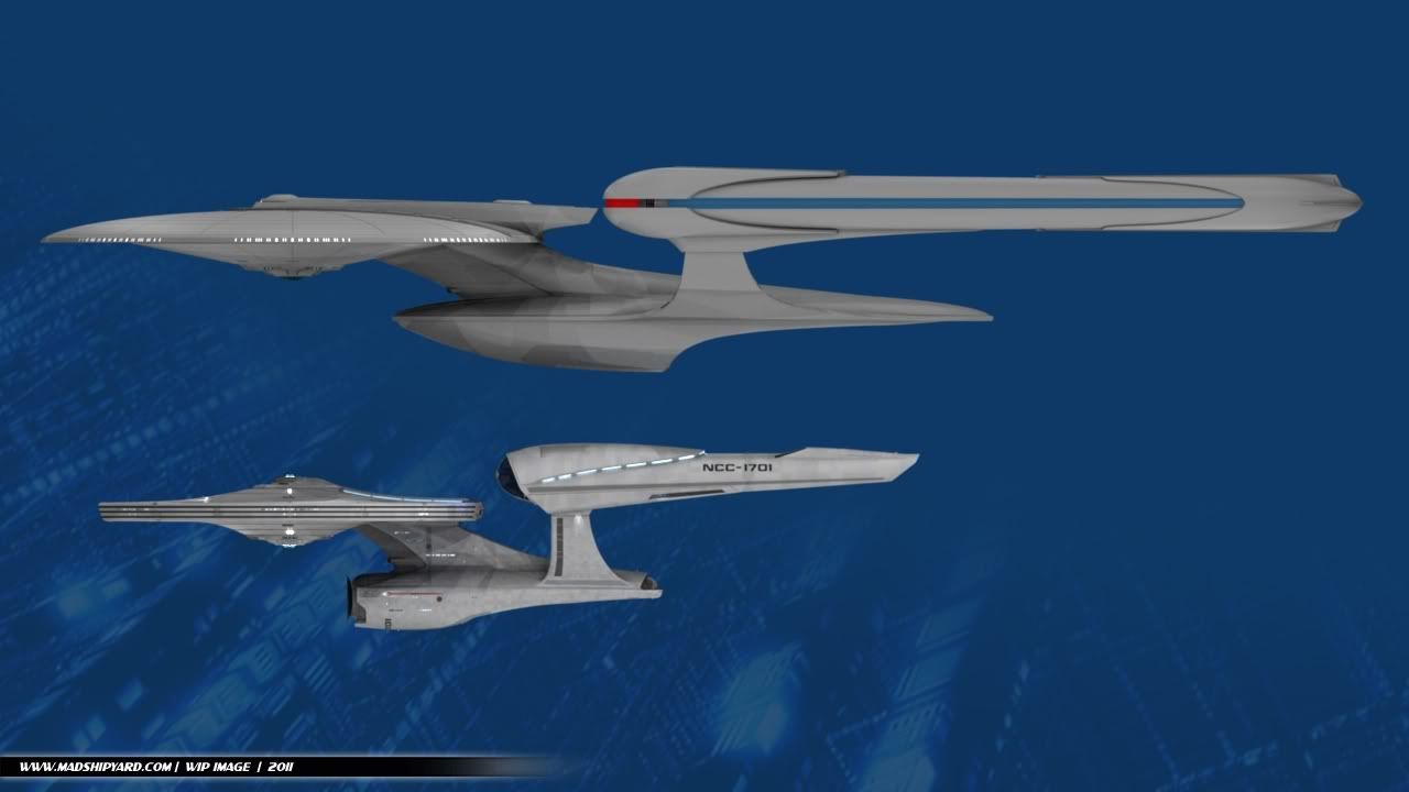
Even with the Ryan Church design as comparison it needs something more. I think it's repeating to much. The JJ style neck and it's goose back on engineering are supposed to be traits of the Constitution. So it's like it's really mimicking the original Enterprise not the excelsior. Excelsior is a platform design. All the ajoining parts are fitted tot he same level on the engineering hull. This doesn't beget that concept. The nacelles aren't over-sized like the JJstyle. There was a guy that did an excelsior JJstyle on the forums. It was pretty good. (I personally don't like Ryan Church's design at all though)
Thanks for all the comments, guys. Well, the idea here is to reference the 2009 Movie Style of the Enterprise, while keeping some of the same ideas of the real Excelsior. I get that you don't like this ship... I knew not everyone was going to. Of course, I'm still not finished yet... Which other other Excelsior are you talking about, though? The only one that I really saw was over at SFM, by "Don't Shoot". It was pretty cool, if not a little weird.
Those guys didn't like Probert's Enterprise Refit either - said it was "too hard to photograph right" or somesuch...
I think that was only because of the paintjob though, wasn't it? It messed up their green screen method, if I remember right.
This is the one I was referring to... http://www.scifi-meshes.com/forums/attachment.php?attachmentid=75218&d=1259932737 http://www.scifi-meshes.com/forums/attachment.php?attachmentid=75184&d=1259850401 It's neat, even if it is a little weird.
Yeah, that one is greeble-riffic. But I found another one in my Trek folder. It's a lot cleaner in terms of surface details, which improves the aesthetics.