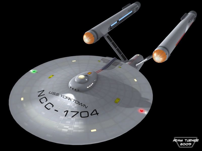
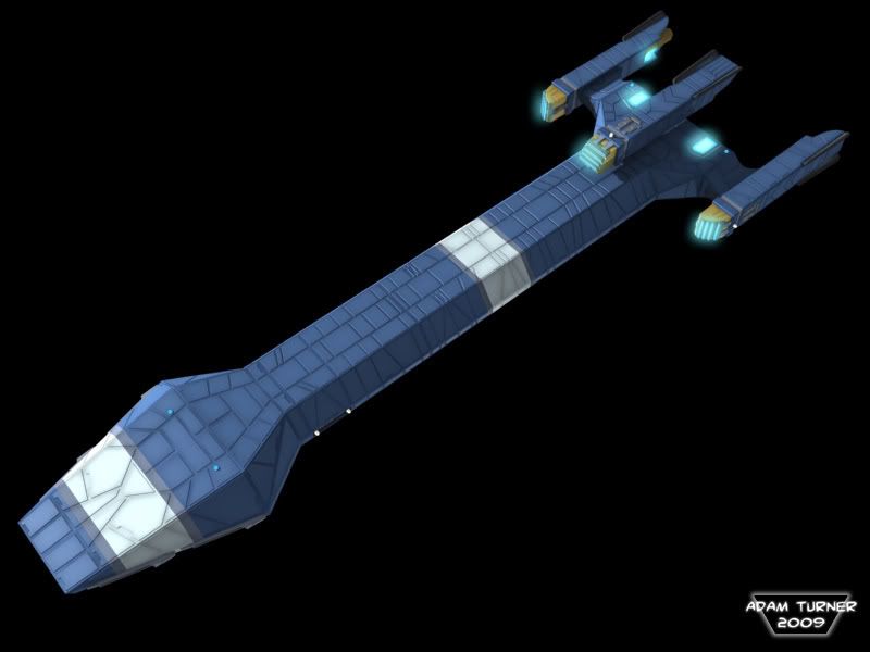
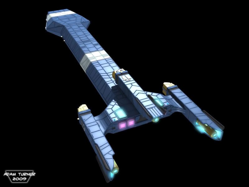
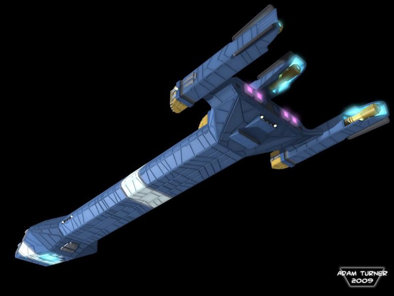
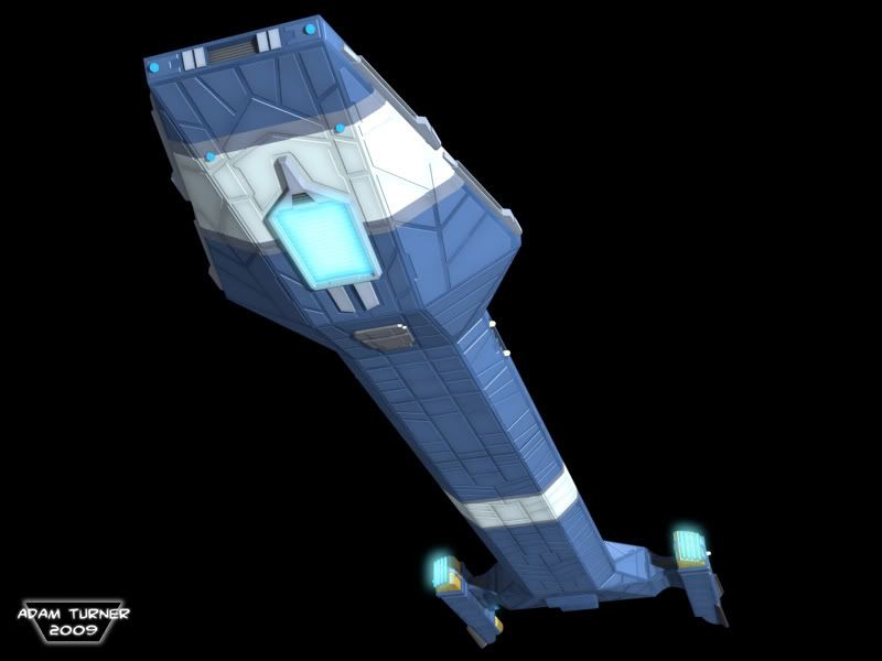
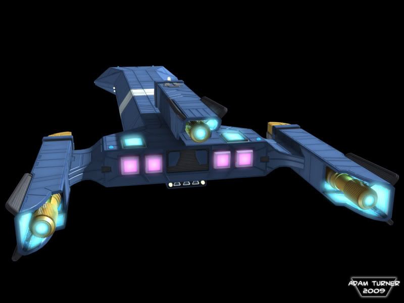
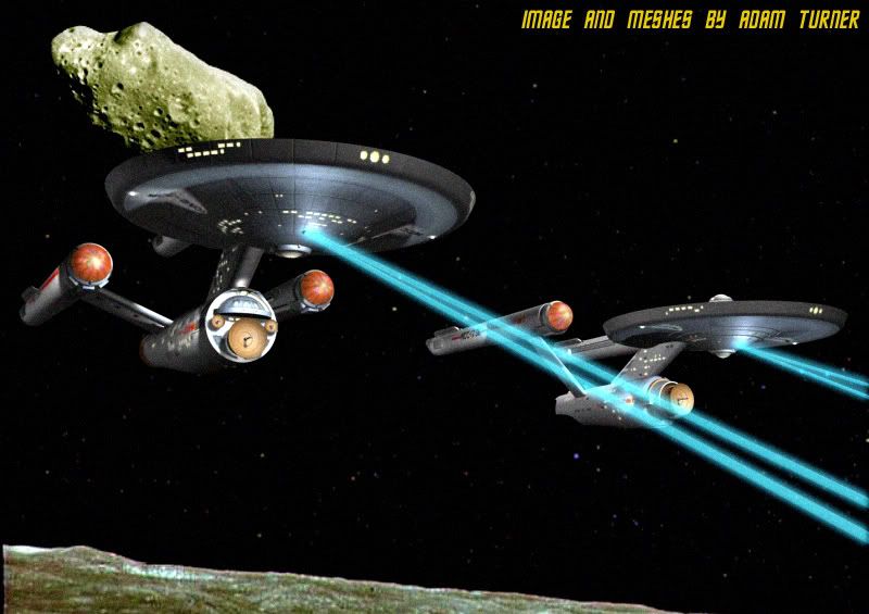
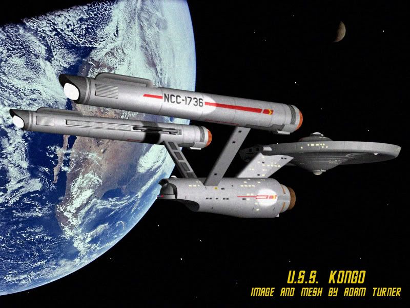
Hey guys. These are two models I've never been totally happy with, and recent projects for ADB have called for them, so I've decided to redo them both. Let me know what you think.
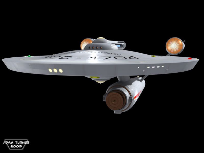
The Connie:

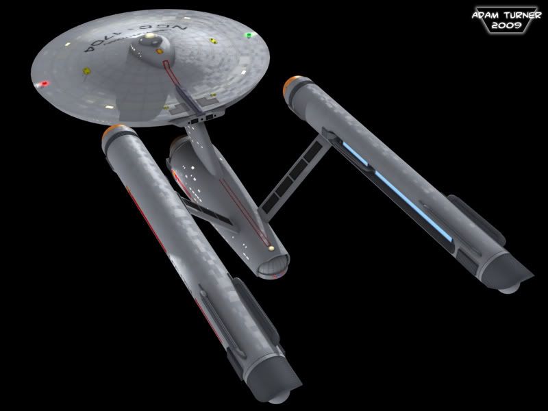
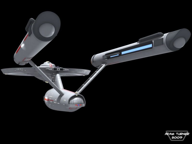
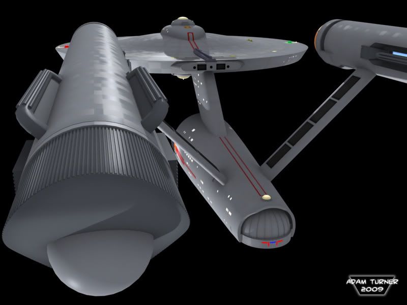

The Connie:


")
")

