The only way to do that right now is to rewatch Cage and WNMHGB and bask in the glory that is faded mustard, chokehold-blue, and puke peach. (IMHO, pale pastels just don't do anything for me. I blame my ADHD ferrets.)
The turtleneck quilting is nice, but the color hues are desaturated and bland.
Possibly made for b/w photography, but as even "Cage" was filmed in color I suspect they may have had a goal for Trek to be in color from the get-go to take advantage of the new color presentation technology, as a premiere top-tier series. Understandable, given its budget and investment
at the time. Then again, "Cage" has a more austere bridge set whereas WNMHGB featured the bold red trimmings, and maybe color wasn't a thought -- until the second pilot was made but they weren't going to spend any more money than utterly necessary because they already invested a ton and had one failed pilot but took another chance in hopes they'd recover. Okay, it's been 55 years later and I'd opine that by now they probably did recover, just about...

But the second pilot worked and they did the costume redesign into the technicolor wonderland that became iconic. And, yeah, given RGB additive processes, the use of red, green, and blue uniforms is almost an in-joke. But the green looked gold due to the lighting used, which is a bit of a hoot... (and Kirk got his second tunic, which was definitely a definitive green that stayed green no matter what temperature the light bulbs were. I'm partial to 6000K, myself...) Actually, the film stock used might be an influence as well; light color tints can alter the perception of a hue but film stock also plays a role. It's why, back in the day, portrait photography for people used Kodak whereas landscape photographers used Fuji. Kodak did better with the warmer tones, or placed more emphasis on those. Fuji was robust in the greens and blues for sure... Tools o' the trade and all that... nowadays it's just "megapixel myth"...

 The Enterprise captains just like swapping bridges.
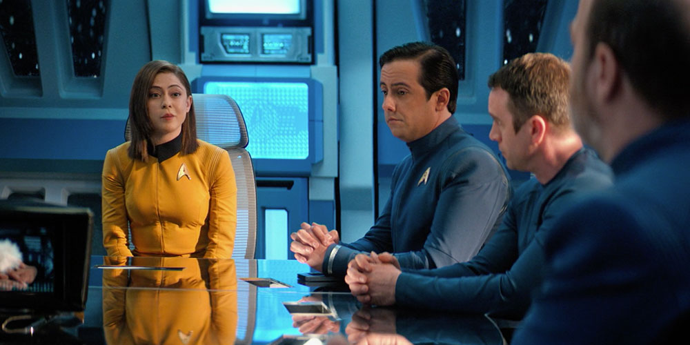

")
