• Welcome! The TrekBBS is the number one place to chat about Star Trek with like-minded fans.
    If you are not already a member then please register an account and join in the discussion!

I never noticed that before...Movie Edition

So, let me get this straight. Fans are fine with thinking the TMP jackets are a throwback to The Cage and that Saavik was the secret offspring of Spock and the Romulan Commander but nobody wants to consider that Kirk actually wanted Spock and McCoy to think he was actually referring to Sam when he talked about losing "a" brother once and spinning it to mean Spock?

Either they remembered the trivia or they didn't.
Well, that's different because...
 
35 minutes from the end of Shawshank and Tim Robbins is talking wistfully about his future, after prison, to which Morgan clamps him down by saying...

"THAT'S A SHITTY PIPE DREAM."
 
So, let me get this straight. Fans are fine with thinking the TMP jackets are a throwback to The Cage and that Saavik was the secret offspring of Spock and the Romulan Commander but nobody wants to consider that Kirk actually wanted Spock and McCoy to think he was actually referring to Sam when he talked about losing "a" brother once and spinning it to mean Spock?

Either they remembered the trivia or they didn't.

That he deliberately faked them out?
 
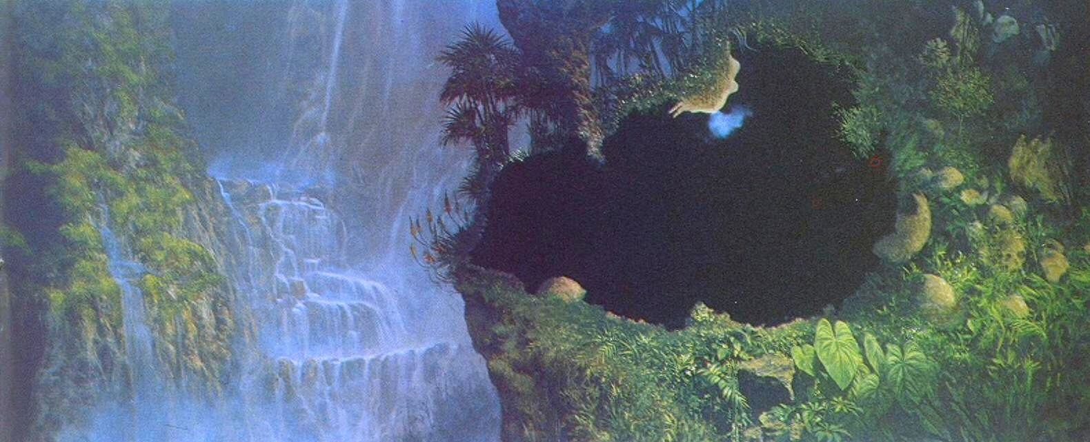
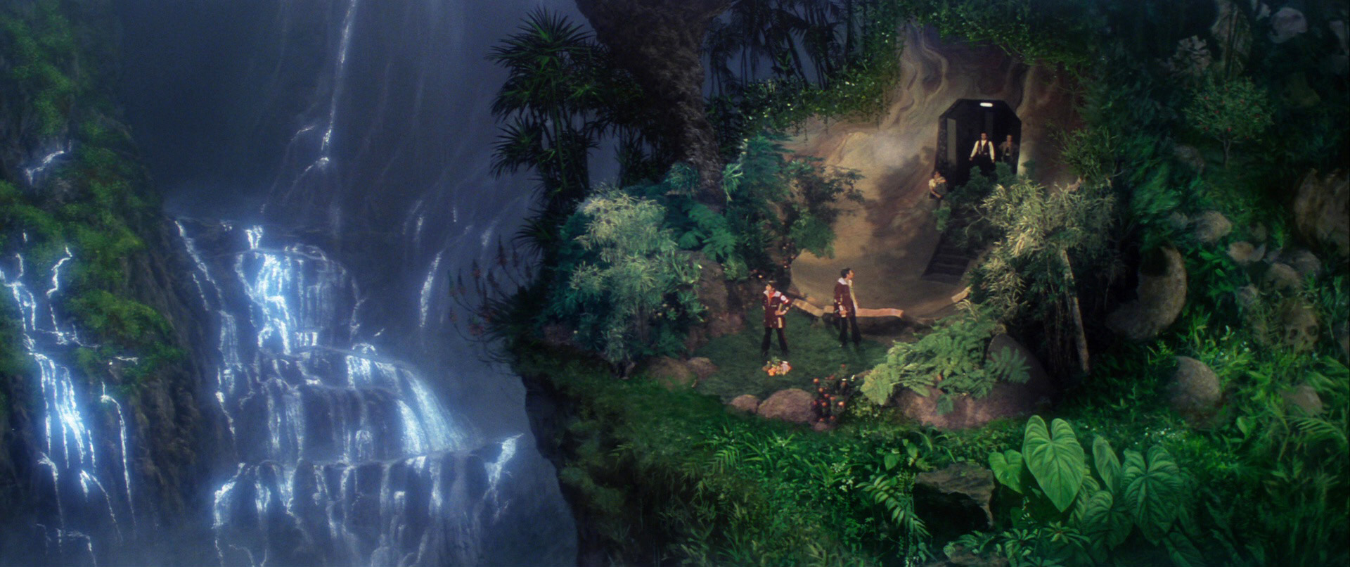
Giant human skulls on the right side of the matt painting for the Genesis cave:

EvGw6aBWQAEVo9s


EvGw7tlWYAYofU9
 
The colour schemes of “The Cage” and TMP are similar likely because the approach to their design was similar: make the control centre look like a credible far-future facility. And so you have this no-nonsense and businesslike facility that could be a combination of naval warship/submarine and futuristic NASA space control centre. The TMP bridge evokes “The Cage” bridge because both designers likely had the same general idea rather than thinking, “Why don’t we go back and update the original bridge idea?”

The TOS colour scheme was motivated primarily by wanting more colour onto the television screen, but by chance they created an environment that could well be more psychologically healthy for people in the long term by not having a drab area to inhabit. Colour has been shown to affect people emotionally. And note that successive bridge designs regained more colour through to TNG that went a step further and tried to make the bridge look exotic. Post TNG designs went back to trying to make it look more techie and businesslike. Then they simply made the bridge and other ship interiors look ridiculously dark—a place no one would want to work in long term.
 
And so you have this no-nonsense and businesslike facility that could be a combination of naval warship/submarine and futuristic NASA space control centre.

Everybody's uniform is classy business-suit colored (gray, brown, tan, etc). No pinstripes or bright colors. TNG is cubicle Trek. Later Trek, it's like they want to emphasize, "yup, we're really in space, not a building somewhere - look, everything's dark, like space and night."
 
Everybody's uniform is classy business-suit colored (gray, brown, tan, etc). No pinstripes or bright colors.
I don't think "classy business suit" with the TMP uniforms. I think "tacky '70s leisure suits." (Except for Kirk's Admiral uniform. That was sharp.)

Patton Oswalt gave the world's most succinct review of TMP in 2022 when he said, "It's oatmeal-colored uniforms on a gunmetal-colored ship. Everyone's in a bad mood. Nothing really happens." (TMP review starts at 2:35.)

To view this content we will need your consent to set third party cookies.
For more detailed information, see our cookies page.
 
Last edited:
Snarky off-the-cuffs remarks say nothing.

The original “The Cage” and WNMHGB era uniforms were likely based on the idea of turn-of-the-century merchant seamen’s attire: trousers with sweater like tunic. Make it look a bit sleeker and there you are: casual regular duty uniform in a shirt-sleeve environment. The oddity was they sported boots rather shoes. For landing party duty on an unknown planet surface boots make sense, but shipboard it doesn’t really. But to save costuming costs you stick with boots.

The TOS era uniforms updated the original design making it look somewhat sleeker and more futuristic along with added colour to help identify what division someone belonged to. Ideally there should have been a bit more variety in colour and a bit more added detail to designate which department someone belonged to but, again, we’re dealing with budget constraints so keep it simple.

TMP was meant to be the Star Trek concept writ large. There is a lot to admire in TMP, but one could also say fairly they might have tried to change too much. The new uniforms were meant to be an evolution of the TOS idea, but more sophisticated, more finished and with more detail. One could argue they got too detailed because the varying insignia colours and uniform styles were confusing without a playbook. It was never meant to be a “disco lounge suit.” Today’s naval and marine personnel can wear a shirt and trousers that are the same colour along with shoes. The main two-piece TMP uniform is meant to be a futuristic evolution of that. The idea of using a seamless or buttonless shirt/tunic suggests a futuristic look that has evolved beyond archaic fussing with button fasteners. These are clothes that are meant to appear seamless and largely wrinkle free.

The real oddity of the TMP design is the oddly cut tunic’s hem and the trousers integrating into the bootlets—both rather silly and needless ideas. But they were trying to suggest a futuristic fashion and that these uniforms were made of unusual futuristic fabrics, but unfortunately they had to use existing 1970’s fabrics.

A lot of perceptions regarding the look of TMP are based on repeated viewings of an unfinished and eventually faded film that wasn’t properly colour graded before it was initially released. When you look at the restored and finished 2022 DE version it looks very different and so much better. It’s not a colourless film at all. The other added element was completing the film’s audio track which restored so much background sound that either couldn’t be heard before or was absent because the film had not been finished. It all serves to create a very different ambience from the faded prints repeated on television for four decades.

TWOK-TUC outfits were a rejection of the previous look for Starfleet. Meyer wanted a militaristic look to go along with his submarine story. But a big part of the design was to veil the aging physiques of the TOS cast, particularly James Doohan (at the time). The previous uniform designs don’t work with less-than-ideal body forms—watch “The Deadly Years” and see how Commodore Stocker looks in his tunic.

TNG opted to return Starfleet’s look to something resembling an evolution of TMP and TOS blended together. One could make the case the TNG uniforms are closer to what TMP could and maybe should have done. Third season TNG brought back a bit more formality with it’s stiffer looking uniform redesign. Successive uniform designs were just variations of the third season TNG idea. Even DSC and SNW perpetuate this concept into their rebooted idea of the pre TOS era. ENT was supposedly a retro version of the DS9 style uniform.

Candidly this stuff is all over the map as every production team has sought to put their stamp on it rather than trying to remain somewhat consistent and coherent with what was previously established.
 
Last edited:
Candidly this stuff is all over the map as every production team has sought to put their stamp on it rather than trying to remain somewhat consistent and coherent with what was previously established.
Indeed, this is the case, as Star Trek is treated as an art to explore, rather than a period piece to replicate. And, as much as I dislike the beige of TMP the uniforms had good cut lines, but impractical detailing at times. TWOK was excess in the opposite direction, ignoring the simplicity of TOS and TMP in favor of the militaristic iconography of a more sea based uniform, closer to Horatio Hornblower.

Unfortunately, what is often ignored by all of these is the fact that in a uniformed service one size does not fit all. The various services have variety in uniforms precisely because ship board duty requires a different uniform, compared to ground or starbase service, compared to landing party duty, compared to using utilities for work, etc.

I think each does a decent job of representing a good stamp by the art department, but needs more variety.
 
Has anyone from the production of TMP confirmed that? Because if not, then it's not "certainly."

I am sure Robert Fletcher mentioned it in interviews. (And Richard Arnold at conventions in the 80s and 90s, although people hate it if I mention RA's name.)

in a uniformed service one size does not fit all. The various services have variety in uniforms precisely because ship board duty requires a different uniform, compared to ground or starbase service, compared to landing party duty, compared to using utilities for work, etc.

Gene R and Robert Fletcher both mentioned the variety of uniform variations in the US Coast Guard of the 70s as an example of what they were trying to achieve with the uniforms for TMP.

ENT was supposedly a retro version of the DS9 style uniform.

And an extrapolation from NASA's jumpsuits.
 
Last edited:
(And Richard Arnold at conventions in the 80s and 90s, although people hate it if I mention RA's name.)
Because Arnold had a persistent habit of presenting his personal opinions and interpretations as incontrovertible facts about the Star Trek Universe. That makes most of his statements about Star Trek suspect, IMO.

He consistently implied that everything that was good about Star Trek was due to Gene Roddenberry and ONLY Gene Roddenberry, even when he damn well knew better. And when it was something he personally regarded as "bad," oh of COURSE Gene had nothing to do with it!

When a fan wrote in to the Star Trek magazine asking about the character of Elias Vaughn from the DS9 novels, Arnold answered, "There is no such character as Elias Vaughn in the Star Trek Universe" instead of just saying something more factual, like "Although there is a character named Elias Vaughn in the recent DS9 novels from Pocket Books, the books are not considered canon to the filmed Star Trek Universe."

When Peter David was writing the Star Trek comic book for DC, Arnold told him howlers like "Captain Kirk is no longer interested in relationships with women" because Kirk hadn't had a major romance in the movies, and that the Gold Key Star Trek comics were what the DC comics should aspire to. On David's TNG novel Vendetta, Arnold insisted that were no female Borg because we hadn't seen one on TNG before that point. He wanted to make Michael Jan Friedman rewrite his entire novel Double, Double to remove Chekov instead of simply changing a Stardate. Arnold also commonly lied that all of his criticisms were coming straight from Gene Roddenberry himself, because he knew that would give more weight to his fannish opinions. He basically drove folks like Peter David, Diane Duane and Margaret Wander Bonanno away from writing licensed Trek fiction for years because they all got sick of dealing with his bullshit. The guy did a LOT of damage to the comics and novels in a short amount of time.

So yeah, I don't much care what Richard Arnold had to say about Star Trek. I don't consider him to be a reliable source.
 
Last edited:
It's sort of an indirect compliment to the makeup team, I suppose, if even TPTB couldn't figure out the genders of the actors playing the Borg...
 
If you are not already a member then please register an account and join in the discussion!

Sign up / Register


Back
Top