• Welcome! The TrekBBS is the number one place to chat about Star Trek with like-minded fans.
    If you are not already a member then please register an account and join in the discussion!

Spoilers General Disco Chat Thread

"I'm a soldier, not a diplomat. I can only tell you the truth."

SMG's thoughts about Burnham in Starfleet fits the idea of what Starfleet is intended to be in the 23rd Century. She'd carry that mentality forward with her in the 32nd Century.

It's really in the 24th Century that life on a Starfleet ship was shown as being more like an office job.

Janeway illustrates the differences between 23rd and 24th century starfleet in 'flashback'

It was a very different time, Mister Kim. Captain Sulu, Captain Kirk, Doctor McCoy. They all belonged to a different breed of Starfleet officers. Imagine the era they lived in: the Alpha Quadrant still largely unexplored… Humanity on the verge of war with the Klingons, Romulans hiding behind every nebula. Even the technology we take for granted was still in its early stages: no plasma weapons, no multi-phasic shields… Their ships were half as fast."
"No replicators. No holodecks. You know, ever since I took Starfleet history at the Academy, I've always wondered what it would be like to live in those days."
"Space must have seemed a whole lot bigger back then. It's not surprising they had to bend the rules a little. They were a little slower to invoke the Prime Directive, and a little quicker to pull their phasers. Of course, the whole bunch of them would be booted out of Starfleet today. But I have to admit: I would have loved to ride shotgun at least once with a group of officers like that."

The Alpha quadrant was a far rougher place in the 23rd century compared to the cultured and civilised 24th, and starfleet officers needed to be rougher as well.
 
This is interesting, they've now changed the font for 'Star Trek' in the title sequence, it's now the TOS Font.

The first 'airing' of Episode 1 used the same font as Seasons 1 and 2.

CBS has since gone back and fixed it, Netflix also has the corrected version. but Crave in Canada is still using the old version.

https://twitter.com/AleSTrek/status/1321149233240641538/photo/1
ElWqLk3WkAM1kNS.png


Picard used the TOS font in advertisements and on the Blu-Ray cover, but the title card used the Discovery font. Lower Decks uses the TOS Font.
 
Last edited:
I've been told that it was indeed a mistake and they didn't have time to fix it, but it was corrected in Episode 2.

RAMA

This is interesting, they've now changed the font for 'Star Trek' in the title sequence, it's now the TOS Font.

The first 'airing' of Episode 1 used the same font as Seasons 1 and 2.

CBS has since gone back and fixed it, Netflix also has the corrected version. but Crave in Canada is still using the old version.

https://twitter.com/AleSTrek/status/1321149233240641538/photo/1
ElWqLk3WkAM1kNS.png


Picard used the TOS font in advertisements and on the Blu-Ray cover, but the title card used the Discovery font. Lower Decks uses the TOS Font.
 
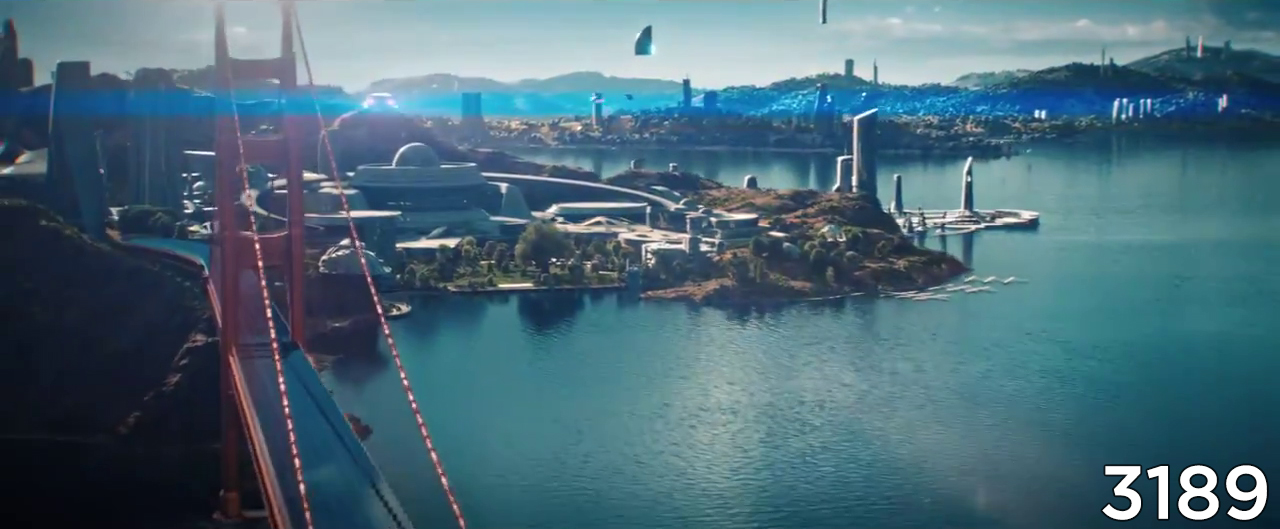
Quite a few changes there compared to the days of STP. Changes to the bridge, water has become land, and it looks like there are changes to the geography or landscaping to the right. Does it seem like there are fewer buildings overall? At first, I was surprised how much it didn't change, but now I'm interested in the ways it has.
How's the bridge different? I'm not really noticing anything
ElbuEBXXgAc6J9Z.jpg:large
 
@Tuskin38, I'm seeing now that it's just that the image quality is so poor. It looked to me like there was a kind of gateway over the bridge to the left, but now I see those are the same structures as the earlier days. Duly noted, too, about the solar panels that you mentioned to me a minute ago on the subreddit--I initially though those were jagged pixels. Hah.

I can't wait until we have something higher res to look at. It's somehow very exciting to get the first glimpse of Earth a thousand years in the future.
 
Quite a few changes there compared to the days of STP. Changes to the bridge, water has become land, and it looks like there are changes to the geography or landscaping to the right. Does it seem like there are fewer buildings overall? At first, I was surprised how much it didn't change, but now I'm interested in the ways it has.
The main difference that jumped out at ME is there seems to be more land in front of the building on the right........like they filled in about 50 yards.
 
I would be more impressed if they replaced the golden gate bridge with a completely different design, how many bridges last over 1000 year? Or its a replica for the tourists.
The solar panels should be gone, that would be so dated for 3100's, it would be like visiting a modern 21st century home in the West using candles for lighting. No one would expect it.
Its a shame SF headquarters have not moved to Mars or Delhi or the Moon after the great Quake of 2997 when California fell into the sea....

There is still a (continually rebuilt) Roman-era bridge in Rome, so I think the Golden Gate surviving isn't that strange, though it must be continually repaired by robots.
 
How's the bridge different? I'm not really noticing anything
ElbuEBXXgAc6J9Z.jpg:large
That because that is not San Francisco. It is right across from San Francisco. What your looking at, are Fort Baker. Behind Fort Baker is Sausaito CA. In the back ground is Beledere and Tiburon CA. The fort and those cities are in Marin County CA.
 
This is interesting, they've now changed the font for 'Star Trek' in the title sequence, it's now the TOS Font.

The first 'airing' of Episode 1 used the same font as Seasons 1 and 2.

CBS has since gone back and fixed it, Netflix also has the corrected version. but Crave in Canada is still using the old version.

https://twitter.com/AleSTrek/status/1321149233240641538/photo/1
ElWqLk3WkAM1kNS.png


Picard used the TOS font in advertisements and on the Blu-Ray cover, but the title card used the Discovery font. Lower Decks uses the TOS Font.
The more I look at it, the more I think the "Star Trek" should be black and the "Discovery" should be red. To make it pop out more.
 
Erm, people on reddit are already discussing episode 3. Is it out for the US already?

Edit: Nevermind. Saw the discussion thread just now.
 
Last edited:
The preview clip for E4 in the ready room is nice!
Culber's perspective on the crew's trauma...

31:20

To view this content we will need your consent to set third party cookies.
For more detailed information, see our cookies page.
 
SanFran.jpg

Cruise ship...OF THE FUTURE!!!

Even if it's a replica, it's beyond cool to see the Golden Gate Bridge still decorating the landscape.

It would have been sublime to have seen humpback whales frolicking in the water as the camera panned back, the perfect symbol of Starfleet and the Federation's legacy.
 
If you are not already a member then please register an account and join in the discussion!

Sign up / Register


Back
Top