• Welcome! The TrekBBS is the number one place to chat about Star Trek with like-minded fans.
    If you are not already a member then please register an account and join in the discussion!

Gazomgs Art & Images

Status
Not open for further replies.
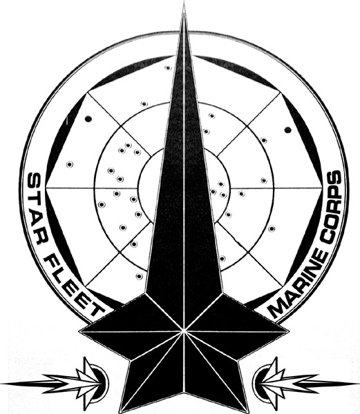
it was on the original image, that FASA made when they made stuff for star trek.

see here, the image I based it on :
latest
OOOHHHHH.....(long and exaggerated to show understanding) ;)

I kind of like the little stylized decal and was trying to visulize it as part of an assignment patch to represent Marine Corp members in duty uniforms.
 
you mean like the red squadron logo ?

The valiant crew wore the little star and delta seen in the red squad logo as a sort of pin.
Right. I was just imagining it as something goes inside the assignment patch, like for the Marine division.
 
if a logo exists in trek I try to make my version based on that, if however no logo exists like the naval fleet then I will tend to make my own usually in the circular or triangular form
I might try to mess with it. I'm not great at it (by far) but I basically imagined using that as the assignment patch designation for a Marine, like the command arrow or science circle inside the delta.
 
3 additions tonight
Fleet Operations Centre --- Logo's #2
Earth Base --- Logo's #2
Ashley Judd --- Celebrity Crew #1


http://gazomg-trek-art.blogspot.com/
That Fleet Operations Centre one turned out good. What are the graphics inside the logo?

Also, I am really enjoying the Crossover section. Not sure if you were familiar with the show Seaquest at all, but it had a bit of a Star Trek vibe to it. But, I might be the only one who remembers the show :D

Good work as always.
 
Never seen Seaquest, then never saw Star Wars, Firefly or a whole heap of stuff I did in the crossovers.

As for the centre of the operations logo, it was a simple pattern that I embossed and shaded. Its a pattern I use in countless logos, used the red version in the daedulus logo, the yellow version in the stargazer logo etc...i liked the pattern and with the right shading look like it has depth
I thought I recognized it. Still looks good.
 
There are some interesting collar variations on the Red Squad label.
- They could almost be a timeline of how the insignia changed over the years from the mid 23rd to the late 24th centuries.

That Cardassian logo is so beautiful and intricate, gazomg. I love what you've done with it.
Now, I'm just going back for another look at your UFP Naval Patrol logo (and probably the United Planets of 62 Cygni, too ;))...
 
That Wesley one really turned out.

Also, every time you update your site logo I go "I think that's my favorite one." Then the next one looks even better. Great work.
 
The Starfleet Academy logo looks great! And I've just noticed that fabulous Keiko O'Brien image in Random #1 - Is that a manip of Troi from Insurrection?
 
So great to see an Andorian on the bridge (Jeffrey Combs in "Whom Gods Destroy" - Retro Trek #3)!
 
I don't know who Jeff Kober is, but that's a great manip of him in the Disco away mission armour.
 
Cadet Tilly really suits the DS9 uniform - great work! And Worf should wear that Original Series dress uniform more often. Anson Mount Pike looks like he's lost a bit of neck, though - or is that just me? Nevertheless, he still looks good. Just not quite as good as Jeffrey Hunter Pike ;)
 
Status
Not open for further replies.
If you are not already a member then please register an account and join in the discussion!

Sign up / Register


Back
Top