^Thank you, I forgot about that scene.
-
Welcome! The TrekBBS is the number one place to chat about Star Trek with like-minded fans.
If you are not already a member then please register an account and join in the discussion!
You are using an out of date browser. It may not display this or other websites correctly.
You should upgrade or use an alternative browser.
You should upgrade or use an alternative browser.
Donny's Late TNG Era Interiors
- Thread starter Donny
- Start date
^Yes, it was, with a long corridor leading up to it.
You will see it in the near futureDid they ever show the E-E's Ten Forward lounge, I can't recall. I'd love to see it.
")
http://archive.frogland.co.uk/#15415146270067/15415146618489There was also the ballroom set in Insurrection, but was that a redress of the FC conference lounge?
^The above schematic shows the configuration of the banquet hall, which was indeed a redress of the observation lounge. The set was move away from the bridge by several feet, and expanded on the sides with changes to the overhead support beams, and an addition to the side support beams like those on the bridge. The port side tied into a small section of corridor, while the starboard side had a private communications alcove.
I'll get around to creating this banquet hall eventually, but for the E's Ten Forward, I have something more grand and original in mind.
I'll get around to creating this banquet hall eventually, but for the E's Ten Forward, I have something more grand and original in mind.
Fantastic news - hopefully with room for Guinan as well!
That crew lounge looked tiny, as if it would be more at home on the NX-01!
You will see it in the near future
http://archive.frogland.co.uk/#15415146270067/15415146618489
^The above schematic shows the configuration of the banquet hall, which was indeed a redress of the observation lounge. The set was move away from the bridge by several feet, and expanded on the sides with changes to the overhead support beams, and an addition to the side support beams like those on the bridge. The port side tied into a small section of corridor, while the starboard side had a private communications alcove.
I'll get around to creating this banquet hall eventually, but for the E's Ten Forward, I have something more grand and original in mind.
Didn't think of that. I always wondered about certain huge windows on the D, and the set of windows on the aft section of the secondary hull of Voyager.
Same hereLooking forward to seeing it!
I'll get around to creating this banquet hall eventually, but for the E's Ten Forward, I have something more grand and original in mind.
When the novels first started calling it “the Happy Bottom Riding Club,” I imagined it as being in the fantail (the bottom of the ship), but they were insistent enough on it being on the front of the ship that I’ve settled on imagining it’s what’s behind the windows on the ridge with the registry number on the bottom of the saucer. There’s also the bank of cutout windows behind that, but it seems like a bad choice for a big room, since all you’ll see is the cutout in the hull unless you’re right next to the window. But either way, it’s still on the bottom of something.
IIRC, Rick Sternbach's Enterprise-D blueprints show smaller lounges scattered around the ship (usually near clusters of living quarters); this would be consistent with those, but it's definitely a disappointment compared to Ten Forward or whatever we might imagine a similar space on the E-E to look like. (Kind of like how the E-E's Stellar Cartography room lacked the wow factor of the one we saw in Generations, or even the interesting layout of the Astrometrics Lab on VOY.)That crew lounge looked tiny, as if it would be more at home on the NX-01!
I'd forgotten Riker named it that in the novels.When the novels first started calling it “the Happy Bottom Riding Club,”...

Part of the problem with the movies is they blew so much of their budgets on things no one cared about instead of using it to expand of things we already had some familiarity with and might actually be interested in. TMP did it right where you got not just the regular sets of the Enterprise, but expanded on it with the Rec Deck and the airlocks, and whatnot. And then you also got to see cool stuff on Earth with Starfleet command, or something on Vulcan, etc. They fleshed out the established world and made it bigger and cooler. Sort of the epitome of the TNG movies doing it wrong, is finally making the Romulans a central element in a film (Nemesis) and then introducing the Remans and a bunch of new stuff that the audience has no prior connection with.
Spent the last day and a half generating the isolinear cards seen in the film. Here's a array of difference colors and the three different card holders we saw in the films. Translucency is always a pain to deal with in real-time, so a lot of tweaking to get everything just right. Note: this isn't an Unreal render, as Unreal's translucency isn't as good as in Marmoset, the tool I use to render out showcase images of props. They don't look as good in Unreal, but they're good enough for set dressing as long as you don't get too close.
Marmoset Render:
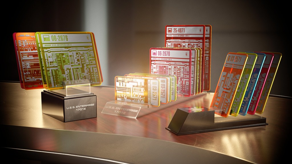
Unreal (notice, not as good looking, even with ray-tracing translucency turned on ):
):

These are the versions of the cards with rounded corners seen in Picard's ready room. I noticed that the chips/cards in scenes around the engine room, had square edges and the "header" graphic of each card was screen printed white/black instead of just silver. I did generate those cards for the day I do the engineering scenes, but they're not featured in the render above.
Marmoset Render:
Unreal (notice, not as good looking, even with ray-tracing translucency turned on
):These are the versions of the cards with rounded corners seen in Picard's ready room. I noticed that the chips/cards in scenes around the engine room, had square edges and the "header" graphic of each card was screen printed white/black instead of just silver. I did generate those cards for the day I do the engineering scenes, but they're not featured in the render above.
Last edited:
The addition of those really brings the set even more to life. One note, the ship's registry on the card holders are missing the dash between 1701 and E. Otherwise...perfection.
I'm guessing here, but if Donny put it that way, that's how they were on set.
@ashefivekay is correct and I appreciate her faith in meI'm guessing here, but if Donny put it that way, that's how they were on set.
. But I also appreciate you looking out, @Flux Capacitor! It is indeed 1701E on the prop, without the hyphen.http://startrekpropcollector.com/trekauctions/image.pl?76bda76a524d1e969d27e1c0b27aaee6
http://startrekpropcollector.com/trekauctions/image.pl?76bda76a524d1e969d27e1c0b27aaee6
There are no close-ups of the chip holder prop to the left that I know of, but I assume what was written on it was the same as the middle holder.
Damn but that's some fine attention to detail on those cards!Spent the last day and a half generating the isolinear cards seen in the film. Here's a array of difference colors and the three different card holders we saw in the films. Translucency is always a pain to deal with in real-time, so a lot of tweaking to get everything just right. Note: this isn't an Unreal render, as Unreal's translucency isn't as good as in Marmoset, the tool I use to render out showcase images of props. They don't look as good in Unreal, but they're good enough for set dressing as long as you don't get too close.
Marmoset Render:
Unreal (notice, not as good looking, even with ray-tracing translucency turned on
These are the versions of the cards with rounded corners seen in Picard's ready room. I noticed that the chips/cards in scenes around the engine room, had square edges and the "header" graphic of each card was screen printed white/black instead of just silver. I did generate those cards for the day I do the engineering scenes, but they're not featured in the render above.
Interesting bit of trivia about the 1701-E vs 1701E too, I wonder why it was never caught on set?
I also wonder how often Picard comes back into his Ready Room after a battle (or even a hard turn to port) and finds those carefully ordered cards spilled all over the floor...

I'm not sure it was a mistake. I figured it was a stylistic choice. But if it was indeed a mistake, the text was never seen clearly on-screen so probably wasn't worth fussing over to get it changed.Interesting bit of trivia about the 1701-E vs 1701E too, I wonder why it was never caught on set?
What do we think? Should I correct it and add a hyphen?
@ashefivekay is correct and I appreciate her faith in me
http://startrekpropcollector.com/trekauctions/image.pl?76bda76a524d1e969d27e1c0b27aaee6
There are no close-ups of the chip holder prop to the left that I know of, but I assume what was written on it was the same as the middle holder.
Interesting, I never knew that! As someone who proofreads a print publication as part of my job, my gut is telling me it was a mistake since there's no real reason to *not* include the hyphen. So I would vote to correct it.
Assuming that the stand was laser-engraved by a third party, it's a simple enough mistake to make and not one worth correcting given the size of the prop.I'm not sure it was a mistake. I figured it was a stylistic choice. But if it was indeed a mistake, the text was never seen clearly on-screen so probably wasn't worth fussing over to get it changed.
What do we think? Should I correct it and add a hyphen?
The cards on the other hand were probably manufactured by the props department.
Sorry, I side on the contrary positionInteresting, I never knew that! As someone who proofreads a print publication as part of my job, my gut is telling me it was a mistake since there's no real reason to *not* include the hyphen. So I would vote to correct it.

I like it as a "real world" Easter Egg

Sorry, I side on the contrary position
I like it as a "real world" Easter Egg
You could definitely look at it that way. For me, it'd be like if a client provides an asset with an error and I include it in my publication. Will anyone who sees the error know it was provided by the client that way or will they simply think that I made the error myself? But it's entirely possible I'm overthinking it in this particular case.
Similar threads
- Replies
- 0
- Views
- 302
- Replies
- 482
- Views
- 60K
- Replies
- 20
- Views
- 4K
If you are not already a member then please register an account and join in the discussion!