-
Welcome! The TrekBBS is the number one place to chat about Star Trek with like-minded fans.
If you are not already a member then please register an account and join in the discussion!
You are using an out of date browser. It may not display this or other websites correctly.
You should upgrade or use an alternative browser.
You should upgrade or use an alternative browser.
Donny's Late TNG Era Interiors
- Thread starter Donny
- Start date


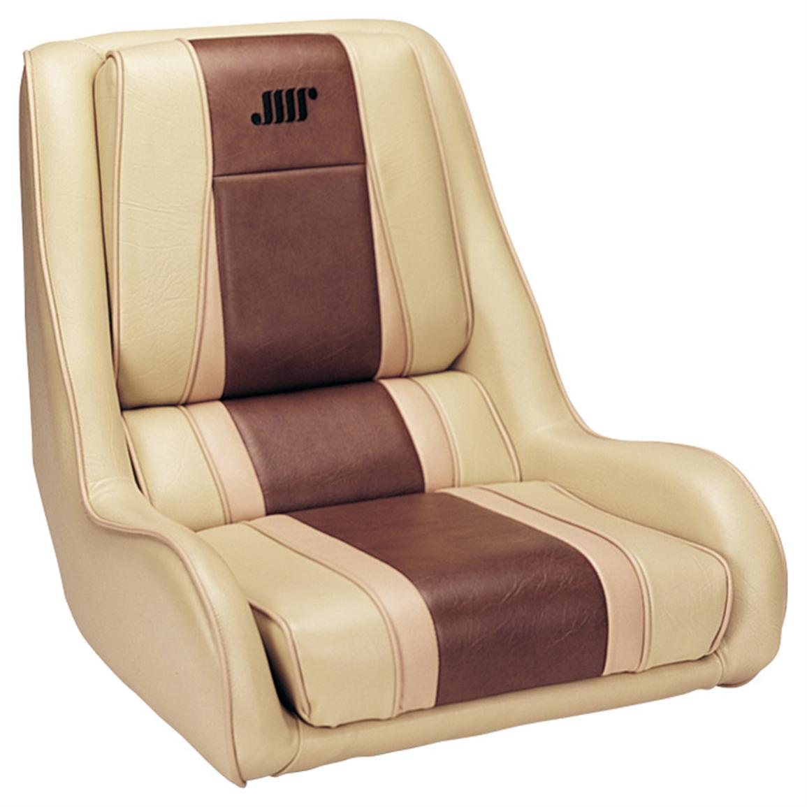
I never realized the conn/ops chairs were darker than the ones at the wall stations. Makes sense; the tan chairs would probably show up better under the darker lighting in those alcoves, while there's plenty of light in the center of the bridge.
I'm betting it was more of a choice at keeping all the chairs at the center of the room (conn/ops, captain, first officer, and counselor) maroon, while contrasting with the brown chairs at the side stations which blend into the background.I never realized the conn/ops chairs were darker than the ones at the wall stations. Makes sense; the tan chairs would probably show up better under the darker lighting in those alcoves, while there's plenty of light in the center of the bridge.
Last edited:
You should work at GM


Tried googling Helm seats to find something similar in shape but to no avail they do look like a boat seat that you could get commercially Great work by the way Donny.
By the way
Thanks, I didn't notice/realize that! I had thought the differences were due to either lighting or a change between movies and hadn't noticed they were both used at the same time.
I never realized the conn/ops chairs were darker than the ones at the wall stations. Makes sense; the tan chairs would probably show up better under the darker lighting in those alcoves, while there's plenty of light in the center of the bridge.
Thanks, I didn't notice/realize that! I had thought the differences were due to either lighting or a change between movies and hadn't noticed they were both used at the same time.
@Lt. Washburn You never cease to amaze me when you find this stuff.
Yes I would say your right on with that one ")
All right! After I posted images of the chairs yesterday, I immediately started modeling the conn/ops stations, which is the first of the strangely shaped free-standing consoles of the E bridge I've tackled. It wasn't as difficult as I thought it would be, but it was time-consuming. I powered through after finishing the model and got the display panel graphics generated as well.
Here's the First Contact version. In FC, all the free-standing consoles had dark green trim details.


In Insurrection, the green trim was removed and grooves were carved into the consoles in their place. Note, in the images below the console appears brighter/less saturated brown, but they're actually the same hue/value/saturation in both shots. It's just the bluer color of the lighting and that light reflecting differently that makes all the difference. I would've assumed the bridge was repainted in-between films if it wasn't for my lighting tests which have shown otherwise (the bridge WAS repainted for Nemesis, however).

This last image has some nostalgic TOS callback vibes to me

I'll be alternative between generating LCARS displays, modeling consoles, and modeling chairs for the duration. I think alternating between those task groups instead of trying to power through one group before moving onto the other is really helping me stay away from burning myself out on this one.
Here's the First Contact version. In FC, all the free-standing consoles had dark green trim details.
In Insurrection, the green trim was removed and grooves were carved into the consoles in their place. Note, in the images below the console appears brighter/less saturated brown, but they're actually the same hue/value/saturation in both shots. It's just the bluer color of the lighting and that light reflecting differently that makes all the difference. I would've assumed the bridge was repainted in-between films if it wasn't for my lighting tests which have shown otherwise (the bridge WAS repainted for Nemesis, however).
This last image has some nostalgic TOS callback vibes to me
I'll be alternative between generating LCARS displays, modeling consoles, and modeling chairs for the duration. I think alternating between those task groups instead of trying to power through one group before moving onto the other is really helping me stay away from burning myself out on this one.
I had no idea the bridge was repainted for Nemesis. Although every time I watch the movie something about the bridge appears...off? Something about the LCARS colour scheme, the lighting in general or just the way it was shot doesn't seem right. Which was a shame as the bridge design is one of my favourite in all of Trek.
Last edited:

Ninja'd. Donny' work is amazing as always but definitely not one of my favorite helm/nav setups.Those Conn/Ops consoles really wrap around snuggly, don't they!
I wonder if any trainee crewmen accidentally knocked any controls with their elbow?
Was this a design attempt to make the bridge appear more claustrophobic and "battle ready", perhaps?
All of these images look so real that I'd swear the bridge set was still standing somewhere and Donny was just letting himself in to take photos! 
One thing that's ways amused/perplexed me with console size is how the E-D and E-E had such small conn, ops and tactical stations compared to the likes of Voyager or the Defiant. I'm guessing that has to do with ship size, smaller ships need larger consoles to handle more functions whilst larger ships can spread them out to other crewmembers elsewhere on board.
One thing that's ways amused/perplexed me with console size is how the E-D and E-E had such small conn, ops and tactical stations compared to the likes of Voyager or the Defiant. I'm guessing that has to do with ship size, smaller ships need larger consoles to handle more functions whilst larger ships can spread them out to other crewmembers elsewhere on board.
The stripes were green? I keep learning new stuff all the time. Or I'm color blind.
^I always thought they were black art tape. Must be a lighting thing. They definitely look classier with the stripes carved into the consoles.
I always thought it was black too. But careful study shows that it was indeed a dark blue/green. Here's a shot with a color sample I took added for demonstration (after creating the below image, I think I could go a little greener in my render now):The stripes were green? I keep learning new stuff all the time. Or I'm color blind.

I personally like the contrast of the dark green stripes. which harmonize with the green of the carpet and the slight tinge of green the light panels have in that film.^I always thought they were black art tape. Must be a lighting thing. They definitely look classier with the stripes carved into the consoles.
Last edited:
Similar threads
- Replies
- 0
- Views
- 343
- Replies
- 482
- Views
- 61K
- Replies
- 20
- Views
- 4K
If you are not already a member then please register an account and join in the discussion!