• Welcome! The TrekBBS is the number one place to chat about Star Trek with like-minded fans.
    If you are not already a member then please register an account and join in the discussion!

Does TOS Still Look Futuristic to You?

^This.

If one wishes to make something look "futuristic", why would one endeavor to make it look "contemporary"?

Logical.

The contemporary design influence was the problem with TNG's sets; the earth tones, leather seats and structures out of a 1980s Sears catalog were not in keeping with the "futuristic" design sense established in TOS, and carried over to the TOS movies.

I believe the perception problem for some in this thread is confusing the post 2001 utilitarian design (or Star Wars' oft-mentioned "lived in" look) with being "futuristic" when the two design senses are not necessarily represented by the other. Take the Spindrift from Irwin Allen's Land of the Giants--the design is not at all born of the ultilitarian school of thought responsible for 2001, but it had an organic, "futuristic" look (for its time) that does not appear to be the most plausible in a strict, science fiction sense.

For this--and many reasons, the TOS interiors still play as being from another time, where the technical influences of today fell out fashion by the time of TOS (in other words, no bulky International Space Station-like structures).
 
The Klingon ship has more in common with Streamline Moderne than Deco, but it's really neither. There's some Googie architecture in some of the matte paintings.
Here's a great site for seeing actual Deco and Moderne.
The Streamline Moderne or Art Moderne style is generally considered a later phase of Art Deco, the earlier phase being Zigzag Moderne.

The Klingon battlecruiser had elements of both styles in surface treatment if not in overall form.

1304070841440114.jpg
 
The Klingon ship has more in common with Streamline Moderne than Deco, but it's really neither. There's some Googie architecture in some of the matte paintings.
Here's a great site for seeing actual Deco and Moderne.
The Streamline Moderne or Art Moderne style is generally considered a later phase of Art Deco, the earlier phase being Zigzag Moderne.

The Klingon battlecruiser had elements of both styles in surface treatment if not in overall form.

This is fascinating. I never thought of the Klingon ship in these terms, but there it is.

The 1920s and 1930s designs were meant to convey beauty, luxury, and sunny optimism, but Matt Jeffries smuggled them into a sinister, menacing alien ship. Neat!
 
I wish people would stop using "art deco" to describe things which aren't. Nothing much in the original Star Trek is art deco.
Of course, I didn't mean it literally, but more figuratively. Art Deco is a fairly abused term, used to apply to a wide range of design motifs that are either fully or partially influenced by the design aesthetics of the 20's and 30's. The phasers and communicators have rather minimalist qualities with various line accents that are similar to the streamline/minimalist motif of the Art Deco period. Remember Dax saying "I love classic twenty third century designs. Black finish, silver highlights." That silver metal center line wrapping around the black body of the communicators certainly echos a minimalist design.
 
Sorry, except for the bit around the neck those other grills and details are too generic to too many styles to say art deco to me.
 
Does anyone know if Wah Chang designed the BoP or manufactured it from Jefferies' design? I have never seen a Jefferies sketch for the BoP, so I assume the former.

I think the design stays close to the requirements of the script -- a stolen Starfleet design. It's a saucer extended to support the nacelles without a secondary hull, with pylons shaped to look like the wings mentioned in the dialogue. Vaguely Art Deco/Streamline Moderne but really more Googie in its saucer and rocket cues.
 
By "bird of prey," do you mean the battlecruiser (also known as the D-7)? I'm pretty sure that's a Matt Jefferies design.
 
I don't believe any Star Trek television show or feature film feels truly futuristic, with the possible exception of Star Trek: The Motion Picture.
 
Wah Chang built the Romulan ship, yes. I don't know if anyone ever turned up a Jefferies sketch of it.
 
Last edited:
Each Star Trek bridge has looked pretty futuristic to me at the time it was produced with the exception of STAR TREK (2009). That's the only bridge that felt over designed and focused on aesthetics over function.

Its the only bridge that seemed dated straight away and I'm not talking about the spotlights.

In fact I liked everything about that movie apart from the production design. To me, it didn't create a believable universe, which tended to pull me out of the movie.

Tough titties,

That movie was sour dreck or a satre wreck. Take you're pick.

Another interested unrelated note, while the SFX were good in TMP, I find some of the fan film SFX better than Trumble's jumble, er, space jungle. Also anybody notice the symbolic metaphor of the words V'ger and it's predassessor, Nsa? Maybe Admiral Probert would know.
 
I wish people would stop using "art deco" to describe things which aren't. Nothing much in the original Star Trek is art deco.

Most of my few complaints about the refit track back to Abel's art director Richard Taylor wanting art deco incorporated ... hence the saucer rim lines, which scale-wise actually hurt the look, and some of the nacelle detail, which is I think based on an old car (and looks lousy compared with the TOS big spinning ball nacelles, for me at least.)
 
Most of my few complaints about the refit track back to Abel's art director Richard Taylor wanting art deco incorporated ... hence the saucer rim lines, which scale-wise actually hurt the look, and some of the nacelle detail, which is I think based on an old car (and looks lousy compared with the TOS big spinning ball nacelles, for me at least.)

I'm not sure what "rim lines" you're referring to. Do you mean the horizontal stripes that encircle the outer edge of the saucer?

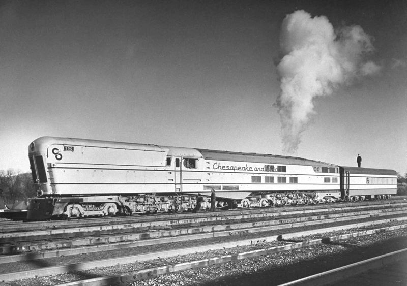
The TMP refit nacelles were based not on a car, but a once-futuristic locomotive:

ArtDecoCO12_zps7ef4c178.jpg


What I'm not too crazy about is that the front end of each warp nacelle bears a cross that looks like "the" Cross, which is way out of place unless the ship was launched by United Federation of Presbyterians or something.
 
If you are not already a member then please register an account and join in the discussion!

Sign up / Register


Back
Top