• Welcome! The TrekBBS is the number one place to chat about Star Trek with like-minded fans.
    If you are not already a member then please register an account and join in the discussion!

Design the Next Enterprise

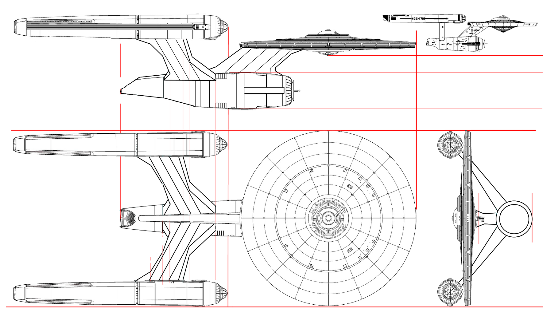
Irishman: We had this discussion about three years back when Gabriel Koerner suggested essentially dressing up the 1701 but dividing it into twice the number of decks, miniaturizing the windows, and calling it bigger. In a thread on this forum, I remember Koerner suggesting that this improved the 1701 design by giving it, as he described them, bigger breasts.

I responded then (or if I didn't, I should have) that a well-engineered, artistically considerate design suggests to the eye automatically the size that it is. You can't just inflate a good design to double or triple the size and suggest that it fits. Bernd Schneider on Ex Astris Scientia posted a wonderful discussion on why, after the latest Trek movie was produced, the guys who boasted how great it was that the new 1701-XI was double its original size, were just blowing smoke. Putting together all the visual cues, including deck divisions, Schneider demonstrates that Ryan Church had no obvious intention to make 1701-XI significantly larger than it ever was.

(Besides, the interior designers placed all the important rooms within 30 yards of one another anyway: sickbay's down the hall from the bridge, turn right instead of left and there's the transporter room, and just downstairs is the brewery. But that's another tangent.)

In short, if you're making your ship triple the size, you need to present some degree of engineering that justifies the expansion. I like the '66 Ford Mustang too, but I wouldn't triple its size and call it a Freightliner.

DF "Although There Were Times During the Last Snowstorm I Could Have Used a One-third Scale Freightliner" Scott

I'm not quite sure what I've said that you're arguing against.

Can you clarify?
 
Dammit, when is Vektor going to post his design? I am anxious to see it and the deadline is almost upon us!
 
Suggesting that the Excelsior is "perfection that can't be improved upon" is hyperbole to say the least. It's not that attractive or interesting a design, nor is it particularly well thought-out.
 
Wow... I must say, I really do like that. I'm not sure about the deep secondary hull, but I DO like the general design... great work!
 
Not sure what to tell you. I drew it as if viewed through a fairly wide-angle lens, which is one way of giving an object a sense of "big-ness." I think it works rather well.
 
Okay, mine has been posted:

http://www.startrekonline.com/enterprise/gallery?share=1335

Can't say that the resized and resampled image on the site really does it justice, but oh well. Now that it's been submitted, maybe I'll take a chance and post the hi-res original on my Website in the next day or two.

Good luck, everybody!

I don't like the four Nacelles...(I think they should be combined on each side to be one nacelle or too look like the halves of one nacelles.

Other than that....I think we have a winner. Good Job.
It's unique, powerful and extremely elegant in it's one fascinating way.

My congratulations Vektor. Much better looking than my ship.
 
It's not that attractive or interesting a design, nor is it particularly well thought-out.
I think beauty is in the eye of the beholder and for a fictional ship in a fictional setting I find nothing wrong with how it was thought out.

Vektor - beautiful art as usual. I like how you had the engineering hull undercut actually cut into the saucer as well. Wish I had done that on mine!

Entry 1322 is a very nice piece of art, though I am not sure I like the design so much.
 
Well, this is about as good as it gets for my design - I'm running out of time to enter the contest, my digital skills are limited, I'm trying to learn how to use brand-new-to-me Apple compatible programs since I cant use my PC stuff on my Mac, yada yada yada.

So I cleaned it up a bit. I'm going to try adding some more details here and there, change some things that don't work the way I want, when my brain ain't so fried...


newprise-81.jpg
 
Suggesting that the Excelsior is "perfection that can't be improved upon" is hyperbole to say the least. It's not that attractive or interesting a design, nor is it particularly well thought-out.

I happen to like it.
 
It's not that attractive or interesting a design, nor is it particularly well thought-out.
I think beauty is in the eye of the beholder and for a fictional ship in a fictional setting I find nothing wrong with how it was thought out.

Vektor - beautiful art as usual. I like how you had the engineering hull undercut actually cut into the saucer as well. Wish I had done that on mine!

Entry 1322 is a very nice piece of art, though I am not sure I like the design so much.

Indeed he took certain directions I wouldn't have thought of.
 
I don't like the four Nacelles...(I think they should be combined on each side to be one nacelle or too look like the halves of one nacelles.

If you look at the Heavy Cruiser category on the STO website, all of the existing ship models have four nacelles. I don't know for sure that the new Enterprise is supposed to be a heavy cruiser but that's the assumption I'm making.

My congratulations Vektor. Much better looking than my ship.

Actually, your design is probably my favorite. Not including my own, of course. ;)
 
I don't like the four Nacelles...(I think they should be combined on each side to be one nacelle or too look like the halves of one nacelles.

If you look at the Heavy Cruiser category on the STO website, all of the existing ship models have four nacelles. I don't know for sure that the new Enterprise is supposed to be a heavy cruiser but that's the assumption I'm making.

My congratulations Vektor. Much better looking than my ship.
Actually, your design is probably my favorite. Not including my own, of course. ;)


I tell you what though, Magellanic Class just doesn't fit ship's look.
 
My take.
http://www.startrekonline.com/enterprise/gallery?share=1302

The larger version of the image from my website:

http://infinityreach.multiply.com/photos/album/2/Infinity_Reach_Galleries#photo=179

Applied Jefferies design ethic and kept the exterior smooth as was necessary, deciding the technology was advanced enough that nothing would be visible unless utilized - i.e., concealable windows, hatches/escape pods, most of the weapons emplacements (except for the forward section of the main pylon, a bit of deception there), maneuvering-units. Why give an opponent cues on firing at what might be critical areas of the ship? My opinion is that the main/nacelle pylons are not the weakest point of any of the Enterprise designs, since these are part of the keel itself; having built one for my TOS Enterprise, can vouch for such a structure. (In one of the TNG novels, Picard once turned the Enterprise-D ninety degrees along the longitudinal axis and smashed the main pylon through another ship like an axe-blade. "Ramming speed!")

Took the styling cues for the primary-hull from my Navarone design (a much converted Lunar Models Excelsior kit I'm still working on), and my Discovery for the engineering hull/nacelle arrangement. Started as a series of sketches - some were really out there, very fluid designs but decided to make it more functional. Did the final design in a quick one-night stretch.
 
If you are not already a member then please register an account and join in the discussion!

Sign up / Register


Back
Top