• Welcome! The TrekBBS is the number one place to chat about Star Trek with like-minded fans.
    If you are not already a member then please register an account and join in the discussion!

deg3D_TOS.5 Enterprise

Re: deg3D_"Standard orbit Mr. Sulu."

Your shot reminds me (at least a little) of some of the stock "classic" shots of the Enteprise, like this one.

It would be fun to see some of the "classic" shots reproduced, with your new models. Same goes for Vektor's.
I think we need to see a recreation of the Battle of the Mutara Nebula between deg3D's Enterprise and Vektor's Enterprise. :evil::techman:
 
Re: deg3D_"Standard orbit Mr. Sulu."

Beautiful!
Wow. I am amazed at how talented you folks are. I would love to do this kind of thing, but I'm no good with 3D stuff.


J.
 
Re: deg3D_"Standard orbit Mr. Sulu."

Thanks very much guys. :)

Your shot reminds me (at least a little) of some of the stock "classic" shots of the Enteprise, like this one.

It would be fun to see some of the "classic" shots reproduced, with your new models. Same goes for Vektor's.

Well, speaking for my own TOS.5 E, I have many classic shots in mind to reproduce with her grace Wingsley. ;)

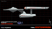
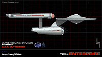
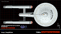
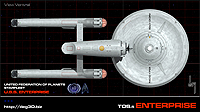
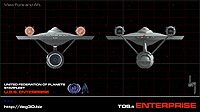
But for now, the stats and orthos...

All linked shots are: 1956 x 1100


FYI for my fellow Trekkers, there are lots more detail shots on my website (albeit half-size @ 978 x 550), and now that the stats, orthos, and detail shot(s) chores are out of the way, more E scenography will be comin'...

deg

It's only a model. - Patsy, Monty Python and the Holy Grail
 
^ incredible work, really!!

Although 4 shuttlecraft seems quite low

Thanks alot dude. :)

The number of SC was lowered by me, as per actual spacial capacity to actually fit a number of SC in her. Trek always "fudges" stuff, and I am trying to keep it more in-line with reality with that number eh. Think of it as just another TOS.5 re-fit detail eh. :)

deg
 
BTW, just for the sake of opinion, and future editing once things speed-up, what are your guy's thoughts on the bussards? And no worries, I've probably already heard it or somethin' like it in my own head already eh. :)

For the record, the bussards are the one area I am not 100% liking, and will be revisited as they have actually kinda been abandoned for now, as modo (the 3D program I use) is just kinda lacking in its ability to do what it is that I want, at least inexpensively render-time-wise. And as it is, I have kinda come to the end of my rope waiting on renders for a simple enough effect that I could do in LightWave. Who knows, maybe I will just redo it in LW at some point, but that's just more work (of another variety) on the project. Ah, throw it on the pile eh. :)

As it is, all the SSS (sub-surface-scattering) and other crap I had to do to even get close to a frosted glass look takes so long forever and a day to render just tests so I can just see what is going on.

And the red, I'm not thrilled with the 80's Trek look of the bright red eh. Bit too garish perhaps. Plus with that color, it reminds me a lot of a hot electric-stove burner. I can't shake it. I will come back to them at some point and hopefully modo 401 (the new version coming in not too long hopefully) will have come up with some less-expensive alternatives for achieving the frosted glass efx.

Arrrrgghhh, ya just get to the point ya know sometimes, ya just can't even look and/or want to look at it again. Thus the idea of revisiting later... LOL :)

Thanks for your input(s) guys. :)

deg
 
deg3D, I've never been fond of the glowing bussards in the first place. I always thought it looked like a gimmick effect rather than something rationally thought about. Why should bussard collectors glow in the first place, and shouldn't they have openings for collection? And if they're reactor domes (as I always believed), then why on earth make them out of materials that are transparent to the enormous energies released? Doesn't that put the primary hull decks closest to them at some risk? Isn't it wasteful letting some of that energy escape as light?

Vektor's project drove this home for me. His gorgeous nacelles are tipped with copper and they look outstanding. Simple, clean, and functional.

Here's a few experiments I'd do if I were in your shoes:
If they're bussard collectors ... make the domes out of a metallic mesh of some sort and light it from within with a plasma of superheated interstellar gasses that swirl and fade from a dull red up through blue-purple and into white-hot.

If it's a reactor, leave the caps opaque, but put a detail at the side that suggests a circular vent around the base of the dome that perhaps lets just a little light escape and might illuminate the domes a bit with reflected light.

If it's a space/energy sink (ala Franz Joseph), then maybe a clear dome is justified, perhaps with coils visible beneath with "St Elmo's fire" dancing over the components and a white light sensor dome immediately up front.

[shrugs]

On the other hand, just stick pinwheels in there and make sparkles of interstellar love and joy spill out of 'em and I'm sure you'd still do a fantastic job.
 
I'm not a fan of the red domes either. As for yours:

-There is something about the interior details that, when viewed from the front quarter, create the optical illusion that the domes are concave in the center and not convex.
- the domes are 30-50 foot in diameter. add some detail to reflect this size. they don't look as huge as they are supposed to be. (they remind me of the old glass-domed indicator lights found on electrical equipment of the mid 20th century.)
-If you believe Matt Jefferies early designs, these and not some never-seen warp core were the source of power on the ship. Some eye candy to reflect this choice by the original designer wouldn't hurt.
-not really about the domes but the three "cowling" pieces under each nacelle seem odd with the solid black ends. maybe some detailing here to break up the solid black?

Otherwise a tremendous job; I really like the choices you've made on what to change and what to leave untouched.
 
Thanks very much guys for those excellent suggestions. And while I agree with the "concept" of solid opaque domes, that is leaving the Trek universe and its art direction at bit too far behind for me.

While the glowing domes may not be the most realistic conceptualization of the bussard collector or ramjet, I feel a Trek starship without them would be lacking the glowy "eye-candy" that I have come to expect, and do enjoy for that matter. Plus, it breaks up all the plain metal and adds contrast and interest to the ol' gal IMO.

Science Fiction is just that, fiction, and as such, it often goes for what looks cool, over what may or may not be more plausible. So the opaque concept is most definitely out for me. It just kills any "life" the ship design has.

The domes themselves I never really thought of as the actual collectors themselves. Those were more like plasma churning chambers, with the three collectors or ramjets being below them. I actually did build the churning hardware detail into their interiors, with the new vanes attached to those four spokes entering the forward end at the center of the field coils' core so-to-speak (not to be confused with the warp core, as that is in engineering I believe), and thus spinning the core(s) to churn the plasma through the rest of the field coils. My whole idea was to show the actual mechanism that was working away inside the domes, churning the plasma flow.

I was just watching In a Mirror, Darkly last night and I must say, the old efx is not as dated as I had come to think of it as. It actually looked quite nice in those shots. Who knows, maybe I will revert to the old standard with the "sparkles of interstellar love and joy." LMAO, good one dude. :D

Still for now, I think I will just let it simmer in my subconscious for a while, and see what it can come up with on its own. After a while, with spending all one's time thinking about it, creative flow can tend to become blocked and sometimes just walking away for a while can help get things moving again. To do by non-doing, as the Tao puts it.

But I wil take all your excellent ideas with me as I do. Thanks very much for your inputs guys, always good to hear what other Trekkers have to say in regard to Big E eh. :)

deg
 
I guess I am chiming in a bit late, and I know my thought is probably too far off your art-thoughts, but for me, I would do glowing blue on the nacelle's forward dome, on the inboard grilles, and on the aft dome or vents (take your pick). It suggests the nacelle as a somewhat self-contained reactor system, which is my personal preference, and I think it looks pretty cool.

I should know soon enough. I am having a model built to my specifications that will be done with a blue nacelle forward dome...

Rob+

Ha, ya know what Rob, blue being my fav color, I have been in the process of trying out that look. It seems a bit less garish, and more in line (IMO) of the color that warp plasma would be, and more mechanically realistic overall in a sense.

The only draw-back is loss of contrast, as in my mind's eye I can see the blue just falling into the background of the ship's overall grayish color. I will check to see what it looks like though. :)

BTW, who is building your model eh? Is it practical or CG?

Thanks for your thoughts on E. :)

deg
 
Ha, ya know what Rob, blue being my fav color, I have been in the process of trying out that look. It seems a bit less garish, and more in line (IMO) of the color that warp plasma would be, and more mechanically realistic overall in a sense.

Indeed... my thoughts exactly.

The only draw-back is loss of contrast, as in my mind's eye I can see the blue just falling into the background of the ship's overall grayish color. I will check to see what it looks like though. :)

Any chance you'll post what it looks like? :)

BTW, who is building your model eh? Is it practical or CG?

Thanks for your thoughts on E. :)

Practical. Over on another thread, CaptainHawk1 offered to build one for me, so I sent him the kit. It will still be a few weeks until it is done, I would imagine. Interestingly, I am using the same 'decals' as you (except UES instead of USS, and a UESPA logo instead of the boomerang... the ship is the Constellation, BTW)

Rob+

EDIT - The only other thing I'd suggest about your model is doing the dish in copper... and possibly backlit...

I had the same two dish suggestions on another forum, and this was my response:

Na, not a big fan of the orange color, never was. And with the lights added to the sides and back of the nacelles I felt I had reached the overall limit to tastefully using that effect, so I stuck with the more traditional feel for the dish.

I did do a render test on the blue bussards, and as much as I love the color blue, it just doesn't work for me on the bussards.

As I mentioned before, I was just watching In a Mirror, Darkly last night and I must say, the old efx is not as dated as I had come to think of it as. It actually looked quite nice in those shots.

So I am indeed giving the old standard with the "sparkles of interstellar love and joy" a try with my own slight changes to the vanes. They are the traditional 12 spoke pin-wheels, but I changed their spoke edge profile shape just a bit. I must say, I think I am liking the bussards much better now.

I will post the blue version for you a bit later. ;)

deg
 
The rejected blue bussards test:


deg

I definately have to say that I love it! I think it looks great. About the only thing I would probably do differently would be alter the cap to eliminate the ability to see the framework inside the nacelle and have a roiling energy about it, much like the Enterprise-E bussards.

Thanks for posting it, though... I love the fact that you are using the same font-style that I am going for on my TOS model... I'll post pics when it arrives.

Rob+
 
Well, glad you like it Rob. When it's desaturated a bit I tend to like it more, as it's less garish...


Oh, and I like seeing the works inside eh. :)

Look forward to seeing your practical. :)

deg
 
The rejected blue bussards test:


deg
I think this looks great. When you get around to the new effect, I am curious to see what THAT would look like if it was done in shades of blue/green.

Anxiously awaiting more pics. :)

-=MadMan1701A=-
 
If you are not already a member then please register an account and join in the discussion!

Sign up / Register


Back
Top