• Welcome! The TrekBBS is the number one place to chat about Star Trek with like-minded fans.
    If you are not already a member then please register an account and join in the discussion!

deg3D_TOS.5 Enterprise

deg3D

Captain
Captain
Peace and Long Life to All. :)

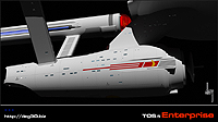
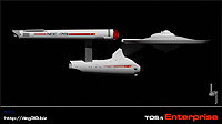
Ah TOS E, my life-long love affair with her (although I love all Es, just TOS E the most). Yet, given the day-and-age I decided to give her a bit of an industrial design upgrade/face-lift.

I am not changing any of her beautiful lines (no need IMO), the fantastic clean esthetic that Matt gave us, that I love sO much, but I am tweaking her parts a bit to bring her up-to-speed with today's level of more realistic detailing.

She is still a WIP, with about 70% of her modeling now done. The main hull/saucer detailing is pretty much all that is left to do (modeling-wise anywho), then on to painting...

Hope you like her as much as I do (and if not, that's cool too), and nice to meet a fellow bunch of Trekkers. :)

deg

It's only a model. - Patsy, Monty Python and the Holy Grail

My TOS.5 Enterprise... (click on thumbs for larger versions)



Last edited:
very cool, looks great! :D
flamingjester4fj.gif
 
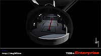
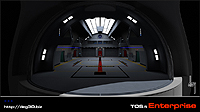
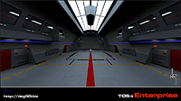
The interior of the hangar deck looks rather TNGish. Is that on purpose?

Interesting work on the nacelles. I can't wait to see you bring the saucer details out.
 
Thanks guys. :)

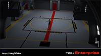
...but I could do without the naked man. :)

LOL, he's just my 6' 1" scale dude NiteTrek, but he should probably get his uniform from his quarters at some point though. He'll be put on report until he does. :)

The interior of the hangar deck looks rather TNGish. Is that on purpose?

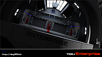
The shuttlebay is based on TOS (basic structure) and TMP(s) (mostly V, detailing and deck lines), a kinda hybrid of the two Wingsley. While I love TNG, I'm not a huge fan of the art direction of that period. Not enough to actually build something from it anywho. And TNG is a bit too far of a leap into the future to incorporate that style into my TOS.5 take.

Thanks again guys. :)

deg

It's only a model. - Patsy, Monty Python and the Holy Grail
 
Last edited:
Interesting work on the nacelles.

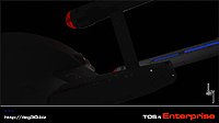
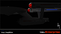
Here's a closer look at each end of the nacelles.

Always liked the end globe, just never liked the way it was mounted, kinda just stuck onto the end. And the Christmas tree bussards are a tad out-dated IMO.

deg

It's only a model. - Patsy, Monty Python and the Holy Grail

 
Very nice :bolian:. I,too, like what you're doing with the nacelles, and the general approach of updating the iconic lines without simply replacing them with new forms.
 
Astonishing work, deg3D! I'm drooling over this beautiful ship!

I love what you did with the nacelles. Also, the hangar deck looks very cool!
 
Thanks guys, that means a lot coming from other hard-core Trekkers. The true acid-test IMO. :)

Love the "Mirror Brain" avie BTW Ptrope. :techman:

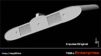
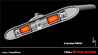
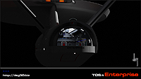
Here's a closer look at my updated impulse engines.

deg

It's only a model. - Patsy, Monty Python and the Holy Grail

 
I'm really enjoying this superdetailing of the original shape. For the most part, I think what you've come up with fits rather well.
 
Peace and Long Life to All. :)

Ah TOS E, my life-long love affair with her (although I love all Es, just TOS E the most). Yet, given the day-and-age I decided to give her a bit of an industrial design upgrade/face-lift.

I am not changing any of her beautiful lines (no need IMO), the fantastic clean esthetic that Matt gave us, that I love sO much, but I am tweaking her parts a bit to bring her up-to-speed with today's level of more realistic detailing.

She is still a WIP, with about 70% of her modeling now done. The main hull/saucer detailing is pretty much all that is left to do (modeling-wise anywho), then on to painting...

Hope you like her as much as I do (and if not, that's cool too), and nice to meet a fellow bunch of Trekkers. :)

deg

It's only a model. - Patsy, Monty Python and the Holy Grail

My TOS.5 Enterprise... (click on thumbs for larger versions)


VERY nice!

And that hangar deck rocks, even though it's not strictly faithful to what's shown onscreen. :techman:
 
Last edited:
I agree with everyone here.
This looks gooooooood.

My favorite updated part, so far, is the front of the nacelle.
 
And that hangar deck rocks, even though it's not strictly faithful to what's shown onscreen. :techman:

That's what I like about it. What's the purpose of someone creating yet another exact duplicate of the Enterprise? You've seen one, you've seen them all. I think it's great that people take the basic ship and incorporate their own ideas/improvements into it.

That hanger deck rocks!! Would love to see it on screen. :techman:
 
Thanks guys. :)

...even though it's not strictly faithful to what's shown onscreen.

Indeed, as NiteTrek shared in his POV, it's not my intention to build a 3D model of the series' practical filming model, or rather a model of a model. The shuttlebay, like the whole ship's neo-detailing is my concept, based on classic E, with TMP(s)' Es influencing and thus dovetailing back in time into some of the aspects of her detailing upgrades.

Of note, the shuttlebay in the end will probably be tweaked color-wise, losing the garish bright 60's palette colors, and I may lose the blue side landing lights in lieu of putting lighted landing strips into the actual deck itself. Still, with tractor-beam shuttle landing procedures, there not really a point and I like to keep things as realistic as my industrial design sense in able to conceive of extrapolating sci-fi ideas into reality. We'll see about the blue lights, they may be binned altogether...

A big pet-peeve of mine is stuff that doesn't look like it serves any logical mechanical purpose. I like to make stuff look (as much as I can) like it would actually "work" and serve a purpose as opposed to just looking sci-fi cool for the sake of sci-fi cool. I have had to hold back from some stuff, lest I wander off down the E "re-imagined road," and that I do not want to do, as I love E basically as she is, and there is a reason for her inspiring that feeling in me: she's beautiful, in her less-is-more, sublime, and graceful design esthetic, IMO. :)

This is the main reason, for the first time, that I feel a fear in my heart about new and incoming Trek, this based on the "bloated" new E design glimpsed in the trailer. Her grace is gone IMO. Even in all the previous films and series (of which I have never missed one single second of any-and-all Trek, not one second from day one, 09.08.66), while refitting her, they always retained/maintained her graceful lines. The new E looks like a bloated beast with those fat nacelles IMO. More and bigger is not better as far as I am concerned, esp. when it comes to E.

Out of all the "new" Es on the net (aside from my own that is) I really like Vektor's subtle upgrade version of E the best, but even that is a tad too much IMO, case in point, the sweeping of the nacelle struts. In my view, there's no reason for it (other than an esthetic change, and I think I have been clear on what I think about TOS E's existing esthetics), as there's no drag in space. And Gabe's was a nice take, but again, a bit too much for me personally.

But to each his own vision eh. The spice o' life IMO. :) I always enjoy seeing other artist's competent and considerate "re-envisioning" takes on E. However, for me, I just want to maintain her wondrous, timeless, and iconic profile while re-tooling her detailing to bring her into the 21st century (relatively speaking).

Oh yeah....can't wait to see the bridge!! Use a naked female this time! ;)

I'll see what I can do about a gal. ;)

deg
 
Last edited:
Hiya, Deg!

Beautiful, sir, just beautiful! I do so like what you have done with the nacelle caps and your updated impulse engine detail is excellent.

I agree with NiteTrek....."Use a naked female this time!"

;)
 
Thanks guys. :)

...even though it's not strictly faithful to what's shown onscreen.

Indeed, as NiteTrek shared in his POV, it's not my intention to build a 3D model of the series' practical filming model, or rather a model of a model. The shuttlebay, like the whole ship's neo-detailing is my concept, based on classic E, with TMP(s)' Es influencing and thus dovetailing back in time into some of the aspects of her detailing upgrades.

Of note, the shuttlebay in the end will probably be tweaked color-wise, losing the garish bright 60's palette colors, and I may lose the blue side landing lights in lieu of putting lighted landing strips into the actual deck itself. Still, with tractor-beam shuttle landing procedures, there not really a point and I like to keep things as realistic as my industrial design sense in able to conceive of extrapolating sci-fi ideas into reality. We'll see about the blue lights, they may be binned altogether...

A big pet-peeve of mine is stuff that doesn't look like it serves any logical mechanical purpose. I like to make stuff look (as much as I can) like it would actually "work" and serve a purpose as opposed to just looking sci-fi cool for the sake of sci-fi cool. I have had to hold back from some stuff, lest I wander off down the E "re-imagined road," and that I do not want to do, as I love E basically as she is, and there is a reason for her inspiring that feeling in me: she's beautiful, in her less-is-more, sublime, and graceful design esthetic, IMO. :)

This is the main reason, for the first time, that I feel a fear in my heart about new and incoming Trek, this based on the "bloated" new E design glimpsed in the trailer. Her grace is gone IMO. Even in all the previous films and series (of which I have never missed one single second of any-and-all Trek, not one second from day one, 09.08.66), while refitting her, they always retained/maintained her graceful lines. The new E looks like a bloated beast with those fat nacelles IMO. More and bigger is not better as far as I am concerned, esp. when it comes to E.

Out of all the "new" Es on the net (aside from my own that is) I really like Vektor's subtle upgrade version of E the best, but even that is a tad too much IMO, case in point, the sweeping of the nacelle struts. In my view, there's no reason for it (other than an esthetic change, and I think I have been clear on what I think about TOS E's existing esthetics), as there's no drag in space. And Gabe's was a nice take, but again, a bit too much for me personally.

But to each his own vision eh. The spice o' life IMO. :) I always enjoy seeing other artist's competent and considerate "re-envisioning" takes on E. However, for me, I just want to maintain her wondrous, timeless, and iconic profile while re-tooling her detailing to bring her into the 21st century (relatively speaking).

deg

This is a great point of view, respectful of what made the original model iconic in the first place, and yet not ignorant of the needs of the big screen or HD-TV to provide additional layers of detail and scale.

I'm increasingly intrigued by the notion of a massive anti-modern Trek artistic campaign, that instead of again and again trying to translate the TOS design into some Star Wars-ified ubership clotted with purposeless detail, takes all the other designs from modern Trek and renders them with the Jefferies aesthetic of "less is more".

I suspect that would require some real artistic skill to pull off, and is the reason we see it done so rarely.
 
If you are not already a member then please register an account and join in the discussion!

Sign up / Register


Back
Top