Ok, so the purpose of the various symbols used on different uniforms during TOS was to denote the ship an officer was assigned to. Common-ish knowledge, decent enough concept. What that doesn't explain though is the absolutely batshit crazy design of some of them. I can sort of see the simplicity of the Exeter design, and everyone loves the iconic arrowhead (I should imagine), but what the hell was the Constellation design about? Or that off-centre arrow for Defiant? Or the vaguely-rear-end shape of the Antares? And what is it about a squiggly line that says "Constellation", assuming it wasn't just the Admiralty deciding "the hell with it, go crazy, design me a patch that looks like a rear end".
-
Welcome! The TrekBBS is the number one place to chat about Star Trek with like-minded fans.
If you are not already a member then please register an account and join in the discussion!
You are using an out of date browser. It may not display this or other websites correctly.
You should upgrade or use an alternative browser.
You should upgrade or use an alternative browser.
The Defiant had the arrowhead of the Enterprise in the episode The Tholian Web, What they did in In a Mirror, Darkly was a retcon.
It's unclear how the patches actually related to various ships. Some Starbase personnel actually wore the Enterprise arrowhead as well.
It's unclear how the patches actually related to various ships. Some Starbase personnel actually wore the Enterprise arrowhead as well.
And what is it about a squiggly line that says "Constellation", assuming it wasn't just the Admiralty deciding "the hell with it, go crazy, design me a patch that looks like a rear end".
Props-wise I'd guess the main mandate was just to get them done in time for the shoot and make them impossible to mistake for each other by the viewer.
Personally I actually loved the wacky assignment patches and missed them in later incarnations of Trek...
I like them well enough, even if the designs are crazily abstract and there's no way in hell to tell what ship they represent if you don't already know.
The "rear end" comment is actually referring to Antares' patch, which literally looks like a rear end. Best. Patch. Ever. At least from a kooky viewpoint.
The recent novel Rise of the Federation: A Choice of Futures postulated that the different symbols originally represented the different species' fleets which merged to become UFP Starfleet, with the arrowhead belonging to the UESPA.
The "rear end" comment is actually referring to Antares' patch, which literally looks like a rear end. Best. Patch. Ever. At least from a kooky viewpoint.
Yeah, I never noticed it from quite that angle before...

The "rear end" comment is actually referring to Antares' patch, which literally looks like a rear end. Best. Patch. Ever. At least from a kooky viewpoint.
Yeah, I never noticed it from quite that angle before...
It could also, if you squint, be a particularly impressive set of a certain element of female anatomy, but I think the rear end is more innocuous in that respect.
Although that might be common-ish knowledge, here's some information which isn't so commonly-ish known:
http://www.startreknewvoyages.com/?p=2329
(Because of a glitch on our website, you might have to hit your Refresh button after clicking the link.)
http://www.startreknewvoyages.com/?p=2329
(Because of a glitch on our website, you might have to hit your Refresh button after clicking the link.)
Ok, so the purpose of the various symbols used on different uniforms during TOS was to denote the ship an officer was assigned to. Common-ish knowledge, decent enough concept. What that doesn't explain though is the absolutely batshit crazy design of some of them. I can sort of see the simplicity of the Exeter design, and everyone loves the iconic arrowhead (I should imagine), but what the hell was the Constellation design about? Or that off-centre arrow for Defiant? Or the vaguely-rear-end shape of the Antares? And what is it about a squiggly line that says "Constellation", assuming it wasn't just the Admiralty deciding "the hell with it, go crazy, design me a patch that looks like a rear end".
All of the patches, I believe, from the original series were hatched from the fertile mind of Bill Theiss.
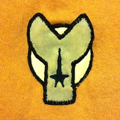
The Constellation patch (to me, at least) seems to be an "art deco-ish" concept of a planet-like heavenly body (not one of the female guest stars that Kirk seduced) traversing the galaxy. The Exeter Patch seems to be the 'blazed paths' between five heavenly bodies...
By the way, the Enterprise patch seems to be a stretched, rotated and off-center version of the Federation pennants seen on the sides of the ship. The Defiant patches seen in "In A Mirror, Darkly" seem to be a different type of off-shoot of the pennant.
Although that might be common-ish knowledge, here's some information which isn't so commonly-ish known:
http://www.startreknewvoyages.com/?p=2329
(Because of a glitch on our website, you might have to hit your Refresh button after clicking the link.)
Now that is a fascinating read.
I notice when I saw various Phase II episodes that Phase II does use separate emblems. I take it that's a decision to follow visual canon, not behind the scenes edicts?
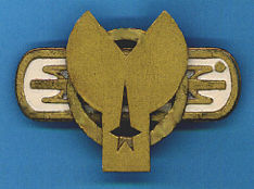
One thing also regarding the Starfleet Command, Constellation and Exeter patches: They're all made with different materials than the gold fabric and black stitching of the Enterprise patch.
The Constellation has the gold fabric, but it also has a lace webbing and silver stitching.
The Exeter has a flat brown fabric, with silver fabric disks.
The Starfleet Command patch is a plastic flower thingy that to this day apparently is sold in craft stores.
It's always disappointing to me to see other assignment patches that fans create that simply mimic the design concept of gold fabric/black stitching ala the Enterprise patch. And most of the designs seem to just be random shapes or blobs just thrown together without rhyme or reason.
Be more creative, fans, please! Think outside the box like Bill Theiss did! He had no money, so he got his ideas and designs using bargain basement sources... why not try his tactics and see what original ideas bubble up in your own fertile minds?
Ok, so the purpose of the various symbols used on different uniforms during TOS was to denote the ship an officer was assigned to. Common-ish knowledge, decent enough concept. What that doesn't explain though is the absolutely batshit crazy design of some of them.
Well, the non-Enterprise ones were basically found objects of clothing, jewelry or whatever, snipped into somthing that looked interesting and fututistic or "spacey." But who can say they don't have some reason or meaning in-universe, and we just don't know what it is? Not every symbol has to be representational, either. The symbol for the US Navy's Medical Corps, for instance? An oak leaf with an acorn on it. Nothing that really says "medicine" about it, but it's the symbol and that's that.
The yellow marks on the red pennants on the sides of the ship were actually a boomerang like shape with rounded points. Hmm, boomerang on red...we hope you come back?By the way, the Enterprise patch seems to be a stretched, rotated and off-center version of the Federation pennants seen on the sides of the ship. The Defiant patches seen in "In A Mirror, Darkly" seem to be a different type of off-shoot of the pennant.

You may also enjoy our other recent conversations on this topic:
Exeter Patch
Constellation Patch
Starfleet Command Insignia
Divisions, Insignia, Uniforms and Assignment Patches
Exeter Patch
Constellation Patch
Starfleet Command Insignia
Divisions, Insignia, Uniforms and Assignment Patches
Last edited:
Only one of those links works.You may also enjoy our other recent conversations on this topic:
Exeter Patch
Constellation Patch
Starfleet Command Insignia
Divisions, Insignia, Uniforms and Assignment Patches
Always test your links!
")
The prime universe used the arrowhead as the fleet standard, the Defiant in the mirror universe ( IAMD ) was from a different universe than the prime, IMHO.The Defiant had the arrowhead of the Enterprise in the episode The Tholian Web, What they did in In a Mirror, Darkly was a retcon.

The prime universe used the arrowhead as the fleet standard, the Defiant in the mirror universe ( IAMD ) was from a different universe than the prime, IMHO.The Defiant had the arrowhead of the Enterprise in the episode The Tholian Web, What they did in In a Mirror, Darkly was a retcon.
Huh?
Only one of those links works.
Always test your links!
I did. I musta messed something up when I took out the red highlight on "patch"
Fixed them.
You may also enjoy our other recent conversations on this topic:
Exeter Patch
Constellation Patch
Starfleet Command Insignia
Divisions, Insignia, Uniforms and Assignment Patches
All of the patches, I believe, from the original series were hatched from the fertile mind of Bill Theiss.
Yep, and a fan artist for Bjo Trimble's "wheel cover" Concordance had interpretations of these, plus insignias from TAS and a few originals.
When I was creating a fanfic set post-TMP, and then realising the insignia for my various Starfleet uniforms, I counted all the sides of the polygons used for the various insignias and realized there were no seven-sided insignias (yet), so I created this one for the USS Hood:
USS Hood insignia badge by Therin of Andor, on Flickr
USS Hood insignia badge by Therin of Andor, on Flickr
If you are not already a member then please register an account and join in the discussion!