• Welcome! The TrekBBS is the number one place to chat about Star Trek with like-minded fans.
    If you are not already a member then please register an account and join in the discussion!

Comparing Notes at the San Francisco Yards

David cgc

Admiral
Premium Member


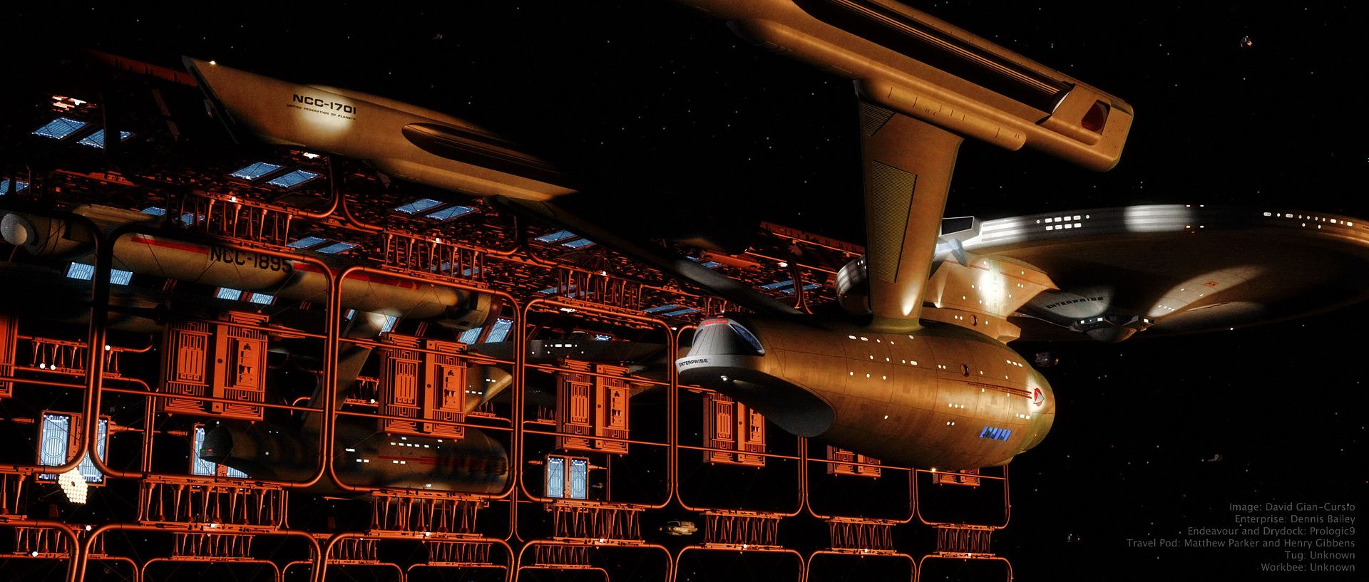
Having some time to return to Lightwave and a truly spiffy new model of the TMP drydock which was just released by its modeler, I decided to address an image bunny which had been itching me for a while. Namely, I'd wanted to do a take on this Andrew Probert painting with the Enterprise reflected pre- and post-refit. I ultimately remembered a photo from 1912 of the Titanic and her sister ship Olympic side-by-side at the repair yard and decided to do something similar.

In this case, the newly-upgraded Enterprise has returned to Earth so the engineers of the U.S.S. Endeavour can get some practical experience with the new designs as they begin to refit their own ship.

I colored the main light as if the sun had just set at that moment. It gives the picture a bit of a sepia tone. It also explains why the image is so grainy, because the photo had to be taken at a very high ISO since there was no more direct sunlight. ;) I pulled the colors from this photo. In retrospect, I botched the lighting a little, as you can see banded shadows because I used two lights, one blue to represent the upper sky, and one red to represent the sky at the horizon. I am, however, very happy with the coherence (for want of a better term) of the image. A lot of times, the different eras of Star Trek can end up looking like totally different universes, and I feel like I avoided that in this one. There doesn't seem anything at all odd about the original series and movie era sitting side-by-side.

I'm actually thinking I might be able to get a little more milage out of this picture. I may try out some alternate lighting setups.
 
Very nice. And the double shadows aren't very noticeable--I've seen professionally produced work that's worse *coughDarronDochtermancoughcough*. :D

Now this is the quality of image we need in the next SOTL calender.
 
Indeed it is. I picked the Endeavour because, 1)Why not? b)It's one of the starring ships of the Vanguard novel series, so it has a bit of crossover to it, and most importantly, iii) because for some reason it stuck in my head that the novel "A Flag Full Of Stars" mentioned that Endeavour was going to be the next Connie to receive the refit after the Enterprise was finished.
 
The TOS ship is rather hard to see. Since it's partially obscured by the drydock framework, maybe a bit more light would make it stand out more?

Otherwise, very cool!
 
Nice work, David cgc. I didn't know you dabbled in CGI. Nicely brought together. I wish I could do as nicely with pratical models as what you've done here in the CGI world. I'd like to see a few more shots of this scene, perhaps from a few different angles? :)

Q2
 
gorgeous,simply gorgeous!
flamingjester4fj.gif
 
very nice :D

you should post it over at scifi-meshes.com
I'm sure everyone will love it, and it's a good excuse to stop lurking :devil:
 
My new desktop. Really profoundly well done. Love seeing these two beautiful ships side by side.

Oh, hey, Matt! Decide to join in all the fun? ;)

you should post it over at scifi-meshes.com
I'm sure everyone will love it, and it's a good excuse to stop lurking :devil:

Lurking, hell. I just wanted see the pictures people were posting whenever I was linked there. Still, I may join in.

That's sexy. Have you done the same scene at other angles with different lighting?

I've finished one variation so far. I may put it and any more I come up with on-line in the coming days. So far, though, the first is my favorite.
 
This is fantastic.
If I didn't know better, I'd think those were physical models.
Despite your qualms about the lighting, it's perfect.
 
I love the picture!
Your engines really look like they have MASS to them with the angle, detail and lighting.
I like it!
 
Very nice, though I mush echo the point about lighting. Perhaps just dialling up the docking lights on the drydock and push the colour a little more towards the blue/green end of the spectrum would help it compete a little better with the yellow mainlight and thus make the Endeavour stand out a little more from the drydock.
 
mmmm, nah. Go back to the first image but increase the intensity of the space dock "floods" shining on the Endeavour. So it shows through better.

And Great Googly those look like physical models! What are you using to render?
 
Last edited:
Just the stock Lightwave renderer. I have started doing more and more adjustment in Photoshop after the render is completed, though, which is a big help. I also credit Final Gather radiosity for giving a little extra pop, and saving my renders as high dynamic range .exr files so I have the most control possible in Photoshop.

Here it is with another lighting setup. No high res version so far, since I still haven't taken care of my new website problem, because I am lazy. Personally, I like the original version more.

n5140088_40892390_9926.jpg
 
Well, for me, the 1st. looks like it's being influenced by, say the sun just peaking around the earth. The 2nd. looks more like what I'd expect to see if the ships/dock were in earth's shadow. Both look great to me. I'd like to see a high res. version of the 2nd. too. Right now, the 1st. is my desktop image on my home PC. Great job!

Q2
 
If you are not already a member then please register an account and join in the discussion!

Sign up / Register


Back
Top