They could still press a visible button to activate communications, such as their SF patch, for the audience's sake.
Then it would be sort of redundant to have it implanted.
They could still press a visible button to activate communications, such as their SF patch, for the audience's sake.
Except they couldn't be so easily taken or misplaced. And many times they didn't press the combadge but just started talking....They could still press a visible button to activate communications, such as their SF patch, for the audience's sake.
Then it would be sort of redundant to have it implanted.
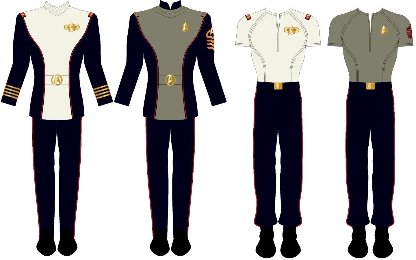
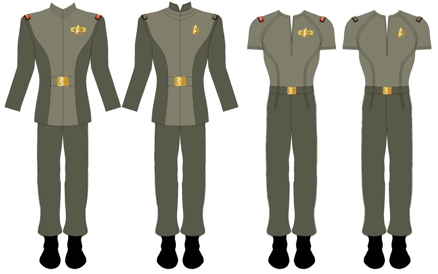
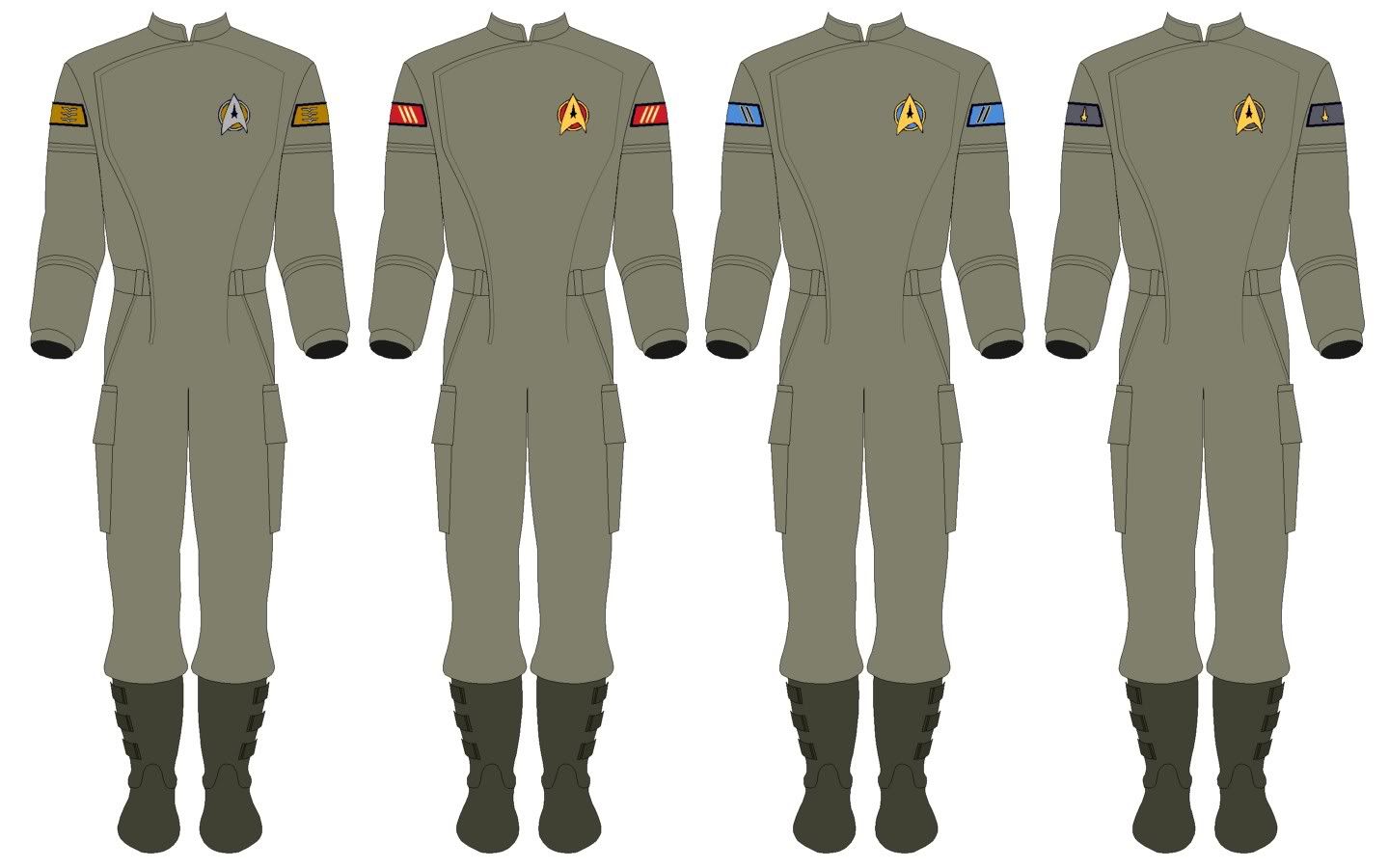
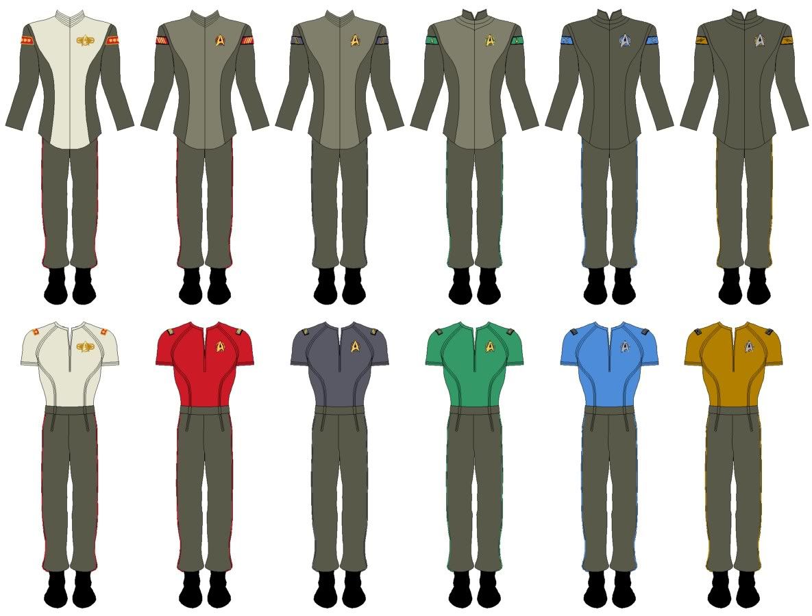
I would call most of your uniforms greenish. But I have a terrible time confusing red, green, and brown. I'm partially colorblind, and I certainly don't see nearly as many distinct colors as the typical person does.Just noticed: some of my monitors display the "Grays" as pretty much khaki although the machine on which I do most of my design stuff shows them as shades of off-gray!
What colors do you guys see? The intention was that they should appear as a kind of warm-ish, slightly yellow gray.

Might just as well ask why Humanoids need a uniform. Uniforms have a function in terms of unit cohesion and group identity, this is likely the primary reason Jellico required Troi to put on a standard uniform in stead of dressing as she saw fit too. She was part of the team.Maybe so you can tell him apart from all the other dolphin crewmembers?Why would a dolphin crew member need a uniform?
")
")
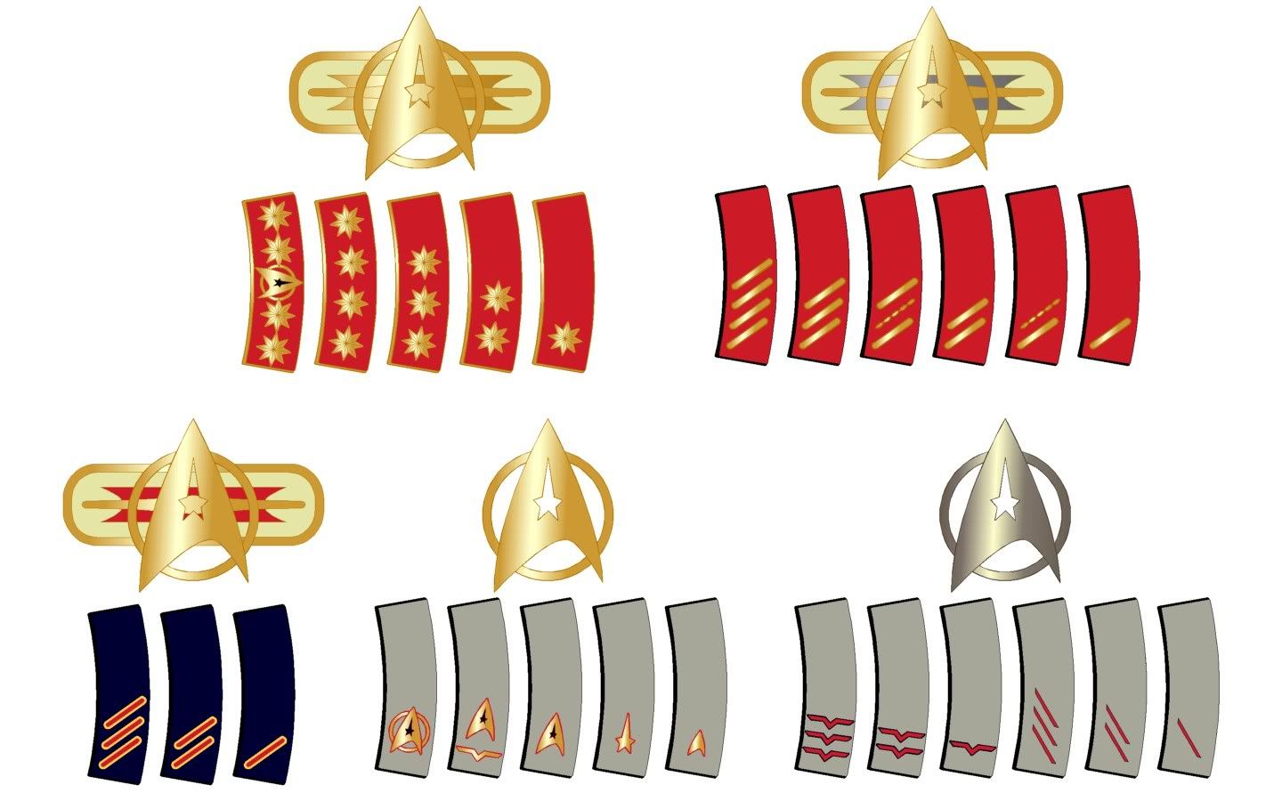
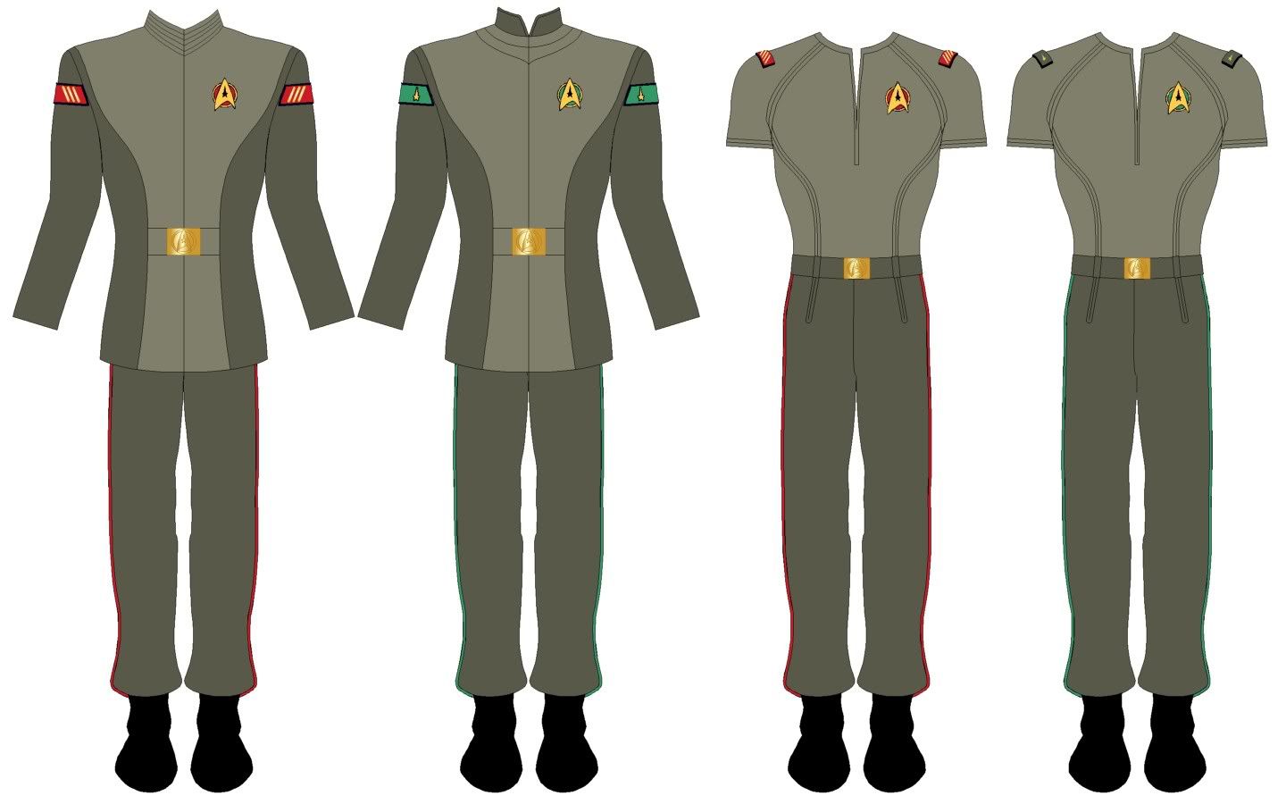
Take away the the colours from underneath the badges, I'd have loved these.

I have to admit, instead of the standard rectangle ribbons, I perfer the triangle ribbons from TOS. They're one of those reminders (like you need one) that this is a different culture.
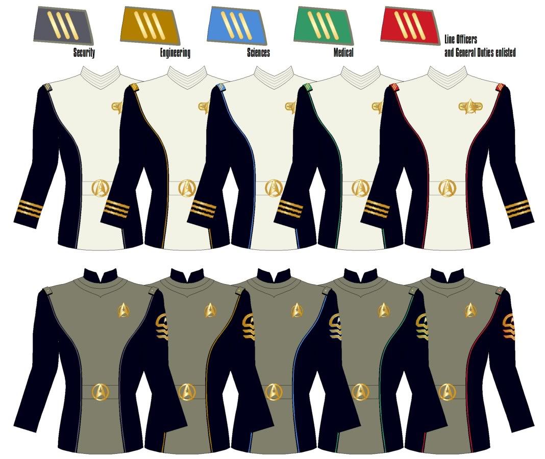
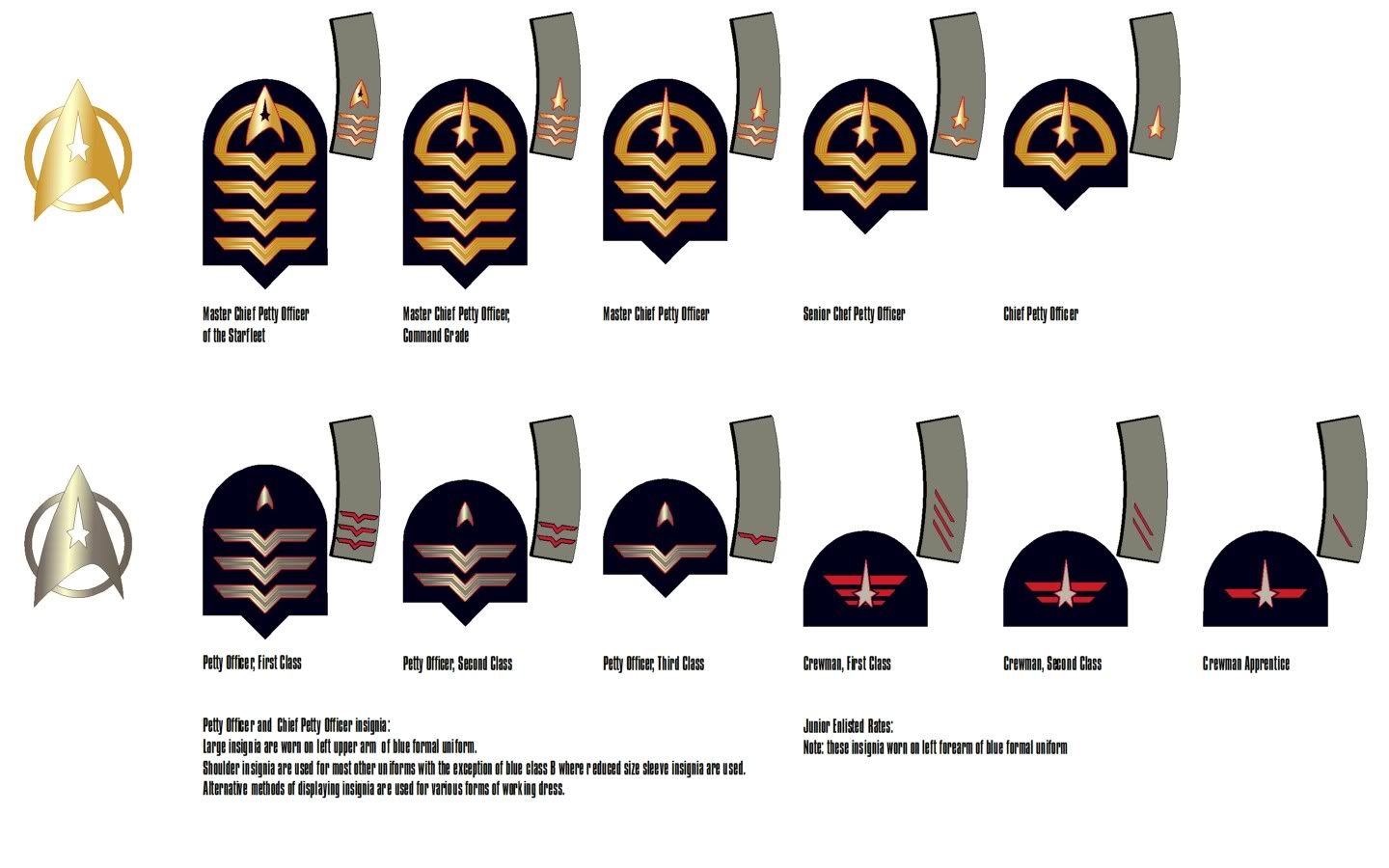
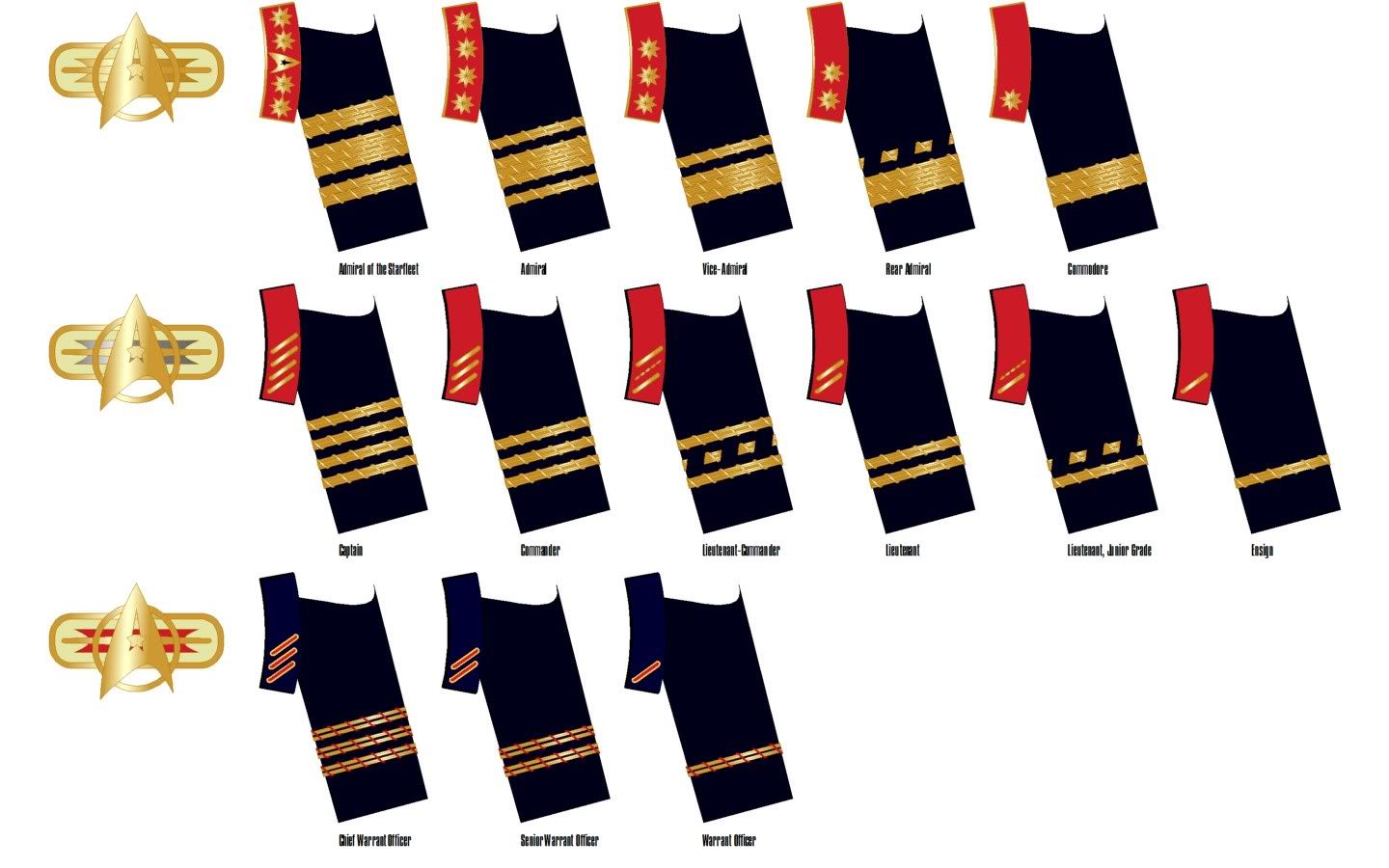
I like Blue Squadron's designs, but find the over use the Starfleet arrowhead to be distracting, especially on the enlisted uniforms.
We use essential cookies to make this site work, and optional cookies to enhance your experience.


