I realize this subject has likely already been debated to death, but I'm new to TNG fandom and this is my first opportunity to express my opinion on a subject I feel strongly about. I apologize in advance and thank everyone for their patience and indulgence.
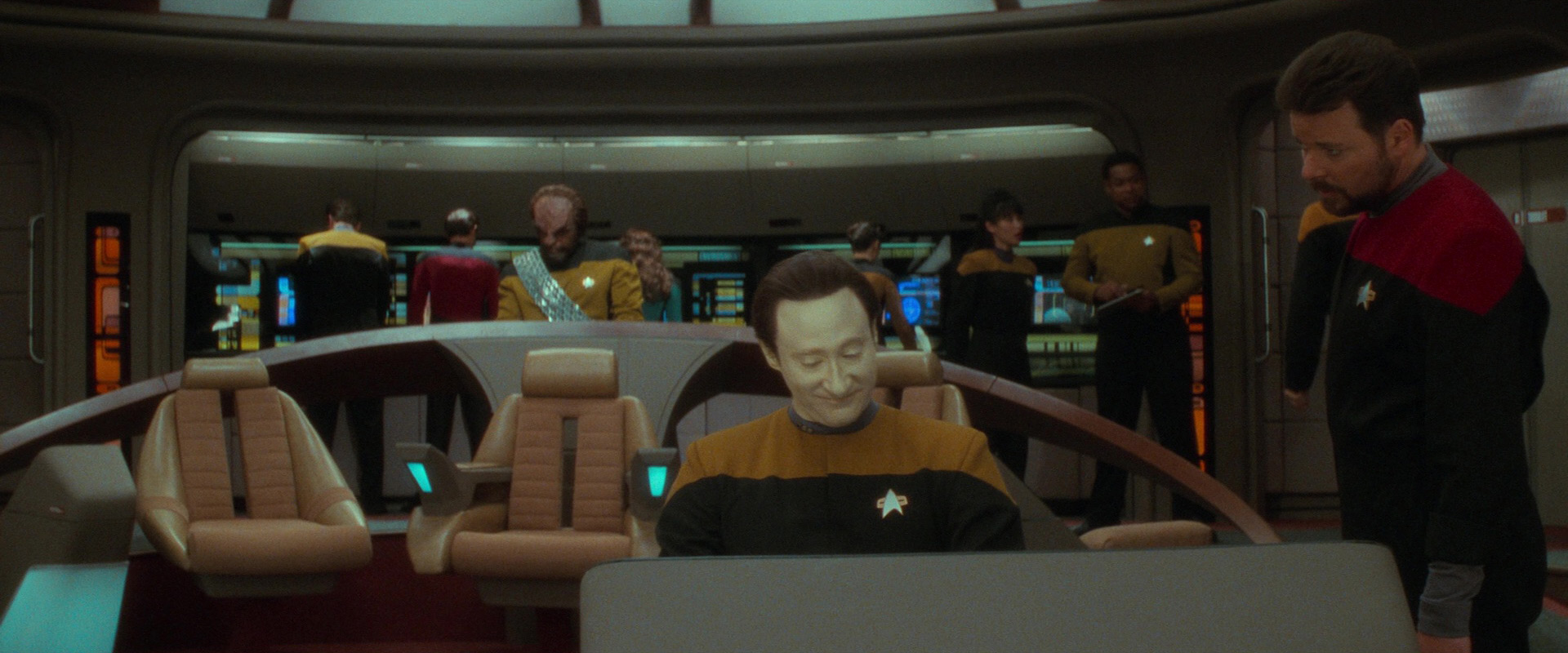
I hated the dark and gloomy lighting of Enterprise bridge in Generations.
1.) It was unrealistic and would be a depressing place to work. A vessel intended to house crew members for years at a time would be designed with an environment that promotes psychological wellness, not melancholy. Outside of a restaurant where the lighting may be dimmed to create a mood, most people's workspaces are not defined by high contrast shadows on the walls and edges of the room cloaked in darkness.
2.) I appreciate that fiction needn't be 100% realistic and there can be artistic motivations behind lighting schemes. Directors may choose gloomy lighting to create an atmosphere or mood of somberness, despair or dystopia. But that doesn't fit with the tone of Stark Trek in general or this movie in particularly. Artistically, it makes no sense.
3.) I believe many people prefer this lighting style because it's supposedly more cinematic. True, most modern, high-budget sci-fi subscribes to this visual design. But that makes it a cliche. Star Trek is supposed to be unique and stand out from other sci-fi, not conform to it. Star Trek is supposed to give audiences an alternative, not more of the same.
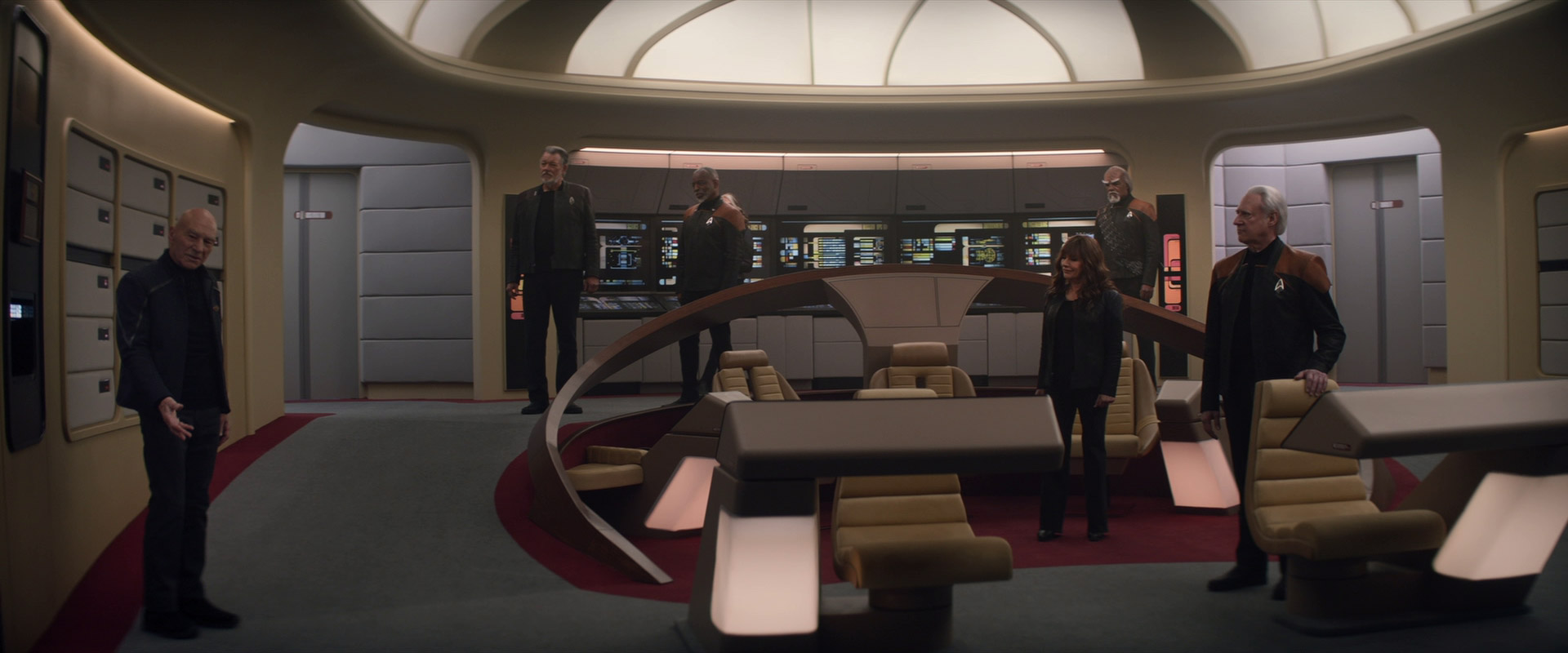
4.) Finally, this didn't have to be a binary choice: "bright as the TV series" versus "dark and gloomy". They could have dimmed the lighting a bit without going to the extreme. For example, in Picard Season 3 the lighting of the Enterprise D was much softer than it had been in TNG, yet brighter than it had been in Generations. That seemed like a reasonable compromise to me.
I hated the dark and gloomy lighting of Enterprise bridge in Generations.
1.) It was unrealistic and would be a depressing place to work. A vessel intended to house crew members for years at a time would be designed with an environment that promotes psychological wellness, not melancholy. Outside of a restaurant where the lighting may be dimmed to create a mood, most people's workspaces are not defined by high contrast shadows on the walls and edges of the room cloaked in darkness.
2.) I appreciate that fiction needn't be 100% realistic and there can be artistic motivations behind lighting schemes. Directors may choose gloomy lighting to create an atmosphere or mood of somberness, despair or dystopia. But that doesn't fit with the tone of Stark Trek in general or this movie in particularly. Artistically, it makes no sense.
3.) I believe many people prefer this lighting style because it's supposedly more cinematic. True, most modern, high-budget sci-fi subscribes to this visual design. But that makes it a cliche. Star Trek is supposed to be unique and stand out from other sci-fi, not conform to it. Star Trek is supposed to give audiences an alternative, not more of the same.
4.) Finally, this didn't have to be a binary choice: "bright as the TV series" versus "dark and gloomy". They could have dimmed the lighting a bit without going to the extreme. For example, in Picard Season 3 the lighting of the Enterprise D was much softer than it had been in TNG, yet brighter than it had been in Generations. That seemed like a reasonable compromise to me.


")