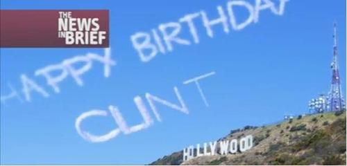
On exactly that note, I've recently read the new Hawkeye Marvel comic series from Matt Fraction, and as brilliant as it is, I can never quite get past the font used in the speech bubbles, which makes Clint's name look a little too much like the above cloud writing.
Fraction attempting to amuse his readers further, or just poor font choice?
Hugo - flipping and flopping on that