-
Welcome! The TrekBBS is the number one place to chat about Star Trek with like-minded fans.
If you are not already a member then please register an account and join in the discussion!
You are using an out of date browser. It may not display this or other websites correctly.
You should upgrade or use an alternative browser.
You should upgrade or use an alternative browser.
All I Got Left is My THREAD BOMBS!
- Thread starter Spaceman Spiff
- Start date
- Status
- Not open for further replies.
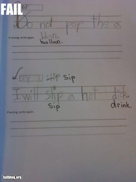
Fonts matter. 
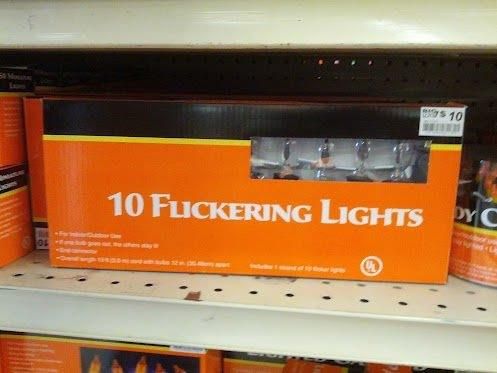
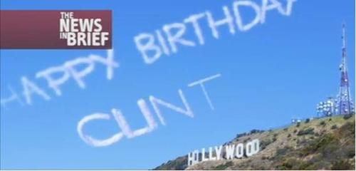


On exactly that note, I've recently read the new Hawkeye Marvel comic series from Matt Fraction, and as brilliant as it is, I can never quite get past the font used in the speech bubbles, which makes Clint's name look a little too much like the above cloud writing.
Fraction attempting to amuse his readers further, or just poor font choice?
Hugo - flipping and flopping on that
Fraction attempting to amuse his readers further, or just poor font choice?
Hugo - flipping and flopping on that
Inspired by a new Misc. thread this evening:

http://www.youtube.com/watch?v=cASKWJou-VE
(of course it's NSFW)

I'm reminded of this clip from The Thick Of It:
http://www.youtube.com/watch?v=cASKWJou-VE
(of course it's NSFW)
On exactly that note, I've recently read the new Hawkeye Marvel comic series from Matt Fraction, and as brilliant as it is, I can never quite get past the font used in the speech bubbles, which makes Clint's name look a little too much like the above cloud writing.
Fraction attempting to amuse his readers further, or just poor font choice?
Hugo - flipping and flopping on that
I really need to check that series out!

We've all seen this one already, right?


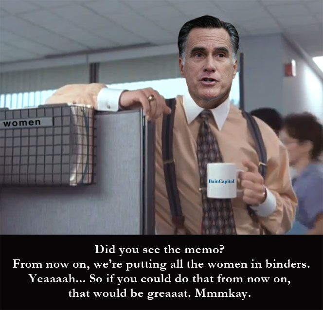
I was inspired to create this by thine evil gaze.


Sweet.
Fonts matter.


 Those two are priceless.
I was inspired to create this by thine evil gaze.

 Nice one!
doubleohfive
Fleet Admiral
That shouldn't be funny, but it is. 

doubleohfive
Fleet Admiral
- Status
- Not open for further replies.
Similar threads
- Replies
- 38
- Views
- 2K
- Replies
- 61
- Views
- 9K
- Replies
- 11
- Views
- 5K
- Poll
Contest: VOTE
Star Trek: Starfleet Academy Forum Motto
- Replies
- 42
- Views
- 2K
- Replies
- 33
- Views
- 15K
If you are not already a member then please register an account and join in the discussion!

