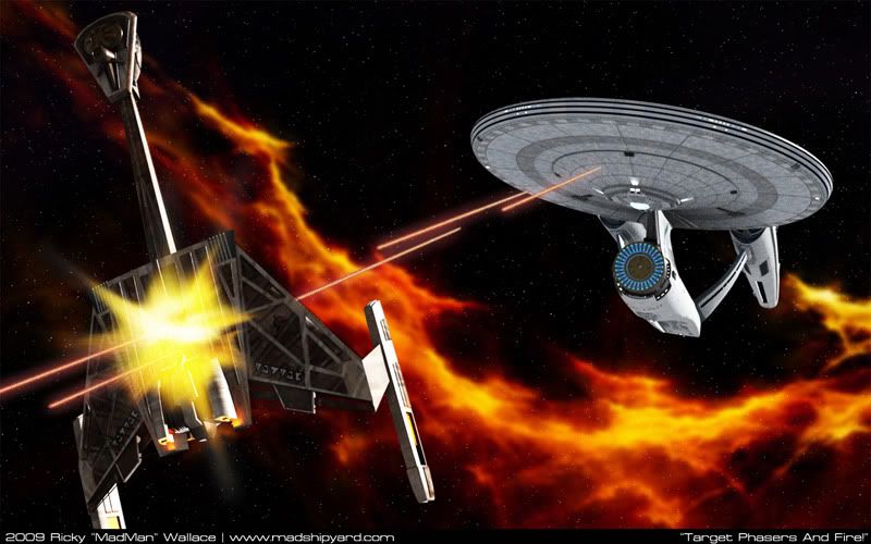
I agree. In a lot of artwork today, things are so dark and contrasty that it's had to see what exactly you are looking at. I think Battlestar Galactica also had this problem alot of the time...
This is a matter of "style" versus "realism." Look at images taken in space (NASA pics, etc). There is little (if any) "ambient light." Shadows are very hard-edged, so you see regions of brilliantly lit surface, immediately (without any softness of edge) into regions of pitch-black shadow.
If you want your renders to look "real" you need to do that... keep "ambient light" down to only that available from starlight, and either have NOTHING (except for self-illumination) or have a single-source directional light (representing the local sun). If you're in orbit, you then get to deal with reflected light from the surface as well. But bright, uniform lighting is never "realistic."
However, it's what people expect to see... based upon the world in which we live (not in space, obviously)... that makes people expect to see the sort of thing you're dealing with.
My approach to this is that what you see on a Trek viewscreen in processed imagery based upon scanners and so forth... not a "view through a window." Scale is wrong, illumination is "virtual," etc, etc. And what we see on our TVs are similarly "altered" to represent information to us in the same fashion.
So, the question is... are you trying to do "viewscreen representations" of Trekkian "reality" or are you trying to do "real-world representations" of Trekkian "reality?" If it's the first... your renders are lit exactly right. If it's the second... you need to change your lighting scheme to represent reality.
")


")