I like it!
-
Welcome! The TrekBBS is the number one place to chat about Star Trek with like-minded fans.
If you are not already a member then please register an account and join in the discussion!
You are using an out of date browser. It may not display this or other websites correctly.
You should upgrade or use an alternative browser.
You should upgrade or use an alternative browser.
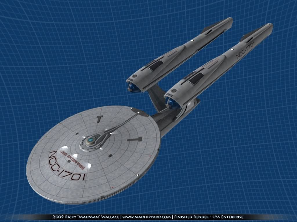
Abram's Enterprise, Version 4
- Thread starter MadMan1701A
- Start date
Thanks.I like it!
")
Well, I finally got some work done on my tshirts...
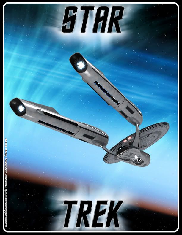
The one with both Enterprises on it goes on a Charcoal Grey shirt, and the one with the barrier on it goes on a Dark Blue Shirt. If anyone else wants to make one, I can post the full resolution images.
I put credits on them, just in case. It'd be cool to show up at the theater and see someone wearing my shirt. Last update for the night......
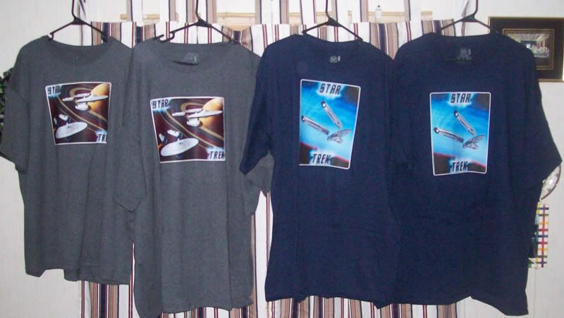
Shirts are done. They're cooling off at the moment... those iron on labels get pretty hot.
Shirts are done.
They're cooling off at the moment... those iron on labels get pretty hot. Wider distance between the nacelles and shorter nacelles. Is the primary hull correct it does not look like it has enough of a dome under the bridge. It seems so out of proportion next to the TOS Enterprise. Sorry... Mad man your render of it is great though.
Hey i just noticed something.... I dunno, maybe it's just a weird artifact or just the nature of your render process? I'm not experienced in such things myself, but I noticed that while parts of the ship themselves interact with the light and have a highlights and shadows on them, none of he parts cast shadows onto other parts! It's most noticeable on the classic E. But also Saturn ought to be casting shadows on its own rings. Is that something you can fix or is it one of those things that has to be built into the model from the beginning and isn't worth the trouble at this point?
--Alex
--Alex
I agree that it would be a little big more balanced if the Nacelles were closer together, and I built mine a little longer on purpose, because I think they look better that way. Of course, they aren't much longer...Wider distance between the nacelles and shorter nacelles. Is the primary hull correct it does not look like it has enough of a dome under the bridge. It seems so out of proportion next to the TOS Enterprise. Sorry... Mad man your render of it is great though.
The bridge area I tried very hard to get right, since it was the one area on my previous version that was way off. There's not really room for a deck there... It's more like a raised mounting platform or something. You can check out the model I used for reference here... http://www.quantummechanix.com/Star_Trek_Gallery.html .
It does show a definite change in style between the two ships, though. I can't really say I l like one more than the other. They are both great.
It's strange that you noticed that.Hey i just noticed something.... I dunno, maybe it's just a weird artifact or just the nature of your render process? I'm not experienced in such things myself, but I noticed that while parts of the ship themselves interact with the light and have a highlights and shadows on them, none of he parts cast shadows onto other parts! It's most noticeable on the classic E. But also Saturn ought to be casting shadows on its own rings. Is that something you can fix or is it one of those things that has to be built into the model from the beginning and isn't worth the trouble at this point?
--Alex
If the light source is pointed in different directions, it will definitely have the effect you described. In the two images for the Tshirts, the light is coming from up and to the rear... I actually moved it around so that I wouldn't get self shadows all over the image. As for the rings, the same thing would happen... The shadow would be cast if the light was at the right angle.This is fantastic MadMan.
What great ships both are !!
What great ships both are !!
Thanks guys.
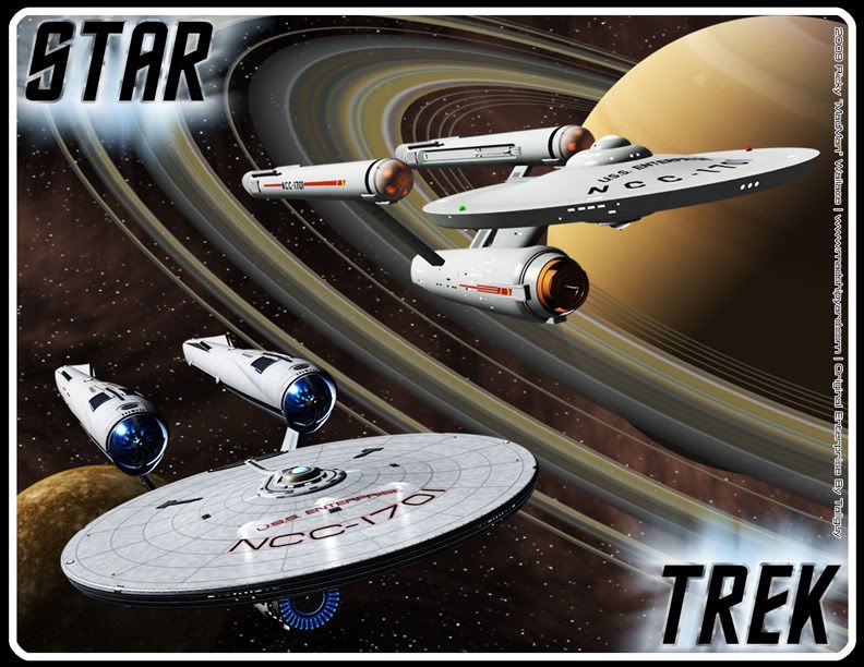
Here's a new image... I was watching some TOS Remastered today, and thought this would make for a good image.
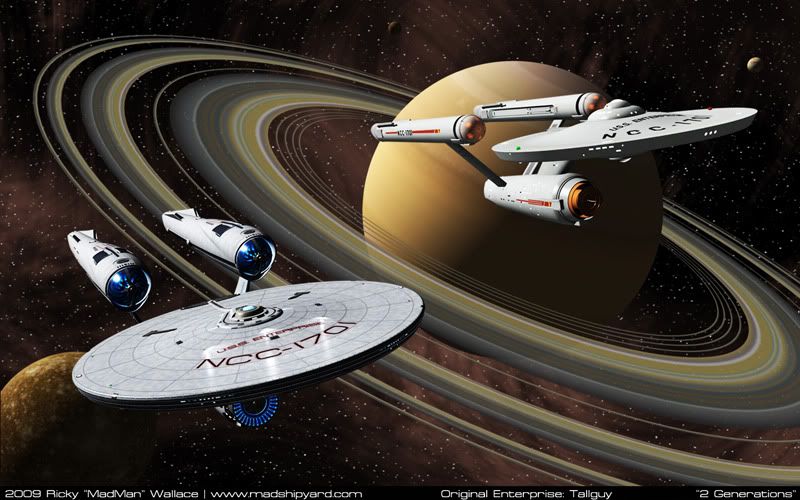
1440x900:
http://i5.photobucket.com/albums/y200/MadMan1701A/Wallpapers/2Generations1440.jpg
1280x1024:
http://i5.photobucket.com/albums/y200/MadMan1701A/Wallpapers/2Generations1280.jpg
I used my model of Saturn for a change. I rendered everything but the nebula in Blender, this time.
Sorry FatherRob, it's not one of the angles you liked.
Thanks.
I thought I would post a new version of my comparison picture... The first one I built in 3 hours on November 11th, last year, when the first images came out. (I remember because it was my birthday. )
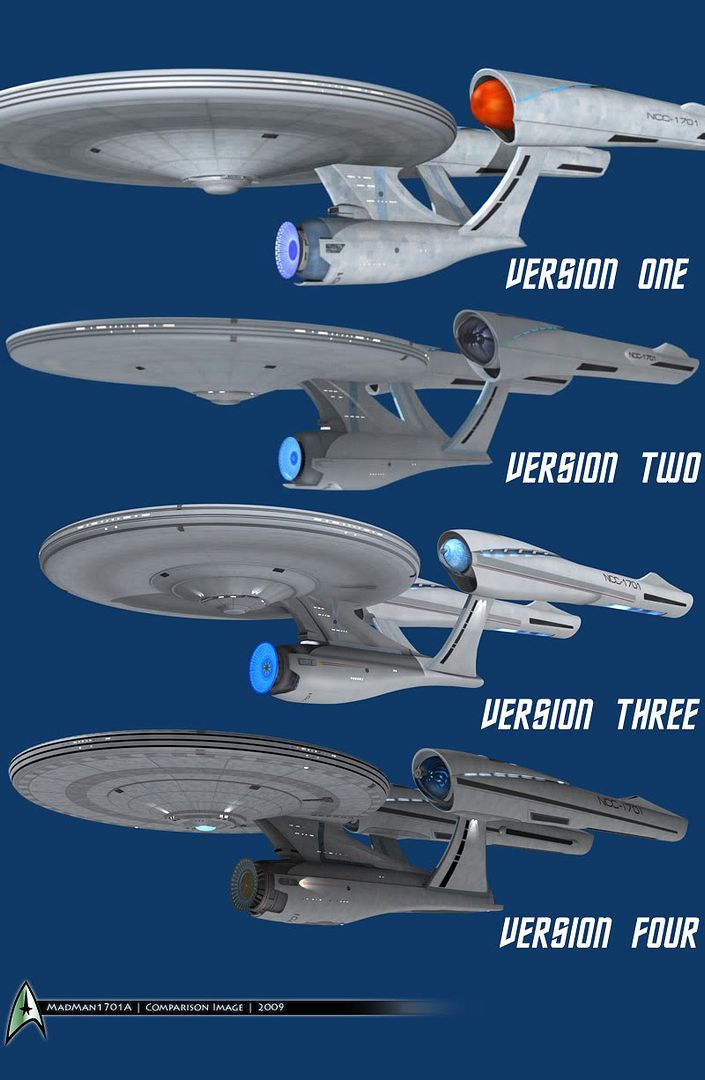
I'm kind of proud of my improvements. I think my modeling technique has come a long way... mainly because I got over my aversion to trying new stuff.
I thought I would post a new version of my comparison picture... The first one I built in 3 hours on November 11th, last year, when the first images came out. (I remember because it was my birthday.
)
I'm kind of proud of my improvements. I think my modeling technique has come a long way... mainly because I got over my aversion to trying new stuff.
Now that is a nice angle for the ship, MadMan...
Also, of interest, I just got back from BK and bought all the glasses. On the glasses, the bussard caps are red, not blue... I'll be curious to see if they change in the film.
Rob+
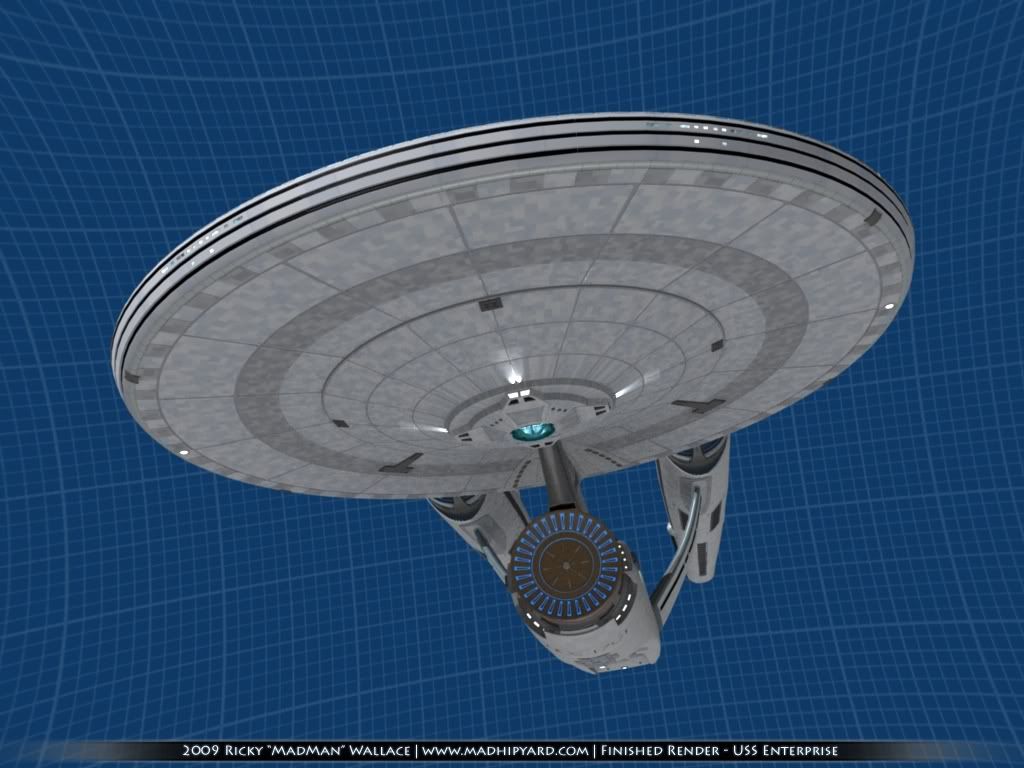
EDIT TO ASK: Am I the only person who finds the lack of any markings on the underside of the saucer to be odd? I think it really detracts from the look of the saucer section, whereas I think the NCC-1701 on the forward end of the secondary hull looks dumb.
Also, of interest, I just got back from BK and bought all the glasses. On the glasses, the bussard caps are red, not blue... I'll be curious to see if they change in the film.
Rob+
EDIT TO ASK: Am I the only person who finds the lack of any markings on the underside of the saucer to be odd? I think it really detracts from the look of the saucer section, whereas I think the NCC-1701 on the forward end of the secondary hull looks dumb.
As a Catholic, this just made my day!come on, father rob, tell us how you REALLY feel.
On the Trek Catholic Liturgical Calendar, tomorrow is the Solemnity of the Commissioning of the Starship Enterprise. My homily tomorrow will focus on the beauty of the original vessel, and how any reinterpretation other than a literal reinterpretation of the design amounts to blasphemy and an overturning of Sacred Canon.
In related news, next Wednesday is the Feast of the Holy Captain's Variant Uniform. My homily for the feast focuses on advantages and disadvantages of black for such a uniform, and advocates for a fundamentalist revision of the variant to return to it's Charlie X (on Charlie) version, which is clearly what was truly intended before the hideous avacado was introduced. (I go on to agree that as long as the cut was formal, as in the Charlie X version, black would be a suitable color for the outfit.)
Next Thursday at 7 PM, I intend to post my 95 Theses on the Enterprise redesign on the doors of the local IMAX.
Rob+


Nice progression there, MadMan!
 Personally, I'm glad you put some curvature into the bottom of the secondary hull around the third version. Out of everything, that bugged me the most!
Thanks.Now that is a nice angle for the ship, MadMan...
Also, of interest, I just got back from BK and bought all the glasses. On the glasses, the bussard caps are red, not blue... I'll be curious to see if they change in the film.
Rob+
EDIT TO ASK: Am I the only person who finds the lack of any markings on the underside of the saucer to be odd? I think it really detracts from the look of the saucer section, whereas I think the NCC-1701 on the forward end of the secondary hull looks dumb.
I do think it's strange that the saucer doesn't have markings on the bottom. Every other Enterprise has had them, and you would think that this one would as well. I hope the Engines do change color. That would be very unique.
Yep, it was hard to figure that part out. Even on my latest version, I got stuck, for a while.As a Catholic, this just made my day!come on, father rob, tell us how you REALLY feel.
On the Trek Catholic Liturgical Calendar, tomorrow is the Solemnity of the Commissioning of the Starship Enterprise. My homily tomorrow will focus on the beauty of the original vessel, and how any reinterpretation other than a literal reinterpretation of the design amounts to blasphemy and an overturning of Sacred Canon.
In related news, next Wednesday is the Feast of the Holy Captain's Variant Uniform. My homily for the feast focuses on advantages and disadvantages of black for such a uniform, and advocates for a fundamentalist revision of the variant to return to it's Charlie X (on Charlie) version, which is clearly what was truly intended before the hideous avacado was introduced. (I go on to agree that as long as the cut was formal, as in the Charlie X version, black would be a suitable color for the outfit.)
Next Thursday at 7 PM, I intend to post my 95 Theses on the Enterprise redesign on the doors of the local IMAX.
Rob+
Nice progression there, MadMan!
OK, I'm finally done! Here's a bunch of large renders, like I always make when I finish one of these. It's just my default lighting rig, so nothing spectacular there.
Here goes...
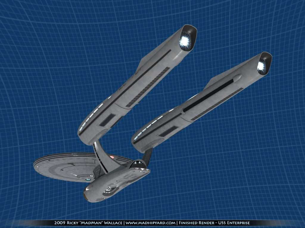
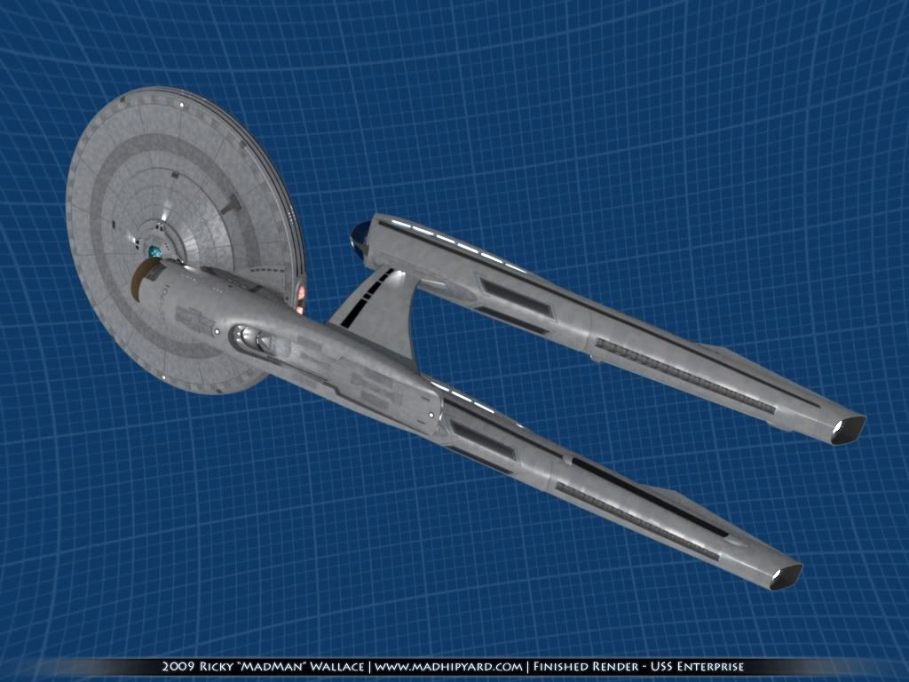
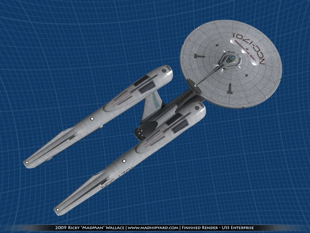
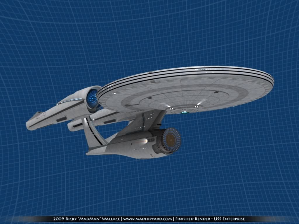
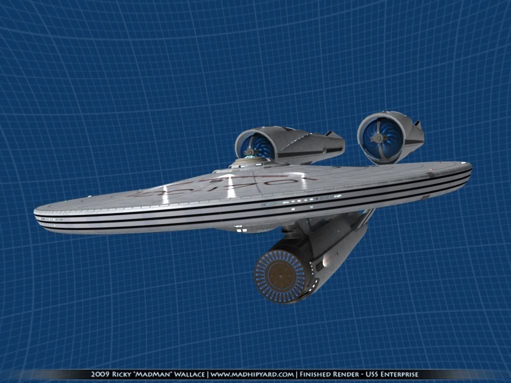
On that last one, the registry looks a little pixelated. If I render at a higher res, that artifact goes away, thankfully.
Now, I get to build the space station, and the rest of the fleet. The rest of the fleet might be simplified models, to use for background shots. The station will probably be pretty dense, though.
Here goes...
On that last one, the registry looks a little pixelated. If I render at a higher res, that artifact goes away, thankfully.
Now, I get to build the space station, and the rest of the fleet.
The rest of the fleet might be simplified models, to use for background shots. The station will probably be pretty dense, though.Nice!
I wish I could get past it, but I just can't help but want to try prying those gigantic nacelles further apart.
I wish I could get past it, but I just can't help but want to try prying those gigantic nacelles further apart.
I know. I still think it's an odd design choice, unless they just wanted to make it feel longer and thinner.Nice!
I wish I could get past it, but I just can't help but want to try prying those gigantic nacelles further apart.
Thanks.^Ditto.
Madman, the level of improvement in your skills and between the first model and the last is remarkable! And I love those shirts!!!
I'm going to keep tweaking... I forgot to add lighting to my dish, and some other things. Then, it's off to do research on lighting rigs.
Similar threads
- Replies
- 19
- Views
- 942
- Replies
- 32
- Views
- 2K
If you are not already a member then please register an account and join in the discussion!