The design and colour scheme isn't even similar.
It's like those complaining that the sets on Discovery looked too much like the Kelvin sets. The only thing they have in common is a window viewscreen.
The design and colour scheme isn't even similar.
agreed. there are some materials that are similar and lighting schemes, but the kelvin timeline films are largely neo-futurist, whereas (i think) discovery has more of a modernist look to it.It's like those complaining that the sets on Discovery looked too much like the Kelvin sets. The only thing they have in common is a window viewscreen.
I look forward to hearing people say how a Section 31 command centre should look according to Gene's Vision.It will undoubtedly be maligned for being lit too dark to properly reflect Star Trek's optimistic utopian ideals, and will be derided for being contrary to Gene Roddenberry's intent.
Right I mean not every thing must be in his vision. Utopia can get boring.I look forward to hearing people say how a Section 31 command centre should look according to Gene's Vision.
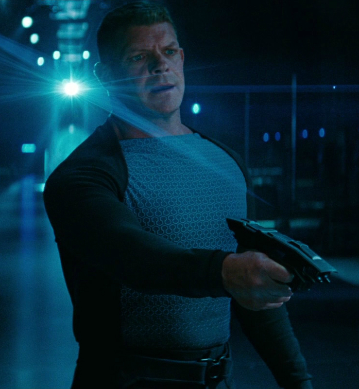
Ehh I liked the dress uniform in into darknessBlack leather garb, of course! Preferable to those awful outfits we saw in INTO DARKNESS.
I think he was referring to the S31 uniformsEhh I liked the dress uniform in into darkness
Pretty much.I think he was referring to the S31 uniforms
Pretty much.
Not a big fan of Michael Kaplan's design aesthetic in ST09 and STID.
http://memory-alpha.wikia.com/wiki/Starfleet_uniform_(alternate_reality)#Section_31
My mistakeI think he was referring to the S31 uniforms
i think if you accept that a covert ops organization has its own uniforms and tech, then the into darkness ones are superior given that they don’t look like bond villain attire. section 31 doesn’t think it’s the bad guys, so why not dress them more like a regular starfleet crew? it’s never been made clear if the uniforms in the kelvin timeline were specific to each individual ship, but at least the ones in into darkness look like they could be in use aboard another starfleet vessel and not tailored to look eeeeeevillllllll.Eeesh. I haven't seen Into Darkness since it was in the theater. The DSC look is a lot better than this.
i think if you accept that a covert ops organization has its own uniforms and tech, then the into darkness ones are superior given that they don’t look like bond villain attire. section 31 doesn’t think it’s the bad guys, so why not dress them more like a regular starfleet crew? it’s never been made clear if the uniforms in the kelvin timeline were specific to each individual ship, but at least the ones in into darkness look like they could be in use aboard another starfleet vessel and not tailored to look eeeeeevillllllll.
Costuming departments seem to be in a constant game of top that when it comes to detailed costumes.I could have done without the tiny insignias all over those shirts. It’s a trend in movies I’m not a fan of since SPIDER-MAN.
Nothing wrong with taking inspiration from the movies. Considering Kurtzman was instrumental in the plot and John Eaves the look, it was to be expected that Disco-31 resemble Star Trek Into Darkness.Looks a bit like the Vengeance. Amazing how a show set in the Prime timeline keeps looking more and more like the Abrams films.
They look fat and unflattering.Pretty much.
Not a big fan of Michael Kaplan's design aesthetic in ST09 and STID.
http://memory-alpha.wikia.com/wiki/Starfleet_uniform_(alternate_reality)#Section_31
We use essential cookies to make this site work, and optional cookies to enhance your experience.