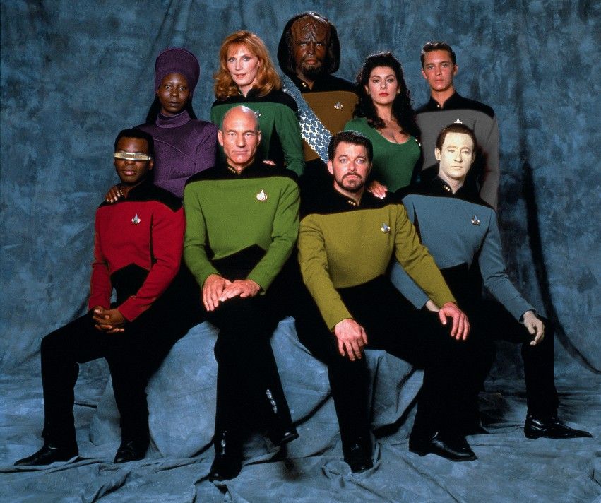
Shouldn't Worf be in red, and Beverly and Deanna in blue?
No. Similarly to the OP's scheme, here security is separate from engineering and medical is separate from (the rest of) science. (Note that Troi and Crusher have the same color, also in line with the OP's scheme.)
If you're going to fiddle with it again, I don't think there's enough of a difference between TOS movie-era medical green and TOS era command green to make the color scheme gel right.
It might be interesting to give Medical and Counseling branches different colors too. But then you could also leave Deanna's dress untouched as she's in a civie dress, not a uniform.
I forgot now which way I ended up. I think I changed Crusher's color to match Troi's dress, but if not it was the other way around (I tried it both ways). The colors were close enough to begin with, and not changing *those* colors much governed what I did for the medical. By the way, keeping Worf's color close to gold is why I gave security brown. Really, security should be camouflage, but that's another story. Gray went to the "cadet," because it was neutral; plus, Wes had been in gray before.
As a general remark, there's an argument to be made for using white as medical, frankly, because blood and other stains show up most clearly on white. That's one thing that TMP got right, I think (as far as McCoy's uniform color was while he was in sickbay; TMP used olive green on the insignia though). TWOK kept the white uniform for McCoy when he was in surgery, at least.
There were some limitations here, simply because I wanted to retain the TNG style that has a lot of black. I tried white for the color, but the black and white together looked awful.
(Just as an aside, there's a gray shirt that's used for outpost personnel in both TOS "Balance of Terror" and "Arena".)
Picard doesn't look to great in green. Maybe it's just his complexion in the photo against it. But remember that Kirk's wrap-around was an informal uniform and had that unique cut and gold piping making it pop. If you want to make the captain stand out, maybe introduce another color here as well - purple or white? Put Beverly in green and Deanna in orange or brown or silver?
...some thoughts. I'm impressed with how close you got TOS shades to match. Kinda sweet.
Yeah, I agree about Picard. I think I actually might have tweaked the color a tad so he looked best, while keeping it in the space of Kirk's wraparound. One quibble with your phrasing is that I wouldn't refer to the wraparound as an informal uniform, as that's basically self-contradictory. I'd refer to it as an alternate uniform, that the captain may wear at his or her own discretion.
You're right about the gold piping. I made everyone's piping match their color, but perhaps that was a mistake.
But yeah, I was struck with the TOS feel gotten simply by basing it on screen-capped colors from TOS.
Thanks for the feedback!
(I didn't intend to hijack the OP's thread, but I did want to remark on the similarity of my divisions in this experiment with the OP's.)

")