-
Welcome! The TrekBBS is the number one place to chat about Star Trek with like-minded fans.
If you are not already a member then please register an account and join in the discussion!
You are using an out of date browser. It may not display this or other websites correctly.
You should upgrade or use an alternative browser.
You should upgrade or use an alternative browser.
The Library of Star Treks That Never Were - Book cover designs
- Thread starter Ptrope
- Start date
Another issue of Compelling magazine (I've decided to bump the timeline back by three years and will have to tweak the dates on issues done so far).
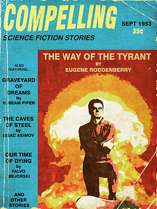
From September 1953, the first part of "The Way Of The Tyrant" about future dictator Colonel Green. The story contains a throwaway line about Khan Singh from "Last Days Of The Supermen" and it was here that Roddenberry had the first inkling of creating a future history.
Edit: Working late on little sleep is good for creativity...bad for spelling. Will have to fix Isaac's name. Goddamitsomuch!
BTW, Graveyard of Dreams was a great story, and The Cosmic Computer was a great novel that was derived from it ") . Always happy to find a Piper fan .
. Always happy to find a Piper fan .
Hey, it wasn't unusual for names to be misspelled in the old pulps, even on covers. Not just pulps, either - Jethro Tull's first single was published as being from "Jethro Toe" .
.
. Always happy to find a Piper fan .Hey, it wasn't unusual for names to be misspelled in the old pulps, even on covers. Not just pulps, either - Jethro Tull's first single was published as being from "Jethro Toe"
.BTW, Graveyard of Dreams was a great story, and The Cosmic Computer was a great novel that was derived from it
Piper was awesome! I never did get through through the entire Terro-Human Future History. I may have actually stopped right around Cosmic Copmuter.....Sadly, due to real life stuff and a need to lighten my load, I've sold off pretty much my entire Piper collection. I still have two copies of the "Empire" collection....one of my favorite book covers.
Hey, it wasn't unusual for names to be misspelled in the old pulps, even on covers. Not just pulps, either - Jethro Tull's first single was published as being from "Jethro Toe"
True that, I'd forgotten. I think I'll just leave it that way because I really don't feel like going back to fix it.
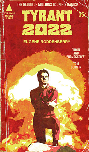
In 1956, Pyramid Books released an expanded version of "The Way Of The Tyrant" titled "Tyrant 2022". This newer expanded edition chronicled both the rise and fall of Colonel Phillip Green and his hand in World War 3.
And here's my latest pieces and doing my part to keep this thread going. I sure would like to see more work by other people here. HINT HINT
This is my homage to Lou Feck's cover for the James Blish episode adaptations (book 8)
The next book was about an immortal who had assumed many identities throughout history. He would later be incorporated into Roddenberry's future history as Flint, still pivotal to history. Roddenberry would write a couple of books for Pyramid, elements of which would be incorporated into his magazine stories where his future history would slowly take shape. However the series grew to fame under the ACE Books banner.
Last edited:
Now it can be revealed - and we'll be nice and not eject MrArcas's work from the library:
The covers for The Seekers have inspired the authors of the Star Trek Vanguard novels:
The Trek Collective: "The Seekers" to become real books!
The covers for The Seekers have inspired the authors of the Star Trek Vanguard novels:
The Trek Collective: "The Seekers" to become real books!


---------


Of all covers, this one really mirrors the layout of an early 1970s novel cover. Well done!
Cool thread Ptrope! I've been working on my own fictional series (for years, sadly) and still working out the chronology. As usual for my Trek work of this nature, it's not quite the Trek you think it is. At any rate, here's where it all started, back in 1956.....


I LOVE the covers!! I can easily imagine both on the racks of yesteryear!

Beautiful!!
Thanks TREK_GOD! Always good to see someone enjoy this stuff! ")
Right now, I've got roughly 18 covers in this fictional line of books and magazines done. And I'm still creating more.
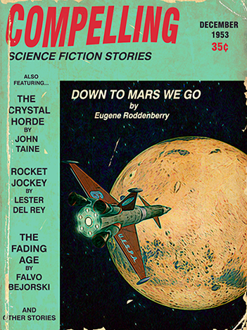
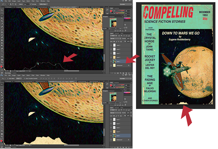
On that note, here's the December 53 issue of "Compelling"
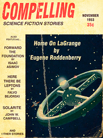
Having dealt with the weighty issues of tyrants, eugenics and doomsday, Roddenberry revealed in the November 53 issue of "Compelling" that Earth had not been totally devastated by World War 3. Having narrowly avoided extinction, humanity has banded together to heal the planet and ensure the survival of the species by colonizing other worlds.
This cover is notable for the fact that I built the ship you see here instead of photoshopping existing images. So it's first for me and I'm pretty happy with the results.
I saw that elsewhere and that is fucking awesome! Arcas' work is crazy brilliant and captures the feel of those old books.
But those images need to be downsized so that the whole book cover can be taken in all at once.
You'll be happy to know that the magazine cover I posted was posted at a slightly larger size than usual.
Right now, I've got roughly 18 covers in this fictional line of books and magazines done. And I'm still creating more.
On that note, here's the December 53 issue of "Compelling"
Having dealt with the weighty issues of tyrants, eugenics and doomsday, Roddenberry revealed in the November 53 issue of "Compelling" that Earth had not been totally devastated by World War 3. Having narrowly avoided extinction, humanity has banded together to heal the planet and ensure the survival of the species by colonizing other worlds.
This cover is notable for the fact that I built the ship you see here instead of photoshopping existing images. So it's first for me and I'm pretty happy with the results.
Now it can be revealed - and we'll be nice and not eject MrArcas's work from the library:
The covers for The Seekers have inspired the authors of the Star Trek Vanguard novels:
The Trek Collective: "The Seekers" to become real books!
I saw that elsewhere and that is fucking awesome! Arcas' work is crazy brilliant and captures the feel of those old books.
But those images need to be downsized so that the whole book cover can be taken in all at once.
You'll be happy to know that the magazine cover I posted was posted at a slightly larger size than usual.
Last edited:
Now it can be revealed - and we'll be nice and not eject MrArcas's work from the library:
The covers for The Seekers have inspired the authors of the Star Trek Vanguard novels:
The Trek Collective: "The Seekers" to become real books!
I saw that elsewhere and that is fucking awesome! Arcas' work is crazy brilliant and captures the feel of those old books.
But those images need to be downsized so that the whole book cover can be taken in all at once.
Actually, if you're using Firefox, you can right-click the image and select "View image," and it will open in a new tab sized to fit the window
. Sadly, IE doesn't appear to have this capability. I like that ship, The Lensman - its design is ... compelling
.Forbin, I know that MrArcas uses some Photoshop brushes to achieve his perfect worn covers; there are some folks on DeviantArt who have them posted as freebies. I use Photopaint, which doesn't work quite the same way as Photoshop, even though it does use many of P'shop's filters, and I pretty much brute-force my wear and tear using scans of actual distressed paper and cover stock, and just work with the blending modes.
Actually, if you're using Firefox, you can right-click the image and select "View image," and it will open in a new tab sized to fit the window
Well you learn something new everydayl.
I like that ship, Lensman - its design is ... compelling
Thanks! Right now I'm in the "exploring the solar system" phase of these covers, and I'm looking at having to do 3D work in order to make up for the lack of official images for me to 'Shop. Plus, I keep remembering little tidbits of history that would work as stories.
Prolly time to break out that chronology

Where does one get the "old and worn cover look" filter?
There are filters, but I have been zero impressed with them.
I've used two methods....the method I'm currently using is Ptrope's method. I'm using actual scanned books with everything but the wear blacked out (sometimes I have to do some 'shopping on the cover to achieve that)
Then (if you're using Photoshop) in "Layer>Layer Style>blending options" I play with different settings until I get the seamless melding (usually "Lighten" works best)
In fact today I'm going to scan some old book covers that have black backs with wear, so it'll be easy to rubber stamp the text out.
In my opinion, this method is the best by far. It allows for far more subtlety in the aging, and frankly, it's the easiest once you have a little library of covers to work from as you can just flip and rotate or just use sections to get a little variety.
Method 2 is the method I discovered on my own years ago and have refined over time. It's actually fairly simple:
Set your background color to an off yellow (of just sample the color from an actual old book)
Cut your main image out, then repaste back in. Select the lasso tool and then just try to make irregular areas and cut them out. It works best with smaller wear as larger areas will just have a big piece of off yellow showing.
Here's an example.
The thing is that the edges tend to be fairly sharp, so you may want to blur them (I usually blur once or twice when I'm done). This is a little more time consuming, so make sure you save often.
As with anything, it takes a little practice to get just right.
Most of the filters I've seen pretty much look like this method. But it's possible my experience and know how with them is limited.
What is funny to me is my seventeen year old son's reaction to these covers. I was reading the thread and he came up behind me, declared them cool and asked if I was going to buy them so that he could read them after. I explained what they were and he said they were "very cool." High praise. I happen to agree with him. These are beautiful covers and I wish we could read the associated stories.
---------
Do Androids Dream of Electric Sheep?
Of all covers, this one really mirrors the layout of an early 1970s novel cover. Well done!
Thanks! I had personal experience to draw on there
.From November '53
More 3D work....I really like this one. When I started this project, I figured I could just do a "collection" cover and just mention these stories, although I didn't plan on doing anything set this early in the timeline.
Oddly enough, I've gotten inspired by this early pre-warp period and it'll be weird to finally get to more familiar territory. This was just supposed to be a brief prologue to the later era, but it's really come alive and I keep getting idea's for more covers for this era.
This one's for you Chesley Bonestell wherever you are.
"Under The Domes Of Mars" was published in the February 1954 issue of Incredible Tales. "Under The Domes Of Mars" tried to give a fair account of life on the colony, eschewing any life threatening scenarios. Instead it dealt with scientist Jackson Roykirk's attempt at navigating dueling bureaucracies in order to ensure his Nomad probe launched as planned.
Ringo felt it was too talky and that such stories were not Roddenberry's forte'.
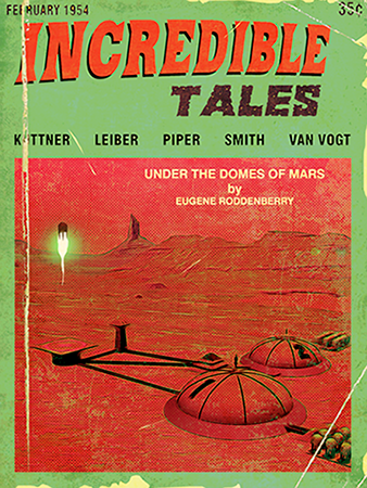
Roddenberry's third and final "Mars" story was written in an overly lurid style, containing everything Marty Ringo wanted from his previous story. As a mild form of "revenge" he did not sell the story to Ringo, nor was it published in the pages of Incredible Tales (as that magazine was published quarterly)
It was instead published in the pages of Comet magazine where it went on to be very well received. This was also the beginning of his friendship with Comet magazine editor Mort Blumberg who encouraged him to send more stories his way. Comet would indeed publish several later stories, but Roddenberry always felt that Compelling magazine was his literary home.
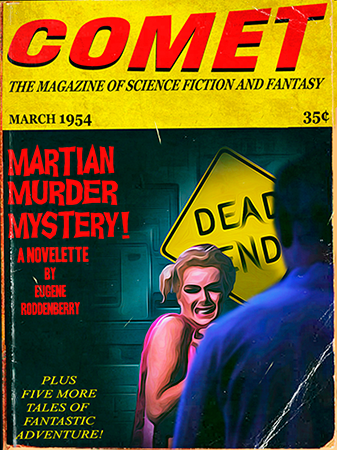
"Martian Murder Mystery!" followed two police detectives as they tried to solve a series of strange murders on the colony. Late in the story they realize that the killers MO is similar to that of Jack The Ripper. An epilogue states that in the end, a total of eight women were killed, but that they never caught the killer or learned his identity.
Ringo felt it was too talky and that such stories were not Roddenberry's forte'.
Roddenberry's third and final "Mars" story was written in an overly lurid style, containing everything Marty Ringo wanted from his previous story. As a mild form of "revenge" he did not sell the story to Ringo, nor was it published in the pages of Incredible Tales (as that magazine was published quarterly)
It was instead published in the pages of Comet magazine where it went on to be very well received. This was also the beginning of his friendship with Comet magazine editor Mort Blumberg who encouraged him to send more stories his way. Comet would indeed publish several later stories, but Roddenberry always felt that Compelling magazine was his literary home.
"Martian Murder Mystery!" followed two police detectives as they tried to solve a series of strange murders on the colony. Late in the story they realize that the killers MO is similar to that of Jack The Ripper. An epilogue states that in the end, a total of eight women were killed, but that they never caught the killer or learned his identity.
Last edited:
Similar threads
- Replies
- 32
- Views
- 2K
- Replies
- 2
- Views
- 364
- Replies
- 5
- Views
- 808
If you are not already a member then please register an account and join in the discussion!