First Poster

Discussion in 'Star Trek Movies: Kelvin Universe' started by PlainSimpleJoel, Dec 3, 2012.

  1. Captaindemotion

    Captaindemotion Admiral Admiral

    Joined:
    May 26, 2001
    Location:
    Ireland
    Ah. I saw one with 17/05/13 here http://www.totalfilm.com/news/star-trek-into-darkness-teaser-poster-revealed

    It looks like the date alters from country to country, but not the poster itself.
     
  2. sojourner

    sojourner Admiral In Memoriam

    Joined:
    Sep 4, 2008
    Location:
    Just around the bend.
    LONG before Dark City.
     
  3. lurok

    lurok Rear Admiral Rear Admiral

    Joined:
    Mar 15, 2011
    Location:
    Lost in the EU expanse with a nice cup of tea
    Way long before Dark City :)

    Assuming that is accurate-ish London (Mill Eye, Gherkin, Thames etc), was having fun trying to work out roughly where BC standing. O2 anyone? :p Or Greenwich Observatory would be neat.


     
  4. Melakon

    Melakon Admiral In Memoriam

    Joined:
    Nov 22, 2012
    Location:
    Melakon's grave
    Yeah, I figured that. But the only other guy in a trenchcoat I could remember at the time was Humphrey Bogart. Or Boris Badenov.
     
  5. trekkiebaggio

    trekkiebaggio Vice Admiral Admiral

    Joined:
    Jul 20, 2004
    Location:
    Dancing to the Jailhouse Rock
    Yeah, I got the Borg vibe as well.
     
  6. Sindatur

    Sindatur The Gray Owl Wizard Admiral

    Joined:
    Jan 2, 2011
    Location:
    Sacramento, CA
    Ah, OK...Too bad, I smelled a Conspiracy and was intrigued
     
  7. Kaziarl

    Kaziarl Commodore Commodore

    Joined:
    Dec 24, 2007
    Location:
    Portland, OR (Kaziarl)
    Has anyone been poking around the source code? I found this:
    SEE THE EXTENDED PREVIEW IN img src="files/images/footer_imax.png"/
    BEGINNING ON DECEMBER 14TH

    But it leads to a blank page with a bunch of gobblygook for the source.

    I know it's not the 14th yet, but thought maybe someone could figure something out with it.
     
  8. Sheridan

    Sheridan Lieutenant Red Shirt

    Joined:
    Aug 18, 2008
    I have. I mentioned it in the other poster thread. There's also a mention of a teaser in the source code.
     
  9. Sheridan

    Sheridan Lieutenant Red Shirt

    Joined:
    Aug 18, 2008
    Can anyone tell if the structure Cumberbatch is standing under is the ruins of a building or the ruins of a starship?
     
  10. SalvorHardin

    SalvorHardin Rear Admiral Rear Admiral

    Joined:
    Mar 6, 2008
    Location:
    Star's End
    It looks like the ruins of a building to me.
     
  11. Warp Coil

    Warp Coil Rear Admiral Rear Admiral

    Joined:
    Mar 15, 2001
    Location:
    NYC
    I see the resemblance to the Dark Knight Rises poster, and I'll agree that it's perhaps not the most original piece of art, but I think it'll serve its purpose well. The building wreckage. The dark, mysterious figure in the center of it all. It comes across as very superhero-y and will likely appeal to a mass audience, which is exactly what Paramount is hoping for.
     
  12. AHirogen

    AHirogen Ensign Red Shirt

    Joined:
    Dec 3, 2012
    Location:
    Sector 41741
    Like the poster. But not very ''trek''. But aren't we all a little bored of starfield. I find this movie very well manage in his release strategies. CAN'T WAIT
     
  13. Temis the Vorta

    Temis the Vorta Fleet Admiral Admiral

    Joined:
    Oct 30, 1999
    Location:
    Tatoinne
    Wow, that design doesn't say Star Trek at all, except for the Starfleet emblem, which is subliminal.

    Not a bad thing of course, from a putting butts in seats standpoint. Trekkies will see the movie in any case. The marketing is aimed at non-fans who want to see The Next Big Hollywood Movie, and don't care if it has spaceships, superheroes or vampires.

    But if it wasn't obvious before that these movies aren't being made for us, it should be now. Star Wars and now Batman, that's the audience they're going for.
     
  14. Cinema Geekly

    Cinema Geekly Commander Red Shirt

    Joined:
    Dec 1, 2012
    First post here.

    Personally I think the poster is great marketing. The new Trek Supreme Court know their audience. They know hard core fans are already going, they know that most of the new fans who became fans of Star Trek because of their first movie will be back.

    They are marketing to people they haven't reached yet. Done in the style of the insanely popular Dark Knight posters, outsiders of Trek might have their attention grabbed by something familiar and still fresh in their minds. They take a look at it further and notice it's for Star Trek yet there are no ships, or Klingons, or even space for that matter. Things that might just pique the interest of someone who might not normally watch Star Trek.

    Sure it's a little derivative but I can see where they would be coming from as far as marketing goes. Plus the mantra of this newest incarnation seems to be "familiar but different".
     
  15. Franklin

    Franklin Vice Admiral Admiral

    Joined:
    Aug 22, 2006
    Location:
    In the bleachers
    From the looks and all other things considered, I'd say Cumberbatch is wearing a proper Mac. I mean, what else would he wear on a dismal day in London when light particles of debris are drizzling down from the air?
     
  16. bullethead

    bullethead Fleet Captain Fleet Captain

    Joined:
    Feb 24, 2008
    To be fair, aiming specifically at the core fandom for any franchise can be a bad move. You need a diverse audience to keep a franchise growing and to avoid creating stories that actively alienate people from entering the franchise by being totally impenetrable due to all the references to earlier works that people haven't seen or heard of.
     
  17. M.A.C.O.

    M.A.C.O. Commodore Commodore

    Joined:
    Sep 13, 2011
    Posters from the 2009 movie
    United States [​IMG]

    United States, United Kingdom, Germany [​IMG]

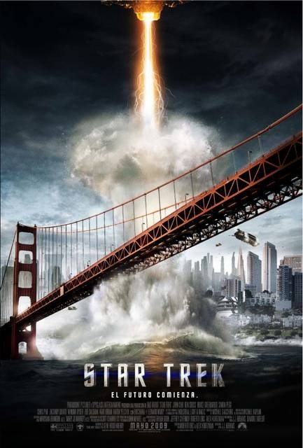
    Spanish Poster[​IMG]

    Japan[​IMG]

    Promotional[​IMG]
    [​IMG]

    Take special look at the Spanish and Japanese posters from the 09. How vague can you get? At least the Us, UK and other Europe posters gave us a blatant portayal of what they were advertising. Take the words star trek off the Spanish and Asian posters and you have no idea what you're looking at. And that's the Into Darkness poster. Vague.
     
  18. Sheridan

    Sheridan Lieutenant Red Shirt

    Joined:
    Aug 18, 2008
    LOL. "Myspace Movies" on the 2009 poster. It really has been a long time.
     
  19. Tom Riker

    Tom Riker Lieutenant

    Joined:
    Oct 9, 2012
    Future-London= Fundon?
     
  20. bullethead

    bullethead Fleet Captain Fleet Captain

    Joined:
    Feb 24, 2008
    Looks more like Londoom to me.