-
Welcome! The TrekBBS is the number one place to chat about Star Trek with like-minded fans.
If you are not already a member then please register an account and join in the discussion!
You are using an out of date browser. It may not display this or other websites correctly.
You should upgrade or use an alternative browser.
You should upgrade or use an alternative browser.
Design the Next Enterprise
- Thread starter Shikarnov
- Start date
...but the backlash from my win has basically took the fun out of it. I know I was CLEARLY not the fan favorite....
Honestly, your design slipped under my radar a bit, but I am so f**king glad you won it and not someone else. I mean, you've seen the runners up right? Save for Vektors and one of two others....yeesh.
I know that in itself might seem harsh, but at the end of the day you won it for an original, elegant design - which is more than can be said for most of the runners up. This fan likes it a lot.
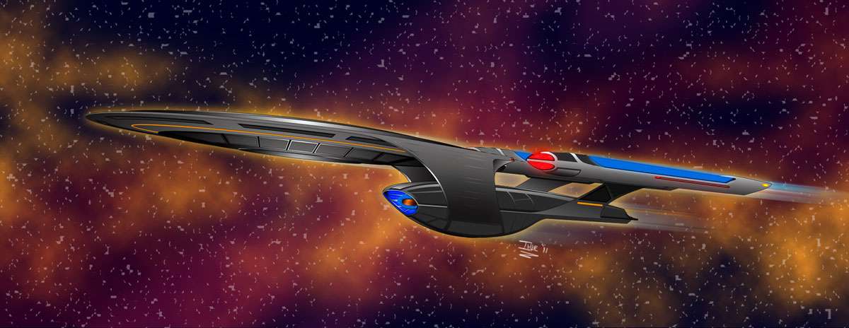
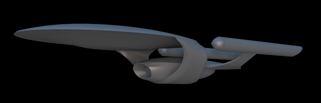
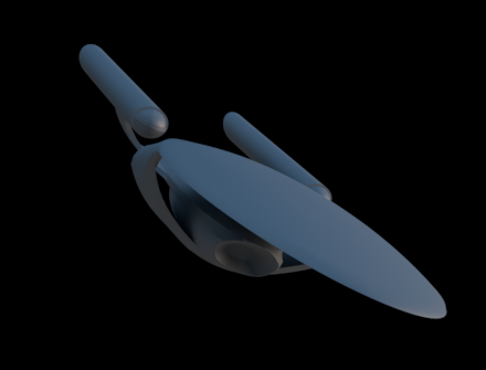
actually I guess this image is deceiving, the saucer is round keeping with the transition to the J. But I am glad this helps some people see where I was going with this.It also makes the saucer look like more of an arrowhead – which I really like. It somehow works better with the dual necks than the saucer does, IMO. It whole thing comes across as very sleek and thrusting, like a dart or arrow.
I really like this. This image leads me to believe that the two necks are actually one continuous piece that circles the secondary hull. If it were to separate I picture the secondary hull just slipping out of the "ring". Was this your intention?
Wow, I just got my wind back from your post. If the ring did actually encompass the secondary hull it could separate with it intact. Now here me out on this, if the ring was with the saucer and we know that ring warp drive technology is out there what you think of perhaps the saucer being warp capable. I am going to do an alteration to this rendering and send it to cryptic to add to there ideas you never know.
Is it bad that I like this idea?Try taking the "necks" with the saucer.
Ooh, yeah! And have them be able to fold out like a pair of wings, for orbital re-entry/emergency landings.
actually I guess this image is deceiving, the saucer is round keeping with the transition to the J. But I am glad this helps some people see where I was going with this.It also makes the saucer look like more of an arrowhead – which I really like. It somehow works better with the dual necks than the saucer does, IMO. It whole thing comes across as very sleek and thrusting, like a dart or arrow.
Sorry, didn't mean to imply that I thought you'd changed it – I was just saying that was my first impression with the foreshortening. Either way, it's a neat painting.
Sean, I promise you I am not going away, I am just not going to do anymore with this design. My life is very full, I am doing alot for Disney at the moment btw if anyone watches HGTV keep an eye out in June, you just might see me working on some stuff. (Shameless plug). I have received some serious accolades from Disney Imagineerings head of sculpting and have had the art director from The Harry Potter films tell me I did an outstanding job on my work for Universals Harry Potter theme park so I know I am a good artist. A few upset fans are not the issue, it was the poor sportsmanship from a few that got to me. That is what took the wind out of my sails. If it was just the upset fans I wouldn't care I didn't enter the contest to please them I entered because I am a Trek fan myself. I have seen the polls that have been created and you know what, no skin off my butt. Let them cry. I will just be reading all the raging on my new Alienware computer.")
That's the spirit. I too have seen the Polls and backlash threads. Just goes to show that there are alot of poor sports out there. I guess with Trek more than anywhere else you can't please everyone.
Now the the initial shock of not making it into the top 25 has worn off a little, I am seeing clearer. As you have posted sketches and this newer illustration I can see the appeal to the design.
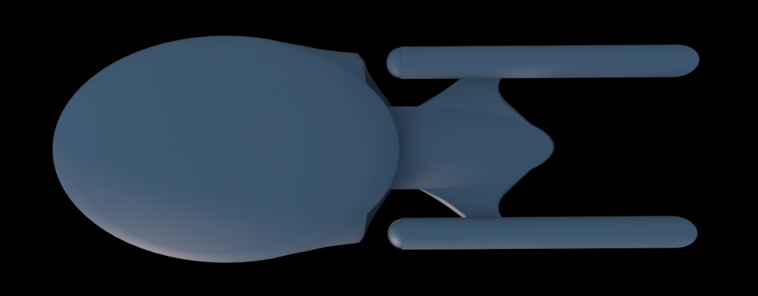
In your newer concept illustration you can see a little more of the Aventine approach in the Nacelles. I admit I will need
to get used to the Duel Neck in the design. I really like the front of the seconardy hull (That is actually my favorite part of your design). Enough with this...LOL
Congrats again, and don't let them get you down anymore. Enjoy the Alienware CPU I am sure that it is going to be a smoking custome CPU.
As for you shameless plug...way to go. Next to Trek and Star Wars the Harry Potter Universe is one of my favorite worlds to imagine and to get serious accolades from someone attached to that world is saying something.
I am sure you career will go even farther. Can't wait to see
that happen.
Hi guys, have to say I wish I could say I was as happy as I was when I got the first emails, but the backlash from my win has basically took the fun out of it. I know I was CLEARLY not the fan favorite, that has been made perfectly clear here and on other sites. That being said, i did a quicky rendering nothing special just a little clean up of the concept sketch I created. This is the last art of the Enterprise F I am going to do seeing as it does nothing but cause such harsh feelings. I am curious to see how close I got to what Cryptic is going to do with it. Now I have a pretty thick skin, I have been doing art and design as a profession for 15 years and I must be doing something right because my work can be seen at Disney World, Universal Studios, on television, in magazines and on DVD, but I hate to say it but this got to me. I have to say I have lost contracts and had people actually slam doors in my face and never once did I cry about it. I am going to walk away from this proud but saddened by the reactions. I would like to put this whole scenario behind me. To those who liked the idea I came up with I thank you for the support. All I ask is please don't ask me to do anymore with this design, as far as I am concerned the Enterprise F was just one more thing I have done, and I am moving on.
Hey, don´t put yourself on the floor! Let the harsh feelings for behind and keep the sketch evolving. The last pic sells the design much better, and I would like to see it evolving and other views posted here, so, maybe, me or other friend can give her a life in a high polly mesh.
")
Count on me as a fan of your ship and (before later than never) congratulations!
Cassio
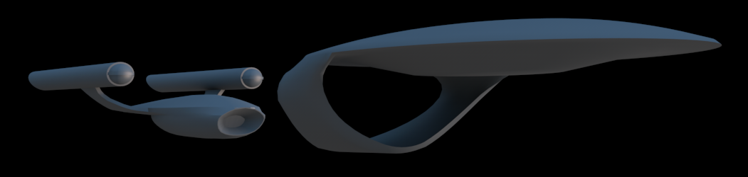
Heh, moving away from the hypotheticals...I've also started work on bringing TitanDesigner's F submission to 3 dimensions...
She´s looking marvelous, but the wip colour and plates can makes she passes as a romulan ship.

I´m waiting for updates bro!

Let me start by saying, Adam, that if this had been the rendering that appeared on the STO contest site, you would have had far more popular votes, and you still would have won with the judges. I'm certain the judges were studying the well-drafted, perspective-drawn images, including those in black-and-white (because yours won, of course). But I'm guilty as charged for having probably passed up your entry once or twice, along with several other black-and-whites and orthographics, to pause at mojomoe's which looked like it belonged in an art gallery (my father owned an art gallery for two decades) and bespeckle it with gold stars.
This is an outstanding rendering, Ihlecreations, and I would strongly advise you at this point to treat the unintelligent (and unintelligible) reactions to your work on STO and elsewhere (forgive me for not having read them myself) as a badge of honor. Post this newest rendering on the front of your Web site and place a link to it at the top of your resume. Have your loved one take a picture of you with your thumbs up behind your Alienware computer and a big Borg-eatin' grin on your face, and make that your logo for the next year.
Having published Web sites for audiences running into the millions, having run online contests not a single one of which was not publicly accused of fraud or conspiratorial judging, and having been a constant recipient of the crap that spews from the fingertips of the illiterate and undersexed, I can genuinely say that there's a point in time when it doesn't matter to you any more. The intelligent, perceptive, contributing, and caring folk among us are still out here, and we still care, and it's for us that you should do the work you do. And keep it up.
And with that, my next suggestion is that you experiment with the ring-docking idea because it could be pretty damn cool. Imagine if the ring that cradles the fuselage were to contain its own auxiliary deflector dish and warp coil, which spring into place when the fuselage is undocked.
Seriously. Now is the time for you to rub all our noses in the glory of your victory.
DF "Imagining a 'Yea, I Designed the Enterprise-F! Were You Sayin' Somethin' to Me?' T-shirt" Scott
I really like this. This image leads me to believe that the two necks are actually one continuous piece that circles the secondary hull. If it were to separate I picture the secondary hull just slipping out of the "ring". Was this your intention?
Wow, I just got my wind back from your post. If the ring did actually encompass the secondary hull it could separate with it intact. Now here me out on this, if the ring was with the saucer and we know that ring warp drive technology is out there what you think of perhaps the saucer being warp capable. I am going to do an alteration to this rendering and send it to cryptic to add to there ideas you never know.
That's sort of what I was thinking.
 I hope Cryptic goes for it!
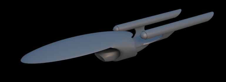
Wow. This second illustration is absolutely beautiful. I actually liked the first one a lot and was really not that surprised that it won the contest. I have a rather obsessive eye for lines and contours and needing them to be just right (part of the reason it takes me so frickin' long to design stuff), and the lines of your ship were clicking with me from the very start. This new image only fires those synapses even more strongly.
I will confess that I had my doubts about the dual neck setup, not because I didn't like the look (I very much did) but because my 3D modeler's brain immediately started seeing physical complications in connecting the two hulls without them twisting like ribbons. I actually ran into similar problems with the nacelle struts on my Grandeur model and it took me a while to solve them satisfactorily. I'll be very interested to see what Cryptic does with that particular feature.
As for the criticism of your design, I've followed a lot of discussions in a lot of different forums and I'd have to say that most of them don't have a frickin' clue what constitutes a good design or a bad one. Many of them are the type who will find fault with anything just to be the loudest and supposedly most "discriminating" voice in the room. Screw 'em. You won, they lost. Moving on.
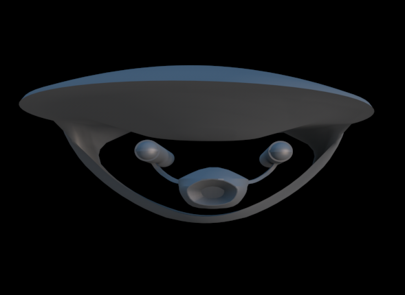
Sean, Jason and the rest of you guys, I really want to say thank you. To be honest, I am a character artist first and foremost, so although I can do objects I have always been envious of you guys who seem to be able to make it look effortless. I seriously wasn't expecting anything to come from this contest, and then to win it was beyond a shock. To hear you guys say you appreciate my design means a lot. Vek, when you look at the saucer next time imagine the line from the beginning of the support strut going straight back and flat at the backside. This is where the impulse engines would be.
Also wanted to add since I have no 3G rendering skills anyone who wants to take a stab at it let me know I will see about getting you the views you need.
@Ihlecreations: You've sold me on the neck now.
Give the fans time. They'll come around.
Count your blessings. Many of us are wasting our lives at jobs we hate dreaming of a career in the arts. Getting paid to do what you love is the real prize.
Give the fans time. They'll come around.
Count your blessings. Many of us are wasting our lives at jobs we hate dreaming of a career in the arts. Getting paid to do what you love is the real prize.
Also wanted to add since I have no 3G rendering skills anyone who wants to take a stab at it let me know I will see about getting you the views you need.
Me! Me!

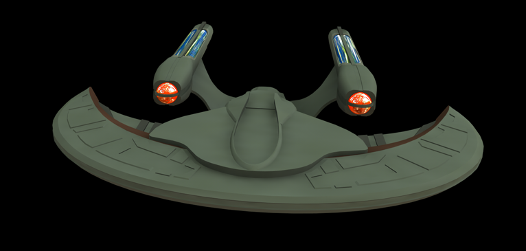
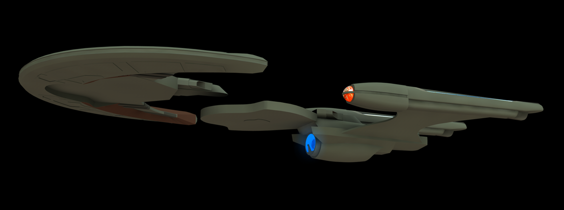
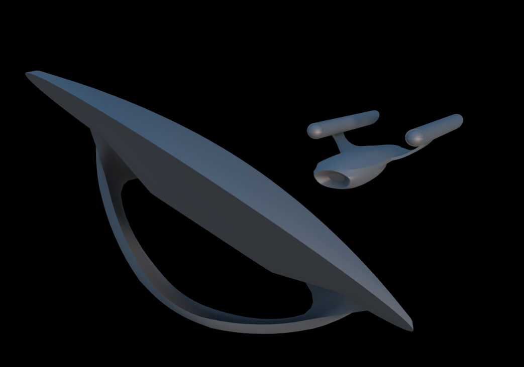
Although I've already had a couple of goes, I took another stab at it again earlier. I think this version is the closest yet to your intended design.
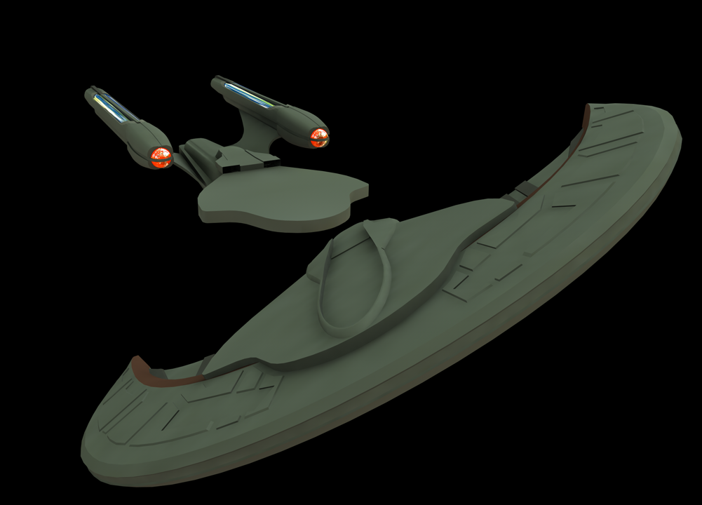
And the ring saucer sep concept...
That saucer sep looks great Dac. I hope cryptic does it that way, though based on dstahl's description, believe they might actually be "stealing" my horseshoe shape sep.  (bottom left)
So I guess they at least saw my supplementary material. Or it's just a coincidence.
Try to get the ring a bit smoother though (and maybe a bit thicker where it meets the saucer), and try not to clip through the secondary hull where they meet. There should be a socket and ideally clamps. Just thoughts for the future. I know it's very rough yet.
(bottom left)So I guess they at least saw my supplementary material. Or it's just a coincidence.
Try to get the ring a bit smoother though (and maybe a bit thicker where it meets the saucer), and try not to clip through the secondary hull where they meet. There should be a socket and ideally clamps. Just thoughts for the future. I know it's very rough yet.
Try to get the ring a bit smoother though, and try not to clip through the secondary hull where they meet. There should be sockets and clamps.
Oh I agree, its just everything I've done regarding this Ent-F is only preliminary while I wait for Ihlecreations or Cryptic to release a more final design. I just wanna get the shape right to try and visualize it fully.
Also, that sucks of Cryptic do nick that horseshoe concept. I thought they were gonna go for the russian doll saucer in a saucer concept I knocked up on the last page. If i'm not mistaken something similar was in a John Eaves concept for STO.
Similar threads
- Replies
- 5
- Views
- 953
- Replies
- 5
- Views
- 3K
- Replies
- 3
- Views
- 5K
If you are not already a member then please register an account and join in the discussion!