• Welcome! The TrekBBS is the number one place to chat about Star Trek with like-minded fans.
    If you are not already a member then please register an account and join in the discussion!

The Flag of United Earth

Really puts those Pacific Islanders in their place huh?

Beverly Crusher suggested (in a hypothetic) that Australia was late to join United Earth, would explain another feature of the flag, no eastern Australia.

Certainly a fair criticism. Personally, I like to pretend that United Earth later changed the projection well enough that Australia, New Zealand, and the Pacific Islands are more clearly visible.

Why does Australia connect with Antarctica?

You would have to ask Mike Okuda, the graphics designer for Enterprise.

Since I finally bothered to upload it to my Photobucket account, though, here is the canonical Flag of United Earth, as seen in the ENT episodes "The Forge" and "Terra Prime:"

591px-Flag_of_United_Earthsvg.png
 
Personally, I always liked this one by James W. Cadle. Simple and effective, without any awkward map or esoteric symbol.

355px-CadleFlagEarthsvg.png

Agreed. Nice colours, simple appearance. It captures the "blue planet", accompanied by an obviously smaller moon. There is no map, thus not discriminating Antarctica as the U.N. flag does and also not potentially causing any debate about which part of the world is "on top" of the map.

While most alien species would probably also live on a mostly blue planet with maybe one or several moons and surely orbit around a star, it's the most politically correct, aesthetically pleasing and most simple flag of a united earth I've seen yet.
 
I based it off the colors of the Olympic rings with the exception of the two additional colors I added to represent the other two continents.
As i understand it, the current five rings in the Olympic flag symbolize the (supposed) five races of Humanity, which makes more sense than basing the flag on the continents of one planet in a multi-planet nation like United Earth. Even if those continent are on the "home world."

By the time the time of TOS rolls around, United Earth might be dozen or even hundreds of worlds.

:)
 
I based it off the colors of the Olympic rings with the exception of the two additional colors I added to represent the other two continents.
As i understand it, the current five rings in the Olympic flag symbolize the (supposed) five races of Humanity...

Nope.

The symbol of the Olympic Games is composed of five interlocking rings, colored blue, yellow, black, green, and red on a white field. This was originally designed in 1912 by Baron Pierre de Coubertin, the founder of the modern Olympic Games. Upon its initial introduction, de Coubertin stated the following in the August, 1912 edition of Revue Olympique:

The emblem chosen to illustrate and represent the world Congress of 1914...: five intertwined rings in different colors - blue, yellow, black, green, and red - are placed on the white field of the paper. These five rings represent the five parts of the world which now are won over to Olympism and willing to accept healthy competition.

According to De Coubertin the ring colors with the white background stand for those colors that appeared on all the national flags of the world at that time.

The current view of the International Olympic Committee (IOC) is that the symbol "reinforces the idea" that the Olympic Movement is international and welcomes all countries of the world to join. As can be read in the Olympic Charter, the Olympic symbol represents the union of the five continents and the meeting of athletes from throughout the world at the Olympic Games. However, no continent is represented by any specific ring. Prior to 1951, the official handbook stated that each colour corresponded to a particular continent: blue for Europe, yellow for Asia, black for Africa, green for Australia and red for America (North and South considered as a single continent); this was removed because there was no evidence that Coubertin had intended it.


http://en.wikipedia.org/wiki/Olympic_symbols
 
Huh. I had always been under the impression the colors were derived from each nation's flag having at least one of those colors in it.
 
How about this? Earth as a blue circle, so avoiding any political quarrels about which countries appear where, in black representing space, with a ring of stars.

UnitedEarthFlagcopy.jpg
 
That is kind of awesome. Not sure if the blue globe it's immediately recognizable as "Earth" without the moon or any feature, but it's really beautiful. Excellent work.
 
Huh. I had always been under the impression the colors were derived from each nation's flag having at least one of those colors in it.

Take another look at my post. That's in there too. :)

According to De Coubertin the ring colors with the white background stand for those colors that appeared on all the national flags of the world at that time.
 
I liked the gay UN flag better when it was China's 1912 republican flag. :shifty:

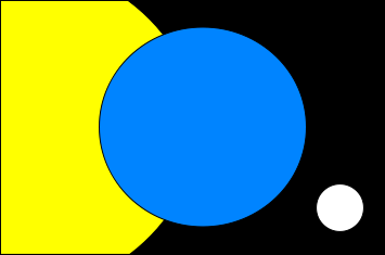
Why, because it has multicolored stripes?

Point taken, but most stripe patterns don't go as far, either limiting the colors (America, Cuba, Greece) or limiting the number of stripes (Russia, Serbia, Hungary, etc.). (Of course, there is always the Comoros.) The post-Qing flag of China always struck me as very different, and for much the same reason as yours, because of the challenge of graphically representing as many ethnic groups as possible.

regarding the actual design, it's actually not so bad but the UN's canton is clashy.
 
... and also not potentially causing any debate about which part of the world is "on top" of the map.

Is it Big Block of Cheese Day, already? ;)

I don't fully understand, but I think I know what your objection is.
Still: A Flag representing a whole planet would better represent it impartially, neutrally and whollly, wouldn't it? Who knows, maybe one day, there'll be some small cities on Antarctica with families living there?
 
How about this? Earth as a blue circle, so avoiding any political quarrels about which countries appear where, in black representing space, with a ring of stars.

UnitedEarthFlagcopy.jpg

I really like this. Have you thought of adding the moon to it? I know that would ruin the perfect symmetry (I'm OCDish enough myself to be spazzed out by symmetry being out of whack) but on many of the other flags featured I preferred the ones that also featured our moon.

Someone mentioned earlier (was it Iguana?) about a flag's design needing to be simple enough for a child to draw. As a child incapable of drawing a maple leaf growing up in Canada, I heartily second this motion. :bolian:
 
The point I was making in my last post was that perhaps the flag should
be a representation of the people of United Earth and not it's terrain.

:)
 
T'Girl said:
The point I was making in my last post was that perhaps the flag should
be a representation of the people of United Earth and not it's terrain.

I didn't really think about that. Maybe there should, in reality, be a UE flag, a sol system flag and a human colonies flag?

The idea of human races is absolutely unscientific though and should not be represented in a flag. Through globalization, different ethnicities will mix even more, so that one day, there'll probably be no more europeans, africans and asians. Maybe we'll simply become one?

Tiberius said:

Just what exactly do the stars represent? Nothing. They're just good-looking but meaningless.
 
... and also not potentially causing any debate about which part of the world is "on top" of the map.

Is it Big Block of Cheese Day, already? ;)

I don't fully understand, but I think I know what your objection is.
Still: A Flag representing a whole planet would better represent it impartially, neutrally and whollly, wouldn't it? Who knows, maybe one day, there'll be some small cities on Antarctica with families living there?

Sorry, there's no objection on my part, just a joke about 'The West Wing.' On the show they have "Big Block of Cheese Day," where advocates for causes that wouldn't normally be given the time of day at the White House get a shot at presenting their case to the senior staff.

On one of those days, a group called Cartographers for Social Equality (led by Dr. Phlox ;)), presented their case that classrooms should replace their Mercator Projection maps with equal-area Peters Projection maps. At the end, they even suggested inverting the map to favor the Southern Hemisphere.

So basically they're discussing the same issues you mention above.

You can see it here:

[yt]http://www.youtube.com/watch?v=n8zBC2dvERM[/yt]
 
If you are not already a member then please register an account and join in the discussion!

Sign up / Register


Back
Top