Personally, I always liked this one by James W. Cadle. Simple and effective, without any awkward map or esoteric symbol.
Wow... that is really ugly.
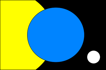
Looks like Pac-Man is hungry!

Personally, I always liked this one by James W. Cadle. Simple and effective, without any awkward map or esoteric symbol.
Wow... that is really ugly.
Actually those are olive branches, symbolic of peace.A number of creative people have designed their own version of the United Earth flag on various fansites, and most of them are generally modeled after the United Nations flag, featuring a geographical globe of Earth surrounded by laurel leaves.
Personally, I always liked this one by James W. Cadle. Simple and effective, without any awkward map or esoteric symbol.
")
Really puts those Pacific Islanders in their place huh?You can view it here.
Beverly Crusher suggested (in a hypothetic) that Australia was late to join United Earth, would explain another feature of the flag, no eastern Australia.
Certainly a fair criticism. Personally, I like to pretend that United Earth later changed the projection well enough that Australia, New Zealand, and the Pacific Islands are more clearly visible.
I know. It was a typo (too many gladiator movies recently).Actually those are olive branches, symbolic of peace.A number of creative people have designed their own version of the United Earth flag on various fansites, and most of them are generally modeled after the United Nations flag, featuring a geographical globe of Earth surrounded by laurel leaves.
On one of those fansites I mentioned earlier, I recall there was a basic United Earth flag that showed every continent, but then there were also "local" United Earth flags with the same globe and olive branch motiff that catered to specific regions more (one for North America, another for South America, Europe, Asia, Africa, etc.--even Antarctica).One good thing about the globe on the U.N. seal is that it’s a polar azimuthal equidistant projection, so just about every bit of land is shown except Antarctica. And nobody lives in Antarctica except penguins and a few bored scientists.
That's actually a great idea.Maybe the Olympic games flag would be better.


These are more or less the only workable ones. I quite like n.3, personally. N.4's shape is intriguing, but blue over green is awful.


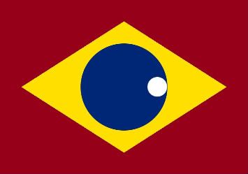
Well, Brazil would make a good Earth's flag (without the equatorial scroll and southern stars). Apparently, someone beat me to it.I was going for a play on Brazil's flag with that last one
")
In general, I prefer flags that use the Rule of tincture: "metal (i.e. white or yellow) should not be put on metal, nor colour (i.e. any other colour) on colour". Heraldic silliness aside, it's a good rule of thumb, as it makes for easily recognizable (and usually aesthetically pleasing) flags.If you want to mess around with the colors to make them more to your liking, go for it.

We use essential cookies to make this site work, and optional cookies to enhance your experience.

