Design the Next Enterprise

Discussion in 'Fan Art' started by Shikarnov, Nov 17, 2010.

  1. Irishman

    Irishman Fleet Captain Fleet Captain

    Joined:
    Aug 9, 2004
    Location:
    Charlotte, NC
    At lease they're unique.
     
  2. Saquist

    Saquist Commodore

    Joined:
    Jun 22, 2009
    Location:
    Starbase Houston
  3. sojourner

    sojourner Admiral In Memoriam

    Joined:
    Sep 4, 2008
    Location:
    Just around the bend.
    Well, I decided my design was as done as it was going to get and I went ahead and submitted it today. Thanks to Vektor for his work on determining the best aspect ratio!

    I feel I failed with my design in so far as coming up with something new while still retaining the "Enterprise fundamentals". Still, I think it's a good design.

    http://www.startrekonline.com/enterprise/gallery?filter=search&keyword=eickler
     
  4. Dac

    Dac Commodore Commodore

    Joined:
    Aug 9, 2005
    Location:
    The Essex wastes...
    Not bad man by any means. I really like the side view. However, I think if you'd just made the pylons a bit more "flowy" and less rigid you'd be onto a great design. Unfortunately I think the blockyness of it leads more to an early 24th century lost era design more than anything else.
     
  5. goofy

    goofy Lieutenant

    Joined:
    Dec 25, 2010
  6. Dac

    Dac Commodore Commodore

    Joined:
    Aug 9, 2005
    Location:
    The Essex wastes...
    Whoa, thanks goofy, I totally missed those on his blog. That fast attack ship design is pretty nifty too.
     
  7. sojourner

    sojourner Admiral In Memoriam

    Joined:
    Sep 4, 2008
    Location:
    Just around the bend.

    Yea, I just can't seem to get into the flowing designs needed for the era.
     
  8. goofy

    goofy Lieutenant

    Joined:
    Dec 25, 2010
    [​IMG]

    more of John Eaves' fast attack ship
     
  9. Saquist

    Saquist Commodore

    Joined:
    Jun 22, 2009
    Location:
    Starbase Houston
    The isometric perspective view has...potential.
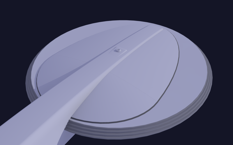
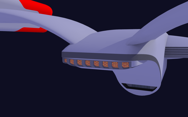
    I'm not sure about the choice in certain details like the bussards but the return of the circular saucer is interesting. The Pylon supports is a new take as well as the nacelle mounts are very unique and don't contradict structural realities. I can't see the lower hull but it looks weird and the squareness of it's tail is a bit raw.

    The Pylons:
    They look interesting in the perspective view but ordinary in the plan view. It's quite a contrast. I expected something more fluid in the plan.

    Side Profile:
    Very balanced. Each module has it's own tier. The nacelles on the top and the saucer next and the Star Drive last. The Greater Mass above the star drive has a balanced distribution because of the length of the nacelles but a unlike most star fleet designs this has a good solid center of mass from this view.

    Plan View Top:
    The design is lanky and slim. I don't particularly agree with the straight meld from the star drive to the saucer over the top but it's hard to conceptualize without a back/top view.

    Overall:

    Its the the balance and proportions are the best parts. I think it needs more work in the details but the original configuration maintains the Constitution standard while I detect a Excelsior like inspiration with the rear stardrive section that's appealing from the rear/bottom perspective. The aft section of the nacelles are a keeper but the bussards need a more modern style. And for some reason...I actually like the almond shape in the middle of the saucer. I have yet to figure out why I like it. I'll think about it....get back to you.
     
  10. Kaiser

    Kaiser Rear Admiral Rear Admiral

    Joined:
    Sep 19, 2007
    Location:
    Boyertown, PA as of July 2011
    Looks good to me :) :techman:
     
  11. BolianAuthor

    BolianAuthor Writer, Battlestar Urantia Rear Admiral

    Joined:
    Sep 24, 2003
    Location:
    Torrance, California
    I too, like it.
     
  12. sojourner

    sojourner Admiral In Memoriam

    Joined:
    Sep 4, 2008
    Location:
    Just around the bend.
    Thanks Saquist, good comments. I agree on the forward nacelles not really reaching a 25th century aesthetic. I'll post a couple close-ups here tomorrow that won't violate contest rules to give you a look at some of the areas that are hard to see.

    As far as "25th century innovation" in the design, the only real thing I thought about was the lower most cascade of the black ring around the saucer edge. That's the phaser strip. Nearly 360 degree arc and can target both above and below the saucer due to it being on the outermost edge. I envision the ship to be some where in the size range of the Ambassador class.
     
  13. DFScott

    DFScott Captain Captain

    Joined:
    May 16, 2001
    Location:
    Indianapolis, IN
    I decided to vote this one up, Sojourner. I think it obviously qualifies as a ship that's "clearly the Enterprise," keeping all the visual cues that would enable a five-year-old to identify it correctly if he saw it on a book cover or in the midst of a video game.

    But the one distinctive element it adds is something I've decided I like. This ship has a backbone. It runs from the nose clear to the hangar deck (if that's what that is) [EDIT: I see from your recent posts that it's your impulse engines, and this is a great place for them], and it suggests strength, direction, and alignment of functions. If there's anything an engineer could criticize even about the original Jefferies design of 1701, it's this idea that an occupant has to zig-zag through an elevator to get between the two most important rooms in the ship. Your design has a trunk, a spine, and the saucer is aligned with it. This is something the John Eaves 1701-E suggested, but your design makes a bit more plainly obvious. The deflector and sensor functions hang below the spine a bit, and the control functions are maybe one or two flights above it.

    Your design isn't this queenly, luxurious cruise ship like the 1701-D, but I frankly never really liked that aspect of D anyway. I've always thought Enterprise's character should be bold, but plainly stated -- less Jean-Claude Van Damme, more Clint Eastwood. (Or if you prefer, less Angelina Jolie, more Diana Rigg.)

    And so you didn't texture it or pose it, but so what. Jefferies presented some sketches to Roddenberry, and he pointed at some and said I like that one, maybe that one, flip this one upside down and I like it better, I don't like that one... And you've presented a contender, which works. I've seen fully textured models I don't care for nearly as much.

    DF "Once Again Alluding to Angelina Jolie" Scott
     
    Last edited: Jan 13, 2011
  14. DFScott

    DFScott Captain Captain

    Joined:
    May 16, 2001
    Location:
    Indianapolis, IN
    Irishman: We had this discussion about three years back when Gabriel Koerner suggested essentially dressing up the 1701 but dividing it into twice the number of decks, miniaturizing the windows, and calling it bigger. In a thread on this forum, I remember Koerner suggesting that this improved the 1701 design by giving it, as he described them, bigger breasts.

    I responded then (or if I didn't, I should have) that a well-engineered, artistically considerate design suggests to the eye automatically the size that it is. You can't just inflate a good design to double or triple the size and suggest that it fits. Bernd Schneider on Ex Astris Scientia posted a wonderful discussion on why, after the latest Trek movie was produced, the guys who boasted how great it was that the new 1701-XI was double its original size, were just blowing smoke. Putting together all the visual cues, including deck divisions, Schneider demonstrates that Ryan Church had no obvious intention to make 1701-XI significantly larger than it ever was.

    (Besides, the interior designers placed all the important rooms within 30 yards of one another anyway: sickbay's down the hall from the bridge, turn right instead of left and there's the transporter room, and just downstairs is the brewery. But that's another tangent.)

    In short, if you're making your ship triple the size, you need to present some degree of engineering that justifies the expansion. I like the '66 Ford Mustang too, but I wouldn't triple its size and call it a Freightliner.

    DF "Although There Were Times During the Last Snowstorm I Could Have Used a One-third Scale Freightliner" Scott
     
    Last edited: Jan 13, 2011
  15. SonicRanger

    SonicRanger Rear Admiral Rear Admiral

    Joined:
    Feb 17, 2001
    Location:
    Minneapolis, MN
    Yeah, it's not as if Jefferies and Roddenberry just arbitrary increased the size of the TOS Enterprise...

    Oh, wait, right, they did.
     
  16. sojourner

    sojourner Admiral In Memoriam

    Joined:
    Sep 4, 2008
    Location:
    Just around the bend.
    As promised, 2 closeups. Now, I went into this design knowing it would only be seen in very small images, so I made no real atempt at detail or precision. I just wanted to get the broad strokes down as it were.
    Here is a better look at the "almond shape" of the primary hull. I have always loved the side profile of the Excelsior Class primary, but didn't want to ape it completely, so I changed the shape of the upper and lower "domes".
    [​IMG]

    Here is a close-in of the rear with my "electric razor" impulse engine. If my skills and Sketchup had been up to it, this whole area including the nacelle struts would have been one blended and flowing piece.
    [​IMG]
     
  17. DFScott

    DFScott Captain Captain

    Joined:
    May 16, 2001
    Location:
    Indianapolis, IN
    I can see where the creators had license to play with their original scales prior to setting everything in stone. Yea, they were thinking about something the size of George Jetson's car before they went with the 1701 we all know. But the very first shot of "The Cage" gave the viewer some sense of the final scale of the ship, and I think one reason it's worked as well as it has is because the architecture fits the scale. It works at the size the creators settled on. Making something arbitrarily bigger doesn't make it grander.

    DF "Wishes Donald Trump Were Tuning In" Scott
     
  18. Redstang

    Redstang Cadet Newbie

    Joined:
    Dec 26, 2010
  19. Titan Designer

    Titan Designer Fleet Captain Fleet Captain

    Joined:
    Oct 7, 2005
    Location:
    Colorado Springs, CO
  20. Kaiser

    Kaiser Rear Admiral Rear Admiral

    Joined:
    Sep 19, 2007
    Location:
    Boyertown, PA as of July 2011