• Welcome! The TrekBBS is the number one place to chat about Star Trek with like-minded fans.
    If you are not already a member then please register an account and join in the discussion!

Design the Next Enterprise

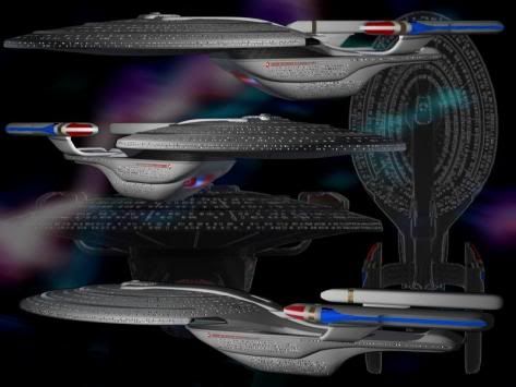
Well firstly the impulse engines are not pointing up, they're angled and are located above and below the secondary hull so in total there are 4 and allows quick manoeuvres. Due to the engines being shaped the way they are they look square when viewed from above. :p

The saucer is connected to the secondary hull, as I said before, centrally. In a way you could say the edge of the saucer is embedded in the secondary hull, at least that's what it would look like.

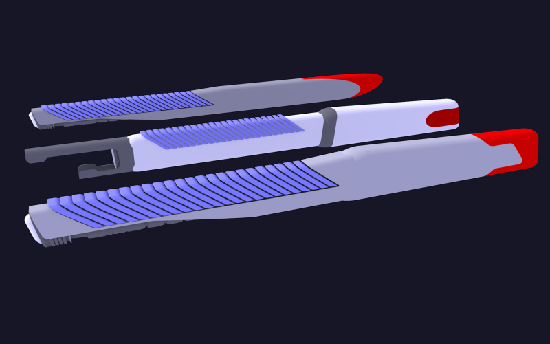
As for what are the light blue lines, why they're aesthetic of course. ;)

I'm already doodling my own sketches of it from scratch. I bet I can make your concept look fab. Mind you, it's going to conform to MY design sensibilities, so it will end up looking like the Ent-D did compared to TOS Enterprise...
 
I'm already doodling my own sketches of it from scratch. I bet I can make your concept look fab.

Cool. I look forward to seeing it. :)

Don't get your hopes up... I'm not a miracle worker, you know...:rofl:

I'm ditching the circular saucer for a big, long oval.

Your warp engines are attached at two points - this suggests that they are "held firm" and should be tight and compact against the ship. I don't want it to look like a squat little square, so I want the engineering section and the engines and the pylons crunched down in the aft, and the big long oval saucer will stretch out pretty far, to dominate.
 
Of all the ones I have seen this one is by far my favorite!

1701f.jpg

 
^
Too 90s for my taste.


~Belisarius
---------------------------
"All life is struggle, from first breath to last."
- Anonymous
 
Here are some nacelles I am NOT using. Sigh, don't think I will ever get this any place interesting. The current favorite, not shown, has details similar to the front nacelle.
scenacelleNo.png
 
I think you need to follow the aesthetics of the warp engine field grill to influence your bussard collector design. In other words, your grill looks like a venting ridge, or gills, or layers of quills, or any number of interesting features found in nature...perhaps even Picard's lionfish. Subsequently, I'd say take a look at some aquatic shell geometry for the shape of your bussard colllectors, or "intakes" from combat aircraft, etc. Go another way with it. Think practical. Think organic. Take what you have that works well (those interesting ridges) and expand that throughout the design. I think you'll have a great starting point to wrap a 25th-century starship around, as well.


~Belisarius
---------------------------
"All life is struggle, from first breath to last."
- Anonymous
 
I'm already doodling my own sketches of it from scratch. I bet I can make your concept look fab.

Cool. I look forward to seeing it. :)

Still sketching... still going off on wild tangents...

I gotta tell ya, when I drew a side view, the engineering hull (the way I drew it anyway) looked a lot like the paddle wheel on an old riverboat:

mississippi-riverboat-cruises.jpg


I even had echos of the famed Fhloston Paradise:

fifth-element.jpg
 
I'm posting a larger version of my ship (posted before) because the size on the site is rather small.


I never really saw the Enigma as a Enterprise but why not? It's the same twin Engine design in a slightly more advanced 24 century style. I think it's design lineage is obvious. Made for Transwarp and Stealth. And it's running a length of 520 meters.
 
I never really saw the Enigma as a Enterprise but why not? It's the same twin Engine design in a slightly more advanced 24 century style. I think it's design lineage is obvious. Made for Transwarp and Stealth. And it's running a length of 520 meters.

Saquist, I think your Enigma class would be an awesome Enterprise, excellent intense design.:bolian:
 
That one caught my eye when it first went up. Very cool design. Almost looks like it has some Klingon influence with the way the nacelle pylons are shaped.

I just hope re-posting it here doesn't mess with the rules about entries not being "published" anywhere else.
 
I hope that's not the case.
The DJ Curtis' Century and Sean Tourangeau's new design don't deserve to be disqualified.
 
It doesn't help that it seems as if multiple people are posting the Century as their own entries. Good old fashioned plagiarism!


Sometimes I'm wondering if this is not actually a contest for the worst survey website in the gaming business.
 
^
"Thank you for helping us help you help us all. Now f*** off."

;)


~Belisarius
---------------------------
"All life is struggle, from first breath to last."
- Anonymous​
 
If you are not already a member then please register an account and join in the discussion!

Sign up / Register


Back
Top