My poster for the sequel.
http://img545.imageshack.us/i/xiiposter.png/
http://img545.imageshack.us/i/xiiposter.png/
") Excellent poster. I want it.
Excellent poster. I want it.I miss the good old days when artists made the posters instead of photoshopped "head shots". In fact, I'm just going to bring out a poster that is very dear to my heart.
See? That's an awesome freaking poster.... well, if you take out the theater seat and the text up above. Even with that, I still like it better than any of those close up shots of the actors looking down on us.
") )
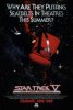
)2. If you take out the movie seat and the text, all you have in your poster is the backdrop of space with a tiny little TMP Enterprise. What's exactly so "freaking awesome" about that? (And it goes without saying that the movie that poster was advertising was the farthest from "freaking awesome" as you could.


Not sure the STIV posters are good examples for your point, J. After all, very little of TVH took place in space, so those posters were far more indicative of the film's setting.OMG! Leonard Nimoy doesn't know anything about Star Trek! Why, these aren't even in space!
Not sure the STIV posters are good examples for your point, J. After all, very little of TVH took place in space, so those posters were far more indicative of the film's setting.OMG! Leonard Nimoy doesn't know anything about Star Trek! Why, these aren't even in space!
Jeyl said:But the most common theme that I like about the old posters was that it was in space.... Space. The setting of most Star Trek stories....

 ).
).Yeah, I follow now. I think I read through the thread too quickly earlier. At least that FC poster still gives you an idea that it's a Trek film, though, whereas I can also see his point about the STXI international poster not giving any real visual clues that it's for a Trek film (other than the title
If he would have displayed the official U.S. release poster, or even the official U.S. teaser poster, his point would have been moot.
Please...
Do you just get up every morning and write out agenda items for What I'm Going to be Irate About Today? Seriously. Stop.

If he would have displayed the official U.S. release poster, or even the official U.S. teaser poster, his point would have been moot.
Please. What I'm trying to emphasize here is that this marketing strategy isn't trying to showcase space as an element in a movie that's called STAR TREK. A movie based on a series about space travel. The Voyage Home poster is different because that's a film that changed the setting from previous entries. This however is supposed to be the first in a new series yet it leaves out that element in favor of faces and silhouettes, even going so far as to paint it as a disaster movie like Independence Day in other countries. It's like they're saying Star Trek doesn't work if it's marketed as such.
And it's not just the marketing either. The whole context of the film's story practically has no interest in space at all. Like that scene with Kirk looking at the Enterprise under construction. Forget the Star Wars touches, I'm not not going to touch that. But if you want to remove the interest in space travel, don't start with someone looking up at the stars wondering what's out there, but instead have him look at an Earth made object that he wants for his own. Heck, they made a poster for that one to.
Yet your argument is rendered moot by my simply posting images from official release posters that aren't set in space, which I have done.
Yet your argument is rendered moot by my simply posting images from official release posters that aren't set in space, which I have done.
Yeah, my original point being that 'that' one official poster totally sells the "Star Trek" feel by having it be all Independence Day style with a laser shooting down on a recognizable landmark.
We use essential cookies to make this site work, and optional cookies to enhance your experience.