• Welcome! The TrekBBS is the number one place to chat about Star Trek with like-minded fans.
    If you are not already a member then please register an account and join in the discussion!

What's wrong with Comic Sans?

Garamond is a great font.
I dislike Garamond, not because it's done anything to me, but because I've seen way too many resumes done in Garamond, as that is/was the font Microsoft Word's resume wizard used. Garamond, to me, is laziness.

It also reminds me of a scene in "The Devil's Heart" by Carmen Carter, that speaks of Garamond the High Ruler of the Romulan people. "Garamond the mighty, Garamond the Dead!" (as spoken by J'Ross, his former Queen).
Love that book. :)
 
You're all a bunch of wankers.

Now with that out of the way, Comic Sans responds by way of Mike Lacher:

Listen up. I know the shit you've been saying behind my back. You think I'm stupid. You think I'm immature. You think I'm a malformed, pathetic excuse for a font. Well think again, nerdhole, because I'm Comic Sans, and I'm the best thing to happen to typography since Johannes fucking Gutenberg.

You don't like that your coworker used me on that note about stealing her yogurt from the break room fridge? You don't like that I'm all over your sister-in-law's blog? You don't like that I'm on the sign for that new Thai place? You think I'm pedestrian and tacky? Guess the fuck what, Picasso. We don't all have seventy-three weights of stick-up-my-ass Helvetica sitting on our seventeen-inch MacBook Pros. Sorry the entire world can't all be done in stark Eurotrash Swiss type. Sorry some people like to have fun. Sorry I'm standing in the way of your minimalist Bauhaus-esque fascist snoozefest. Maybe sometime you should take off your black turtleneck, stop compulsively adjusting your Tumblr theme, and lighten the fuck up for once.

People love me. Why? Because I'm fun. I'm the life of the party. I bring levity to any situation. Need to soften the blow of a harsh message about restroom etiquette? SLAM. There I am. Need to spice up the directions to your graduation party? WHAM. There again. Need to convey your fun-loving, approachable nature on your business' website? SMACK. Like daffodils in motherfucking spring.

When people need to kick back, have fun, and party, I will be there, unlike your pathetic fonts. While Gotham is at the science fair, I'm banging the prom queen behind the woodshop. While Avenir is practicing the clarinet, I'm shredding "Reign In Blood" on my double-necked Stratocaster. While Univers is refilling his allergy prescriptions, I'm racing my tricked-out, nitrous-laden Honda Civic against Tokyo gangsters who'll kill me if I don't cross the finish line first. I am a sans serif Superman and my only kryptonite is pretentious buzzkills like you.

It doesn't even matter what you think. You know why, jagoff? Cause I'm famous. I am on every major operating system since Microsoft fucking Bob. I'm in your signs. I'm in your browsers. I'm in your instant messengers. I'm not just a font. I am a force of motherfucking nature and I will not rest until every uptight armchair typographer cock-hat like you is surrounded by my lovable, comic-book inspired, sans-serif badassery.

Enough of this bullshit. I'm gonna go get hammered with Papyrus.
 
Huh. Not sure how I missed that, I certainly recollect the posts immediately before and after it. My mind must've edited it out of existence on account of the extended hyperlink thing, although I'm not sure why that would be the case. Vague resemblance to an advertisement perhaps? :confused:
 
I personally prefer Verdana, at least for computer screens. Garamond's also nice, if I can get my hands on it.

Garamond is a great font. It also reminds me of a scene in "The Devil's Heart" by Carmen Carter, that speaks of Garamond the High Ruler of the Romulan people. "Garamond the mighty, Garamond the Dead!" (as spoken by J'Ross, his former Queen).

Too much? :shifty:

The trouble is, it's a pain to get a hold of. >.<
 
Wow, people really give a shit about fonts? Umm, ok. I only 'care' about fonts when someone copies something with fixed width formatting into a variable width font and I have to go through the trouble of converting it so I can read their fucking table.
 
I don't hate it, but it is overused.

I generally stick to three fonts: Palatino Linotype for professional-looking stuff, Calibri for all of our brochures at the library (it's easy on the eyes and friendly-looking, yet still professional-looking), and Gill Sans for the screensaver ads I make for our demo NOOKs at the bookstore (Gill Sans is the "official" font for all NOOK-related advertising). I'll pull out different fonts depending on the occasion, but these three serve me pretty well.
 
This is a font that's much hated across The Interwebnetsformationhighways. Why? I mean, sure, it's not a great font, but I mean it's not terrible. I rarely use it, I'm more of an "Arial" fan, myself. But many people have some deep, deep hate for Comic Sans.

Porque?
This thread is the only place I have ever seen people even mention a hate of comic sans.
 
Does anyone here love FixedSys as much as I do? When I need a monospace font, fuck Courier. FixedSys all the way!!!

I grew up on DOS, that probably has something to do with it.
 
Does anyone here love FixedSys as much as I do? When I need a monospace font, fuck Courier. FixedSys all the way!!!

I grew up on DOS, that probably has something to do with it.
Quark Express used to have a problem where it would substitute whatever font was in the document with courier. It all came from not having that non-courier font on your computer.
 
Apparently the hatred for Comic Sans is not a new phenomenon....


[yt]http://www.youtube.com/watch?v=KzmrxKhaKRU[/yt]
 
This is a font that's much hated across The Interwebnetsformationhighways. Why? I mean, sure, it's not a great font, but I mean it's not terrible. I rarely use it, I'm more of an "Arial" fan, myself. But many people have some deep, deep hate for Comic Sans.

Porque?
This thread is the only place I have ever seen people even mention a hate of comic sans.

Don't know any designers, eh?
 
Wow, people really give a shit about fonts? Umm, ok. I only 'care' about fonts when someone copies something with fixed width formatting into a variable width font and I have to go through the trouble of converting it so I can read their fucking table.
Tell them to use tabs instead of spaces. Hell, we could do that even back in the manual-typewriter days. With tab-delimited text, all your columns should line up properly no matter what font you're using.
 
I actually used Comic Sans for the title screens for short film I made..and also for a documentary about a youth workshop:alienblush::shifty::D
 
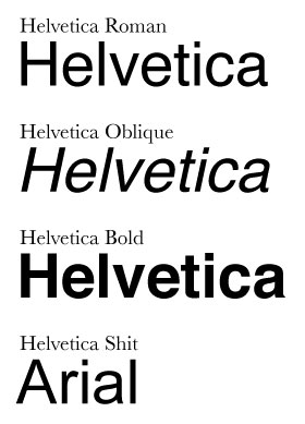
Can't stand Comic Sans, also don't like Arial - Helvetica's redheaded stepchild.

helv.jpg
 
This is a font that's much hated across The Interwebnetsformationhighways. Why? I mean, sure, it's not a great font, but I mean it's not terrible. I rarely use it, I'm more of an "Arial" fan, myself. But many people have some deep, deep hate for Comic Sans.

Porque?
This thread is the only place I have ever seen people even mention a hate of comic sans.

Don't know any designers, eh?
The ones I know have more imortant things going on in their lives to care about what font somebody uses.
 
It looks like a child's handwriting (Or possibly one who writes as bad as one, like me) which annoys me when there is a lot of text. For short messages it can work quite well.
 
If you are not already a member then please register an account and join in the discussion!

Sign up / Register


Back
Top