About David Mack's "The Sorrows of Empire" wasn't that already out in the Mirror Universe omnibus?
-
Welcome! The TrekBBS is the number one place to chat about Star Trek with like-minded fans.
If you are not already a member then please register an account and join in the discussion!
You are using an out of date browser. It may not display this or other websites correctly.
You should upgrade or use an alternative browser.
You should upgrade or use an alternative browser.
2009 Fall Book Preview With Covers
- Thread starter Man of Steel
- Start date
Margaret described her cover philosophy at Shore Leave last year thusly: For her books, she wants covers that don't obviously look like Star Trek covers, that someone can read on the New York subway and not be embarassed by.
If that is true then she needs to re-think what is embarrasing. I think all but the Vangaurd book would be embarrasing for me to carry on the subway! In fact the word ashamed comes to mind.
Kevin
This is a full-novel-length expanded version of that story.About David Mack's "The Sorrows of Empire" wasn't that already out in the Mirror Universe omnibus?
This is a full-novel-length expanded version of that story.About David Mack's "The Sorrows of Empire" wasn't that already out in the Mirror Universe omnibus?
Is it expanded enough to buy it if you already own Glass Empires?
It will be more than double the length of the original.This is a full-novel-length expanded version of that story.About David Mack's "The Sorrows of Empire" wasn't that already out in the Mirror Universe omnibus?
Is it expanded enough to buy it if you already own Glass Empires?
I'm curious about Precipice since I'm reading Summon the Thunder at the moment, after reading what the linked site said about it... it's like..."what happened...?"
*puzzled*
Soon I'll get to find out!")
It's worse for me - I usually read in as close to chronological order as possible and mostly wait until my next run to read any new books (the recent trend towards more connected novels has made me rethink this policy in the novels set in the 24th century, though). I'm getting close to them, but I've still only read the FIRST Vanguard novel.
On the topic of the covers, I've got to say, they do feel fairly... underwhelming. I can understand the reasoning, but I'm going to have to agree to disagree here - specifically, I disagree with the idea that there is some kind of embarrassment with reading a Star Trek novel - a novel based on a TV show that is still watched and loved by fans both long-term and recent after forty plus years? I've proudly read my novels in plain sight from age nine, and have never once been mocked for it.
Synthesis' cover is especially visually unappealing to me - to my eye, the cover resembles a romance novel more than a sci-fi novel. Given that I'm a twenty-one year old male, THAT would be embarrassing for me to be seen reading, far more than reading a Star Trek book ever would.
However, I guess I'm somewhat in the minority in that I don't think the 'Unworthy' cover doesn't look all that bad. It actually makes me think of the opening credits of Voyager. That one and Vanguard look really nice.
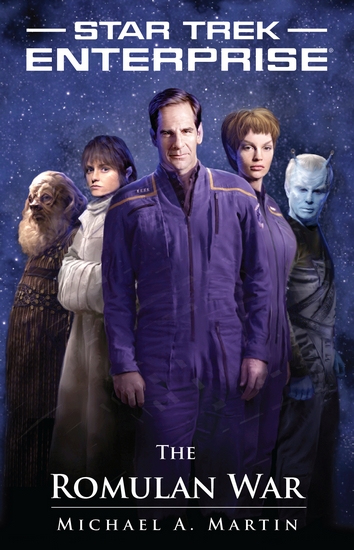
I agree with the comments on T'Pol's head and face looking very odd, though. I also think there's something wrong with Archer's face. Not sure what exactly, but something just looks... off.
Marlena's face also looks to be lighted different than her body. Am I alone in that I kinda liked the full body shot of the two from the stand-in cover more than the close ups? Though I would also like to see something a little more evident that this is the mirror universe than just the title and the bearded Spock - maybe a Terran Empire symbol or something?
I'll be honest; I still think the best TrekLit covers are the Avatar books. Though either way, I've been reading trek books on Kindle since March, and the lack of covers really hasn't bothered me at all.
I do love the Neverending Sacrifice cover, though; I may buy that book just to have the cover. It's lovely.
I do love the Neverending Sacrifice cover, though; I may buy that book just to have the cover. It's lovely.
Does anybody know if they're going to be selling the TNES cover in larger sizes? If so, who would be the legitimate seller?
Does anybody know if they're going to be selling the TNES cover in larger sizes? If so, who would be the legitimate seller?
I've never heard of them doing anything like that. I know KRAD has the cover art for Diplomatic Implausibility in a larger size, but I believe that was a special arrangement with the artist.
I think it'd be pretty brilliant if they sold prints of some of these covers, but I suppose the market would be rather small.
It probably would be a small market. But, there is a such thing as print-on-demand for art prints, just one at a time as people order them. Sites like deviantART or cafepress provide a venue. Now, I bet the publisher could do it a little better than that, but they could also work with one of those sources or something similar, as a way to get it done.
It probably would be a small market. But, there is a such thing as print-on-demand for art prints, just one at a time as people order them. Sites like deviantART or cafepress provide a venue. Now, I bet the publisher could do it a little better than that, but they could also work with one of those sources or something similar, as a way to get it done.
Stephan Martinere is an artist of Trek covers. He did the cover for Sky's the limit which is a very beautiful cover. I loved it that I contacted him directly and asked if it was available to purchase and he linked me to his site.
He's got a lot of neat stuff there for purchasing and the prices vary depending on the work.
On a side note: Where is the cover link to the NES?
http://memory-alpha.org/en/wiki/File:The_Never_Ending_Sacrifice_cover.jpg
Trekmovie might have a larger size.
Such a pretty cover.
Thanks for the link Kirk.
Who's the man in the photo? Hard to make out.
Nice to see Cardassia.
Thanks for the link Kirk.
Who's the man in the photo? Hard to make out.
Nice to see Cardassia.
Is this the first time a Tellarite has featured on cover art?
The Tellarite crewmember in CoE/SCE has been on the virtual covers.
But I'm excited that I own this costume ("It's A Wrap!" eBay auctions), that appears on the cover of "The Romulan War"!

On the topic of the covers, I've got to say, they do feel fairly... underwhelming. I can understand the reasoning, but I'm going to have to agree to disagree here - specifically, I disagree with the idea that there is some kind of embarrassment with reading a Star Trek novel - a novel based on a TV show that is still watched and loved by fans both long-term and recent after forty plus years? I've proudly read my novels in plain sight from age nine, and have never once been mocked for it.
There's a misinterpretation here about the thinking behind Pocket's cover philosophy. The idea of having covers that you wouldn't be embarrassed to read on the subway has nothing to do with whether they're Star Trek or not, just with whether they're good cover designs or not. The goal isn't to hide their identity as Trek novels, simply to reject the old, cheesy cover designs of the past. It's not about being ashamed of ST, it's about wanting to make ST look as classy as it deserves to look.
But I'm excited that I own this costume ("It's A Wrap!" eBay auctions), that appears on the cover of "The Romulan War"!
Therin in a Tellarite costume? I've crossed over into some warped Mirror Universe, haven't I?
")
Very nice, Therin...you wear it well.
Similar threads
- Replies
- 11
- Views
- 11K
- Replies
- 1
- Views
- 5K
- Replies
- 0
- Views
- 4K
If you are not already a member then please register an account and join in the discussion!