-
Welcome! The TrekBBS is the number one place to chat about Star Trek with like-minded fans.
If you are not already a member then please register an account and join in the discussion!
You are using an out of date browser. It may not display this or other websites correctly.
You should upgrade or use an alternative browser.
You should upgrade or use an alternative browser.
MadMan's Wallpaper Thread (Wide Image Warning)
- Thread starter MadMan1701A
- Start date
(Why is it, by the way, that no one said a thing in MONTHS to me about the Jaynz material.. not a word.. not a peep... then I get hundres of people pissed at me suddenly for retiring it?!)
NBC had that same problem in the late 60s when they tried to cancel a certain show...the name escapes me.
(Why is it, by the way, that no one said a thing in MONTHS to me about the Jaynz material.. not a word.. not a peep... then I get hundres of people pissed at me suddenly for retiring it?!)
NBC had that same problem in the late 60s when they tried to cancel a certain show...the name escapes me.
")
Yeah, I know I post stuff sometimes and no one replies, but a lot look at it. It's just the way things are....
NBC had that same problem in the late 60s when they tried to cancel a certain show...the name escapes me.
It starred William Shatner.. I think it was "Barbary Coast"! ...
NBC had that same problem in the late 60s when they tried to cancel a certain show...the name escapes me.
It starred William Shatner.. I think it was "Barbary Coast"! ...
I thought it was T.J. Hooker (or was that the '70s?)
I thought it was T.J. Hooker (or was that the '70s?)
That was early 80's, baby.. complete with big hair.
I thought it was T.J. Hooker (or was that the '70s?)
That was early 80's, baby.. complete with big hair.
He was in that show with Heather Locklear? I never noticed!

Oh, and Vance, got any comments on the Capella I am working on?
Hey guys... I released my files tonight. Version 4 is available for public download...
MadMan's Shipyard | Downloads
There's two files there... one with the Blender version, and one with Lightwave, 3DS, and OBJ files.
Have fun.
Hey Everybody! I'm still here...
I've been away practicing all kinds of stuff. On the following image, I probably have overdone a few of my new effects, but it's kind of an experiment with a new style. I've been studying some of my favorite images, from several artists, and I've tried to use different techniques from each. I hope if turned into something halfway successful.
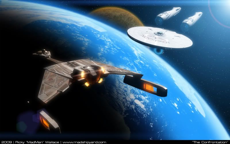
1440x900:
http://i5.photobucket.com/albums/y200/MadMan1701A/Wallpapers/TheConfrontation1440.jpg
1280x1024:
http://i5.photobucket.com/albums/y200/MadMan1701A/Wallpapers/TheConfrontation1280.jpg
I even have Lens Flares!
So, how is it?
I've been away practicing all kinds of stuff. On the following image, I probably have overdone a few of my new effects, but it's kind of an experiment with a new style. I've been studying some of my favorite images, from several artists, and I've tried to use different techniques from each. I hope if turned into something halfway successful.
1440x900:
http://i5.photobucket.com/albums/y200/MadMan1701A/Wallpapers/TheConfrontation1440.jpg
1280x1024:
http://i5.photobucket.com/albums/y200/MadMan1701A/Wallpapers/TheConfrontation1280.jpg
I even have Lens Flares!
So, how is it?
Okay, now you're getting it. 
Yes, the lens flares on the Kingon engines are too much, and too synthetic looking, and the flare from the sun is probably too bright (or at least, not quite right; look here for how a sun flare looks from orbit). But your lighting has has come a long way, and your shading on the planet is really good. I like it. Aside from that, the only thing that jumps out at me is that the atmospheric gradient is too large and looks too much a like a glow; again, see the NASA photo. I might also suggest having your clouds on a separate, slightly larger sphere with a transparency map so they throw shadows onto the planet below.
Yes, the lens flares on the Kingon engines are too much, and too synthetic looking, and the flare from the sun is probably too bright (or at least, not quite right; look here for how a sun flare looks from orbit). But your lighting has has come a long way, and your shading on the planet is really good. I like it. Aside from that, the only thing that jumps out at me is that the atmospheric gradient is too large and looks too much a like a glow; again, see the NASA photo. I might also suggest having your clouds on a separate, slightly larger sphere with a transparency map so they throw shadows onto the planet below.

That is Awesome! Is that a cut out in the Klingon warp nacelle or does the part there just happen to match the color of the ocean behind it?
The planet really looks nice to me. In fact, the whole image reminds me of the box cover from the old Star Fleet Battles game.
The planet really looks nice to me. In fact, the whole image reminds me of the box cover from the old Star Fleet Battles game.
Thanks.Okay, now you're getting it.
Yes, the lens flares on the Kingon engines are too much, and too synthetic looking, and the flare from the sun is probably too bright (or at least, not quite right; look here for how a sun flare looks from orbit). But your lighting has has come a long way, and your shading on the planet is really good. I like it. Aside from that, the only thing that jumps out at me is that the atmospheric gradient is too large and looks too much a like a glow; again, see the NASA photo. I might also suggest having your clouds on a separate, slightly larger sphere with a transparency map so they throw shadows onto the planet below.
Yeah, I need to do some refining... but I'm glad I'm on the right track.
As far as the planet goes... It's entirely a Photoshop creation.
I was aiming for kind of an airbrushed look, I think... I'm still hunting better cloud maps and larger textures I can use to make these types of planets. Now that I'm in the right direction, I'll make another one.
Thanks.That is Awesome! Is that a cut out in the Klingon warp nacelle or does the part there just happen to match the color of the ocean behind it?
The planet really looks nice to me. In fact, the whole image reminds me of the box cover from the old Star Fleet Battles game.
There is a cut out on the Klingon's nacelle... I'm not sure what purpose it might serve, other than maybe those orange panels get really hot.

Looking good MadMan
Not to pick nits, but the scout and destroyer that you based off Franz Joseph's work are slightly off. The original designs had deflector dishes (like the one mounted on the front of the E's secondary hull) extending down from where the 'bubble' on the bottom of the saucer normally lives, instead of said 'bubble'.
This illustration should help:

Perhaps, you could fiddle with your scout and destroyer when you have some time to more reflect the original design? In any case your work stands alone and I visit your site everyday! Keep up the good work.
Also I forwarded your work to Steve Cole, the designer of Star Fleet Battles, a starship game that uses elements of TOS Trek, including the Franz Joseph designs that you created NuTrek versions of. He was mightily impressed. Has he contacted you yet?
Regards,
J
Not to pick nits, but the scout and destroyer that you based off Franz Joseph's work are slightly off. The original designs had deflector dishes (like the one mounted on the front of the E's secondary hull) extending down from where the 'bubble' on the bottom of the saucer normally lives, instead of said 'bubble'.
This illustration should help:
Perhaps, you could fiddle with your scout and destroyer when you have some time to more reflect the original design? In any case your work stands alone and I visit your site everyday! Keep up the good work.
Also I forwarded your work to Steve Cole, the designer of Star Fleet Battles, a starship game that uses elements of TOS Trek, including the Franz Joseph designs that you created NuTrek versions of. He was mightily impressed. Has he contacted you yet?
Regards,
J

And, it's funny that you show those images of the ships as 'accurate'.. since the Columbia doesn't have spires like that anywhere.
http://www.jaynz.info/images/ADB/ADB_Hermes.png
Thanks for checking out the site! He has indeed contacted me, and we talked about a few things.
As Vance said, I wasn't going for a 100% replication of the original designs, just something neat that I think Vance suggested, and I ran with it. I did try it out with the deflector dishes, but it looked pretty goofy... so I just left them off.
I need to build new versions that incorporate parts of my latest Enterprise model, but I've been off learning how to composite better, and learning how to get planets to look good.
Similar threads
- Replies
- 14
- Views
- 3K
- Replies
- 10
- Views
- 956
- Replies
- 2
- Views
- 355
If you are not already a member then please register an account and join in the discussion!